Last updated on 19th May 2025| 9396
- Introduction to Data Visualization
- Importance of Data Visualization in Decision-Making
- Key Features of Data Visualization Tools
- Tableau: A Leading Visualization Tool
- Power BI: Microsoft’s Data Visualization Solution
- Qlik Sense: Interactive Data Analytics
- D3.js for Web-Based Data Visualization
- Best Practices for Effective Data Visualization
Introduction to Data Visualization
Data visualization is the process of representing data and information graphically, using elements like charts, graphs, and maps. It enables users to easily identify trends, outliers, and patterns in large datasets, making complex information more understandable. In today’s data-driven world, where vast amounts of data are generated daily, visualization plays a vital role in helping businesses, researchers, and individuals make informed decisions. By converting raw data into visual formats, organizations across industries such as finance, healthcare, marketing, and logistics can better analyze and forecast outcomes. Data Science Training emphasizes effective data visualization to enhance decision-making by simplifying complex relationships and highlighting key insights. It allows users to quickly identify anomalies and spot potential opportunities, which may otherwise go unnoticed in traditional reports or spreadsheets. As data continues to grow in volume and complexity, robust visualization tools have become essential rather than optional. These tools improve communication, foster a data-driven culture, and support strategic planning. Ultimately, data visualization bridges the gap between data and understanding, empowering users at all levels to derive actionable insights and make faster, smarter decisions.
Are You Interested in Learning More About Data Science? Sign Up For Our Data Science Course Training Today!
Importance of Data Visualization in Decision-Making
Data visualization is essential in decision-making as it transforms complex datasets into clear and understandable insights. It allows businesses to interpret vast amounts of data efficiently, enabling faster and more informed decisions. Organizations use visual tools to analyze customer behavior, monitor market trends, and evaluate operational performance. These visual representations make it easier for decision-makers to identify patterns, correlations, and anomalies that might be overlooked in raw data formats. One key benefit of using VBA in Excel is its role in enhancing data visualization for storytelling. By presenting data visually, stakeholders can grasp intricate relationships and trends more effectively. For instance, a line chart showing a company’s sales performance over time offers immediate clarity compared to a table full of numbers. This form of communication enhances collaboration across departments and ensures that everyone, regardless of technical background, can understand the insights.
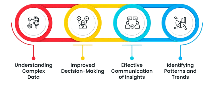
Data visualization is also a critical component of predictive analytics. By illustrating historical trends, organizations can forecast future outcomes with greater accuracy. Beyond the private sector, government agencies and policymakers use visual tools to monitor economic indicators, track public health statistics, and observe environmental changes. Ultimately, data visualization bridges the gap between complex data and actionable insight, making it a cornerstone of modern decision-making.
Key Features of Data Visualization Tools
- Interactive Dashboards: Users can filter and manipulate data in real time, allowing for a more dynamic analysis experience.
- Data Integration: Ability to connect with multiple data sources such as databases, spreadsheets, and cloud services to unify datasets.
- Customizable Visuals: A wide range of chart types, color schemes, and formatting options that cater to different analytical needs.
- Collaboration Capabilities: Using the LightGBM Algorithm, teams can share reports and insights easily, improving communication and decision-making.
- AI and Automation: Advanced tools integrate artificial intelligence to provide automated insights and trend predictions, reducing manual effort.
- Mobile Accessibility: Many modern data visualization tools offer mobile-friendly dashboards, enabling users to access and interact with data on the go, ensuring continuous insights anytime, anywhere.
- Security and User Permissions: Robust security features and role-based access controls help protect sensitive data and ensure that only authorized users can view or manipulate specific datasets.
- Real-Time Data Updates: The ability to connect to live data sources allows dashboards to display the most current information, which is critical for time-sensitive decision-making and monitoring.
- User-Friendly Interface: Tableau is renowned for its intuitive drag-and-drop interface, making it accessible to both technical and non-technical users. This simplicity allows users to build complex visualizations without extensive coding knowledge.
- Robust Data Connectivity: Tableau supports seamless integration with a wide range of data sources, including SQL databases, cloud platforms, spreadsheets, and big data tools, helping users understand the difference between Data vs Information.
- Interactive Dashboards: Tableau allows users to create interactive dashboards where filters, parameters, and tooltips can be used to explore data dynamically. This interactivity helps uncover insights through real-time manipulation and deeper analysis.
- Advanced Analytics: Tableau supports complex calculations, statistical analysis, trend lines, and forecasting. Users can build calculated fields and incorporate R or Python scripts to perform advanced analytical tasks.
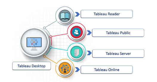
- Collaboration and Sharing: Tableau makes it easy to publish dashboards to Tableau Server, Tableau Online, or Tableau Public. These platforms support team collaboration, sharing insights securely and efficiently.
- Mobile Optimization: Tableau dashboards are optimized for mobile devices, allowing users to view and interact with reports on smartphones and tablets without compromising functionality.
- Strong Community and Support: With a large global user community, extensive learning resources, and active forums, Tableau users benefit from continuous support, innovation, and shared best practices.
- Collaboration Tools: Users can easily share insights, annotate dashboards, and collaborate with team members, improving communication and collective analysis.
- Robust Security: Qlik Sense offers enterprise-grade security features, including role-based access control and data encryption, ensuring data integrity and compliance.
- Associative Data Model: Qlik Sense uses an associative data engine that allows users to explore data freely without being restricted by predefined hierarchies. This model highlights hidden relationships and uncovers insights that might be missed in traditional query-based tools.
- Self-Service Analytics: Qlik Sense empowers users at all levels to create their own visualizations and dashboards without needing advanced technical skills, similar to learning How to Use the Percentage Formula in Excel for quick data insights.
- Smart Search and AI Integration: With AI-powered capabilities and smart search features, Qlik Sense helps users quickly find relevant data, identify trends, and receive automated insights, making analysis faster and more efficient.
- Data Connectivity: Qlik Sense connects to a wide variety of data sources, including cloud services, databases, and spreadsheets. It allows for real-time data updates and seamless integration of disparate datasets.
- Responsive Design: Dashboards in Qlik Sense are fully responsive, meaning they automatically adapt to different screen sizes, including tablets and smartphones, ensuring consistent user experience across devices.
To Explore Data Science in Depth, Check Out Our Comprehensive Data Science Course Training To Gain Insights From Our Experts!
Tableau: A Leading Visualization Tool

Power BI: Microsoft’s Data Visualization Solution
Microsoft Power BI is a leading data visualization and business intelligence tool widely favored by enterprises, especially those within the Microsoft ecosystem. Its seamless integration with popular Microsoft products such as Excel, Azure, and SQL Server enhances its functionality and ease of deployment. Power BI allows users to pull in data from various sources, transform it, and present it through interactive and visually appealing dashboards. One of the key strengths of Data Science Training is the use of AI-powered insights and advanced analytics, which enable users to uncover trends, make predictions, and derive actionable decisions with minimal manual effort. The platform is designed to be user-friendly, allowing users with little to no coding experience to create detailed and dynamic reports. Its affordability and scalability make it suitable for businesses of all sizes from small startups to large enterprises. Power BI also supports real-time data streaming, which is particularly valuable for industries that rely on immediate analytics, such as finance, retail, and logistics. With cloud-based deployment and mobile access, Power BI ensures that users can access and share reports anytime, anywhere. Overall, Power BI’s combination of power, flexibility, and ease of use makes it a top choice for modern data visualization.
Are You Considering Pursuing a Master’s Degree in Data Science? Enroll in the Data Science Masters Course Today!
Qlik Sense: Interactive Data Analytics
D3.js for Web-Based Data Visualization
D3.js (Data-Driven Documents) is a powerful JavaScript library designed for creating highly customized, web-based data visualizations. Unlike many out-of-the-box visualization tools, D3.js gives developers full control over the visual representation of data by binding data directly to the Document Object Model (DOM). This direct integration allows for the dynamic generation and manipulation of visual elements, making D3.js ideal for building interactive dashboards, animated charts, and data-driven stories. One of D3.js’s standout features is its unmatched flexibility. Developers can design almost any type of chart or visualization, tailored to specific needs and creative vision, while ensuring accuracy through Data Validation in Excel. Whether it’s a bar chart, scatter plot, heat map, or complex hierarchical diagram, D3.js supports advanced customizations and transitions that bring data to life. It is widely used in fields such as journalism, finance, and academic research, where data storytelling and clarity are critical. Additionally, D3.js supports integration with web standards like HTML, SVG, and CSS, making it a natural fit for web development projects. While it requires solid programming knowledge, particularly in JavaScript, its depth and power make it a preferred choice for developers seeking precise control over how data is visualized and interacted with.
Preparing for Data Science Job? Have a Look at Our Blog on Data Science Interview Questions & Answer To Ace Your Interview!
Best Practices for Effective Data Visualization
Effective data visualization is not just about making charts look attractive; it’s about conveying information clearly and accurately. One of the most important practices is to know your audience. Tailor your visualizations to their level of expertise and the decisions they need to make. Next, choose the right chart type based on the data and the message. For example, use line charts for trends over time, bar charts for comparisons, and pie charts for proportions though sparingly. Keep it simple by avoiding clutter and unnecessary elements in your Data Science Training. Overloading a visualization with colors, labels, or 3D effects can distract from the core message. Use color purposefully to highlight key data points or group related information, and maintain consistency in color schemes. Label clearly axes, legends, and data points should be easy to read and interpret. Incorporating interactivity, such as tooltips or filters, can enhance understanding without overwhelming the viewer. Finally, always validate your data before visualization to ensure accuracy. A well-designed but incorrect chart can mislead users and lead to poor decisions. Following these best practices ensures that your visualizations are both impactful and trustworthy.