Last updated on 21st May 2025| 9690
- Introduction to Data Visualization Types
- Categorical Data Visualization Methods
- Numerical Data Visualization Techniques
- Bar Charts and Histograms for Distribution
- Scatter Plots for Relationship Analysis
- Heatmaps for Correlation Visualization
- Pie Charts and Donut Charts Usage
- Conclusion
Introduction to Data Visualization Types
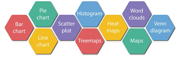
Data visualization is a key component of data analysis that involves representing data graphically to make information more accessible, understandable, and actionable. Different types of visualizations serve different purposes depending on the nature of the data and the message being conveyed. Line charts are commonly used to show trends over time, making them ideal for time-series data. Bar charts and column charts help compare quantities across different categories. Pie charts show proportions within a whole but are best used with a small number of categories to avoid confusion. Histograms are used to display the distribution of numerical data and identify patterns such as skewness or outliers, making them a key concept in Data Science Training. Scatter plots reveal relationships or correlations between two continuous variables. Box plots summarize data distributions, showing medians, quartiles, and potential outliers. Heatmaps use color intensity to show the magnitude of values across two dimensions, which is especially helpful for correlation matrices or performance metrics. Advanced types like bubble charts, violin plots, and treemaps are used for more complex data storytelling. Understanding these visualization types and their ideal applications is essential for selecting the right chart to convey insights clearly and effectively.
Are You Interested in Learning More About Data Science? Sign Up For Our Data Science Course Training Today!
Categorical Data Visualization Methods
Categorical data visualization methods are essential for exploring and understanding the distribution, frequency, and relationships of data grouped by categories. Since categorical variables represent discrete groups or labels (such as gender, region, or product type), specialized charts are used to display their values effectively. Bar charts are among the most common tools, using the height or length of bars to compare frequencies or counts across categories, much like AI Powered PowerPoint Generator Tools simplify visual data presentation. Count plots, commonly used in libraries like Seaborn, are a specific type of bar chart that directly show the number of occurrences for each category. Pie charts offer a circular representation of category proportions within a whole, though they are best used when comparing a limited number of categories.
Box plots can also be applied to categorical data when comparing the distribution of a continuous variable across different categories, highlighting medians, quartiles, and outliers. Violin plots extend box plots by showing the kernel density of the data, offering deeper insight into the distribution within each category. Strip plots and swarm plots display individual data points and are useful for visualizing variability within small groups. Choosing the right method depends on the data structure and the insight one aims to uncover.
Numerical Data Visualization Techniques
- Introduction: Visualizing numerical data is crucial for understanding trends, relationships, and distributions, making it easier to analyze and interpret complex quantitative information.
- Line Charts: Line charts are commonly used to track changes over time or continuous data. They help illustrate trends and patterns, particularly in time-series analysis.
- Histograms: Histograms display the distribution of data by dividing it into bins. They allow users to observe the frequency of values, detect skewness, and spot outliers in continuous data.
- Scatter Plots: Scatter plots help examine relationships between variables, similar to how Master Prompt Engineering for Better AI Results identifies key patterns.
- Box Plots: Box plots provide a summary of data distribution, showing the median, quartiles, and potential outliers. They offer a clear view of the spread and variability in a dataset.
- Heatmaps: Heatmaps visualize data matrices where values are represented through color intensity. They’re particularly useful for identifying patterns, correlations, and trends in large datasets.
- Use Cases: These visualization techniques are essential across various fields, such as finance, healthcare, and marketing, helping analysts and decision-makers extract valuable insights from numerical data.
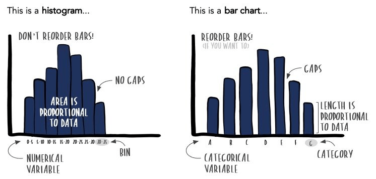
- Introduction: Bar charts and histograms are fundamental tools in data visualization used to represent and compare distributions, but they serve different purposes depending on the data type.
- Bar Charts: Bar charts are used to display the frequency or count of categorical data. Each bar represents a category, and its height corresponds to the value or frequency of that category.
- Histograms: Histograms show data distribution using bins, a key concept in Data Science Training.
- Axes and Gaps: In bar charts, there are usually gaps between the bars to emphasize discrete categories, whereas histograms have adjacent bars to show the continuity of data.
- Customization: Both charts can be customized with titles, labels, colors, and gridlines using libraries like Matplotlib and Seaborn, making them adaptable for presentation or analysis.
- Interpretation: Bar charts help compare different categories easily, while histograms reveal the shape of data distributions, such as skewness, modality, and spread.
- Use Cases: These charts are commonly used in business, research, and statistics for summarizing sales data, survey responses, measurement distributions, and more.
- Introduction: Heatmaps are a visual representation of data where values are depicted by color, making them especially useful for showing the strength and direction of correlations between variables.
- Correlation Matrix: A heatmap typically displays a correlation matrix, where each cell represents the correlation coefficient between two variables in a dataset.
- Color Encoding: Colors range from cool tones (like blue) for negative correlations to warm tones (like red) for positive correlations, with the intensity of the color indicating the strength of the relationship.
- Interpretation: Heatmaps allow users to quickly identify strong positive or negative relationships and easily spot variables with little to no correlation.
- Diagonal Values: The diagonal of a correlation heatmap always shows a value of 1, as each variable is perfectly correlated with itself, much like how ChatGPT Plugins integrate seamlessly with the core system.
- Library Support: In Python, libraries like Seaborn make it easy to create heatmaps using the heatmap() function, which supports color gradients, annotations, and customization.
- Use Cases: Heatmaps are widely used in exploratory data analysis to detect patterns, assess multicollinearity, and support feature selection and model building in machine learning workflows.
To Explore Data Science in Depth, Check Out Our Comprehensive Data Science Course Training To Gain Insights From Our Experts!
Bar Charts and Histograms for Distribution

Scatter Plots for Relationship Analysis
Scatter plots are a fundamental tool in data visualization, widely used for analyzing the relationship between two continuous variables. Each point on a scatter plot represents an observation, with its position determined by the values of the two variables one plotted along the x-axis and the other along the y-axis. This visual arrangement makes it easy to detect patterns, trends, and potential correlations. A positive relationship appears as an upward-sloping cluster of points, indicating that as one variable increases, so does the other, a concept also leveraged by AI Tools for Coding to identify patterns in data. Conversely, a downward slope suggests a negative relationship, where one variable increases as the other decreases. If the points are scattered randomly without a clear pattern, it implies no correlation. Scatter plots are especially useful in identifying linear and non-linear relationships, outliers, and clusters within the data. They are often paired with trend lines or regression lines to quantify and emphasize the strength and direction of the relationship. Tools like Matplotlib, Seaborn, and Plotly in Python make creating scatter plots straightforward and customizable. Overall, scatter plots are essential for exploratory data analysis, helping analysts form hypotheses and understand how variables interact before applying more advanced statistical techniques or predictive models.
Want to Pursue a Data Science Master’s Degree? Enroll For Data Science Masters Course Today!
Heatmaps for Correlation Visualization
Pie Charts and Donut Charts Usage
Pie charts and donut charts are popular visualization tools used to represent the proportional distribution of categorical data. A pie chart displays data as slices of a circle, where each slice corresponds to a category and its size reflects the proportion or percentage of that category within the whole. This format makes it easy to compare parts to the whole and observe dominant categories at a glance. However, pie charts are most effective when visualizing a small number of categories, typically no more than five or six, as too many slices can make the chart difficult to interpret, similar to how AI Art Generator Toolsperform best with clear and simple inputs. A donut chart is a variation of the pie chart with a blank center, which can improve readability and provide space for labels or totals. Both charts are often used in business dashboards, surveys, and reports to illustrate market share, budget allocation, or customer preferences. Despite their visual appeal, these charts are less precise for comparing values than bar charts, especially when differences are subtle. Therefore, they are best used for emphasizing general proportions rather than exact comparisons. When used appropriately, pie and donut charts offer a simple and visually engaging way to present part-to-whole relationships in categorical data.
Preparing for Data Science Job? Have a Look at Our Blog on Data Science Interview Questions & Answer To Ace Your Interview!
Conclusion
In conclusion, data visualization plays a vital role in transforming raw data into meaningful insights through visual representation. It enhances understanding, supports data-driven decision-making, and allows patterns, trends, and anomalies to emerge more clearly than through raw numbers alone. Python offers a rich ecosystem of powerful libraries such as Matplotlib, Seaborn, Plotly, Dash, and Streamlit that cater to a wide range of visualization needs, from simple static charts to complex, interactive dashboards. Choosing the right type of visualization, whether it’s a bar chart for categorical comparison, a scatter plot for relationship analysis, or a heatmap for correlation insights, depends on the nature of the data and the story one wants to tell in Data Science Training. Tools like Pandas also simplify plotting for quick exploratory analysis. Meanwhile, libraries like Plotly and Bokeh offer advanced features for interactivity, making data exploration more dynamic and user-friendly. Streamlit and Dash take visualization further by enabling the creation of full-fledged analytical web applications. Whether for business intelligence, scientific research, or data journalism, effective visualizations not only convey information efficiently but also engage the audience. As data continues to grow in complexity and volume, mastering visualization techniques will remain a key skill for analysts, scientists, and anyone working with data.