Last updated on 18th Nov 2021| 13211
Browse our top Data Visualization in R interview questions and answers and start preparing for your Data Visualization in R interview. It will help you fast-track your career and land you into the best jobs as Data Visualization Specialists, Data Visualization Engineer, Data Visualization Developer, etc. Set your bar higher with our interview questions for Data Visualization in R that will give you the much-needed edge over your peers. Prepare well and crack your interview with ease and confidence!
1. What is ggplot2 in R?
Ans:
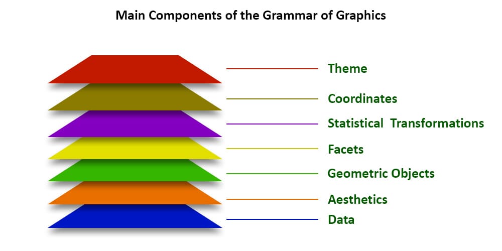
ggplot2 is a data visualization package in R that provides a powerful and flexible framework for creating a wide range of static and dynamic plots. It follows the grammar of graphics, allowing users to build complex plots by combining different layers and components.
2. Explain the basic structure of a ggplot2 plot.
Ans:
The basic structure of a ggplot2 plot involves using the ggplot() function to specify the data and aesthetics, followed by adding layers using the + operator. The structure typically looks like this: ggplot(data = , aes()) + . The aes() function defines the aesthetic mappings, and geometric objects represent the type of plot (e.g., points, lines, bars).
3. Differentiate between geom_point() and geom_line() in ggplot2.
Ans:
geom_point() is used to create a scatter plot, where each data point is represented as a point on the plot. It is suitable for visualizing individual data points.
geom_line() is used to connect data points with lines, creating a line plot. It is useful for visualizing trends or relationships between data points over a continuous scale, such as time.
4. How do you install and load R packages for data visualization?
Ans:
- Install packages with install.packages(“package_name”).
- Load packages using library(package_name).
- Example : install.packages(“ggplot2”).
5. Explain the purpose of the ggplot2 package in R.
Ans:
The ggplot2 package in R is designed for creating versatile visualizations with a declarative syntax. It follows a layered approach, enabling users to add components like data, aesthetics, and geometric objects incrementally. Developed by Hadley Wickham, ggplot2 adheres to the Grammar of Graphics principles, offering high customization and control. Its extensibility allows for the creation of a wide range of static, animated, and interactive plots, making it a fundamental tool for data visualization in R.
6. Differentiate between base R plotting and ggplot2.
Ans:
- Base R offers basic plotting functions.
- ggplot2 provides a layered, declarative syntax.
- Base R is procedural; ggplot2 is more declarative.
- ggplot2 creates complex plots with less code.
- ggplot2 is highly extensible and customizable.
7. What is the role of the ggplot() function in creating visualizations?
Ans:
- Foundation for ggplot2 visualizations.
- Sets up data and variables.
- Crucial for subsequent layering.
- Initiates the plotting process.
- Defines context and structure.
8. Describe the components of a ggplot object.
Ans:
- Includes data, aesthetic mapping, geometric objects.
- Statistical transformations and coordinates.
- Data forms the plot foundation.
- Aesthetics map variables to visuals.
- Geoms determine plot type (points, lines).
9. How can you create a scatter plot using ggplot2?
Ans:
- Use ggplot() to initiate.
- Specify data and aesthetics.
- Add geom_point() for points.
- Example: ggplot(data, aes(x = var1, y = var2)) + geom_point().
- Explain the concept of aesthetics (aes()) in ggplot2.
10. Explain the concept of aesthetics (aes()) in ggplot2.
Ans:
- Defines data-to-visual mappings.
- Specifies variable mappings.
- Used in ggplot() and geoms.
- Crucial for customization.
- Example: aes(x = var1, y = var2).
11. What is the purpose of geom_bar() in ggplot2, and how is it used?
Ans:
geom_bar() in ggplot2 is designed to construct bar charts, portraying the distribution of categorical data. It requires specifying the categorical variable for the x-axis, and the height of the bars signifies the count or frequency of each category. Additional aesthetics like fill and color can be employed for visual enhancement, and customization options allow for adjusting parameters like position and width.
- ggplot(data = df, aes(x = category)) +
- geom_bar()
12. How can you customize axis labels in ggplot2 visualizations?
Ans:
- Use labs() or scale_x/y_continuous().
- Adjust labels with xlab() and ylab().
- Example: labs(x = “X-axis label”, y = “Y-axis label”).
- Fine-tune appearance for clarity.
13. Discuss the importance of the theme() function in ggplot2.
Ans:
- Alters the overall appearance of the plot.
- Adjusts elements like fonts, colors.
- Enhances aesthetics for better readability.
- Example: theme_bw() for a clean theme.
14. Explain the role of color in data visualizations and how it can be customized in ggplot2.
Ans:
- Signifies data categories or patterns.
- Set colors with scale_fill_manual() or scale_color_manual().
- Enhances visual appeal and clarity.
- Example: fill = “blue” in aesthetics.
15. What is the purpose of the facet_wrap() function in ggplot2?
Ans:
- Facilitates creating small multiples.
- Divides a plot into facets based on a variable.
- Useful for comparing subsets of data.
- Example: facet_wrap(~variable).
16. How do you add a trendline to a scatter plot in ggplot2?
Ans:
- Use geom_smooth() with method “lm” for linear regression.
- Enhances scatter plots with regression trends.
- Example: geom_point() + geom_smooth(method = “lm”).
17. Compare and contrast geom_histogram() and geom_density() in ggplot2.
Ans:
| Aspect | geom_histogram() | geom_density() | |
| Purpose |
Create histograms for continuous data |
Generate smoothed density plots. | |
| Representation | Bars or bins based on data ranges | Continuous lines representing density. | |
| Aesthetics | Requires x-axis values; optional y | Typically used with x-axis values only. | |
| Density Estimation | Histograms show count within bins | Density plots show smoothed data trends. |
18. How can you create a boxplot using ggplot2, and what insights can it provide?
Ans:
- Utilize geom_boxplot() for visualizing distribution.
- Depicts median, quartiles, and potential outliers.
- Example: ggplot(data, aes(x = category, y = value)) + geom_boxplot().
- Offers insights into data spread and central tendency.
19. Discuss the use of the ggmap package for geographical visualizations.
Ans:
- Integrates maps into ggplot2 visualizations.
- Allows plotting data on real-world maps.
- Requires API key for Google Maps access.
- Useful for spatial data exploration.
- Example: ggmap::get_map(location) + ggmap::geom_point(data).
20. Explain the concept of layers in ggplot2.
Ans:
- ggplot2 builds plots in layers.
- Each layer adds a component to the plot.
- Layers include data, aesthetics, geoms.
- Facilitates customization and flexibility.
- Example: ggplot() + geom_point() + geom_line().
21. How do you handle missing values in your visualizations in R?
Ans:
- Use na.rm parameter in plotting functions.
- Impute missing values before plotting.
- Remove or interpolate missing data.
- Libraries like tidyr assist in handling missing values.
- Ensure clear communication of missing data.
22. What is the significance of the coord_flip() function in ggplot2?
Ans:
- Flips x and y axes in a plot.
- Useful for horizontal bar charts.
- Improves readability for long category labels.
- Example: coord_flip() in ggplot2.
- Enhances visualization of certain data distributions.
23. How can you create animated visualizations in R using gganimate?
Ans:
The gganimate package in R extends ggplot2, allowing the generation of dynamic plots. By incorporating functions like transition_ within ggplot2, this package facilitates the creation of animated visualizations that showcase changes over time or with respect to a specific variable. This capability adds a layer of engagement and exploration to data visualization, making it especially useful for conveying evolving trends and patterns.
24. Describe the process of integrating Shiny with R for interactive visualizations.
Ans:
The integration of Shiny with R opens avenues for creating interactive visualizations through web applications. Shiny enables the development of user-friendly interfaces with real-time data manipulation capabilities. This seamless interaction allows users to explore and analyze data interactively, providing an effective platform for dynamic and responsive data visualization.
25. Explain the purpose of the heatmap function in R for matrix data.
Ans:
The heatmap function in R is tailored for visualizing matrix data. It employs a color scale to represent values, making patterns and variations easily discernible. This visualization method is particularly effective for exploring large datasets, revealing underlying structures, relationships, or clusters within matrices. The heatmap’s color intensity provides an intuitive representation of the magnitude of values.
26. How can you customize legends in ggplot2 visualizations?
Ans:
Legends in ggplot2 play a crucial role in explaining variable-to-visual mappings. To enhance interpretability, customization of legends is essential. Functions like labs() allow modification of legend titles, while scale_ functions provide control over appearance aspects such as color and size. Tailoring legends ensures that information is communicated clearly in ggplot2 visualizations, contributing to their overall clarity and effectiveness.
27. Discuss the concept of small multiples in data visualizations.
Ans:
- Small multiples display subsets of data.
- Each plot represents a category or variable.
- Facilitates easy comparison and pattern recognition.
- Enhances comprehensive understanding of the dataset.
28. How do you create a bar chart with error bars in ggplot2?
Ans:
- Use geom_bar() for bars and geom_errorbar() for errors.
- Specify aesthetics within aes() for variables.
- Customize error bars using parameters like position_dodge().
- ggplot(data, aes(x = category, y = value))
- + geom_bar(stat = “identity”, position = “dodge”)
- + geom_errorbar(aes(ymin = lower, ymax = upper), position = “dodge”).
29. Explain the significance of the ggplot2 extensions like ggExtra and ggthemes.
Ans:
- ggExtra: Enhances ggplot2 with functions like ggMarginal().
- ggthemes: Offers ready-to-use themes and color palettes.
- Streamlines theme selection and customization.
- Enriches ggplot2 with additional features and aesthetics.
30. How can you create 3D visualizations in R?
Ans:
- Use packages like rgl and plot3D.
- rgl enables interactive 3D plots.
- plot3D provides functions for static 3D plots.
- Enhances data exploration with a third dimension.
31. Discuss the role of the ggsci package in customizing color palettes.
Ans:
- ggsci extends ggplot2 with specialized color palettes.
- Offers a variety of visually appealing color options.
- Designed for scientific and data visualization purposes.
- Simplifies color customization for ggplot2 plots.

Develop Your Skills with Data Visualization Certification Training
Weekday / Weekend BatchesSee Batch Details32. What is the purpose of the ggforce package in enhancing ggplot2 functionalities?
Ans:
- ggforce extends ggplot2 with additional functionalities.
- Provides features like geom_parallel() and geom_arrow().
- Enhances plot customization and complexity.
- Enables the creation of advanced and specialized visualizations.
33. How can you create a choropleth map in R?
Ans:
To create a choropleth map in R, load the ggplot2 and sf packages, read in spatial data using st_read(), and use ggplot() with geom_sf() to plot the map. Customize aesthetics like fill color with the aes() function.
34. Discuss the use of the patchwork package for combining multiple ggplot2 plots.
Ans:
Install and Load patchwork : Install the “patchwork” package and load it using library().
Create and Combine Plots : Design individual ggplot2 plots, then combine them using the + operator.
Customize Layout : Use plot_layout() to arrange plots, specifying the desired columns or rows.
Display Combined Plot : Print the combined plot to visualize multiple ggplot2 plots in a single layout. The patchwork package simplifies this process.
35. Explain the process of creating word clouds in R.
Ans:
Install and Load Packages : Use install.packages() to install “tm” and “wordcloud,” then load them with library().
Preprocess Text : Tokenize and clean text with functions from the “tm” package.
Generate Word Cloud : Utilize wordcloud() to create a word cloud, specifying text and relevant parameters.
36. How do you handle overplotting issues in scatter plots?
Ans:
Overplotting in scatter plots can be managed by adjusting point transparency using alpha blending. R’s “ggplot2” package facilitates this through the alpha parameter in geom_point() aesthetics.
37. Discuss the advantages of using the plotly package for interactive visualizations.
Ans:
Plotly” in R offers interactive visualizations, enhancing exploration. It supports various chart types and allows embedding in web applications. Plotly facilitates sharing interactive plots online for a broader audience.
38. How can you create a time series plot in ggplot2?
Ans:
For a time series plot in R using “ggplot2,” ensure data includes a time variable. Use ggplot() and geom_line() with customized aesthetics for the x and y axes. Further enhancements, such as labels and themes, can be applied for clarity and interpretation.
39. How can you create a radar chart in R?
Ans:
To create a radar chart in R, use the “fmsb” or “plotly” package. A radar chart, also known as a spider or star plot, displays multivariate data on axes emanating from a central point. It is suitable for visualizing and comparing multiple variables across different categories. Customize the chart by specifying axes, labels, and data points for each variable, providing insights into the relative strengths or performance of categories.
40. Explain the role of the cowplot package in customizing ggplot2 layouts.
Ans:
The cowplot package in R serves to customize ggplot2 layouts. It allows users to modify and arrange multiple ggplot2 plots in a flexible manner, offering features like shared axes, custom annotations, and the ability to align and combine plots into complex layouts. The package enhances the presentation and visual appeal of multi-plot visualizations.
41. How do you create a sunburst chart in R?
Ans:
To create a sunburst chart in R, use the “sunburstR” or “plotly” package. These packages enable the creation of interactive sunburst charts, where hierarchical data is represented as a series of nested rings. The data hierarchy is visualized by the radial layout, with each ring representing a level of the hierarchy.
42. Discuss the concept of hexagonal binning in ggplot2 for handling dense data.
Ans:
Hexagonal binning in ggplot2 involves grouping data points into hexagonal bins, providing a clearer representation of the data distribution in dense scatter plots. Instead of relying on individual points, hexagons are colored based on the density of points within each bin. This method helps overcome overplotting issues and provides a smoother visualization of data density.
43. How can you create a violin plot in ggplot2?
Ans:
To create a violin plot in ggplot2, use the geom_violin() function. A violin plot is a combination of a box plot and a kernel density plot, providing insights into the distribution and density of the data. Customize the plot further using additional ggplot2 functions for themes, labels, and other aesthetic adjustments, tailoring the visualization to the characteristics of the dataset.
44. Explain the purpose of the rayshader package for 3D data visualization.
Ans:
The rayshader package in R is designed for 3D data visualization. It enables users to transform 2D elevation data into visually appealing 3D renderings. The package uses ray-tracing techniques to simulate light and shadows, providing a realistic and intuitive representation of terrain or other spatial data. It is particularly useful for geospatial and scientific visualizations.
45.How do you customize axis scales in ggplot2?
Ans:
In ggplot2, axis scales can be customized using functions like scale_x_continuous() and scale_y_continuous(). These functions allow you to modify the axis labels, breaks, and limits. Additionally, scale_ functions provide options for customizing color, size, and other scale-related aesthetics, allowing users to tailor the appearance of the plot to their specific needs.
46. Discuss the use of the leaflet package for interactive maps in R.
Ans:
The leaflet package in R is employed for creating interactive maps. It builds on the JavaScript Leaflet library, providing a straightforward interface for embedding interactive maps in R. Users can add markers, polygons, pop-ups, and other interactive elements. The resulting maps can be easily shared online, making leaflet a popular choice for web-based mapping applications.
47. Explain the process of creating a network graph in R.
Ans:
Install and Load Packages : Install “igraph” and “ggraph,” then load them for network analysis and visualization.
Data Preparation : Organize data in an adjacency matrix or edge list suitable for network analysis.
Create Network Object : Use graph_from_data_frame() from “igraph” to form a graph object.
Plot the Network : Utilize “ggraph” functions to visualize the network, customizing aesthetics and layout.
48. Discuss the role of the circlize package for circular visualizations.
Ans:
The circlize package in R is pivotal for circular visualizations, especially in genomic data. It provides functions to create circular plots, facilitating the representation of relationships and patterns in circular layouts.
49. How can you create a sunburst chart in R using the sunburstR package?
Ans:
To create a sunburst chart in R, use the “sunburstR” package. This package enables interactive sunburst charts, representing hierarchical data as nested rings. Utilize functions like sunburst() to specify data and customize chart appearance.
50. Explain the significance of the esquisse package for ggplot2.
Ans:
The “esquisse” package in R is significant for ggplot2 users, providing an interactive GUI for creating ggplot visualizations. It simplifies the process, allowing users to design and customize plots through a user-friendly interface without extensive code knowledge.
51. How do you create a lollipop chart in ggplot2?
Ans:
To create a lollipop chart in ggplot2, use the geom_segment() and geom_point() functions. Specify data, mapping aesthetics, and customize elements like colors and labels for an effective representation of point values with associated lines.
52. Discuss the use of the plotROC package for creating ROC curves in R.
Ans:
The plotROC package in R is utilized for creating Receiver Operating Characteristic (ROC) curves. It simplifies the process of visualizing the performance of classification models by providing functions like plot.roc() for plotting ROC curves and calculating related metrics.
53. How can you create a calendar heat map in R?
Ans:
To create a calendar heat map in R, use packages like “ggplot2” and “ggcal.” Represent time-based data with color intensity variations. Customize aesthetics, including colors and labels, to effectively convey patterns and trends over time.
54. Explain the purpose of the plotly::subplot() function in combining multiple plots.
Ans:
The plotly::subplot() function in R, part of the “plotly” package, allows combining multiple plots into a single subplot layout. It streamlines the creation of complex visualizations by arranging individual plots in a grid, facilitating comparisons and enhancing the overall presentation.
55. Discuss the advantages of using the ggridges package for ridge plots.
Ans:
The ggridges package simplifies ridge plot creation with a concise syntax, offering enhanced aesthetics for improved visualization of overlapping distributions. It provides a clear representation of density plots, facilitating easy comparison of multiple distributions.
56. How can you create a waterfall chart in R?
Ans:
Generate a waterfall chart in R using packages like “waterfall” or “plotly.” This chart visually displays cumulative values with incremental bars, effectively illustrating positive and negative contributions. Customize aesthetics and labels to enhance clarity and insight in the visualization.
57. Explain the significance of the shinydashboard package for building dashboards.
Ans:
The shinydashboard package in R is essential for constructing dashboards. It streamlines the dashboard creation process, providing an intuitive framework for building interactive and visually appealing dashboards in R using the Shiny web application framework.
58. Discuss the process of creating animated choropleth maps in R.
Ans:
To create animated choropleth maps in R, utilize packages like “ggplot2” and “gganimate.” Start by preparing time-series data with geographic information. Use functions like geom_sf() and transition_time() to animate changes over time, facilitating the visualization of dynamic patterns in geographic data.
59. How can you create a radar chart in R using the fmsb package?
Ans:
To create a radar chart in R, use the “fmsb” package. Begin by installing and loading the package. Prepare data with variable values for each category. Utilize the radarchart() function to generate the radar chart, customizing labels, colors, and other aesthetics for an effective representation of multivariate data.
60. How do you create a sunburst chart using the sunburstR package?
Ans:
To create a sunburst chart in R, use the “sunburstR” package. Start by installing and loading the package. Utilize the sunburst() function, providing the hierarchical data and customizing the chart’s appearance for an interactive sunburst visualization.
61. Explain the purpose of the flexdashboard package for building interactive dashboards.
Ans:
The flexdashboard package in R is designed for building interactive dashboards. It allows the integration of R code, visualizations, and narrative text into a single interactive dashboard. With a Markdown-based framework, users can create dynamic and responsive dashboards that adapt to various screen sizes.
62. Discuss the role of the shinyjs package in enhancing Shiny applications.
Ans:
The shinyjs package in R enhances Shiny applications by providing additional JavaScript functionalities. It allows users to execute custom JavaScript code within Shiny apps, enabling features like dynamic elements, conditional formatting, and interactivity that go beyond the standard Shiny capabilities.
63. Explain the significance of the gridExtra package in arranging ggplot2 plots.
Ans:
The gridExtra package in R is crucial for organizing and arranging multiple ggplot2 plots. It offers the grid.arrange() function, allowing users to create customized layouts, such as grids or matrices, for improved visualization. This package streamlines the process of combining and aligning diverse plots, providing control over the placement and scaling of individual visuals. It enhances the flexibility of presenting complex visualizations and facilitates side-by-side comparisons. Overall, gridExtra is valuable for creating cohesive and well-organized arrangements of ggplot2 outputs.

Get JOB Oriented Data Visualization Training for Beginners By MNC Experts
- Instructor-led Sessions
- Real-life Case Studies
- Assignments
64. How does the ggplot2 package contribute to data visualization in R?
Ans:
ggplot2 simplifies data visualization in R by following Grammar of Graphics principles, offering a layered approach for building versatile plots. With a declarative syntax, it supports a wide range of plot types, making it a powerful tool for data exploration and presentation.
65. Explain the purpose of the ggplot2 themes and how they can be customized.
Ans:
Themes in ggplot2 control overall plot appearance, providing consistency. The theme() function allows customization of elements like fonts and colors. Themes are essential for maintaining a cohesive visual style across multiple plots.
66. What are the key differences between geom_point() and geom_jitter() in ggplot2?
Ans:
- geom_point() stacks overlapping points in a scatter plot.
- geom_jitter() adds random jitter to prevent overlap, suitable for high-density datasets.
- geom_jitter() is beneficial when exploring larger datasets with many overlapping points.
67. How can you create a faceted scatter plot using ggplot2?
Ans:
To create a faceted scatter plot, use facet_grid() or facet_wrap() functions in ggplot2. For example, facet_grid(A ~ B) creates a grid of scatter plots based on categorical variables “A” and “B,” providing a visual representation of combinations between their levels.
68. How do you create a bar plot with error bars using ggplot2?
Ans:
To create a bar plot with error bars in ggplot2, one can utilize geom_bar() for the bars and geom_errorbar() for representing uncertainties. By specifying the appropriate aesthetics within these geometries, users can generate comprehensive visualizations that not only show the distribution of data but also provide insights into the associated uncertainties.
69. Discuss the use of color scales in ggplot2 and provide examples of different color scales.
Ans:
Color scales in ggplot2 dictate the visual representation of data points, influencing how viewers interpret information. Notable examples include Viridis, offering perceptual uniformity; Heatmap, suitable for sequential transitions; and Rainbow, a cyclical scale often used for categorical data.
70. How can you customize legends in ggplot2, such as changing titles and positions?
Ans:
Customizing ggplot2 legends is crucial for improving plot clarity and aesthetics. Using the labs() function, titles can be modified, while theme() adjustments allow for changes in legend positions. This flexibility enables users to tailor legends according to the specific requirements of their visualizations.
71. Explain the significance of the gganimate package for creating animated visualizations in ggplot2.
Ans:
The gganimate package significantly enhances ggplot2 by introducing animation capabilities. Functions like transition_states() enable dynamic storytelling by animating data changes over time. This is particularly valuable for conveying temporal patterns or trends in a more engaging and comprehensible manner.
72. What are the advantages of using the ggExtra package for extending ggplot2 functionality?
Ans:
The ggExtra package extends ggplot2 functionality by offering additional tools for annotation, highlighting, and enhancing visualizations. Features like ggMarginal and ggExtra::grid.arrange() allow users to add marginal histograms or density plots to existing ggplot2 plots. This package thus provides supplementary capabilities for refining and extending the interpretability of ggplot2 visuals.
73. Discuss the role of the ggmap package for integrating geographical data with ggplot2.
Ans:
The ggmap package is instrumental in incorporating geographical data into ggplot2 visualizations. It provides functions to retrieve and plot maps from online sources, allowing users to overlay spatial data onto maps seamlessly. This integration enhances the capacity of ggplot2 for geospatial analysis and visualization.
74. How can you create a density plot in ggplot2, and what does the geom_density() function do?
Ans:
In ggplot2, a density plot is crafted using the geom_density() function. This function estimates and visualizes the probability density function of a continuous variable. By specifying the variable in the aes() function, users can create a density plot that illustrates the distribution of data, providing insights into its underlying pattern.
75. Explain the purpose of the ggcorrplot package for visualizing correlation matrices.
Ans:
The ggcorrplot package is designed specifically for visualizing correlation matrices. It streamlines the process of creating visually appealing and informative plots that represent the correlation structure among variables. With customizable features for color, size, and labels, ggcorrplot enhances the exploration of relationships within multivariate datasets.
76. How do you create a violin plot in ggplot2, and what does it represent?
Ans:
To create a violin plot in ggplot2, use the geom_violin() function. This plot combines aspects of a box plot and a kernel density plot, showcasing the distribution of data. The width represents density, providing insights into data concentration, while the plot’s shape conveys the probability density across different values.
77. Explain the purpose of the ggraph package for graph visualization in R.
Ans:
The ggraph package in R specializes in graph visualization. It builds on ggplot2, offering a consistent grammar for plotting network and graph structures. With ggraph, users can create aesthetically pleasing and customizable visualizations of complex networks, facilitating the exploration of relationships and patterns within graph data.
78. How does the circlize package contribute to circular visualizations in R?
Ans:
The circlize package in R is designed for circular visualizations, particularly for genomic data representation. It provides functions to create circular plots, such as chord diagrams and heatmaps, allowing users to effectively display relationships, patterns, and hierarchical structures in a circular layout.
79. Explain the process of creating a waterfall chart in R using the waterfall package.
Ans:
To create a waterfall chart in R, use the waterfall package. This involves specifying the data structure with positive and negative values, and then utilizing the waterfall() function to generate the chart. Waterfall charts are useful for illustrating cumulative impacts of sequentially introduced values in a clear and concise manner.
80. What are the benefits of using the shinydashboard package for building interactive dashboards?
Ans:
The shinydashboard package in R streamlines the creation of interactive dashboards. It provides a framework for building dashboards with a user-friendly design, structured layout, and easy integration of Shiny elements. With pre-designed components like boxes, tables, and tabs, shinydashboard simplifies the process of constructing visually appealing and functional dashboards in R.
81. How can you create animated choropleth maps in R using the gganimate package?
Ans:
Creating animated choropleth maps in R involves utilizing the gganimate package. Start with a base choropleth map using ggplot2 and add the transition_time() function from gganimate to animate changes over time. This allows for the visualization of dynamic patterns and trends in geographic data, enhancing the temporal aspect of choropleth maps.
82. Discuss the role of the wordcloud package in generating word clouds in R.
Ans:
The wordcloud package in R plays a pivotal role in creating word clouds. It provides functions to generate visually striking representations of word frequencies in a text corpus. By employing customizable parameters, users can control aspects like color, font size, and layout, making it a valuable tool for visualizing textual data patterns.
83. Explain the significance of the plotly::subplot() function in combining multiple plots.
Ans:
The subplot() function from the plotly package is significant for combining multiple plots in R. It allows users to arrange and display diverse plots in a single layout, facilitating effective comparisons. By specifying the desired arrangement and dimensions, users can create complex visualizations that integrate various insights into one coherent display.
84. How does the hexbin package assist in handling dense data in ggplot2?
Ans:
The hexbin package in R is beneficial for handling dense data in ggplot2 by introducing hexagonal binning. It aggregates points into hexagons, providing a more informative representation of point density. This helps overcome overplotting issues in scatter plots, offering a clearer visualization of data distribution.
85. Discuss the process of creating a radar chart in R using the fmsb package.
Ans:
Creating a radar chart in R involves using the fmsb package. After installing and loading the package, users can utilize functions like radarchart() to generate radar charts, also known as spider or star plots. These charts visualize multivariate data across different variables, making it useful for comparative analysis and pattern identification.
86. What are the advantages of using the cowplot package for arranging ggplot2 plots?
Ans:
The cowplot package streamlines the arrangement of ggplot2 plots by offering functions like plot_grid() for easy composition. Its advantages include simplified customization of layout, alignment, and spacing, contributing to improved aesthetics and clarity in composite visualizations.
87. Explain the purpose of the plotly package for interactive visualizations in R.
Ans:
The plotly package is designed to create interactive visualizations in R. It enables users to build dynamic plots with features such as zooming, panning, and tooltips. This functionality enhances the exploration of complex datasets, providing an engaging and responsive environment for data analysis and presentation.
88. Discuss the advantages of using the esquisse package for ggplot2.
Ans:
The esquisse package enhances the ggplot2 experience by offering a user-friendly graphical interface within RStudio. With its point-and-click functionality, esquisse simplifies the process of creating ggplot2 plots, making it accessible for users with varying levels of expertise. This tool promotes ease of use and efficiency in the ggplot2 plotting workflow.
89. How can you create a calendar heat map in R using ggplot2?
Ans:
To create a calendar heat map in R with ggplot2, use functions like geom_tile() and scale_fill_gradient() to represent data across dates. Organize the data with date information and a variable to visualize. By leveraging ggplot2’s flexibility, users can customize appearance and color schemes, effectively conveying temporal patterns and variations in time-series data.
90. What is the role of the flexdashboard package in building interactive dashboards?
Ans:
The flexdashboard package in R facilitates the creation of interactive dashboards by seamlessly integrating with R Markdown. It allows users to combine narrative text, code, and interactive visualizations in a single document. With structured layouts, flexdashboard enables easy organization of content, providing a responsive design that adapts to different screen sizes. The package supports interactive components like charts and tables, and its customizable theming allows users to personalize the appearance of the dashboard. Easy deployment options to platforms like RStudio Connect or shinyapps.io make sharing and publishing interactive dashboards straightforward.