Last updated on 19th Aug 2025| 13159
- Introduction to Design Examples
- Web Design Examples
- Mobile App UI Examples
- Dashboard UI Designs
- E-commerce UI/UX Designs
- Accessibility-Centered Designs
- Onboarding Flow Designs
- Error Message Designs
- UX Writing Examples
- Interaction Design Showcases
- Microinteractions and Animations
- Case Studies Breakdown
Introduction to Design Examples
Design is more than just aesthetics; it’s the backbone of effective user experiences that engage, inform, and delight. Understanding how design principles are applied through real examples gives designers insight into creating intuitive, accessible, and impactful products an approach central to UI/UX Training, where learners analyze case studies and hands-on projects to translate abstract concepts into user-centered design solutions. This article explores diverse UI/UX design examples from websites to mobile apps, dashboards to microinteractions to provide a thorough understanding of best practices and inspire your next project. Examples serve as powerful learning tools. They transform abstract design principles into tangible applications, illustrating how user needs are met and business goals achieved. Each example embodies problem-solving, creativity, and user-centered thinking. Great UI/UX design examples combine usability, consistency, accessibility, and emotional resonance. They ensure users find what they want quickly, understand content effortlessly, and feel confident using the product. Let’s explore key categories of UI/UX design examples and unpack what makes each effective.
Ready to Get Certified in UI/UX Design? Explore the Program Now UI/UX Design Online Training Offered By ACTE Right Now!
Web Design Examples
Websites are a key way for communication and commerce. Good web design combines visual appeal and usability to turn visitors into engaged customers. Whether it’s landing pages or corporate sites, successful digital experiences focus on design elements that guide user interaction. Apple’s product pages show this with large, eye-catching images and strong calls-to-action that naturally grab attention. Meanwhile, platforms like Medium reveal how smart use of typography, white space, and content hierarchy can create inviting reading spaces. Designers like Tobias Ahlin use personalized layouts, interactive galleries, and storytelling to display their work. Corporate websites like Slack strike a balance between professionalism and approachability through friendly illustrations and clear messaging. Good web design goes beyond looks. It includes consistent branding, easy navigation, fast load times, and accessible features that create engaging digital experiences. These elements clearly communicate brand identity and encourage meaningful user engagement.
Mobile App UI Examples
Unique Challenges Mobile apps face constraints like smaller screen size, touch input, and variable network conditions. Design must prioritize essential content and interactions.
Common Patterns and Examples
- Navigation: Instagram uses a bottom navigation bar for ease of thumb reach, while many apps use hamburger menus for secondary options. Clear iconography with labels helps usability.
- Onboarding: Apps like Duolingo offer gamified onboarding, making first-time use engaging and less overwhelming. They introduce features gradually, allowing users to learn by doing.
- Forms: Airbnb’s booking forms demonstrate how to minimize friction auto-fill, clear error messaging, and progress indicators keep users moving forward smoothly.
- Notifications: WhatsApp’s notification system balances real-time updates with user control, allowing customization of notification tones and mute options.
Best Practices:
- Prioritize content and minimize clutter.
- Use platform-specific UI conventions (Material Design for Android, Human Interface Guidelines for iOS).
- Provide feedback on interactions with animations or sound.
- Support offline use and handle slow connections gracefully.
- Google Analytics: Shows key performance indicators (KPIs) in a clean grid with cards highlighting important metrics. Color coding signals performance trends.
- Tableau Dashboards: Known for powerful, interactive visualizations where users can filter data, drill down into details, and export reports seamlessly.
- Microsoft Power BI: Dashboard UI Designs give users a consistent experience on desktop and mobile devices by responsively adapting the layout.
- Prioritize the most important metrics at the top.
- Use charts that match the data type (bar, line, pie) for clarity.
- Provide filtering options without overwhelming the interface.
- Ensure the dashboard is responsive and accessible.
- Slack: Uses progressive disclosure, introducing core features step-by-step instead of overwhelming the user.
- Duolingo: Gamifies onboarding with bite-sized tasks and rewards.
- Netflix: Personalizes onboarding by asking about genre preferences.
- Evernote: Offers a skip option for experienced users.
- Use clear, concise language.
- Incorporate visuals or animations to explain concepts.
- Allow users to control the pace and skip tutorials.
- Provide instant value by helping users complete key tasks early.
- Mailchimp: Avoids jargon with messages like “Invalid email address. Please check and try again.”
- Slack: Suggests corrective actions, “Check your internet connection and try again.”
- GitHub: Uses humor to ease frustration, “This is not the page you’re looking for.”
- Google Forms: Highlights errors inline and with subtle animations.
- Use plain language, avoiding technical terms.
- Provide actionable next steps.
- Use consistent visual cues like red icons or colors.
- Maintain a friendly and empathetic tone.
- Instagram’s Like Animation: The heart pulse provides emotional gratification.
- LinkedIn Loading Dots: Indicates activity without frustrating the user.
- Apple iOS Toggles: Smooth state changes confirm actions clearly.
- Google Forms: Instant validation with checkmarks reduces error anxiety.
- Use plain language, avoiding technical terms.
- Provide actionable next steps.
- Use consistent visual cues like red icons or colors.
- Maintain a friendly and empathetic tone.
To Explore UI/UX in Depth, Check Out Our Comprehensive UI/UX Online Training To Gain Insights From Our Experts!
Dashboard UI Designs
Purpose Dashboard UI Designs aggregate data to empower users to make informed decisions quickly. Clarity and customization are key.
Examples
Best Practices:

E-commerce UI/UX Designs
In the fast-changing world of e-commerce design, the user journey matters. It guides customers smoothly from discovering a product to making a purchase. Leading platforms like Amazon demonstrate this by providing detailed product pages that combine intuitive layout, rich media, and streamlined navigation hallmarks of effective design explored in UI/UX Training, where learners study real-world examples to understand how thoughtful interface design drives user engagement and conversion. These pages feature multiple images, user reviews, and interactive Q&A sections that help build trust with consumers. Key design features, such as clear “Buy Now” and “Add to Cart” buttons, along with user-friendly options like instant search results and multi-select filters from Zalando, help users navigate and refine their choices effectively. The checkout process is also vital. Shopify-powered sites show best practices with one-page checkouts that include clear step indicators and various payment options. This setup helps reduce cart abandonment rates. Personalization enhances the user experience, as seen with Netflix’s AI-driven recommendation model, which suggests content and products based on user preferences. By using strategies like easy navigation, trust-building features such as reviews and security badges, simple checkout processes, and smart personalization, e-commerce platforms can create more engaging experiences. This leads to higher conversion rates and greater customer satisfaction.
Looking to UI/UX Training? Discover the UI/UX Design Expert Masters Program Training Course Available at ACTE Now!
Accessibility-Centered Designs
Accessibility in digital design is more than a legal requirement. It is a fundamental commitment to inclusivity. This approach ensures that everyone can use digital products, regardless of their abilities. Leading platforms like GOV.UK, Twitter, YouTube, and Medium set a great example.
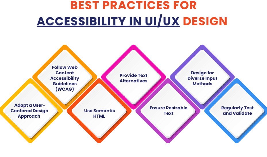
They incorporate user-friendly features such as high-contrast color schemes, keyboard navigation, screen reader compatibility, and customizable text settings. By following the Web Content Accessibility Guidelines (WCAG), organizations can create fair digital experiences through design choices like semantic HTML, ARIA roles, detailed image descriptions, and multimedia alternatives. Involving users with disabilities in testing is crucial. Their participation helps validate and improve accessibility strategies. This process transforms digital platforms from simple tools into truly inclusive spaces that respect and accommodate the diverse needs of all users.
Onboarding Flow Designs
Importance First impressions shape continued use. Effective onboarding helps users understand the product quickly and reduces churn.
Examples
Best Practices:
Preparing for UI/UX Design Job Interviews? Have a Look at Our Blog on UI/UX Design Interview Questions and Answers To Ace Your Interview!
Error Message Designs
Turning Errors Into Opportunities Error messages inform users when something goes wrong. Well-crafted messages reduce frustration and guide users toward solutions.
Examples
Best Practices:
UX Writing Examples
UX writing plays an important role in shaping how users see things and motivating their actions through carefully crafted text. By using clear, concise, and brand-friendly language, designers can significantly improve the user experience. Strategic microcopy elements, such as action-oriented button labels like “Submit” or “Create,” helpful error messages, and engaging descriptions for empty states can guide users more effectively. For example, Dropbox and Trello show how thoughtful messaging can turn frustrating moments into positive experiences. Best practices include using simple, direct language that matches the brand personality, employing microcopy to lessen cognitive load, and regularly testing the text with real users. Ultimately, well-designed UX writing changes functional text into a strong tool for communication, making digital experiences more intuitive, supportive, and user-friendly.
Interaction Design Showcases
Interaction design is an important part of user experience. It looks at how users interact with interface elements and how the system responds. Leading tech companies show strong examples of this principle. Google Material Design creates consistent button states with clear visual feedback. Tinder uses easy swiping gestures to create a natural flow of interaction. Likewise, Airbnb employs smooth transitions and animations to guide users through booking processes. Slack includes subtle loading indicators and confirmation ticks to reassure users.
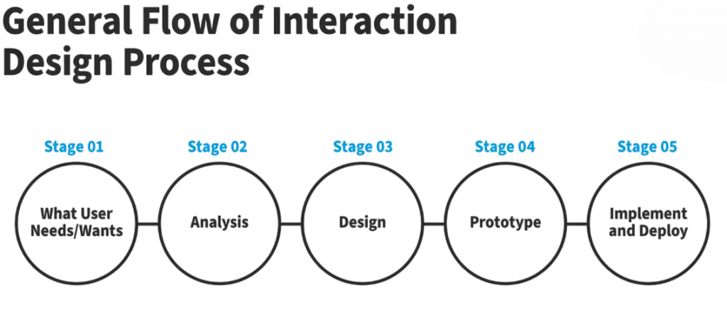
The key to effective interaction design is using best practices. This includes providing immediate and clear feedback, keeping interaction patterns consistent, reducing distracting animations, and ensuring compatibility across devices. By focusing on these principles, designers can build interfaces that are not just attractive but also feel intuitive and responsive. This approach ultimately improves user engagement and satisfaction.
Microinteractions and Animations
Small Details with Big Impact Microinteractions are tiny animations or responses that improve the feel of a product.
Examples
Best Practices:
Case Studies Breakdown
Case studies provide a clear look into the design process. They show the detailed steps from identifying the problem to implementing the solution. By carefully documenting each stage including understanding the user’s context, conducting thorough research through interviews and analytics, and generating new ideas with brainstorming and prototyping these accounts offer valuable insights into design methods, all of which are core practices emphasized in UI/UX Training, where learners build end-to-end design workflows grounded in real-world research and iterative development. The structured approach includes key phases like user research, creating detailed wireframes, refining visual design, and performing rigorous usability testing. In the end, these case studies reveal real results through key performance metrics. They highlight improvements such as increased user engagement, better conversion rates, and reduced errors. This broad viewpoint not only shows the design team’s strategic thinking but also demonstrates how user-centered design can tackle complex problems.