 LMS
LMS
Last updated on 23rd Apr 2024| 3860
 20555 Ratings
E-mail this post
20555 Ratings
E-mail this post
CSS3 stands for Cascading Style Sheets level 3. It’s a style sheet language used to describe the presentation of a document written in HTML or XML. CSS3 brings many new features and enhancements to the table, including animations, transitions, gradients, shadows, and more, allowing for more creative and dynamic web design. CSS3 also introduces advanced layout techniques like Flexbox and Grid, making it easier to create complex, responsive designs with less effort.
1. What is CSS3?
Ans:
CSS3 stands for Cascading Style Sheets level 3. It’s the latest version of the CSS specification used to style web pages. It’s the latest evolution of the CSS language and is used to style the appearance of web pages written in HTML and XHTML. CSS3 introduces new features like animations, gradients, transitions, and more, allowing for more sophisticated and visually appealing web designs.
2. What are the main features introduced in CSS3 compared to CSS2?
Ans:
- Media queries for responsive design.
- It has rounded corners and shadows with border-radius and box-shadow.
- Transitions and animations.
- Flexbox layout.
- Grid layout.
- Custom fonts with @font-face.
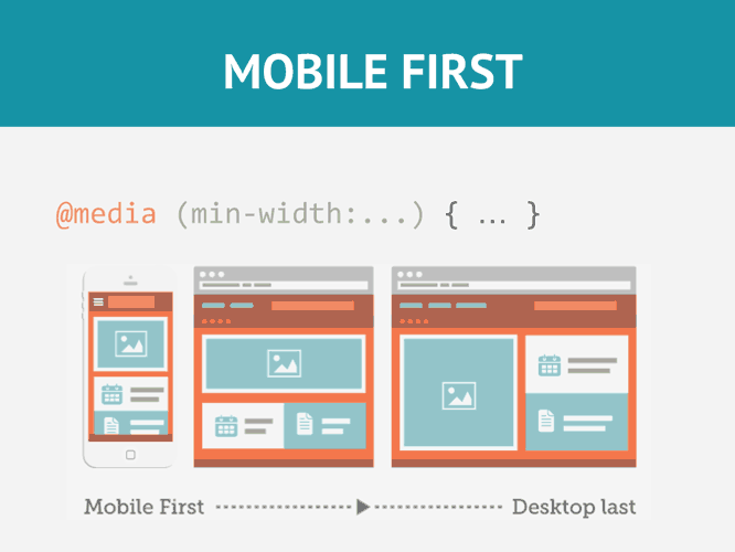
3. Explain the concept of responsive web design in CSS3.
Ans:
Responsive web design in CSS3 involves creating web pages that adapt and respond to different screen sizes and devices. This is achieved using media queries, flexible layouts, and relative units like percentages and ems. Media queries enable the application of different styles based on factors like screen width, resolution, and orientation, ensuring that the website looks good and functions properly on various devices, from desktop computers to smartphones and tablets.
4. What are media queries in CSS3?
Ans:
Media queries are CSS3 features that allow developers to apply different styles based on characteristics of the user’s device, such as screen size, resolution, and orientation. They enable responsive design by adjusting the layout and appearance of a website based on the device being used to view it. Media queries enable the creation of responsive web designs by targeting specific devices or conditions and adjusting the layout, styling, and content accordingly.
5. How is a gradient background created in CSS3?
Ans:
- Employ the CSS3 background property.
- Choose between the linear-gradient() or radial-gradient functions.
- Configure parameters such as gradient direction, colors, and other properties within the function.
6. Explain the concept of CSS3 animations.
Ans:
CSS3 animations allow developers to animate elements on a web page without using JavaScript. Animations can be applied to properties such as transform, opacity, colour, and more, using keyframes to define the animation’s progression over time.
7. What are transitions in CSS3?
Ans:
Transitions in CSS3 enable smooth changes in property values over a specified duration. They allow developers to control the speed and timing of changes such as colour, size, and position, creating more visually appealing user experiences. Additionally, transitions can be combined with other CSS3 features like transformations and animations for even more dynamic effects.
8. What is the difference between em and rem units in CSS3?
Ans:
| Feature | em Units | rem Units |
|---|---|---|
| Definition | Relative to the font size of the element itself | Relative to the font size of the root element (``) |
| Inheritance | Inherited from parent elements | Not affected by parent elements; remains consistent throughout the document |
| Scalability | Can result in compounding effects, as each nested element’s font size is relative to its parent | Ensures consistent scaling across the document, unaffected by nesting or parent font sizes |
| Complexity | Can become complex when nested deeply, as changes in parent elements affect child elements. | Simpler to manage for consistent sizes throughout the document. |
9. Explain the concept of flexbox layout in CSS3.
Ans:
Flexbox layout is a CSS3 feature that provides a more efficient way to layout, align, and distribute space among items in a container. It offers greater control over the arrangement of elements, allowing for easier creation of complex and responsive layouts. It also supports dynamic resizing and reordering of items, making it ideal for responsive design. Moreover, Flexbox eliminates the need for complex float-based layouts and ensures consistent alignment across different screen sizes.
10. What are vendor prefixes in CSS3? Why are they used?
Ans:
- Vendor prefixes are prefixes added to CSS3 properties to ensure compatibility with different browsers during the experimental stage of CSS feature implementation.
- They are used to apply experimental or browser-specific features, such as -WebKit- for WebKit-based browsers like Chrome and Safari, -moz- for Mozilla-based browsers like Firefox, and -ms- for Microsoft browsers like Edge.
- As browser support for CSS features improves, vendor prefixes are gradually phased out.
11. What is the box model in CSS3?
Ans:
The box model in CSS3 defines how elements on a webpage are rendered by browsers. It comprises four main components: content, padding, border, and margin. These components form layers around the content of an element, influencing its size, spacing, and appearance on the page. Understanding the box model is crucial for precise layout control and ensuring consistent element sizing across different browsers. Additionally, the model allows for fine-tuning of spacing and alignment, facilitating the creation of well-structured and visually appealing designs.
12. Explain the difference between inline and block-level elements in CSS3.
Ans:
Inline elements flow within the text and do not start on a new line, while block-level elements start on a new line and take up the full width available. Examples of inline elements include <span> and <a>, while examples of block-level elements include <div> and <p>. Additionally, inline elements only take up as much width as necessary, making them suitable for styling small sections of text, whereas block-level elements are ideal for creating larger, structural sections of a webpage.
13. What is the clearfix technique in CSS3?
Ans:
The clearfix technique is used to contain floated elements within a parent element. It prevents the parent element from collapsing when its children are floated. This is achieved by adding a clear fix class to the parent element or using the ::after pseudo-element with the clear: both property. Additionally, the clearfix method ensures that the parent element expands to include its floated children, maintaining proper layout and avoiding visual bugs. This technique is particularly useful in complex layouts where multiple floating elements are involved.
14. Explain the concept of specificity in CSS3.
Ans:
When a variety of competing styles are available, an element’s style is applied based on CSS3 specificity. Combining the selectors used to target an element yields the result. Styles with greater specificity are prioritized above those with less specificity. To convey specificity, a four-part value structure, like a, b, c, and d, is frequently utilized. The letters a, b, c, and d represent the number of ID selectors, class selectors, attribute selectors, and pseudo-classes, respectively, in this format. Gaining an understanding of specificity is crucial for debugging and ensuring that the right styles are applied.
15. What are pseudo-classes and pseudo-elements in CSS3? Provide examples.
Ans:
Special keywords called pseudo-classes and pseudo-elements can be applied to selectors to target elements according to their position or state inside the text. Pseudo-elements include ::before and ::after, whereas pseudo-classes include :hover, :active, and :nth-child(). While pseudo-elements construct and style new components that are not existent in the HTML, pseudo-classes target items dynamically based on user interaction or document structure. For sophisticated styling and improving user experience, both are necessary.
16. Explain the concept of inheritance in CSS3.
Ans:
In CSS3, inheritance describes how some property values are transferred from parent elements to their offspring. Certain attributes can be explicitly overridden by giving the property on the child element a new value; these properties are not all inherited. Characteristics like color, font-family, and line-height are frequently inheritable, while border, padding, and margin are not. Comprehending inheritance facilitates the creation of layouts that are predictable and consistent.
17. What are the advantages and disadvantages of using CSS preprocessors like Sass or Less?
Ans:
Using variables, mixins, nesting, and functions is one benefit of utilizing CSS preprocessors; this can result in more modular and manageable code. Preprocessors, however, come with an additional build step and could be difficult for developers who are not familiar with their syntax to master. By enabling sophisticated functions like automatic vendor prefixing and mathematical calculations, preprocessors can significantly increase efficiency. Notwithstanding these advantages, more setup and equipment could be needed due to the increased complexity.
18. Explain the concept of a CSS sprite.
Ans:
A CSS sprite is a technique used to combine multiple images into a single image file and then use CSS to display only a portion of that image at a time. This reduces the number of HTTP requests required to load multiple images, improving page performance. By using CSS properties like background-position, developers can precisely control which part of the sprite is shown. This technique can greatly enhance loading times and reduce server load, especially for sites with many small graphics.
19. What is the box-shadow property in CSS3 used for? Provide an example.
Ans:
- The box-shadow property in CSS3 adds shadow effects to elements.
- It accepts values for horizontal and vertical offsets, blur radius, spread radius, and colour.
- For example, box-shadow: 2px 2px 4px rgba(0, 0, 0, 0.5) adds a shadow 2 pixels to the right and 2 pixels down with a blur radius of 4 pixels and a semi-transparent black colour.
20. Explain the difference between display: none and visibility: hidden in CSS3.
Ans:
Display: none; removes the element from the document flow, making it completely invisible and not taking up any space.
Visibility: hidden; hides the element while still preserving its space in the layout.
21. Explain the concept of CSS specificity and how it is calculated.
Ans:
When many conflicting styles are applied to an element, CSS specificity establishes which style takes precedence. It is determined by combining the selectors that are used to target an element. A four-part value is commonly used to indicate specificity, with larger numbers denoting better specificity. Comprehending specificity makes it easier to prevent conflicts and guarantees that styles are applied correctly in accordance with design specifications. In order to manage intricate CSS rules and avoid inadvertent style overrides, the concept of specificity is essential.
22. What are the differences between absolute, relative, fixed, and static positioning in CSS3?
Ans:
Absolute positioning positions an element relative to its nearest positioned ancestor. An element is positioned relative to its normal position by relative placement. An element is positioned in relation to the viewport using fixed positioning. The default positioning, known as static positioning, adheres to the standard document flow.Each positioning method serves different layout purposes, and understanding their effects is key to achieving desired visual results and responsive designs. Combining these methods can create sophisticated layouts and alignments.
23. Explain the difference between transition and animation properties in CSS3.
Ans:
The CSS3 transition feature enables smooth transitions between two states of an element, such as size or color adjustments. The animation property, on the other hand, enables more intricate animations that employ keyframes and timing functions. Simple state changes are best served by transitions; but, animations provide you greater control over more complex sequences of changes. By giving website pieces dynamic visual effects, both features improve user experience.
24. What are CSS variables (custom properties), and how do they differ from traditional variables?
Ans:
CSS variables, sometimes referred to as custom properties, allow variables to be defined and utilized within CSS stylesheets. Unlike conventional variables used in programming languages, CSS variables are scoped to the element in which they are defined and can be dynamically changed using JavaScript. Because changes to one variable’s value automatically affect all of its uses, this feature promotes uniformity across stylesheets and makes global modifications easier to apply. CSS variables are a helpful tool for modular and maintainable design.
25. Explain the concept of the z-index property in CSS3.
Ans:
In CSS3, the z-index attribute indicates an element’s stack order along the z-axis. Higher value elements are those that show up above elements with lower z-index values. The z-index attribute only applies to positioned elements, or elements having a value of relative, absolute, or fixed. Controlling the z-index makes it easier to properly layer elements in complex layouts and solve overlapped element issues. Creating designs that are both aesthetically beautiful and interactive requires the use of the z-index.
26. What is the CSS @media rule used for? Provide an example.
Ans:
The @media rule in CSS3 is used to apply styles based on the characteristics of the device, such as screen size, resolution, and orientation. It allows for the creation of responsive designs that adapt to different viewing environments. For example, @media screen and (max-width: 768px) { /* styles here */ } apply styles only when the screen width is 768 pixels or less.
27. Explain the concept of a CSS grid layout and its benefits.
Ans:
CSS grid layout is a two-dimensional layout system that allows for the creation of complex grid-based designs with rows and columns.It makes it simpler to design responsive and adaptable layouts by giving you great control over the arrangement and alignment of elements. Grid layout enables the design of both regular and irregular grid structures, offering tools for controlling gaps, alignment, and spanning across rows and columns. This facilitates the creation of intricate and adaptive web designs with fewer lines of code.
28. What is the difference between transform and transition properties in CSS3?
Ans:
The transform property in CSS3 allows for the transformation of an element’s size, shape, and position, such as scaling, rotating, and skewing. Conversely, the element’s smooth transition between two states over a predetermined period of time is managed by the transition attribute. While transform provides immediate visual changes, transition ensures these changes occur gradually, enhancing the user experience by adding smoothness and fluidity to the visual effects. Both properties can be combined for sophisticated and dynamic animations.
29. Explain the concept of CSS blend modes and provide examples of their usage.
Ans:
CSS blend modes allow for the blending of colors between elements and backgrounds. They can be used to create effects such as overlays, fades, and color adjustments. The blend modes overlay, screen, multiply, and soft-light are a few examples. These modes work by adjusting how colors interact with one another, allowing for creative effects and enhancing visual design without the need for additional image processing. Experimenting with blend modes can lead to unique and visually compelling results.
30. What are the differences between the inline-block, inline, and block display properties in CSS3?
Ans:
The block display property makes an element a block-level element, causing it to start on a new line and take up the full width available. The inline property makes an element an inline-level element, allowing it to flow within the text. The inline-block property combines the characteristics of both block and inline elements, allowing it to flow within the text while also respecting its width and height properties.
31. Explain the concept of Flexbox and its advantages over traditional layout methods.
Ans:
Flexbox is a CSS3 layout model that provides a more efficient way to arrange, align, and distribute space among items in a container. Its benefits over conventional layout techniques include automated spacing correction, dynamic item resizing, and simpler alignment. Flexbox simplifies the creation of complex layouts by enabling flexible item arrangements and responsive design adjustments. It also supports features like alignment along multiple axes and distribution of space within containers.
32. What are CSS filters, and how can they be used to enhance web design?
Ans:
CSS filters are effects applied to elements to modify their appearance, such as blur, grayscale, brightness, and contrast. They can be used to improve accessibility, provide visual interest, and create effects in web design. Filters are applied directly in CSS, allowing for on-the-fly adjustments without altering the original images or elements. This capability supports creative visual enhancements and enables fine-tuning of visual elements to achieve desired aesthetic outcomes.
33. Explain the concept of CSS grid and how it differs from other layout methods like Flexbox.
Ans:
CSS grid is a two-dimensional layout system that allows for the creation of complex grid-based layouts with rows and columns. It differs from Flexbox in that it provides greater control over both the rows and columns, making it more suitable for overall page layout. At the same time, Flexbox is better suited for arranging items within a single row or column.
34. What are the advantages of using CSS preprocessors like Sass or Less?
Ans:
CSS preprocessors offer several advantages, including the ability to use variables, mixins, nesting, and functions, which can lead to more maintainable and modular code. They also provide features like inheritance and mathematical operations, which are not available in standard CSS. Preprocessors can streamline the development process by enabling code reuse and simplifying complex style definitions. However, they introduce additional build steps and require familiarity with their specific syntax and tools.
35. Explain the concept of feature queries (@supports) in CSS3 and how they can be used.
Ans:
CSS3 feature queries (@supports) let developers apply styles only in cases where the browser is able to support those particular CSS features. Applying fallback styles or offering improved styles for browsers that support particular capabilities might both benefit from this. Feature queries enable progressive enhancement by targeting modern capabilities while maintaining compatibility with older browsers. This approach ensures that users with different browser versions receive the best possible styling experience.
36. What are CSS transitions, and how do they differ from CSS animations?
Ans:
CSS transitions allow for smooth changes in property values over a specified duration, while CSS animations allow for more complex animations with keyframes and timing functions. Transitions are typically used for simple state changes, while animations are used for more elaborate effects. Transitions are ideal for straightforward visual adjustments, whereas animations offer control over multiple stages of an effect, enabling intricate and engaging animations that enhance user interactions.
37. Explain the concept of pseudo-elements in CSS3 and provide examples of their usage.
Ans:
Pseudo-elements are special keywords that allow for the creation of virtual elements that are not present in the HTML markup. Examples include ::before and ::after, which can be used to add content before or after an element, and ::first-line and ::first-letter, which can be used to style the first line or the initial character of a text block. Pseudo-elements provide a powerful way to insert additional content and styling without modifying the HTML structure, offering greater flexibility in design.
38. What are CSS counters, and how can they be used?
Ans:
CSS counters are variables maintained by CSS that can be incremented or decremented to track the number of occurrences of certain elements. They can be used to build a table of contents, make custom numbering schemes, or automatically number items in a list. CSS counters offer a way to manage and display sequential information dynamically, reducing the need for manual updates and enhancing the consistency of numbered content across web pages.
39. Explain the concept of aspect ratio in CSS3 and how it can be maintained using intrinsic sizing.
Ans:
Aspect ratio in CSS3 refers to the ratio of an element’s width to its height. When an element’s dimensions are limited, intrinsic scaling enables it to keep its aspect ratio, preventing distortion while resizing. This property is particularly useful for responsive design, ensuring that media and layout elements maintain their intended proportions across different screen sizes and orientations.
40. What is the clip-path property in CSS3 used for? Provide an example.
Ans:
The clip-path property in CSS3 specifies a clipping region for an element, allowing only a portion of the element to be visible. It takes values that specify the geometry of the clipping zone, such as inset(), polygon(), circle(), and ellipse(). For example, clip-path: polygon(0 0, 100% 0, 100% 80%, 0 100%) creates a clipping region in the shape of a triangle. This property enables the creation of custom-shaped elements and effects without altering the underlying content.

Get JOB CSS3 Training for Beginners By MNC Experts
- Instructor-led Sessions
- Real-life Case Studies
- Assignments
41. Explain the concept of CSS specificity and how it affects style precedence.
Ans:
CSS specificity determines which styles take precedence when multiple conflicting styles are applied to an element. It is determined by combining the selectors that are used to target an element. A selector’s specificity value increases with its level of specificity, giving it greater precedence over competing styles. Specificity is crucial for resolving conflicts between stylesheets and ensuring that the intended styles are applied as expected.
42. What is the difference between pseudo-classes and pseudo-elements in CSS3?
Ans:
Pseudo-classes target elements based on their state or interaction, such as :hover, :active, and :focus. In contrast, pseudo-elements target specific parts of an element, such as ::before, ::after, or ::first-line and ::first-letter. Pseudo-classes allow for dynamic styling based on user actions, while pseudo-elements create and style content that doesn’t exist in the HTML. Both provide advanced styling capabilities that enhance the user experience and visual design.
43. Explain the concept of the CSS content property and its usage with pseudo-elements.
Ans:
The content property in CSS3 is used with pseudo-elements (::before and ::after) to insert content into the document. It can insert text, images, or generated content and can be combined with other properties like url() and attr() to create dynamic content. This capability allows for the addition of decorative or functional content without altering the HTML, facilitating cleaner markup and more flexible styling options.
44. What are the differences between the transition and animation properties in CSS3?
Ans:
The transition property in CSS3 allows for a smooth transition between two states of an element over a specified duration and can only transition between two states. However, the animation property enables more intricate animations with timing functions, numerous phases, and keyframes. Transitions are best suited for simple changes in properties, while animations provide more control and creativity for intricate visual effects and sequences.
45. Explain the concept of CSS inheritance and how it affects style propagation.
Ans:
CSS inheritance refers to the process by which certain property values are passed from parent elements to their children. Styles can spread throughout the document hierarchy thanks to inheritance, which lets child elements inherit their parent elements’ styles unless they are specifically overridden. This feature simplifies the management of styles across nested elements and ensures a consistent visual appearance within a design hierarchy.
46. What are vendor prefixes in CSS3, and why are they used?
Ans:
Vendor prefixes are prefixes added to CSS3 properties to ensure compatibility with different browsers during the experimental stage of CSS feature implementation. They are used to apply experimental or browser-specific features, such as -WebKit- for WebKit-based browsers like Chrome and Safari, -moz- for Mozilla-based browsers like Firefox, and -ms- for Microsoft browsers like Edge.
47. Explain the concept of CSS normalization and its benefits.
Ans:
CSS normalization is the process of ensuring consistent default styles across different browsers by resetting or normalizing the default styles provided by browsers.It guarantees a more consistent display of web pages across various browsers and devices and helps to prevent discrepancies. Normalization provides a foundation for building consistent and cross-browser compatible designs, minimizing discrepancies in default styling.
48. What are the differences between CSS resets and CSS normalizations?
Ans:
CSS resets aim to reset or neutralize browser-specific default styles by removing all default margins, paddings, and other styles. On the other hand, CSS normalizations reset or normalize specific styles—like font sizes, line heights, and list styles—in an effort to provide uniform default styles across various browsers. Both approaches serve to reduce cross-browser inconsistencies, but normalization maintains more default styles compared to a full reset.
49.What is the :nth-child() pseudo-class in CSS3 used for? Provide examples.
Ans:
The nth-child() pseudo-class in CSS3 allows for the selection of elements based on their position within a parent element. It accepts a formula an+b and selects every element that matches the formula. For example, nth-child(2n) selects every even child element, while nth-child(3n+1) selects every third child element starting from the first. This capability enables precise targeting of elements for styling and layout adjustments.
50. Explain the concept of feature queries (@supports) in CSS3 and their usage.
Ans:
Feature queries (@supports) in CSS3 allow developers to apply styles only if the browser supports certain CSS features. Applying fallback styles or offering improved styles for browsers that support particular capabilities might both benefit from this. It determines whether a particular feature is supported by the browser and only applies the styles in that case. This method promotes progressive enhancement and ensures compatibility with various browser capabilities.
51. What is the current colour keyword in CSS3, and how is it used?
Ans:
The current Color keyword in CSS3 represents the computed value of the color property. It can be used to set the value of other properties, such as border or background-color, to the same color as the element’s text color without explicitly specifying the color value. This keyword simplifies the management of color schemes and ensures consistency across various design elements.
52. Explain the concept of the CSS calc() function and its usage.
Ans:
The calc() function in CSS3 allows mathematical calculations to be performed within style declarations. It can dynamically calculate values for properties like width, height, margin, and padding, allowing for more flexible and responsive layouts. By using calc(), developers can create complex layouts with relative measurements and precise adjustments, enhancing the adaptability of designs.
53. What is the object-fit property in CSS3 used for? Provide examples.
Ans:
The object-fit property in CSS3 specifies how an <img>, <video>, or <iframe> element should be resized to fit its container.It supports fill, contain, cover, none, and scale-down settings, among others, to provide you exact control over the aspect ratio and content cropping. This property ensures that media elements are displayed correctly and responsively within their containers.
54. Explain the concept of CSS variables (custom properties) and their benefits.
Ans:
CSS variables, also known as custom properties, allow for the definition and use of variables within CSS stylesheets. They have a number of advantages, such as the capacity to declare reusable values, build design systems or themes, and use JavaScript to dynamically change styles. Custom properties simplify the maintenance of consistent design elements and enable more dynamic styling options.
55. What are the differences between the ::before and ::after pseudo-elements in CSS3?
Ans:
The ::before and ::after pseudo-elements in CSS3 create virtual elements that are inserted before and after an element’s content, respectively. Without changing the HTML syntax, they can be used to add generated content, ornamental elements, or icons to an element. This technique allows for enhanced styling and visual effects while keeping the HTML clean and focused on structure.
56. Explain the concept of CSS specificity and how it affects style precedence.
Ans:
CSS specificity determines which styles take precedence when multiple conflicting styles are applied to an element. With greater specificity values superseding lesser ones, it is determined by combining the selectors used to target an element. Understanding specificity is essential for managing conflicts and ensuring that the intended styles are consistently applied across elements.
57. What is the aspect-ratio property in CSS3 used for? Provide examples.
Ans:
The aspect-ratio property in CSS3 is used to specify the aspect ratio of an element’s box, ensuring that it maintains a certain width-to-height ratio even as its dimensions change. It accepts values like auto, 1/1, 16/9, and landscape, allowing for precise control over the aspect ratio. This property supports responsive design by maintaining consistent proportions regardless of the element’s size adjustments.
58. Explain the concept of CSS grid layout and its benefits over other layout methods.
Ans:
CSS grid layout is a two-dimensional layout system that allows for the creation of complex grid-based layouts with rows and columns. Its benefits over other layout methods include:
- Greater control over both the rows and columns.
- Support for responsive design.
- The ability to create more sophisticated and flexible layouts.
59. What are the differences between CSS preprocessors and CSS postprocessors?
Ans:
CSS preprocessors, such as Sass and Less, are tools that extend the capabilities of CSS by adding features like variables, mixins, nesting, and functions. Conversely, CSS postprocessors are programs that alter or optimize CSS code after it has been written. One example is autoprefixer, which automatically adds vendor prefixes. Preprocessors simplify the development process by enabling more efficient and organized coding practices, while postprocessors enhance the final CSS output for better cross-browser compatibility and performance.
60. Explain the concept of CSS counters and how they can be used to generate content.
Ans:
CSS counters are variables maintained by CSS that can be incremented or decremented to track the number of occurrences of certain elements.They can be used to build a table of contents, make custom numbering schemes, or automatically number items in a list. Counters can be styled and formatted using CSS, allowing for dynamic and flexible presentation of ordered content. This feature is particularly useful for creating automatically updated lists and structured content that adjusts based on the number of items.

61. Explain the concept of CSS specificity and inheritance and how they interact with each other.
Ans:
CSS specificity determines which styles take precedence when multiple conflicting styles are applied to an element, while inheritance determines which styles are passed from parent elements to their children. Specificity always wins out, but inheritance may take control if a child element has its style declaration for a property. Specificity is calculated based on the specificity hierarchy of selectors, ensuring that the most precise styles are applied. Understanding both concepts is essential for managing complex stylesheets and ensuring consistent styling.
62.What is the not() pseudo-class in CSS3 and how is it used? Provide examples.
Ans:
The :not() pseudo-class in CSS3 allows for the selection of elements that do not match a specified selector. All elements can have styles applied to them, with the exception of those that meet specific requirements. For instance, all components without the class “highlight” are chosen by :not(.highlight). This pseudo-class is useful for excluding specific elements from style rules and for applying styles to a broad range of elements while excluding those that meet certain conditions.
63. Explain the concept of the CSS outline property and its usage.
Ans:
The outline property in CSS3 draws a line around an element outside the border to make it stand out from its surroundings. It accepts values for line style, color, and width and is typically used to provide visual feedback for interactive elements like links and form fields. Unlike borders, outlines do not affect the layout or spacing of an element, making them ideal for highlighting elements without altering their dimensions. The outline property is often used for accessibility enhancements and focus indicators.
64. What is the difference between the float and clear properties in CSS3?
Ans:
The float property in CSS3 specifies whether an element should float to the left or right of its container, allowing text and other elements to wrap around it. The clear property, on the other hand, controls the behavior of elements adjacent to floated elements, specifying whether they should be allowed to float alongside them or not. Floats are commonly used for layout purposes, while clear ensures that elements are properly aligned and do not overlap or interfere with floated elements.
65. Explain the concept of CSS specificity and how it affects the application of styles.
Ans:
CSS specificity determines which styles take precedence when multiple conflicting styles are applied to an element. Higher specificity values are prioritized over lower ones in the calculation of specificity, which is dependent on the combination of selectors used to target an element. To guarantee that styles are applied accurately and consistently across various aspects, specificity is crucial. It helps in debugging CSS issues by understanding which rules are being applied and which are being overridden.
66. What are CSS mixins, and how can they be used with preprocessors like Sass?
Ans:
CSS mixins are reusable blocks of CSS code that can be included in other style rules using the @mixin directive. They encapsulate common styles and patterns, making it possible to create modular and maintainable stylesheets. Mixins can be used with preprocessors such as Sass to more effectively construct complex or repeated CSS code. They also support parameterization, enabling the creation of flexible styles that can be customized based on different needs.
67. Explain the concept of CSS pseudo-elements and their usage.
Ans:
CSS pseudo-elements are special keywords that allow for the creation of virtual elements not present in HTML markup. They can be used to add information before or after an element, or to style particular parts of an element, like the first letter or line of text. Pseudo-elements provide a way to enhance and manipulate the visual presentation of content without modifying the HTML structure. They are particularly useful for adding decorative or functional content in a clean and efficient manner.
68. What is the transform property in CSS3 used for? Please provide examples of its usage.
Ans:
The transform property in CSS3 is used to apply transformations to elements, such as scaling, rotating, skewing, and translating. It accepts values like scale(), rotate(), skew(), and translate(), allowing for the creation of visually dynamic and interactive effects. Transformations can be combined and animated for more complex visual effects, contributing to engaging user experiences and creative design solutions. The transform property operates on the element’s visual representation without affecting the document flow.
69. Explain the concept of CSS variables (custom properties)
Ans:
CSS variables, also known as custom properties, allow for the definition and use of variables within CSS stylesheets. Unlike traditional variables in programming languages, CSS variables are scoped to the element they are defined in and can be dynamically updated using JavaScript. They enable the creation of reusable and consistent design values throughout a stylesheet, facilitating easier maintenance and theming. Custom properties enhance the flexibility and dynamism of CSS, enabling styles to adapt based on user interactions or application state.
70. What is the empty pseudo-class in CSS3 used for? Provide examples.
Ans:
The :empty pseudo-class in CSS3 selects elements that have no children or text content. It can be used to apply styles to elements that do not contain any content, such as empty <div> or <p> elements. For example, div:empty { display: none; } hides empty <div> elements from the layout. This pseudo-class helps manage and clean up unused or redundant elements, contributing to a more efficient and streamlined page structure.
71. What is the CSS box-sizing property used for, and how does it affect the sizing of elements?
Ans:
The box-sizing property in CSS3 controls how an element’s width and height are calculated. It accepts values like content-box (the default) and border-box. When set to border-box, an element’s width and height include padding and border, making it easier to create consistent layouts. This property simplifies layout calculations by ensuring that the specified dimensions encompass all aspects of the element’s box model, reducing the need for additional calculations and adjustments.
72. Explain the concept of CSS sprites and how they can be used to optimize web performance.
Ans:
CSS sprites are a technique used to combine multiple images into a single image file and then use CSS to display only a portion of that image at a time. This reduces the number of HTTP requests required to load multiple images, improving page performance and load times. Sprites can be used to optimize loading times and enhance visual design by consolidating images into a single resource. By carefully positioning background images, developers can efficiently manage and display various icons or graphics.
73. What is the text-overflow property in CSS3 used for, and how does it work?
Ans:
The text-overflow property in CSS3 is used to specify how text should be displayed when it overflows its containing element. It accepts values like ellipsis, clip, and string, allowing for the truncation of text with an ellipsis (…) or clipping of overflow text. This property is useful for handling overflow scenarios in layouts where space is limited, ensuring that text content is presented neatly and does not break the design.
74. Explain the concept of CSS specificity and how it is calculated.
Ans:
CSS specificity determines which styles take precedence when multiple conflicting styles are applied to an element. It is calculated based on the combination of selectors used to target an element, with higher specificity values overriding lower ones. Specificity is typically represented as a four-part value: inline styles, IDs, classes, and element selectors. Understanding and managing specificity is crucial for resolving conflicts and applying the correct styles across a website.
75. What are CSS custom properties (variables), and how do they differ from traditional variables in programming languages?
Ans:
CSS custom properties, also known as variables, allow for the definition and use of variables within CSS stylesheets. Unlike traditional variables in programming languages, CSS variables are scoped to the element they are defined in and can be dynamically updated using JavaScript. Custom properties enable the creation of flexible and reusable styles, supporting consistent theming and design updates. They simplify the process of applying design changes across multiple elements by adjusting a single value.
76. What is the current colour keyword in CSS3, and how is it used?
Ans:
The currentColor keyword in CSS3 represents the computed value of the color property. It can be used to set the value of other properties, such as border or background-color, to the same color as the element’s text color without explicitly specifying the color value. This keyword ensures consistency in color usage throughout an element, streamlining the management of color schemes and simplifying style adjustments.
77. Explain the concept of CSS normalization and its benefits.
Ans:
CSS normalization is the process of ensuring consistent default styles across different browsers by resetting or normalizing the default styles provided by browsers. It helps to avoid inconsistencies and ensures a more predictable rendering of web pages across different browsers and devices. Normalization establishes a common baseline for styling, enabling developers to build consistent and reliable designs regardless of browser variations.
78. What is the scroll-behavior property in CSS3 used for? Provide examples.
Ans:
The scroll-behavior property in CSS3 specifies an element’s scrolling behavior. It accepts values like auto, smooth, and instant and controls the scrolling animation or behavior when navigating within a page using anchor links or JavaScript scrolling. This property enhances user experience by providing smooth and controlled scrolling effects, improving navigation and interaction within web pages.
79. Explain the concept of the CSS Unicode-bidi property and its usage.
Ans:
The unicode-bidi property in CSS3 specifies the directionality of text in an element. It accepts values like normal, embed, bidi-override, and isolate, allowing for the control of text direction, text layout, and bidirectional text handling. This property is essential for handling complex text layouts and ensuring correct rendering of bidirectional text, such as Arabic or Hebrew, in web content.
80. What are CSS combinators, and how do they work? Provide examples.
Ans:
CSS combinators are selectors used to target elements based on their relationship to other elements in the document tree. Examples include the descendant combinator ( ), child combinator (>), adjacent sibling combinator (+), and general sibling combinator (~). They allow for more specific and targeted styling of elements based on their context and hierarchy within the document. Combinators enable complex and precise selections, enhancing the ability to style elements based on their structural relationships.
81. Explain the concept of CSS grid layout and its advantages over other layout methods like Flexbox.
Ans:
CSS grid layout is a two-dimensional layout system that allows for the creation of complex grid-based layouts with rows and columns. Its advantages over other layout methods like Flexbox include:
- More precise control over both the rows and columns.
- Support for overlapping elements.
- Easier creation of grid-based designs.
82. What are CSS media queries, and how are they used in responsive web design?
Ans:
CSS media queries are a feature of CSS3 that allows developers to apply styles based on the characteristics of the device, such as screen size, resolution, and orientation. They are commonly used in responsive web design to create layouts that adapt and respond to different screen sizes and devices. By using media queries, designers can tailor the appearance and functionality of a website for various devices, ensuring an optimal user experience across desktops, tablets, and smartphones. Media queries can also adjust styles based on other criteria like device aspect ratio and viewport width.
83. Explain the concept of CSS animations and transitions and how they differ from each other.
Ans:
CSS animations and transitions are both features of CSS3 that allow for the animation of elements on a web page. Animations are more complex and versatile, allowing for the creation of custom animations with keyframes and timing functions. Transitions, on the other hand, are simpler and are used to change property values smoothly over a specified duration. Animations provide greater control over multiple stages of the animation sequence, while transitions are ideal for subtle changes and state changes. Both techniques can be used to enhance the visual appeal and interactivity of a website.
84. What is the contain property used in CSS3? Provide examples.
Ans:
The `contain` property in CSS3 specifies the confinement of an element’s layout and paint styles within its containing block. It accepts values like `none`, `strict`, and `content`, controlling the extent to which an element’s styles affect its containing block and vice versa. This property helps in optimizing performance by limiting the scope of layout calculations and rendering, which can be beneficial in complex or large web applications. By using `contain`, developers can improve rendering efficiency and manage layout boundaries more effectively.
85. Explain the concept of CSS variable scoping and how it affects the use of variables in stylesheets.
Ans:
CSS variables, also known as custom properties, can be scoped to the global scope or specific elements using the `:root` pseudo-class or within CSS rules. Global variables can be accessed and modified by any element, while local variables are limited to the scope of their containing elements. This scoping allows for flexible and modular design systems, where global variables define overarching styles and local variables cater to specific component needs. CSS variables enhance maintainability and consistency in style definitions across a stylesheet.
86. What are the differences between the position values static, relative, absolute, and fixed in CSS3?
Ans:
The `static` position value is the default position for elements and follows the normal document flow. `Relative` positioning positions an element relative to its normal position. `Absolute` positioning positions an element relative to its nearest positioned ancestor. `Fixed` positioning positions an element relative to the viewport. Each positioning method affects the layout and stacking context differently, allowing for versatile design adjustments. Understanding these positioning techniques is essential for creating complex and responsive layouts.
87. Explain the concept of CSS specificity and how it affects the application of styles.
Ans:
CSS specificity determines which styles take precedence when multiple conflicting styles are applied to an element. It is calculated based on the combination of selectors used to target an element, with higher specificity values overriding lower ones. Specificity is important for ensuring that styles are applied correctly and consistently across different elements. Developers need to be aware of specificity rules to troubleshoot style conflicts and manage complex stylesheets effectively. It helps in understanding how styles cascade and are resolved in the final rendering.
88. What is the scroll-snap property in CSS3 used for? Provide examples.
Ans:
The `scroll-snap` property in CSS3 is used to control the behavior of scrolling containers, allowing for snapping to specific points or elements during scrolling. It accepts values like `none`, `mandatory`, and `proximity`, controlling the snapping behavior and the alignment of snapped elements. This property is useful for creating smooth and predictable scrolling experiences, such as in carousels or paginated content. By implementing `scroll-snap`, developers can enhance user interaction and ensure a more cohesive scrolling experience.
89. Explain the concept of CSS inheritance and how it affects the propagation of styles.
Ans:
CSS inheritance refers to the process by which certain property values are passed from parent elements to their children. Inheritance can override specificity if a child element has its style declaration for a property, but otherwise, specificity takes precedence. Inheritance is important for creating consistent and maintainable stylesheets, allowing for a streamlined application of styles across nested elements. Understanding inheritance helps in managing design consistency and reduces redundancy in style declarations.
90. What is the user-select property in CSS3 used for? Provide examples.
Ans:
The `user-select` property in CSS3 controls the user’s ability to select text and other elements on a web page. It accepts values like `none`, `text`, and `all`, controlling whether text can be selected, elements can be dragged, and text can be copied or pasted. This property is useful for managing text interaction and preventing unwanted text selection in certain areas. By controlling `user-select`, developers can improve the user experience and ensure that text selection aligns with the intended design.
91. Explain the concept of CSS specificity and how it affects the cascade of styles.
Ans:
CSS specificity determines which styles take precedence when multiple conflicting styles are applied to an element. It is calculated based on the combination of selectors used to target an element, with higher specificity values overriding lower ones. Specificity is crucial for understanding how styles cascade and are applied to elements. Knowing how specificity works helps in creating predictable and manageable stylesheets, resolving conflicts, and ensuring that the intended styles are consistently applied.
92. What are CSS custom properties (variables), and how do they differ from preprocessor variables?
Ans:
CSS custom properties, also known as variables, allow for the definition and use of variables within CSS stylesheets. Unlike preprocessor variables, CSS variables are native to CSS and can be manipulated dynamically using JavaScript. They are scoped to the element they are defined in and cascade like other CSS properties. Custom properties support real-time updates and can be used to create dynamic themes and responsive designs. They simplify the process of applying and managing design changes across a website.
93. Explain the concept of the CSS clip-path property and its usage.
Ans:
The `clip-path` property in CSS3 is used to specify a clipping region for an element, allowing only a portion of the element to be visible. It accepts values such as `circle()`, `ellipse()`, `polygon()`, and `inset()`, which define the shape of the clipping region. It is commonly used for creating non-rectangular shapes and masking elements. By utilizing `clip-path`, designers can create unique visual effects and enhance the presentation of content without altering the underlying HTML structure.
94. What is the CSS mix-blend-mode property used for, and how does it work?
Ans:
The `mix-blend-mode` property in CSS3 specifies how an element’s content should blend with the content of its parent and background. It accepts values like `normal`, `multiply`, `screen`, `overlay`, and `difference`, allowing for a variety of blending effects to be applied to elements. This property can be used to create visually striking effects and interactive designs by controlling how colors and images interact. Blending modes are particularly useful for creative graphics and advanced visual styling.
95. Explain the concept of CSS overflow property and its possible values.
Ans:
The `overflow` property in CSS3 specifies how content that overflows its container should be handled. It accepts values like `visible`, `hidden`, `scroll`, and `auto`, controlling whether overflow content is visible, clipped, or scrollable within its container. This property helps manage layout and content presentation, ensuring that elements are displayed correctly without disrupting the overall design. By adjusting `overflow`, developers can control how excess content is managed and presented to users.
96. What is the difference between the CSS before and before pseudo-elements?
Ans:
Both `::before` and `::after` are used to create pseudo-elements that insert content before and after an element’s content, respectively. The `::before` syntax is used for pseudo-elements, while `before` is the older, legacy syntax. The `::before` and `::after` pseudo-elements are highly versatile and can be styled with CSS to add decorative elements or content without altering the HTML markup. They are commonly used for adding icons, decorative content, or additional visual elements in a clean and efficient manner.
97. Explain the concept of CSS currentColor keyword and how it is used.
Ans:
The `currentColor` keyword in CSS3 represents the computed value of the `color` property. It can be used to set the value of other properties, such as `border` or `background-color`, to the same color as the element’s text color without explicitly specifying the color value. This keyword ensures that color consistency is maintained throughout an element, making it easier to manage and update styles. It simplifies color management and ensures that related properties inherit the text color dynamically.
98. What are CSS flex containers and flex items, and how do they differ from each other?
Ans:
CSS flex containers are elements that create flex containers using the `display: flex` or `display: inline-flex` property. Flex items are the children of flex containers, and they are laid out along the main axis of the flex container according to the flex layout algorithm. The flex layout provides flexible and responsive arrangements of items, allowing for dynamic resizing and alignment. By using flex containers, developers can create complex layouts with ease and adapt to various screen sizes and content requirements.
99. Explain the concept of CSS pseudo-classes and provide examples of commonly used pseudo-classes.
Ans:
CSS pseudo-classes are keywords that can be added to selectors to style elements based on their state or position in the document. Examples include `:hover`, `:active`, `:focus`, `:first-child`, `:nth-child()`, and `:not()`. They allow for the creation of interactive and dynamic styles based on user interaction and document structure. Pseudo-classes enable developers to apply styles based on element states or specific conditions, enhancing the overall user experience and interaction design.
100. What is the CSS will-change property used for, and how does it affect performance?
Ans:
The will-change property in CSS3 is used to inform the browser that an element’s properties are likely to change in the future, allowing the browser to optimize the rendering and performance of the element. It accepts values like auto, scroll-position, transform, and opacity, indicating which properties will change. Using will-change can improve performance by allowing the browser to prepare for upcoming changes, but it should be used sparingly to avoid unnecessary overhead.