 LMS
LMS
Last updated on 03rd Jul 2020| 3586
 (5.0) | 16547 Ratings
E-mail this post
(5.0) | 16547 Ratings
E-mail this post
These CSS Interview Questions have been designed specially to get you acquainted with the nature of questions you may encounter during your interview for the subject of CSS. As per my experience good interviewers hardly plan to ask any particular question during your interview, normally questions start with some basic concept of the subject and later they continue based on further discussion and what you answer.we are going to cover top 100 CSS Interview questions along with their detailed answers. We will be covering CSS scenario based interview questions, CSS interview questions for freshers as well as CSS interview questions and answers for experienced.
1.Describe CSS.
Ans:
Cascading Style Sheets, or CSS, is a fundamental technology. In web development, they shape the appearance and layout of HTML documents. It empowers designers and developers to control web pages’ fonts, colours, spacing, positioning, and responsiveness. CSS selects HTML elements and applies styling rules, separating content and presentation. This separation is crucial for crafting visually appealing, user-friendly, and consistent web interfaces. CSS enables websites to adapt and customize their appearance across various devices and screen sizes.
2. What does an external style sheet mean? How would you connect to it?
Ans:
An external style sheet is an independent CSS file that holds style instructions for a website, facilitating the segregation of design and layout from HTML content. This division enhances the website’s manageability and uniformity. You use the HTML <link> element in your HTML document’s <head> section to link to an external style sheet. You define the ‘rel’ attribute as “stylesheet” and the ‘href’ attribute to point to the external CSS file’s location. This connection enables the HTML document to implement the styles specified in the external CSS file throughout its content.
3. Tell me about the three CSS3 elements.
Ans:
CSS3, the latest iteration of Cascading Style Sheets, introduced a range of enhancements and features for web styling. Three key components within CSS3 are as follows:
- Media Queries: Media queries empower responsive web design by enabling style adjustments based on the user’s device characteristics, such as screen size, orientation, or resolution. This ensures a seamless experience across various devices, from desktop computers to mobile phones.
- Transitions and Animations: CSS3 provided native support for transitions and animations, allowing for smooth and visually captivating effects without needing JavaScript or Flash. Transition properties like `transition-duration` and `transition-property` facilitate gradual style changes, while animation properties like `@keyframes` permit the creation of more complex animations.
- Flexbox Layout: CSS3 introduced the Flexbox layout model, simplifying the arrangement of elements within a container. Developers can establish adaptable and responsive layouts through properties like `display: flex` and `flex-direction`, making it easier to align and distribute content.
4. How much do you know about the element selector in CSS3?
Ans:
- These selectors are fundamental CSS components, enabling styles to apply to specific HTML elements. They are identified by the name of the HTML element itself, without any additional attributes or classes. For instance, to style all instances of ‘<h1>’ elements in a document, you would employ the selector ‘h1’.
- Element selectors serve the purpose of applying consistent styles to all occurrences of a particular HTML element. However, they exhibit less specificity than class or ID selectors, making them more susceptible to overriding by more specific selectors.
- Element selectors play a pivotal role in the organization and styling of web documents, adhering to the essential principle of separating content from presentation, which is fundamental in web development and design.
5. Which types of media may we include in CSS3?
Ans:
- Screen
- Handheld
- Embossed
- Speech
- Projection
- Tv
- All
- Aural
6. What benefits and drawbacks come with utilizing external style sheets?
Ans:
Advantages:
- Modularity: External style sheets promote modularity by separating design and layout from HTML content, resulting in cleaner and more maintainable code.
- Consistency: They ensure a consistent look and feel across multiple web pages, maintaining a cohesive design throughout the website.
- Caching: Browsers can cache external style sheets, leading to faster loading times for subsequent pages since the CSS file is stored locally.
- Ease of Updates: Updating the styling is efficient, as changes in a single external CSS file apply universally, saving time and effort.
- Collaboration: In team projects, external style sheets encourage collaboration between designers and developers, as design work can be done independently of content and structure.
Drawbacks:
- Additional HTTP Request: Linking to an external style sheet necessitates an extra HTTP request, potentially causing slight delays in page loading, especially for large files or when hosted on a different server.
- Dependency: If the external CSS file is inaccessible or fails to load, the page’s styling may be compromised, impacting the user experience.
- Limited Control: External style sheets offer less control over individual HTML element styles compared to inline or embedded styles, which can be limiting for specific elements.
- Complexity: Managing multiple external CSS files for a large website can become intricate, requiring careful organization and documentation to prevent conflicts and confusion.
- Not Ideal for Inline Styles: External style sheets are unsuitable for applying styles to individual elements within the HTML document; in such cases, inline or embedded styles are more appropriate.
7. What advantages and disadvantages do embedded style sheets offer?
Ans:
Advantages:
- Precise Control: Embedded styles empower you to define styles for individual HTML elements, providing detailed control over their appearance.
- Isolation: Styles within embedded style sheets are confined to the specific HTML document, reducing the risk of conflicts with external styles and cross-page effects.
- No Additional Requests: Unlike external style sheets, embedded styles do not require extra HTTP requests, potentially resulting in quicker page loading times, particularly for smaller documents.
- Portability: Styles travel alongside the HTML document, simplifying sharing and reuse as a self-contained file.
- Rapid Prototyping: Embedded styles are advantageous for quick prototyping and single-page applications where maintaining a separate CSS file may be unnecessary.
Disadvantages:
- Limited Reusability: Embedded styles are tied to the page in which they are defined, making it challenging to maintain design consistency across multiple pages.
- Maintenance Complexities: When making global style changes or updates, modifications must be applied individually to each HTML document, potentially leading to inconsistencies and errors.
- Complexity: For extensive websites or projects with numerous HTML documents, managing embedded styles can become unwieldy, resulting in code duplication and organizational challenges.
- Reduced Modularity: Embedded styles may not encourage code modularity and organization as effectively as external style sheets.
- Collaboration Challenges: In collaborative projects, embedded styles can complicate teamwork between designers and developers who work within the same HTML document.
8. What is the difference between the CSS box-sizing models “content-box” and “border-box”? How do they affect the arrangement?
Ans:
| Content-Box | Border-Box | |
|
an element’s width and height are determined by its content, excluding padding and borders. This implies that padding and borders are added to the specified dimensions. |
an element’s width and height encompass the content, padding, and borders. Padding and borders are included within the specified dimensions, ensuring they do not expand the element’s size. | |
| if you set an element’s width to 200 pixels and include 10 pixels of padding and a 2-pixel border, the element’s total width becomes 212 pixels. | if you set an element’s width to 200 pixels with 10 pixels of padding and a 2-pixel border, the element’s total width remains 200 pixels. The padding and border are contained within this width. | |
|
This model is beneficial when you need precise control over the content area’s size and wish to manage padding and borders separately. |
This model is commonly preferred for creating responsive layouts as it maintains a fixed element size, unaffected by padding and borders, simplifying design adjustments. |
9. Describe the fundamental syntax of a CSS rule.
Ans:
The basic structure of a CSS rule comprises two essential elements: a selector and a declaration block. Let’s break down these components:
- Selector: The selector serves as the criterion for pinpointing the HTML elements that the CSS rule will affect. It can encompass an element name, class, ID, or a combination thereof. For instance:
- An Element Selector like `p` focuses on all `<p>` elements.
- A Class Selector such as `.my-class` applies to elements marked with the `class` attribute as “my-class.”
- An ID Selector like `#my-id` pertains to an element bearing the `id` attribute “my-id.”
- Declaration Block: Enclosed within curly braces `{}`, the declaration block houses one or more property-value pairs. Each property signifies a specific CSS style attribute (e.g., `color`, `font-size), while its associated value defines the exact styling attributes for the selected elements.
For Example:
Here’s an illustrative CSS rule:
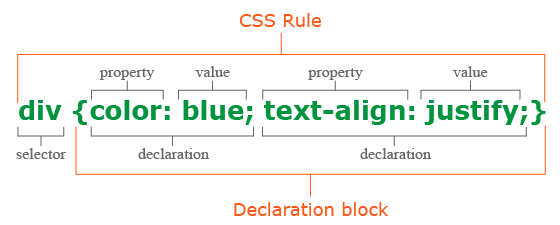
The declaration block contains two property-value pairs that set the text color and font size for all {<p>} elements to be green and twenty pixels, respectively. The selector in this rule is {p}, which means that all {<p>} elements are affected by the rule.
10. What are the different font attributes that CSS3 offers?
Ans:
- Font-family
- Font-size
- Font-weight
- Font-style
- Font-variant
- Font-stretch
- Letter-spacing
- Text-transform
- Text-decoration
11. Is it possible to import a file into CSS3 for insertion?
Ans:
Yes, you can use the @import rule to import external CSS files into a CSS3 page. This feature makes it easier to manage and organise styles across several files by allowing you to include one CSS file inside another. The following is the syntax to import a CSS file:
@import url(‘path-to-your-file.css’);
In this syntax, ‘path-to-your-file.css’ represents the relative or absolute path to the external CSS file that you wish to import. It’s crucial to position the ‘@import’ rule at the beginning of your CSS file, before any other style rules, for it to have the intended effect.
By making use of the ‘@import’ rule, you can create a modular and structured approach to your CSS styles, making maintenance and updates more manageable. It’s important to bear in mind that employing multiple imports may lead to additional HTTP requests, which can marginally influence page loading times. Hence, it’s advisable to strike a balance between organisational benefits and performance considerations when utilising the @import rule in CSS3.
12. Where is the class selector useful?
Ans:
When you wish to apply a certain style to several HTML elements that have the same class property, you can use CSS’s class selector. The class selector is frequently used in the following scenarios:
- Groups of Elements in Style
- Using Original Styles
- Reusability
- Efficiency
- JavaScript Communication
- Integration with Third Parties
13. When is the “hover” pseudo-class used in CSS, and what does it mean?
Ans:
In CSS, styles that should be applied to an element when a user hovers their cursor over it are defined by the “hover” pseudo-class. When a user interacts with interactive elements like buttons and links (anchors), it’s frequently used to deliver visual feedback. For example, you can use the “hover” pseudo-class to signal interaction when a user hovers over a link by changing its colour, underlining it, or applying other stylistic alterations. Offering visual clues for interactive or clickable items improves the user experience and makes websites more interesting and user-friendly.
This is an example of how to use the “hover” pseudo-class to make a link’s colour change when a user hovers over it:
- a:hover {
- color: red;
- }
14. Describe the meaning of the word “cascading” as it relates to style sheets.
Ans:
Cascading is a rule hierarchy in style sheets that prioritises styles, allowing more specific rules to prevail over less specific ones. Styles can be declared through external style sheets, internal blocks, or inline styles. When conflicts arise, the selector’s specificity, document order, and rule significance determine which style prevails. This process allows developers to create structured, orderly style sheets, ensuring a methodical and controlled approach to web content styling.
15. How do you resolve conflicts between custom and framework styles when modifying a CSS framework?
Ans:
- Utilise CSS specificity to prioritise custom styles.
- Use !important sparingly; it overrides conflicting styles.
- Sequence matters; declare custom styles after framework styles.
- Modify or extend framework class names when possible.
- Customise styles for specific framework components.
- Consider modularizing custom styles into separate files.
- Employ browser developer tools to inspect and debug conflicts.
- Maintain documentation for clarity and ease of future maintenance.
- Rigorously test custom styles to ensure functionality and avoid surprises.
16. Describe what a CSS selector is and give some examples of the different types.
Ans:
A CSS selector is a pattern used in web development to choose specific HTML elements for styling within a webpage. Selectors set the criteria for selecting elements, and styles are then applied to these chosen elements. CSS provides several types of selectors to target elements based on various attributes, relationships, and conditions. Here are common CSS selector types:
- Element Selector: Selects elements by tag name (e.g., `p`).
- Class Selector: Targets elements with a specific class (e.g., `.btn`).
- ID Selector: Selects a unique element by ID (e.g., `#header`).
- Universal Selector: Targets all elements (`*`).
- Attribute Selector: Selects elements based on attribute values (e.g., `a[target=”_blank”]`).
- Descendant Selector: Selects elements within another (e.g., `ul li`).
- Child Selector: Targets direct children (e.g., `div > p`).
- Adjacent Sibling Selector: Selects immediately following elements (e.g., `p + h2`).
- Pseudo-Class Selector: Targets elements in a state or based on interaction (e.g., `:hover`).
- Pseudo-Element Selector: Styles parts of elements (e.g., `::first-line`).
17. Is it possible to overrule the underlining of hyperlinks?
Ans:
Yes, you can override the default underlining of hyperlinks in CSS by targeting the `<a>` (anchor) elements and using the CSS property `text-decoration` set to “none.” This allows you to remove the underlines from hyperlinks, offering design flexibility to create unique link styles or indicate visited links differently while enhancing the overall aesthetics of your webpage.
18. Explain the CSS descendant combinator. Give an instance.
Ans:
The CSS descendant combinator, denoted by a space (“), is a tool for selecting elements that are descendants of a specified element. This selector allows you to style elements based on their hierarchical relationship within the HTML structure. For example, if you have the CSS rule `p em { color: blue; }`, it targets `<em>` elements that are descendants of `<p>` elements. This means that any text enclosed in `<em>` tags within paragraphs will be displayed in blue, while `<em>` elements outside of `<p>` elements will not be affected. The descendant combinator is useful for applying styles based on the nesting of elements in your HTML document.
Example:
- p em {
- color: blue;
- }
19. Why is commenting necessary in a CSS file, and how can you do it?
Ans:
- Documentation: They explain style purposes and functions, aiding future developers.
- Collaboration: Facilitating cooperation by enhancing code understanding.
- Debugging: Assisting in error identification and code clarity.
- Maintenance: Simplifying updates with context and explanations.
In a CSS file, you can use the syntax shown below to add comments:
- /* This is a single-line comment */
- /*
- This is a multi-line comment.
- It can span multiple lines.
- */
- .selector {
- property: value; /* This is an inline comment */
- }
Single-line comments start with ‘/*’ and end with ‘*/,’ while multi-line comments allow for detailed explanations across several lines. Inline comments can be appended at the end of a CSS rule to clarify a specific property or value. Strategic use of comments enhances the legibility and manageability of CSS code.
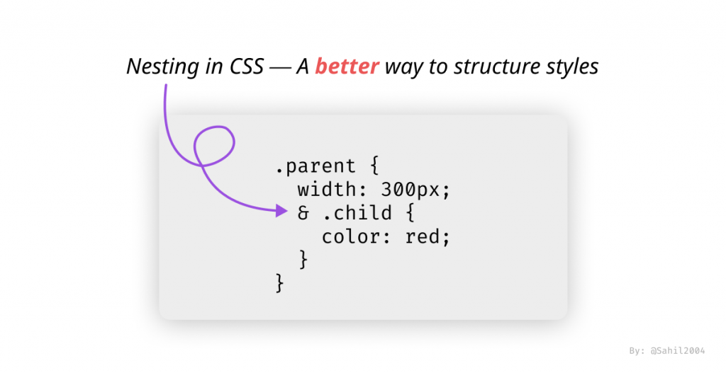
20. How is Nesting CSS3 used?
Ans:
By defining styles for items inside other elements, nesting in CSS3 enables styles to be clearer and more arranged. It makes your CSS code easier to read and manage by streamlining its structure. For instance, you can reduce redundancy and improve readability by nesting styles for particular elements inside of their parent elements.
21. Why are CSS frameworks used in web development, and what do they mean?
Ans:
CSS frameworks are crucial in web development for creating visually appealing and responsive websites. They consist of pre-written CSS and JavaScript code, providing standardized components like grid systems, typography, and form elements. These frameworks streamline work, reduce repetitive styling tasks, ensure compatibility across different browsers, and uphold industry best practices. This approach leads to quicker development, enhanced maintenance, and the ability to craft contemporary, polished websites with minimal effort.
22. Explain tweening.
Ans:
Tweening, also known as “in-betweening,” is a crucial animation technique used to create fluid transitions between keyframes in computer graphics and multimedia. It involves creating intermediate frames between keyframes, allowing for smooth motion and visual effects. Tweening automatically interpolates object properties like size, color, and position, eliminating the need for manual frame specification. This method is used to create dynamic, visually appealing movements, improving user experience and content for online animations, video games, and other digital media.
23. Which well-known CSS frameworks are there, and what are the main characteristics of each one?
Ans:
- Bootstrap, known for its mobile-first approach and responsive design, simplifies layout creation with a comprehensive set of components and utilities.
- Foundation focuses on responsive design and offers design flexibility with a customizable grid system.
- Bulma, a lightweight framework, is prized for its simplicity, clean grid system, and flexible flexbox-based layout.
- Semantic UI simplifies development through intuitive HTML and theming options for customization.
- Materialize follows Google’s Material Design principles, delivering visually appealing components.
- Tailwind CSS takes a utility-first approach with an extensive set of classes, offering flexibility and efficiency in layout design.
24. Explain how to include a CSS framework such as Bootstrap into a web project.
Ans:
- Obtain the Framework: The framework’s CSS files can be downloaded from the official website or included via Content Delivery Network (CDN) links, which is often faster and more convenient.
- Incorporate CSS Files: In the project directory, locate the CSS files if you downloaded the framework. This step is not necessary if you are using CDN links.
- Link to CSS Files: To reference the CSS files in your HTML file, add ‘<link>’ elements to the ‘<head>’ section. Linking to the primary CSS file for Bootstrap is usually required. It is titled something like “bootstrap.min.css.”
- Apply Framework Classes: With the CSS framework linked, you can employ its predefined classes and components in your HTML to style elements and construct responsive layouts
25. What does the CSS “box model” mean? Which properties give an element its content, padding, border, and margin?
Ans:
The CSS “box model” refers to how HTML elements are structured with content, padding, border, and margin.
The properties that define these aspects are:
- content (width and height)
- padding (padding-top, padding-right, padding-bottom, and padding-left)
- border (border-width, border-style, and border-color)
- margin (margin-top, margin-right, margin-bottom, and margin-left).
26. What is the context selector’s current state of knowledge?
Ans:
The context selector’s current state of knowledge pertains to its application within CSS and is not explicitly mentioned in the question. Context selectors, such as descendant selectors, play a vital role in targeting specific elements within a given context or hierarchy.
27. What is Bootstrap’s grid structure and how can it be altered to fit various layouts?
Ans:
The 12-column Bootstrap grid structure is a responsive layout solution. By splitting the available width between these 12 columns, it enables web developers to create adaptable and responsive web layouts. Because the 12-column arrangement is extremely divisible and adaptable to various screen sizes, it serves as the foundation for the grid system.
- Column Sizing: Modify column widths by specifying the number of columns an element should span, such as `col-md-6` for half the width on medium screens.
- Offsets: Create space between columns using offset classes like `offset-md-3` for a three-column gap on medium screens.
- Responsive Breakpoints: Utilize responsive breakpoints (e.g., `sm`, `md`, `lg`, `xl`) to define column behavior at different screen sizes, allowing precise adjustments.
- Nesting: Implement nested columns to construct intricate layouts, accommodating specific design requirements.
28. Explain CSS3 grouping.
Ans:
CSS3 grouping involves applying a single set of styles to multiple selectors simultaneously, streamlining code and enhancing maintainability. This is achieved by separating selectors with commas and specifying shared styles within a single rule block.
29. How can pseudo-classes like “:focus-visible” and “:focus-within” improve web accessibility and engagement, and when should they be applied?
Ans:
Pseudo-classes such as “:focus-visible” and “:focus-within” are important for improving user engagement and web accessibility, especially for people with disabilities. Here’s how they increase engagement and accessibility, along with when to use them:
- Enhanced Keyboard Navigation: These pseudo-classes make keyboard navigation more intuitive and efficient by visually highlighting focused interactive elements.
- Clear Focus Indication: “:focus-visible” distinguishes between keyboard and mouse interactions, reducing visual clutter for mouse users and improving the user experience.
- Contextual Focus Styling: “:focus-within” styles parent elements when child elements gain focus, ensuring that the entire interaction context is highlighted, benefiting users with cognitive disabilities.
30. What are the benefits of using the built-in JavaScript components in a CSS framework, and how can you make the most of them?
Ans:
Using built-in JavaScript components in a CSS framework offers pre-designed interactive elements. To maximise their benefits, developers can customise their behaviour, styles, and interactions to align with the project’s needs, creating consistent and user-friendly web interfaces.
31. Discuss key considerations for mobile optimization and accessibility when implementing and customising CSS frameworks.
Ans:
Key considerations for mobile optimization and accessibility when implementing and customising CSS frameworks include responsive design for various screen sizes, optimising for touch interactions, ensuring readability, and adhering to accessibility standards such as WCAG.
32. When might you utilise utility classes in CSS frameworks, and what are their purposes?
Ans:
Utility classes in CSS frameworks are employed to apply specific styles directly to HTML elements. They are used when you need quick and straightforward styling for individual elements or components without writing custom CSS, promoting consistency and efficiency in design.
33. Give an example of a custom stylesheet’s typical structure that extends a CSS framework. How is it set up?
Ans:
A custom stylesheet that builds upon the base of a CSS framework usually follows a structure that adds or overrides styles. Here is an illustration of a structure and its arrangement:
- /* Import the framework’s CSS file */
- @import url(‘framework.css’);
- /* Custom styles start here */
- /* Override framework styles for specific elements or components */
- .custom-button {
- background-color: #ff5733;
- color: #ffffff;
- /* Additional styles specific to the custom button */
- }
- /* Extend framework classes with new styles */
- .custom-header {
- /* Custom header styles */
- }
- /* Add new classes or IDs for unique elements */
- #custom-section {
- /* Styles for the custom section */
- }
- /* Media queries for responsive design */
- @media screen and (max-width: 768px) {
- /* Custom styles for smaller screens */
- }
- The process begins with the inclusion of the framework’s CSS file at the outset to guarantee its precedence over custom styles.
- custom styles are introduced, commencing with any overrides targeted at specific elements or components.
- This structure extends the framework’s classes by infusing new styles, preserving harmony with the framework’s organisational schema.
- it incorporates the introduction of fresh classes or IDs tailored to distinctive elements absent from the framework.
- The integration of media queries facilitates responsive design by adjusting styles to accommodate various screen dimensions.
34. When is it appropriate to substitute translate () for absolute positioning?
Ans:
If you need to change an element’s position without changing its layout, you can use ‘translate()’ instead of absolute positioning. This is frequently more effective and prevents possible rendering problems.
35. Why is it so simple to insert a file using the imported function?
Ans:
The imported function makes it simple to insert a file since it enables you to use external stylesheets or components, improving modularity and maintainability in web development.
36. Describe the term Opacity in Css.
Ans:
Opacity in CSS signifies the level of transparency of an element, controlled via the “opacity” property. It ranges from 0 (complete transparency) to 1 (full opacity). Tweaking an element’s opacity results in partial translucency, allowing underlying content to shine through. This property is frequently harnessed in web design to create overlay effects, such as semi-transparent backgrounds or interactive hover effects.
37. Could you elaborate on the meaning and applications of components, often known as UI elements, in CSS frameworks?
Ans:
Components are reusable design patterns and pre-styled elements that speed up web development. In CSS frameworks, they are also referred to as UI elements. These comprise navigation bars, buttons, forms, and more, guaranteeing aesthetically beautiful and uniform user interfaces.
38. Explore the use of the “:nth-of-type()” pseudo-class to selectively target elements within a parent container with an example.
Ans:
Depending on their type and position, components inside a parent container can be targeted using the ‘:nth-of-type()’ pseudo-class.
Example:
Suppose you wish to style each third paragraph element in an HTML structure that contains a list of objects in a container. To do this, you can use the ‘:nth-of-type(3n)’ pseudo-class. Here’s the code for CSS:
- .container p:nth-of-type(3n) {
- color: blue;
- font-weight: bold;
- }
The CSS rule chooses each (‘3n’) paragraph element that is within a ‘.container.’ For those particular paragraphs, it makes the text bold and changes its color to blue.
39. Explain CSS variable fallback values and their role in providing graceful degradation for unsupported variables in older browsers.
Ans:
Fallback values for CSS variables are used to preserve compatibility and consistent styling across different settings, allowing for gentle degradation in older browsers by offering alternate values when CSS variables are not supported.
40. Could you give an example of how to target particular elements in a document using the “:first-child” and “:last-child” pseudo-classes?
Ans:
Using :first-child:
Let’s say you want to style the first item in your HTML list differently from the other items. The pseudo-class ‘:first-child’ is usable. The following is the HTML and CSS code:
- First item
- Second item
- Third item
Using :last-child:
Now suppose you wish to apply a different style to the final list item. The :last-child pseudo-class is available for use.
- li:last-child {
- color: red;
- }
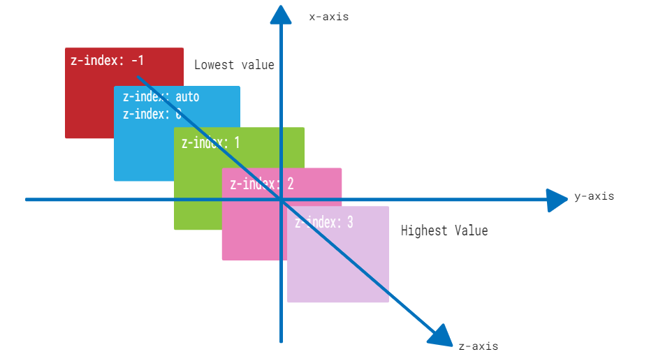
41. Explain z-index.
Ans:
Fundamental CSS property ‘z-index’ regulates how items are stacked on a page in the vertical (z-axis) dimension. Finding the sequence in which elements overlap or appear on top of one another is its main application.
- .my-element {
- position: relative; /* or absolute, fixed */
- z-index: 2; /* Higher z-index value */
- }

Learn On-Demand CSS Training Course from Real Time Experts
Weekday / Weekend BatchesSee Batch Details42. How z-index Works
Ans:
- Stacking Context: Every HTML element creates a stacking context. By default, elements are arranged based on their order in the HTML document, known as the “painters model.”
- Z-Index Values: Elements can be assigned a `z-index` value, which is a positive or negative integer. Higher `z-index` values place elements in front of those with lower values.
- Stacking Order: Elements with higher `z-index` values appear in front of those with lower values. If two elements have the same `z-index`, the one occurring later in the HTML source order takes precedence.
- Position Property: To use `z-index`, an element should have a `position` property value other than `static`, such as `relative`, `absolute`, or `fixed`.
- .my-element {
- position: relative; /* or absolute, fixed */
- z-index: 2; /* A higher z-index value */
- }
43. Just describe the pseudo-class “:checked”. When and how might radio buttons or checkboxes be styled depending on whether they are checked?
Ans:
In CSS, radio buttons and checkboxes can be styled according to whether they are checked or not using the ‘:checked’ pseudo-class. It is very helpful for personalising the way form elements look and provide visual cues when an option is chosen.
44. List the various CSS positioning options for certain elements.
Ans:
- Static
- Absolute
- Float
- Relative
- Sticky
- Grid and Flexbox
- Relative to Container
- Fixed
45. Explain mixins.
Ans:
In CSS preprocessors such as SASS and LESS, mixins are reusable code blocks. They encourage the modularity and maintainability of your code by enabling you to specify and reuse styles across your CSS.
46. How may a webpage be made more print-friendly?
Ans:
You can use CSS media queries to alter the layout of a webpage, eliminate items that aren’t necessary, and adjust the font size for printed output in order to make it print-friendly. Furthermore, print-specific styles can be defined in a different CSS file.
47. Which property is utilised to regulate the scrolling of images?
Ans:
The ‘overflow’ attribute is utilised to regulate how images scroll. You can set it to ‘auto’,’scroll’, or ‘hidden’ to control whether scrollbars show up when a picture is larger than its container.
48. What Distinctions Exist Between CSS Grid and CSS Flexbox?
Ans:
CSS Grid and CSS Flexbox are CSS layout systems. Grid is well-suited for organising elements in two dimensions, while Flexbox is tailored for single-axis layouts. Grid is particularly effective for constructing grid-based structures, while Flexbox is perfect for aligning elements along a singular axis.
49. Explain the “not()” CSS pseudo-class. When and how do you use it to hide specific style elements?
Ans:
The CSS pseudo-class `:not()` is employed to select elements that don’t match a specified selector. It serves as a means to hide or style elements that don’t meet particular criteria.
For Example, suppose you wish to conceal all links within a navigation menu except the one marked with the class “active.” In this scenario, you can apply the `:not()` pseudo-class as follows:
- nav a:not(.active) {
- display: none;
- }
In this illustration, anchor elements within the `nav` section that lack the “active” class will have their `display` property set to “none,” effectively hiding them. The `:not()` pseudo-class is a versatile tool for precisely controlling styles by excluding specific elements from a broader selection, enabling detailed adjustments to your webpage’s visual presentation.
50. Define a CSS preprocessor.
Ans:
A CSS preprocessor is a programming language that extends the functionality of CSS. Popular preprocessors like LESS, Stylus, and SASS add variables, functions, and reusable parts to CSS, increasing its efficiency and maintainability. Developers choose them because of their improved features and advantages in efficiency.
51. What are LESS, Stylus, and SASS? Why are they used by people?
Ans:
LESS, Stylus, and SASS are preprocessor scripting languages that enhance the functionality of CSS. They enhance the creation process by introducing attributes like variables, nesting, functions, and mixins. These languages improve efficiency, organisation, code reuse, maintenance, and design creation. They compile into standard CSS, ensuring compatibility with web browsers, making them ideal for web projects focusing on clean, well-structured, and maintainable CSS.
52. Explain how using variables in SASS and LESS enhances efficiency and maintainability in CSS.
Ans:
Because variables in SASS and LESS allow values to be stored and reused across stylesheets, they significantly increase the efficiency and maintainability of CSS. Cleaner code, uniformity, and simplicity of updating are the results of this.
53. Describe CSS animation
Ans:
CSS animation is a web development method that applies progressive changes to an element’s properties over time to create visually pleasing and dynamic effects. It draws users in and increases interactivity.
54. In SASS or LESS, how do you import external files or libraries? What benefit does this feature offer?
Ans:
The @import directive in SASS or LESS allows you to import other files or libraries. This feature lets you reuse styles across different files, which makes code organisation easier and encourages modularity.
55. Why is CSS animation utilised in web development?
Ans:
In web development, CSS animation is used to improve user experience, create interesting interactions, and present information in a more dynamic and captivating way.
56. Could you explain the CSS definition of the “@keyframes” rule and give an example of how to utilise it to make an animation?
Ans:
An animation sequence’s stages and styles are specified using the CSS definition of the “@keyframes” rule. It details the intermediate stages of an animation as well as the style shifts that take place at different moments in the animation. Here’s an illustration of how to make an animation using “@keyframes”:
- @keyframes slide-in {
- from {
- transform: translateX(-100%);
- }
- to {
- transform: translateX(0);
- }
- }
57. Explain the “animation-duration,” “animation-timing-function,” and “animation-iteration-count” animation attributes.
Ans:
An animation’s duration, or the amount of time needed to finish a cycle, is specified by the “animation-duration” attribute. The attribute “animation-timing-function” regulates the animation’s speed over time by specifying its acceleration and deceleration. The amount of times the animation cycle repeats is controlled by the “animation-iteration-count” element.
58. How does the CSS “animation-fill-mode” property effect the appearance of the animation?
Ans:
The styles applied to an element before and after the animation plays are determined by the CSS “animation-fill-mode” property, which affects how an animation looks. It specifies whether the styles defined in the keyframes of the animation should remain in place or return to their original state once the animation is finished.
59. What do CSS 2D transformations accomplish? What are some typical applications for elements that rotate, translate, and scale?
Ans:
With the help of CSS 2D transformations, elements can be rotated, translated, and scaled in two dimensions. Elements can be translated to change their position within the layout and rotated to produce dynamic visual effects. By allowing pieces to be scaled, layout and design flexibility is made possible.
60. Describe the CSS variable declaration syntax. In CSS, how do you define and utilize a custom property?
Ans:
Custom properties specified with a double hyphen and the property name are used in the CSS variable declaration syntax. For example, the following can be used to define a custom property called ‘–main-color’:
- :root {
- –main-color: #ff0000;
- }

Advance your Career with CSS Training By World Class Faculty
- Instructor-led Sessions
- Real-life Case Studies
- Assignments
61. How do you use CSS transforms to rotate an element 45 degrees? Give an instance.
Ans:
The ‘rotate()’ method in CSS transforms can be used to rotate an element by 45 degrees. To rotate a ‘<div>’ element.
For Example
- div {
- transform: rotate(45deg);
- }
62. Describe the function of the “transform” attribute in transforming HTML components.
Ans:
One can utilise the “transform” feature to apply several transformations, such as translation, rotation, scaling, and skewing, to alter how HTML components appear. It makes it possible to change the visual effects and element placement without changing the way the document flows.
63. Is there a difference between 2D and 3D CSS transformations? What distinguishing factors exist amongst them?
Ans:
It is true that 2D and 3D CSS transformations are different from one another. While 3D transformations take place in a three-dimensional environment and introduce a Z-axis for depth, 2D transformations happen in a two-dimensional space and involve adjustments to the X and Y axes. The added dimension in 3D transformations, which enables items to have depth and be positioned in space, is what sets them apart.
64. What does the property “transform-origin” mean?
Ans:
The position that an element is rotated or transformed around is specified by the “transform-origin” property. It establishes the transformation anchor point for the element by giving an X and Y coordinate.
65. What makes “transform-origin” crucial when transforming an element?
Ans:
Because it manages the transformation’s pivot point, “transform-origin” is essential when changing an element. Achieving certain visual effects requires changing this point because it can drastically impact how the change appears.
66. Describe the idea of perspective and how 3D transformations use the “perspective” characteristic.
Ans:
In 3D transformations, perspective mimics the sense of depth in a scene. The distance between the viewer and the 3D item is defined by the “perspective” parameter, which affects how objects appear in 3D space. It gives an impression of depth, enlarging items that are closer to the observer.
67. How can one use CSS to make a fluid, limitless animation? What characteristics and values are at play here?
Ans:
In CSS, the “animation-iteration-count” property’s “infinite” value is used to provide a smooth, infinite animation. This guarantees an endless loop of the animation. The “animation-timing-function” property also provides features like ease-in, ease-out, or linear transitions, and regulates the animation’s speed and keyframe transitions.
68. Discuss the use of CSS variables in dynamic theming for websites, allowing users to switch between themes.
Ans:
Website dynamic theming uses CSS variables, commonly referred to as custom properties. By setting variables for theme-specific colors, typefaces, or other stylistic elements, they enable users to transition between themes. It is simple to alter these variables to transition between various visual themes, making the experience dynamic and adaptable for the user.
69. How can animations be stopped and started using the “animation-play-state” property?
Ans:
The “animation-play-state” attribute allows for the beginning and stopping of animations. “Running” restarts the animation, while “paused” puts it on hold. This property allows you to dynamically alter the animation playback using JavaScript.
70. What is a responsive web design, exactly?
Ans:
A web development technique called responsive web design seeks to build websites and web apps that adapts to various devices and screen sizes. It makes sure that style and content change to give users the best possible experience on desktop and mobile devices.
71. What time does DOM reflow happen?
Ans:
When changes in the layout or size of the page force the browser to recalculate the locations and geometries of elements in the Document Object Model (DOM), this is known as DOM reflow, or layout computation. Because it’s a computationally demanding procedure that can affect performance, optimising web pages requires reducing reflows.
72. What characteristics does Flexbox have?
Ans:
A CSS layout approach called Flexbox (Flexible Box Layout) offers a productive way to arrange and divide up the space inside a container. It has attributes including adaptable sizing, horizontal and vertical alignment, and effective use of space.
73. Define logical tags.
Ans:
In CSS, tags that are based more on logical structure and content semantics than on styling or outward look are referred to as logical tags. They support the creation of more responsive, easily navigable, and style-independent web content.
74. Explain physical tags.
Ans:
The physical presentation or appearance of material, including as fonts, colors, margins, and padding, is defined by physical tags in CSS. Rather than the fundamental content structure, they are frequently connected to layout and visual stylistic characteristics.
75. Describe the CSS “font stacks” idea. What is the approved method for defining font stacks, and why are they used?
Ans:
A prioritised list of fonts designated for the text content of an element is referred to as a font stack in CSS. The “font-family” property is used to define them, presenting font families in order of choice. In order to preserve consistent typography and readability, font stacks are employed to make sure that the browser may fall back to the next font in the stack if a certain font isn’t accessible on a user’s device.
76. Explain the CSS “BEM” (Block, Element, Modifier) technique. How does it support the organization and grouping of styles in extensive projects?
Ans:
A naming scheme called “BEM” (Block, Element, Modifier) is used in CSS to manage and organise styles in large projects. It divides styles into three categories: modifiers (variations or states), elements (parts of components), and blocks (components). BEM encourages CSS code to be clear, predictable, and modular, which makes it simpler to maintain and expand in intricate online applications.
77. Could you elaborate on the meaning of “CSS architecture” and how big CSS codebases’ scalability and maintainability depend heavily on it?
Ans:
The arrangement and structure of CSS code inside a project is referred to as CSS architecture. Large CSS codebases depend on it for scalability and maintainability. SMACSS or ITCSS are examples of well-defined architectures that provide standards for file structures, naming conventions, and concern separation. These principles help to keep the code organised and manageable even as projects get larger.
78. Explain the role of advanced CSS “media queries” in crafting responsive layouts and provide an example of a complex media query for a specific design scenario.
Ans:
In order to create responsive layouts that adjust to various screen sizes and devices, advanced CSS “media queries” are necessary. Fine-grained stylistic control depending on parameters like screen width, orientation, and pixel density is possible with complex media queries.:
Example:
- @media screen and (min-width: 768px) and (orientation: landscape) {
- /* Styles for large landscape screens */
- }
79. What is “critical CSS,” and how does optimizing the loading speed of web pages benefit from it? How is it applied in a project?
Ans:
Using critical CSS, you can increase the speed at which a webpage loads by giving priority to the styles that are necessary to load before any content that is above the fold. It entails delaying the loading of non-essential styles and inlining or delivering these essential styles early in the HTML. With this method, a website’s perceived performance is maximised by showing material to users faster.
80. How is the background-position attribute used?
Ans:
In CSS, a background image’s position within its contained element is specified using the “background-position” attribute. It uses variables like percentages, pixels, or phrases like “center” or “top left” to define the image’s horizontal and vertical placement.
81. What does image repetition backup entail?
Ans:
In the event that the primary background image is unavailable or fails to load, image repetition backup allows you to define a backup background image or background color. This guarantees that in the event that the desired background image is not displayed, the webpage’s content will still be readable and aesthetically pleasing.
82. Why are internal style sheets used?
Ans:
It is possible to define styles using the “style” attribute within individual HTML components or directly in the document’s <style> element when using internal style sheets. When using small, particular styles or when it is not practicable or required to use external CSS files, they are frequently employed.
83. What does “responsive website” mean to you?
Ans:
A website that is responsive is made to provide the greatest viewing and interaction experience while adapting to various screen sizes and devices.The process entails utilising media queries, fluid design concepts, and flexible layouts to guarantee that the information and structure of the website adapt to various screen sizes, ranging from desktops to mobile ones.
84. Explain the function of the “CSS Grid Layout” in contemporary web design. What distinguishes it from other layout techniques such as Flexbox?
Ans:
A contemporary CSS layout method called “CSS Grid Layout” makes it possible to create two-dimensional grid structures for web layouts. Because it gives you exact control over rows and columns, it’s perfect for intricate layouts. Grid Layout provides a more complete layout solution by handling both rows and columns, in contrast to Flexbox, which concentrates on one-dimensional layouts.
85. In CSS, what is meant by “margins collapsing” and how can this be avoided or managed in a layout?
Ans:
When neighbouring vertical margins in CSS overlap or combine, the result is margins collapsing, which causes unexpected spacing in the layout. It usually occurs when there is no border, padding, or content between neighbouring elements’ margins, or when the margin values are negative. You can utilise strategies like bordering, padding, and margin adjustments to control or prevent margin collapsing.
86. Talk about how responsive design is important for CSS layout. How can layouts be adjusted for various screen sizes and devices using media queries?
Ans:
Responsive design plays a pivotal role in CSS layout by ensuring that web designs adapt seamlessly to diverse screen sizes and devices. Achieved through media queries, this approach allows designers to tailor styles based on factors like screen width, orientation, and pixel density, ensuring that layouts remain visually pleasing and functional across a wide spectrum of devices.
87. Explain the meaning of “CSS overflow” and the many settings that can be used (such as visible, hidden, scroll, auto). How should a layout handle overflowing content?
Ans:
The term “CSS overflow” pertains to how elements handle content that exceeds their defined boundaries. Several settings are available, including “visible” (content spills outside the element’s box), “hidden” (content is concealed), “scroll” (a scrollbar is introduced for navigation), and “auto” (a scrollbar appears when necessary). The choice of setting hinges on the desired layout and how content overflow should be managed.
88. Could you elaborate on the function of the CSS layout’s “display” property values? Which value would you use when?
Ans:
The “display” property in CSS dictates how elements are displayed within the layout. Common values encompass “block” (elements create new block formatting contexts), “inline” (elements are inlined within the text flow), and “flex” (elements are part of a flex container). The selection of the “display” value hinges on the intended layout and the element’s interaction with other components.
89. Describe how the Custom Properties API in JavaScript is utilised to apply and manipulate CSS variables.
Ans:
The Custom Properties API in JavaScript empowers you to apply and manipulate CSS variables, simplifying the process of crafting dynamic and themable designs. JavaScript code can access and modify CSS variables, permitting on-the-fly adjustments to styles such as color schemes, typography, or spacing.
90. Describe how utility classes are used in CSS architecture. What are the advantages of utility classes for project consistency and fast styling?
Ans:
Utility classes within CSS architecture are compact, reusable classes that apply specific styles to elements. They confer the benefits of consistent project styling and expedited development, allowing for the rapid application of predefined styles without the need for custom CSS. Utility classes contribute to the preservation of a uniform design language, proving particularly advantageous in extensive projects.
91. What does the architectural term “modular CSS” mean? How does it dissect styles into parts that can be reused and maintained?
Ans:
In the context of web development, “modular CSS” involves the division of styles into self-contained modules that can be reused and maintained efficiently. Each module is dedicated to styling a distinct aspect of a website or application, enhancing manageability and extendability while minimising the risk of unintentionally affecting unrelated styles.
92. Explain the ITCSS (Inverted Triangle CSS) architecture and its role in organizing CSS styles based on source order and specificity.
Ans:
The ITCSS (Inverted Triangle CSS) methodology is geared toward organising CSS styles based on their source order and specificity. It follows a structured hierarchy, commencing with general styles at the top and progressing to more specific ones at the bottom. This meticulous organisation prevents low-specificity styles from inadvertently overriding high-specificity counterparts, fostering a consistent and sustainable codebase.
93. In collaborative and dynamic projects in particular, how can the long-term maintainability of CSS architecture be guaranteed?
Ans:
The enduring maintainability of CSS architecture in collaborative and dynamic projects hinges on several factors. Comprehensive documentation, version control systems, adherence to coding conventions, and consistent naming conventions all play integral roles in ensuring order. Additionally, regular code reviews and strong teamwork contribute significantly to the sustained upkeep of CSS architecture.
94. Explain CSS image scripts.
Ans:
“CSS image sprites” refer to the consolidation of multiple images into a single image file. This consolidation minimises server requests, potentially enhancing page load speeds. Developers employ CSS to reveal specific segments of the amalgamated image, adjusting the background position to display the relevant image. This approach facilitates efficient image management on websites.