Last updated on 09th Jul 2020| 5337
Tableau is a powerful and fastest growing data visualization tool used in the Business Intelligence Industry. It helps in simplifying raw data into the very easily understandable format.
- Data analysis is very fast with Tableau and the visualizations created are in the form of dashboards and worksheets. The data that is created using Tableau can be understood by professionals at any level in an organization. It even allows a non-technical user to create a customized dashboard.
Download & install Tableau
Step-1: Time to download & install Tableau
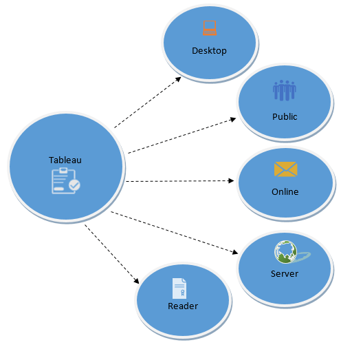
- Tableau offers five main products catering to diverse visualization needs for professionals and organizations. They are:
- Tableau Desktop: Made for individual use
- Tableau Server: Collaboration for any organization
- Tableau Online: Business Intelligence in the Cloud
- Tableau Reader: Let you read files saved in Tableau Desktop.
- Tableau Public: For journalists or anyone to publish interactive data online.
Quick Features
- Tableau Public and Tableau Reader are free to use, while both Tableau Server and Tableau Desktop come with a 14 days fully functional free trial period, after which the user must pay for the software.
- Tableau Desktop comes in both a Professional and a lower cost Personal edition. Tableau Online is available with an annual subscription for a single user, and scales to support thousands of users. Tableau has gone through different versions, here we will discuss the learning curve of Tableau Desktop 9.0.
Step-2: Getting Started with Tableau
- Tableau provides Free Online, Live and Classroom (paid) training programs. This is the best place to start your journey. I would recommend you to follow the path below. Here is Free Online training (“On demand”) with additional resources. All these videos contain the data set to explore at your end.
Step-3: Connecting With Data
- Tableau can connect with various data sources such as text, excel file, databases to big data queries also. In this section, we will look at the basics and advance features of data connectivity with different sources. Here we will also look at Join types, Data Blending, connection with cubes, custom sql and Google Analytics.
Step-4: Creating Views and Analysis
- Tableau has multiple options to represent data in different views, applying filters /drill downs /formatting, creating sets, groups, generating trend lines and performing forecasting. Start exploring !
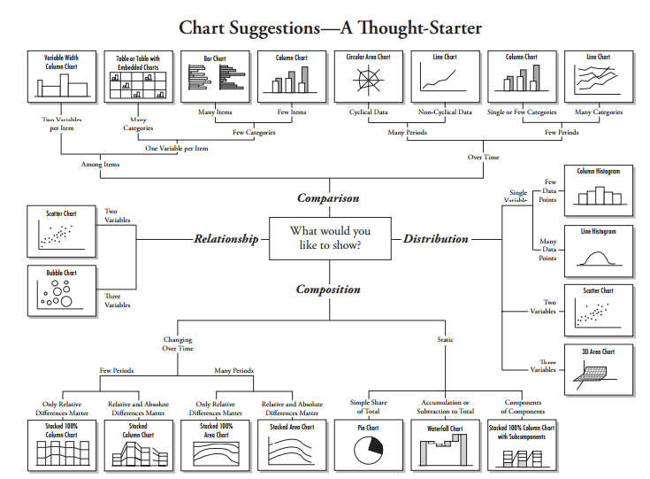
- You have now looked at various objects to visualize data. One big dilemma that you will face while creating data visualization is which object should you choose to represent data.
- The snapshot below will help you to choose and decide the type of visualization. However, the feature of automatic selection of views available in tableau takes care of this issue largely. This feature automatically activates best views for selected dimensions(s) and measure(s). Hence, you need no worry. You are in safe hands
Step-5: Exercise
- Till now, we have looked at data connectivity, various objects and views creation in Tableau. It’s time to get your hands dirty with data and generate inferences using different visualization methods:
Step-6: Time to socialize – Join Community and Groups
- Now that you have a good understanding of Tableau, it’s time to become a part of Tableau communities. This will help you a lot to enhance your learning, get answers to questions and simplified description for complex topics by bloggers. I am listing some of the most useful resources below:
- Tableau Community: It works on a principle of Learn, Connect and Enjoy. It has forums, groups, ideas, Viz talk and workbook library. Here you can get your questions answered quickly. By using the ‘ideas’ section, you can Vote on the Tableau Community’s best product ideas and add your own to the mix.
- Analytics Vidhya Discuss: We are niche in this domain but have tableau experts on board. These experts will answer your questions in detail and in a simplistic approach. Our discussion portal already has few questions related to Tableau and a lot of other topics. You should jump in, if you have not already.
- Blogs: Blogs are always helpful to understand detailed content covering basic and advanced concepts of any complex topic in a more structured and simplistic way.
- Tableau LinkedIn/ Facebook Groups: LinkedIn and Facebook has some excellent groups to ask questions and connect with peers or experts, some groups of special interest are:
- Tableau Software: The biggest Tableau group on Facebook, with over ~75k likes.
- Tableau Software Fans & Friends and Tableau Enthusiasts : These two are the biggest and active group on LinkedIn having 20 and 6 thousands members respectively.
Step-7: Dashboards & Stories
- Tableau ‘Dashboard and Stories’ creation is the USP (Unique selling proposition) of the product. The dashboards so created turn out to be amazing and it certainly takes this product to the next level. Tableau online training program has a separate section for Dashboards and Stories. This section covers the topic as listed below:
- Dashboard and Story Creation
- Adding views and objects to dashboards
- Applying Filters to dashboard
- Various Layouts and Formatting options
- Interactive Dashboard
- Story Points
Step-8: Advance Expressions
- Besides the available measures and dimensions, you can create a calculated expression to develop a new visualization. It may be based on date, mathematical logic, text expressions, input parameters and others. For Data scientists, they can connect tableau with R to enhance the power for analytical inferences.

Best Tableau Training from Industry Experts Trainers
- Instructor-led Sessions
- Real-life Case Studies
- Assignments
Step-9: Advance Visualization Methods
- Tableau has awesome features to create advanced visualizations. We can generate advanced charts in Tableau by playing with some of the properties of objects. Below is the list of advance visualization methods which helps to represent the data in more effective way:
Step-10: Introduction of Tableau Server and Online
- Using Tableau server and Online, you can schedule the tasks and provide authorization to enable data security. It is a job of Tableau administrator but having understanding about these concepts always help you in dashboard development. Below are the resources to understand these two concepts more effectively.
Create a Dashboard in Tableau
- Please click on the New Dashboard tab to create a Tableau Dashboard.
Now you can see the dashboard.
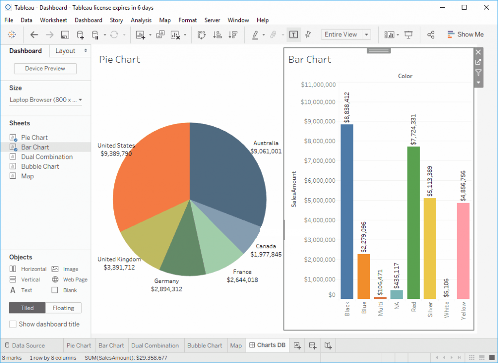
- Device Preview: Use this button to create a View for Phone, Desktop, and Tablet.
- Size: Use this property to adjust the dashboard display size.
- Sheets: List of Sheet that is available to create this dashboard.
- Objects: Predefined Tableau dashboard object that you can use in your dashboard.
- Name of the Dashboard. Right-click and select the Rename Sheet option context menu to rename the dashboard.
- It is the actual work area.
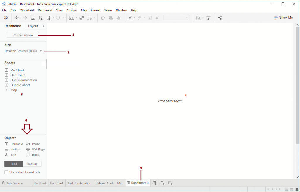
- Hover over any sheet to see the sheet preview, and by clicking the marked button will take you to the original sheet.
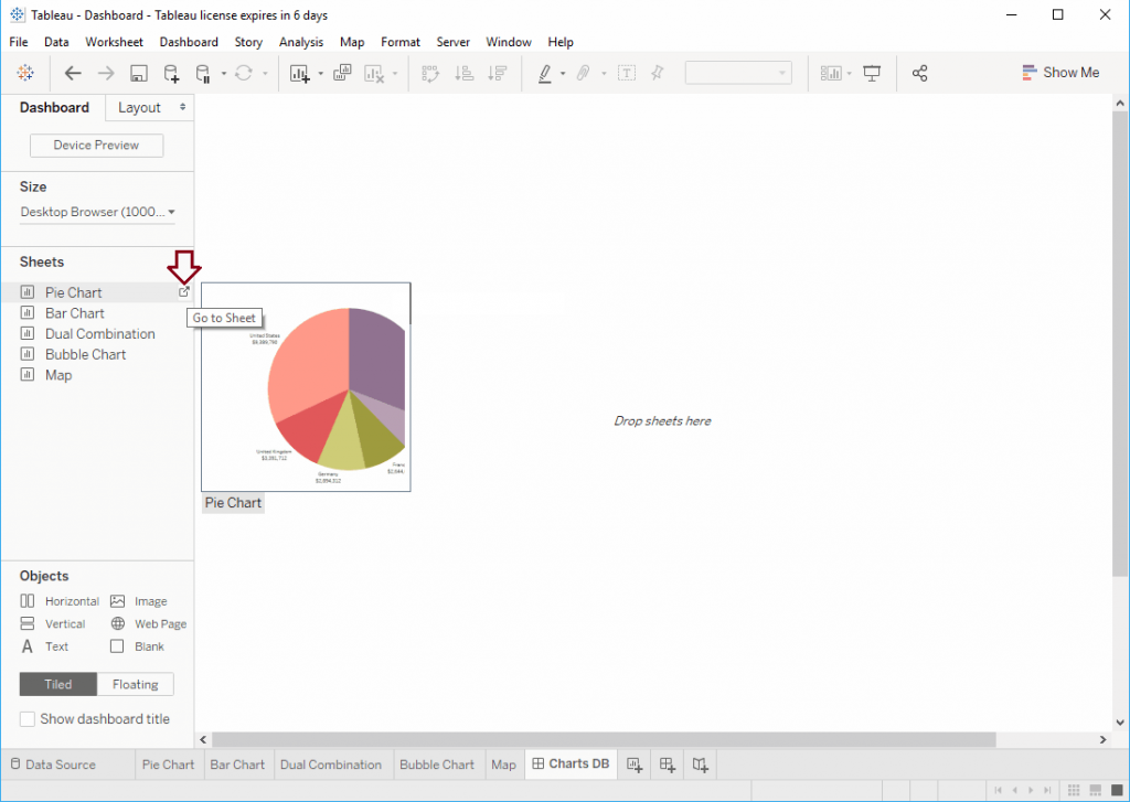
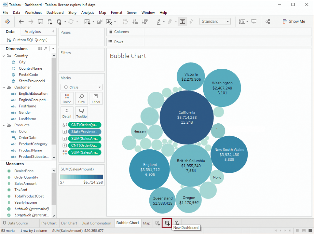
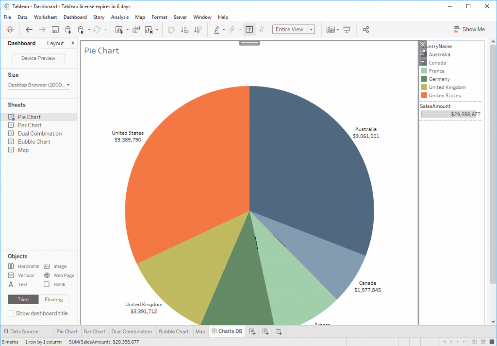
- Let me Drag and Drop Pie Chart to the dashboard.
- Next, let me add the Bar Chart to the dashboard. From the below screenshot, you can see that if you are dragging something to the dashboard, it will ask the location. I mean Top Right, Top Left, Bottom right, etc
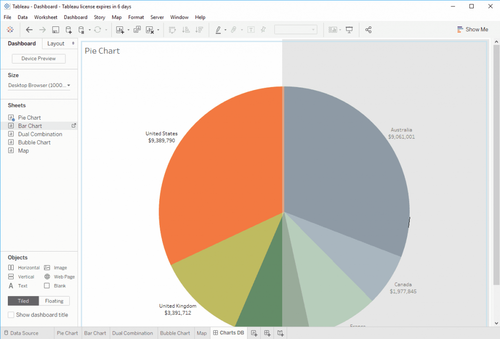
- Now you can see two Sheets inside our Tableau dashboard.
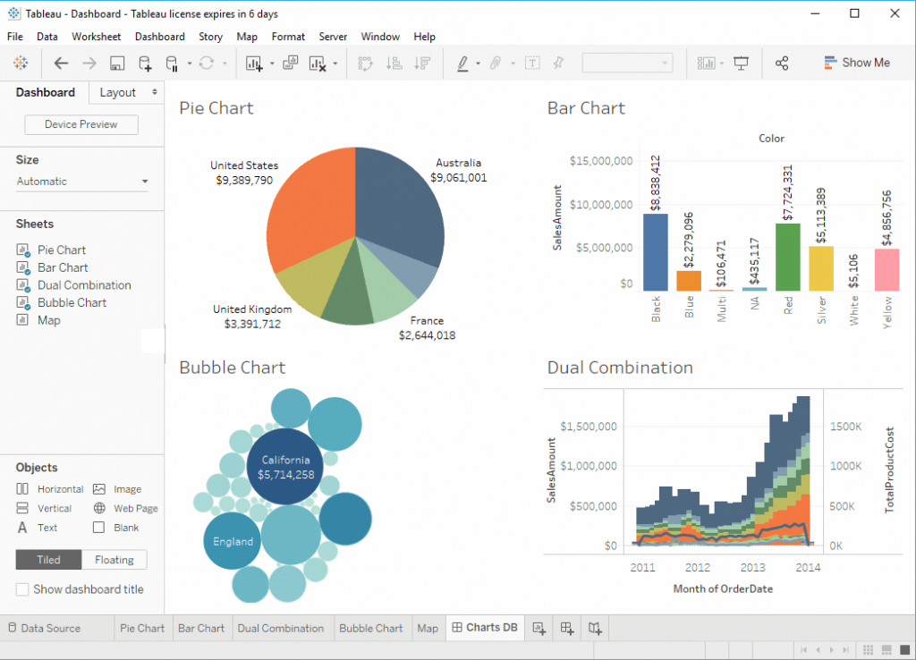
- Let me add the Dual Combination Sheet and Bubble Chart as well.
Rearrange Sheets in a Dashboard
- To rearrange the Sheets on the dashboard, Please select the Sheet that you want to change the location and use the marked field.
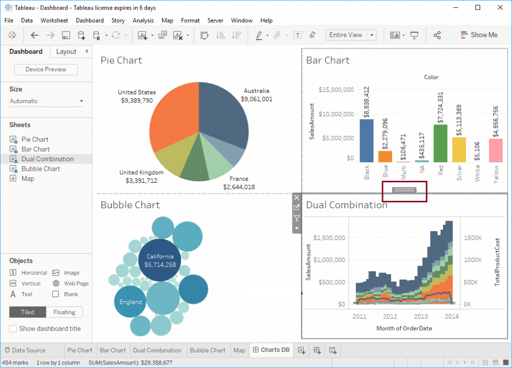
- To demonstrate the same, we placed the Dual Combination sheet at the bottom of the dashboard.
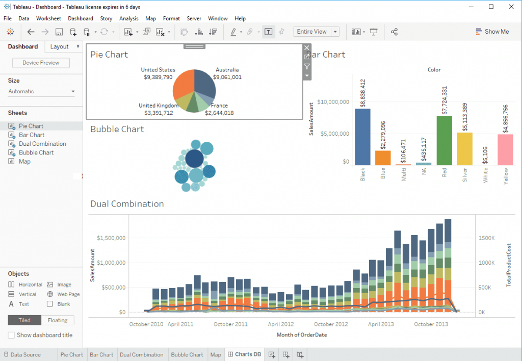
Delete Sheet from Tableau Dashboard
- Please select the Sheet that you want to delete from the Tableau dashboard. Next, click the Close button, as we showed below.

Get In-Depth Knowledge in Tableau Training & Certification Course
Weekday / Weekend BatchesSee Batch Details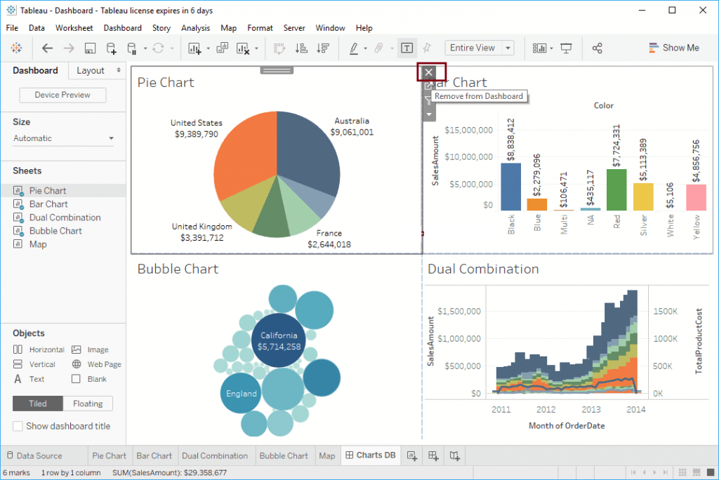
- Or click on the Down arrow and select the Remove from Dashboard option from the drop-down menu.
SD
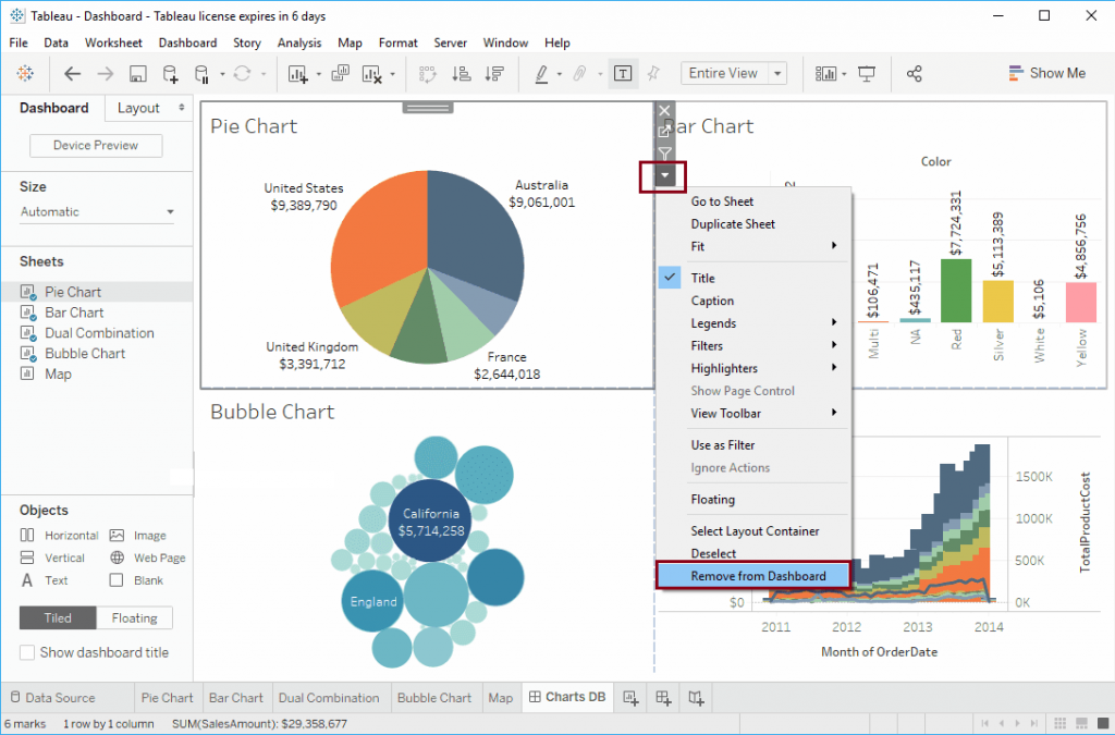
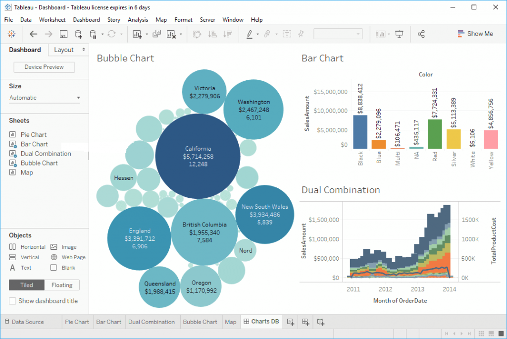
- Either way, it will remove the selected sheet from the Tableau dashboard. From the below screenshot you can see that, there is no Pie Chart in our dashboard
Workbook Components
Sheet: A sheet is a singular chart or map in Tableau.
Dashboard: A dashboard is a canvas for displaying multiple sheets at a time and allowing them to interact with each other.
Container: A container is a layout frame on a dashboard that can house sheets, images, filters/parameters, and text boxes. Containers can be horizontal (objects placed go side-by-side) or vertical (objects placed are on top of one another). Double-click any sheet on a dashboard by the center “grip” marks to select the container that the sheet sits in.
Story: A story is a viewing portal that contains a sequence of worksheets or dashboards that work together to convey information. Each individual sheet in a story is called a story point.
Workbook: A workbook is the entire Tableau file containing your sheets and dashboards.
Packaged Workbook: A single zip file with a .twbx extension that contains a workbook along with any supporting local file data sources and background images. Use this format to package your work for sharing with others who don’t have access to the data.
Tableau Interface
Data Pane: The default left pane that lists your open data sources and the dimensions and measures contained in the selected data sources. Sets and Parameters are also listed here.
Analytics Pane: Clicking the Analytics tab on the left pane will display available analyses for the data displayed on your sheet. Inapplicable analyses will be grayed out. Analyses include adding constant lines, box plots, trend lines, forecasts, and reference bands.
Marks Card: The Marks card is the tool used to create a sheet that controls most of the visual elements in a sheet. Using the Marks card, you can switch between different chart types (bar, line, symbol, filled map, and so on), change colors and sizes, add labels, change the level of detail, and edit the tool tips.
Rows and Columns Shelves: The Rows shelf and the Columns shelf is where you determine which variables will go on what axis. Put data you want displayed along the X-axis on the Columns shelf and data you want displayed on the Y Axis on the Rows shelf.
Data
Dimension: A categorical variable from the dataset that is used to slice and dice the data into different categories. Dimensions are often discrete data. Examples include country, gender, student ID, and name. When a dimension is pulled into your sheet, it takes the form of a blue pill.
Measure: A variable from the dataset that is meant to be aggregated. (This means it should be a number that it makes sense to do math with: sum, average, and so on.) Measures are often continuous data. Examples include GPA, sales, quantity, quota, height, and salary. When a measure is pulled into your sheet, it takes the form of a green pill.
Pill: The visual representation of a data item brought into your sheet. Pills can sit on the rows and columns shelves, the marks card, and the filters card.
Filters/Parameters
Filters: A filter is used to limit what data is being displayed on the sheet. Visible controls for a filter on a sheet or dashboard are called Quick Filters. Each filter is for an individual data field. Both dimensions and measures can be used as filters.
Parameters: While filters limit the data shown in the view, parameters act as a variable in an equation that can be controlled by the end user. Parameters only work in conjunction with either filters, sets, reference lines, or calculated fields. Parameters are workbook-wide and can be used in multiple places (i.e. a single parameter can influence multiple filters and calculated fields across different data sources in the workbook). Parameters are located separate from Dimensions and Measures on the data pane.
Data Groupings and Relationships
Groups: Simplifies large numbers of dimension members by combining them into higher level sub-categories. When a field is grouped, a new dimension node is created and replaces the original dimension in the view. Groups can be made by:
- Highlighting multiple header names or data points then right clicking will allow you to form on-the-fly groupings of dimension levels in the view.
- Clicking on the dimension you want to group in the data pane, then selecting Create > Group… will give access to greater control over your groups.
Sets: A subset of your data that meets certain conditions based on existing dimensions. Unlike a group, sets only have two values: IN and OUT. A member is either IN your set, or not (OUT). Like parameters, sets can be used throughout a workbook on multiple sheets. Also like parameters, sets are located separate from Dimensions and Measures on the data pane. Sets can be created by:
- Highlighting multiple header names or data points then right clicking will give you the option to put those dimension fields in a set.
- Clicking on the dimension you want to group in the data pane, then selecting Create > Set… will give access to greater control over your sets and the ability to create computed sets based on conditions.
Bins: Bins are buckets based on a range of values. While groups and sets are used for grouping dimensions, bins are used for grouping measures. The created bin will be set in the Dimensions shelf. Bins can be created by right-clicking on a measure, then selecting Create > Bins…
Hierarchies: Often data sources have related dimensions that have an inherent hierarchy. For example, a data source may have fields for Country, State, and City. These fields could be grouped into a hierarchy called Location. In this example, a user can expand the country and break down the data into state and city. Hierarchies can be created by:
- Using the CTRL key, select the dimensions you want to be in your hierarchy, right click and Create Hierarchy. Once the hierarchy is created it’s simple to put into the correct order, just drag and drop the dimensions in the hierarchy into the correct position.
- Clicking a field and dragging it on-top of another field will also create a hierarchy.