 LMS
LMS
Last updated on 16th Jun 2025| 9748
 (5.0) | 45782 Ratings
E-mail this post
(5.0) | 45782 Ratings
E-mail this post
- Introduction to React Native
- Overview of React Native Elements Library
- Installing and Setting Up React Native Elements
- Buttons and Inputs
- Cards and Lists in React Native Elements
- Avatars and Icons in React Native Elements
- Overlay and Modal Components in React Native Elements
- Theming and Customization in React Native Elements
Introduction to React Native
React Native is a popular open-source framework developed by Facebook that allows developers to build mobile applications using JavaScript and React. Unlike traditional mobile development, which requires writing separate code for iOS and Android, React Native enables developers to write a single codebase that can be deployed across both platforms.This is possible because React Native uses native components, allowing the app to perform as if it were built using platform-specific languages like Swift or Java/Kotlin. Additionally, for those interested in building their skills further, Web Developer Certification Courses can provide a solid foundation in modern web development practices. React Native leverages the power of React, a widely used JavaScript library for building user interfaces, and allows developers to create rich, interactive UIs with ease. The framework uses a concept called “bridge,” which allows JavaScript code to communicate with native code, ensuring high performance and access to native APIs. With features like hot reloading, fast refresh, and a growing ecosystem of libraries and tools, React Native makes mobile app development faster and more efficient. It is widely adopted by both startups and large companies, including Facebook, Instagram, and Airbnb, due to its flexibility, cost-effectiveness, and ability to deliver a seamless user experience on multiple devices. React Native continues to evolve, making it a top choice for mobile app development in the modern tech landscape.
Are You Interested in Learning More About Web Developer Certification? Sign Up For Our Web Developer Certification Courses Today!
Overview of React Native Elements Library
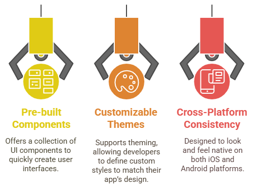
- Wide Range of Pre-built Components: React Native Elements offers a collection of commonly used UI components, including buttons, headers, lists, inputs, and cards, to quickly create user interfaces.
- Customizable Themes: The library supports theming, allowing developers to define custom color schemes, font sizes, and other styles to match their app’s design requirements. Exploring Web Developer Job Description details can also provide insight into the essential skills and responsibilities needed to effectively utilize such theming capabilities in real-world projects.
- Cross-Platform Consistency: The components are designed to look and feel native on both iOS and Android, ensuring a seamless user experience across platforms.
React Native Elements is a highly customizable UI library for building cross-platform mobile applications with React Native. It provides a wide range of pre-designed components, such as buttons, inputs, cards, and more, allowing developers to create clean, modern user interfaces with minimal effort. The library streamlines the development process by offering components that are both easy to use and fully customizable, saving time while ensuring consistency across an app. Here’s an overview of the key features of the React Native Elements library:
- Easy Integration: React Native Elements is easy to integrate into existing projects, with minimal setup required for use in any React Native application.
- Active Community and Support: The library is actively maintained and supported by a large community, providing regular updates, bug fixes, and new features.
- Well-Documented: Comprehensive documentation and example code make it easy for developers to get started quickly and efficiently when using React Native Elements in their projects.
- Customizable Button Styles: React Native Elements buttons can be easily customized with props like color, size, and type, enabling developers to match the app’s design requirements without writing extra styling.
- Multiple Button Variants: Buttons come in various variants such as solid, clear, outline, and disabled, allowing for flexibility depending on the context or action the button represents. Understanding these UI elements is also important when evaluating roles and expectations outlined in Software Engineer Salary discussions and job listings.
- Icon Support in Buttons: Buttons can include icons alongside text, enhancing the visual appeal and making the interface more intuitive. React Native Elements integrates well with react-native-vector-icons for easy icon usage.
- Input Field Customization: Input components allow for full customization, including placeholder text, secure text entry for passwords, and customizable input styles such as borders, colors, and fonts.
- Validation Support: Inputs can be easily integrated with form validation, enabling developers to manage error states, such as incorrect input, with built-in support for custom error messages.
- Event Handlers for Interaction: Both buttons and inputs come with built-in event handlers like onPress for buttons and onChangeText for inputs, allowing developers to easily manage user interactions and updates to app states.
- Versatile Avatar Options: The Avatar component supports images, initials, and even custom icons, making it ideal for displaying user profiles or placeholders when no image is available.
- Customizable Sizes and Shapes: Avatars can be resized and styled into circular, square, or rounded shapes, ensuring flexible, consistent design. Learning What is Express JavaScript also helps in building full-stack apps efficiently.
- Icon Integration in Avatars: Developers can embed icons within avatars or overlay them with status indicators like online/offline badges to enhance functionality and UX.
- Rich Icon Support: React Native Elements supports a wide variety of icons through integration with the react-native-vector-icons library, allowing access to popular icon sets like FontAwesome. MaterialIcons, and more.
- Interactive Icons: Icons can be made interactive by adding event handlers such as onPress, enabling navigation or performing actions directly from the icon component.
- Styling Flexibility: Both Avatar and Icon components offer a range of styling options, including color, background, border, and padding, giving developers full control over their visual presentation.

Installing and Setting Up React Native Elements
To get started with React Native Elements, the first step is to ensure you have a React Native environment set up. If you haven’t done so already, you’ll need to install Node.js, the React Native CLI, and Android Studio/Xcode (for Android/iOS development). Once your development environment is ready, you can install React Native Elements by navigating to your project directory and running the command npm install react-native-elements or yarn add react-native-elements in your terminal, depending on the package manager you prefer.This command will install the library and its dependencies into your project. After the installation is complete, you can begin importing the components you need into your app. Reviewing explore our Web Developer Resume details can also help you highlight relevant skills and tools like this library when applying for developer roles. For example, to use a button component, simply import it like this: import { Button } from ‘react-native-elements’; You can then use it as you would any React Native component in your JSX. Additionally, React Native Elements also requires the installation of react-native-vector-icons for icons, which can be added by running npm install react-native-vector-icons or yarn add react-native-vector-icons. Once the components and icons are set up, you can start customizing the UI according to your app’s design requirements. With React Native Elements installed and configured, you can quickly build consistent and professional user interfaces with minimal effort.
Excited to Obtaining Your web developer Certificate? View The web developer course Offered By ACTE Right Now!
Buttons and Inputs in React Native Elements
React Native Elements offers a variety of pre-built components for creating buttons and input fields, which are essential elements of any mobile application. These components are highly customizable, enabling developers to maintain a consistent look and feel while saving time during development. Below are key features of the Button and Input components in React Native Elements:
Interested in Pursuing web developer certification Program? Enroll For Web developer course Today!
Cards and Lists in React Native Elements
React Native Elements provides pre-designed components for cards and lists, which are commonly used to display structured content in a visually appealing way. The Card component allows developers to easily create sections with headers, images, content, and actions, all encapsulated in a single container. This makes it ideal for showing grouped information such as user profiles, news articles, or product details. Customization options for the Card include adding icons, buttons, and adjusting background colors, borders, and shadows. Additionally, Web Developer Certification Courses can help you learn the necessary skills to implement such customizations effectively. Similarly, the ListItem component enables the creation of simple or complex lists, where each item can include text, images, or icons. This component is highly flexible and supports features like left and right icons, chevrons for navigation, and even switch buttons for toggling settings. Both cards and lists are responsive, ensuring that they render seamlessly across different device sizes. These components are not only easy to implement but also come with built-in support for handling user interactions like taps or presses. By using React Native Elements’ Cards and Lists, developers can significantly speed up the UI development process, ensuring consistency and a polished look without spending much time on custom designs. Whether building a news feed, a settings page, or a product catalog, these components provide the flexibility and functionality needed for dynamic mobile applications.

Avatars and Icons in React Native Elements
React Native Elements offers powerful and easy-to-use components for displaying avatars and icons, which are essential for enhancing the visual appeal and user experience of a mobile app. These components help present user profiles, represent actions, and add clarity through recognizable symbols. With full customization and seamless integration, Avatars and Icons can be tailored to suit any app design. Here are some key features:
Overlay and Modal Components in React Native Elements
React Native Elements include powerful Overlay and Modal components that allow developers to display content on top of the existing UI, making them ideal for creating pop-ups, alerts, dialogs, or loading screens. The Overlay component acts as a lightweight modal that can be used to present temporary content, such as confirmation messages or additional information, without navigating away from the current screen. It supports smooth animations, backdrop customization, and can be toggled on or off with a simple state change. Using the Software Engineering Prototype Model can help test such UI features early in the development process. Developers can control its visibility, dimensions, and styling to suit various use cases. Similarly, the Modal functionality, while not a separate component in React Native Elements, can be achieved using the native Modal component in combination with Elements’ UI features for styling and content presentation. Overlays are especially useful for displaying non-intrusive messages or quick forms, and they support touch-to-dismiss behavior, improving user experience. Both overlays and modals support nesting of other components like buttons, inputs, or images, making them highly flexible. They are also responsive and adapt well to different screen sizes. By using Overlay and Modal components, developers can create interactive and user-friendly interfaces that guide users through tasks without disrupting the flow of the application.
Theming and Customization in React Native Elements
React Native Elements offers robust theming and customization capabilities that allow developers to maintain a consistent design language across their entire application. With the built-in ThemeProvider, developers can define global styles such as colors, font sizes, spacing, and component-specific properties that automatically apply to all UI elements. This eliminates the need to repeatedly pass styling props to each component, streamlining the development process and reducing code duplication. The theming system supports deep customization, enabling developers to override default styles or extend themes to match branding guidelines precisely. Components can also be individually styled using props or by integrating custom styles with StyleSheet, providing flexibility for unique design requirements. Additionally, Web Designing Training can help you master the skills needed to create visually appealing and user-friendly web interfaces. The library supports dynamic theming, allowing the app to switch between light and dark modes or apply user-defined themes at runtime. In addition, React Native Elements integrates well with other styling libraries like styled-components or Tailwind CSS (via extensions), giving developers further control over the look and feel of their app. With these features, theming in React Native Elements not only enhances visual consistency but also accelerates UI development by centralizing and simplifying design management across the application.