 LMS
LMS
Last updated on 10th May 2025| 9717
 (5.0) | 26659 Ratings
E-mail this post
(5.0) | 26659 Ratings
E-mail this post
- Introduction to React Bootstrap Navbar
- Why Use Bootstrap for Navigation in React?
- Setting Up Bootstrap in React
- Understanding the Components of a Navbar
- Creating a Basic Navbar with Bootstrap in React
- Making the Navbar Responsive
- Customizing Navbar Styles and Content
- Best Practices and Performance Considerations
- Conclusion
Introduction to React Bootstrap Navbar
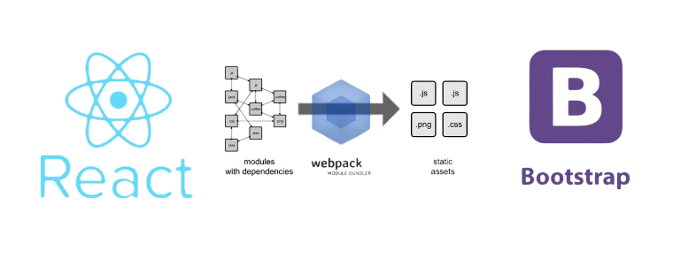
A navbar (short for navigation bar) is a critical part of any web development or application, serving as the primary way to navigate between different sections or pages. In modern web development, responsive navigation bars are essential because they adapt to various screen sizes, ensuring a smooth user experience across desktops, tablets, and mobile devices. Building a responsive navbar in Web Designing and Development Courses can be made easier with React Bootstrap, a set of React components based on the Bootstrap framework. Bootstrap, developed by Twitter, is a front-end framework that provides a variety of pre-built components and Navbar Styles, including navigation bars. React Bootstrap, on the other hand, offers React-friendly versions of these components, ensuring that developers can easily integrate them with React’s declarative approach to building UIs. In this guide, we will cover how to create a responsive navbar using React Bootstrap, ensuring that it looks great on all screen sizes. We will also explore ways to customize the Navbar to suit your application’s needs.
Why Use Bootstrap for Navigation in React?
Bootstrap is one of the most widely used front-end frameworks in web development. It offers a set of pre-designed, ready-to-use components and utilities that simplify the development process. When it comes to navigation bars, Scope for AngularJS Certification provides an easy-to-use, responsive navbar component that automatically adjusts to different screen sizes. Here’s why React developers often choose Bootstrap for navigation:
- Ease of Use: Bootstrap provides a set of well-documented components that are easy to implement in React applications. It reduces the custom CSS you must write for standard components like navigation bars.
- Responsiveness: Bootstrap’s responsive Navbar automatically adjusts to different screen sizes. The Navbar collapses into a hamburger menu for small screens for small screens, making it easy for users to navigate on mobile devices.
- Consistent Design: Bootstrap ensures a consistent design throughout your application. Its components are designed to follow best practices in UI design, resulting in a clean, modern appearance.
- Customization: While Bootstrap provides a default look, it offers extensive customization options to modify the Navigation in React color, layout, and behavior according to your needs.
Learn the fundamentals of Web Development with this Web Developer Certification Courses .
Setting Up Bootstrap in React
Before using Bootstrap components like the Navbar, you must install the Bootstrap framework in your React project. You can achieve this by using npm or yarn, or by adding a CDN link to your HTML file. The recommended approach for React applications is installing Bootstrap via npm, which integrates well with modern development workflows and build tools. To get started, run npm install bootstrap in your project directory. Then, import Bootstrap’s CSS in your src/index.js or App.js file using import ‘bootstrap/dist/css/bootstrap.min.css’;. How to Become a Web Developer makes all Bootstrap styles available throughout your React components. Optionally, you can also install and use react-bootstrap for React-specific Bootstrap components that follow the React component architecture.
- Install React Bootstrap and Bootstrap: Open your terminal and run the following command to install React Bootstrap and the core Bootstrap library: npm install react-bootstrap bootstrap
- Import Bootstrap Styles: Once Bootstrap is installed, import its CSS file into your src/index.js or src/App.js file to apply the default Navbar Styles. Add the following import statement
- Start Using React Bootstrap Components: With Bootstrap installed and Navbar Styles imported, you can now use React Bootstrap components, including the Navbar component, in your React application.
- Navbar: The outermost container that wraps the entire navigation bar.
- Navbar Brand: This is usually the logo or name of your website or application. It’s often positioned at the left of the Navbar.
- Navbar Toggle: This button appears on smaller screens (mobile devices) to toggle the visibility of the navbar items. How to Implement Magnific Popup Responsive in jQuery typically appears on a hamburger menu.
- Navbar Collapse: This section contains the navigation links or items. On larger screens, the items are displayed inline. On smaller screens, they are collapsed into a dropdown menu.
- Navbar Links: These are the individual navigation links users click to navigate through the application or web development.
- Use Lazy Loading for Links: If your Navbar contains many links or dynamic content, consider using lazy loading for certain sections to improve performance.
- Keep It Simple: Avoid overcrowding the Navbar with too many items. Too many links can overwhelm users and make navigating the Understanding React JS Features and Benefits Explained more challenging.
- Accessibility: Ensure your Navbar is accessible by using proper semantic HTML, like aria attributes for screen readers, and testing for keyboard navigation.
- Consistent Design: Consistency is key when designing the Navbar . Stick to a simple, clean design that aligns with your website’s branding.
Dive into Web Development by enrolling in this Web Developer Certification Courses today.
Understanding the Components of a Navbar
A navbar typically consists of several key components, each with its role. Understanding these components will help you create a more flexible and customizable navigation bar. Combined with Bootstrap’s utilities, these components enable you to create a responsive and interactive navbar with minimal effort. The essential elements of a Bootstrap navbar are:

Creating a Basic Navbar with Bootstrap in React
You can create a basic responsive navigation bar in React using the Navbar, Nav, and NavDropdown components from the React Bootstrap library. First, you import these components and use them to structure your navbar. The Navbar component serves as the main container that holds the entire navigation structure. Inside it, Navbar.Brand is used to display your website’s brand or logo, while Navbar.Toggle enables a collapsible menu for mobile responsiveness. The Navbar.Collapse wraps around the navigation links and controls their visibility based on screen size. Within the Navbar.Collapse, the Nav component holds individual navigation links such as “Home,” “Features,” and “Pricing.” Web Developer Certification Courses component allows you to include a dropdown menu with nested items for more complex navigation options. This setup ensures the navbar is user-friendly and responsive, collapsing into a hamburger-style menu on smaller screens. Using React Bootstrap not only simplifies the implementation of responsive navigation but also enhances the visual consistency and scalability of your React applications. It’s a great way to build modern UIs efficiently. React Bootstrap follows Bootstrap’s grid system and utility classes, providing consistency with the traditional Bootstrap framework. You can also customize the appearance of the Navbar using built-in theming options or by applying custom CSS classes. Since the components are reusable and modular, they improve maintainability and code readability. Additionally, React Bootstrap removes the need for jQuery, aligning better with React’s component-based architecture. Overall, it’s a powerful toolset for building elegant and responsive navigation in modern React apps.
Making the Navbar Responsive
Bootstrap’s Navbar is responsive by default. The key component to make it responsive is the expand prop in the Navbar component. Setting expand= “lg” means that the Navbar will expand (show the links inline) on large screens and collapse on smaller screens. In addition, the Navbar . The toggle component is automatically hidden on larger screens and only appears on small screens (like mobile devices). When clicked, it toggles the visibility of the Navbar —collapse component. If you need the Navbar to collapse at different breakpoints, you can adjust the expanded/
Get hands-on experience in web technologies by signing up for this Web Developer Certification Course now.
Customizing Navbar Styles and Content
While the default Bootstrap navbar offers a clean and functional layout, React Bootstrap allows developers to customize the Navbar to better match their application’s design and branding. One common customization involves changing the Navbar’s background and text colors using the bg and variant props—for example, setting bg=”primary” and variant=”light” to achieve a light-themed blue background. To enhance visual appeal, developers can add icons to navigation links using icon libraries like Font Awesome or React Icons, helping users quickly identify sections like “Home” with recognizable symbols. Another useful customization is incorporating a search bar directly into the Navbar using the Form and FormControl components. React Native Made Simple Beginner’s Step-by-Step Guide allows users to perform searches without leaving the current page. Developers can further modify the look and layout of the Navbar using custom CSS by assigning class names to elements and styling them in external or inline stylesheets. These customization options make the Navbar more interactive, branded, and aligned with user expectations, providing a more engaging and professional UI. You can also adjust spacing and alignment using Bootstrap’s utility classes such as ml-auto or me-auto for positioning links. Dropdowns can be enhanced with custom icons or animations for better user experience. Responsive behavior can be fine-tuned by modifying the expand prop to control when the menu collapses. With React Bootstrap’s modular approach, each part of the Navbar can be easily reused or replaced to meet specific application needs. .
Want to ace your Web Development interview? Read our blog on Web Development Interview Questions and Answers now!
Best Practices and Performance Considerations
When building a Navbar Responsive React Bootstrap navbar, there are a few best practices to keep in mind to ensure a smooth user experience and optimal performance:
Conclusion
Creating a responsive navbar with React Bootstrap is straightforward. It combines the power of Bootstrap’s flexible grid system with Navigation in React component-based structure. By understanding the various components that make up a navbar and how to customize Web Designing Training for your specific needs, you can create an intuitive and visually appealing navigation system for your React application. Whether building a small personal project or a large-scale web application, React Bootstrap provides the tools to develop a Navbar Responsive , modern navbar with minimal effort.