 LMS
LMS
Last updated on 10th May 2025| 9140
 (5.0) | 26569 Ratings
E-mail this post
(5.0) | 26569 Ratings
E-mail this post
- Introduction to Tooltips
- Creating Basic Tooltips with CSS
- Positioning Tooltips
- Making Tooltips Responsive
- CSS Transitions for Smooth Tooltip Animations
- Customizing Tooltip Styles
- Handling Tooltip Visibility with CSS
- JavaScript Enhancements for Tooltips
- Best Practices and Accessibility
- Conclusion
Introduction to Tooltips
Tooltips are small, informative elements in a user interface that appear when a user hovers over, clicks, or focuses on a component. Their primary purpose is to provide additional context or help without cluttering the interface. Tooltips are often used in web design to give users more details about buttons, icons, or other UI elements, making websites and apps more user-friendly. The simplicity of tooltips lies in their minimalistic approach, displaying information only when necessary, which can enhance the user experience (UX). While tooltips are most commonly associated with hover actions, they can also be triggered by clicking, focusing, or tapping on an element, making them highly versatile. Web Designing and Development Courses widely seen in form fields, where hovering over an input box may show a description, or on icons, where the tooltip briefly explains the icon’s function. In this article, we will explore how to create and implement tooltips using CSS, focusing on positioning, responsiveness, animations, customization, visibility handling, JavaScript enhancements, and best practices for accessibility.
Creating Basic Tooltips with CSS
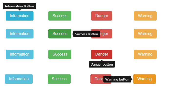
The core principle behind CSS tooltips is simplicity. Typically, a tooltip is a small rectangular or speech-bubble-shaped box that appears when a user interacts with a specific UI element. To create a basic tooltip using CSS, you must use the hover pseudo-class and absolute positioning. In its most basic form, a tooltip consists of an element (like a button, link, or icon) and a tooltip box that appears when the user hovers over the element. This tooltip box is typically hidden by default and becomes visible only when the user hovers over the designated element. The visibility property or opacity property can be used to control the visibility of the tooltip. A very simple tooltip could involve setting the tooltip text as a span or div positioned near the target element. By default, the tooltip is hidden, and once the target element is hovered over, it becomes visible with a small delay to allow the user to notice the information.
Unlock your potential in Web Development with this Web Developer Certification Courses .
Positioning Tooltips
One essential aspect of creating a successful tooltip is positioning. Tooltips need to appear in a way that doesn’t obscure the UI elements the user is interacting with while still being noticeable and easy to read. In CSS, positioning is controlled using properties such as position, top, right, bottom, left, and transform. For example, most tooltips are positioned relative to the element they describe, typically appearing above, below, or beside it. The Downloading Node.js and NPM relative style is commonly applied to the target element, while the tooltip is positioned with position: absolute relative to the target. Depending on the design and user interface, tooltips can be placed with different alignment options, like top-right, bottom-left, or centered. It’s essential to ensure that the tooltip does not overlap or get cut off when a user hovers over an element at the edge of the viewport. This means you’ll need to account for screen edges or use JavaScript to dynamically adjust the tooltip position if it would otherwise be cut off.
Making Tooltips Responsive
Responsiveness is crucial when building any web feature, and tooltips are no exception. Tooltips must adapt to various screen sizes, from desktop to mobile devices. On smaller screens, the space available is limited, and tooltips intended to appear on hover might need to change behavior to suit mobile touch interactions. On mobile, hover-based interactions don’t work either, so tooltips must be triggered by tap or click events. A common approach is to DevOps vs Full Stack the tooltip when the user taps on an element, then remove it after a short delay or when they tap elsewhere. For desktop devices, tooltips can appear instantly on hover, but on mobile, they should be triggered on touch, and larger clickable areas (like buttons) might be necessary to accommodate fingers.Additionally, the font sizes, padding, and margins used in the tooltip should be scalable based on screen size, using relative units such as em, rem, or percentages instead of fixed units like px.
Learn how to manage and deploy Web Development Services by joining this Web Developer Certification Courses today.
CSS Transitions for Smooth Tooltip Animations
- Adding animations to tooltips can significantly enhance the user experience by providing smooth transitions between the hidden and visible states. Rather than simply showing and hiding a tooltip abruptly, you can use CSS transitions to animate its appearance. This can make the interface feel more polished and responsive.
- You can use the transition property on attributes like opacity, visibility, or transform to add a transition effect to a tooltip. For instance, when the user hovers over a button, the tooltip could smoothly fade in using opacity and fade out when the hover ends.
- Incorporating transition delays can also enhance the Dynamic Web Applications. This ensures that the tooltip doesn’t appear or disappear too quickly, giving users time to notice it.
- Additionally, subtle animations like sliding or fading effects can make the tooltip more engaging.
- For example, a tooltip might slide from the top of the screen or fade in from transparent to fully visible, creating a more visually appealing interaction.
Customizing Tooltip Styles
- Tooltips don’t have to look plain or generic; they can be highly customized to fit the style of the website or application. Customizing the appearance of the tooltip typically involves adjusting the background color, font size, border radius, shadow effects, and other visual properties.
- For instance, you can change the tooltip’s background color to make Web Developer Certification Courses stand out more. Common choices include semi-transparent backgrounds or slightly muted tones, which ensure the tooltip is readable but doesn’t overwhelm the user interface. Text color, padding, and margins can also be customized to make the tooltip visually appealing.
- Additionally, you can add a small arrow or pointer to the tooltip to indicate its relationship with the target element. This can be done using the:: after pseudo-element in CSS to create a triangular shape. This arrow can point to the top, bottom, left, or right of the tooltip, depending on the position of the tooltip relative to the target element.
- Borders, shadows, and rounded corners are often used to soften the appearance of tooltips and blend them well with the website’s overall design. Shadows can add depth to tooltips, making them stand out more clearly against the background.
Handling Tooltip Visibility with CSS
- Managing a tooltip’s visibility is a critical part of its design. A tooltip should only be visible when necessary and not overlap other essential elements. In CSS, the visibility and opacity properties are often used to handle this.
- Visibility Property property can be set to either visible or hidden. However, the tooltip will still occupy space in the layout even when hidden, which may affect the design of other elements.
- Opacity Property property is more commonly used in tooltip animations. When the opacity is set to 0, the tooltip is Full Stack Developer Resume, and when set to 1, it is visible. The key advantage of using opacity is that the tooltip doesn’t occupy space when invisible.
- An important consideration when working with visibility is ensuring that the tooltip appears and disappears smoothly. Using CSS transitions on opacity or visibility will help make this change seamless.
- Additionally, tooltips should not be visible indefinitely after the hover ends. You can use transitions combined with visibility: hidden or opacity: 0 after a particular time or upon mouse-out events to hide the tooltip gracefully.
Boost your career in tech by enrolling in this Web Developer Certification Course today.
JavaScript Enhancements for Tooltips
While CSS is excellent for creating basic tooltips, JavaScript can be used to enhance the functionality of tooltips, especially when dealing with more complex behaviors. For example, JavaScript can help, Show tooltips on focus events, which are essential for accessibility (tooltips should be accessible to users who rely on keyboard navigation). Provide the ability to create dynamic tooltips to change content based on user interaction, such as displaying additional information when clicking on an element. Manage tooltip placement dynamically to prevent the tooltip from Angularjs vs Jquery off-screen or blocking important content. JavaScript can also add interactivity, such as opening or closing the tooltip on click or adding custom delay timings for the tooltip’s appearance or disappearance.
Boost your chances in Web Development interviews by checking out our blog on Web Development Interview Questions and Answers!
Best Practices and Accessibility
When implementing tooltips, it’s essential to consider accessibility to ensure that all users, including those with disabilities, can benefit. Tooltips can enhance the user experience but can pose challenges if not correctly implemented.
- Use aria-label or aria-described by attributes: This allows screen readers to associate the tooltip content with the target element, making it accessible to users who rely on assistive technology.
- Ensure keyboard navigation: Node.js Developer should be accessible when using the keyboard. For instance, users should be able to access tooltips with the Tab key and close them using the Escape key.
- Avoid relying solely on hover: Hover may not work on mobile devices or with users who have motor impairments. Consider adding support for touch—or click-based interactions.
- Provide a delay: Tooltips should not appear instantly, which can create a disruptive experience. A slight delay ensures that tooltips don’t appear when users move their mouse across the screen.
- Use a timeout for disappearing tooltips: Ensure tooltips disappear in a reasonable time after the user stops interacting with the element, reducing clutter on the screen.
Conclusion
CTooltips are a valuable feature that can significantly improve user experience by providing additional context or information in a minimalistic and non-intrusive manner. Web developers can create functional and aesthetically Web Designing Training tooltips by leveraging CSS for basic functionality, positioning, and animations and incorporating JavaScript for advanced behaviors and dynamic content. Furthermore, by adhering to best practices and accessibility guidelines, tooltips can become a genuinely inclusive feature that benefits all users, regardless of how they interact with the interface.