Last updated on 06th May 2025| 8559
- Introduction
- Understanding the Importance of Interactive Dashboards
- Know Your Audience and Their Needs
- Utilize Salesforce’s Standard and Custom Reports
- Choosing the Right Visualization Type
- Incorporating Filters and Drill-downs for Interactivity
- Using Dynamic Dashboards for Personalized Views
- Optimize Dashboard Performance
- Incorporating Alerts and Notifications
- Incorporating Alerts and Notifications
- Conclusion
Excited to Obtaining Your Salesforce Certificate? View The Salesforce Training Offered By ACTE Right Now!
Introduction
In today’s fast-paced business environment, data is a crucial asset. Companies need to access real-time insights that can help them make decisions, track performance, and understand trends. Salesforce, as a leading customer relationship management (CRM) platform, offers a robust solution for handling and visualizing data. One of its most powerful features is its ability to create interactive dashboards that provide users with dynamic insights at their fingertips. An interactive dashboard in Salesforce isn’t just a visual representation of data; it is a tool that empowers users to engage with data, drill down into the details, and filter information based on their needs. Through Salesforce Training, users can unlock the full potential of these dashboards, gaining the skills to customize views, analyze trends, and make data-driven decisions effectively. By leveraging the power of these interactive elements, businesses can significantly improve their decision-making processes and overall productivity. In this article, we’ll explore best practices for creating effective, interactive dashboards in Salesforce. These practices are designed to ensure that your dashboards not only look great but also deliver valuable insights that help drive better business outcomes.
Understanding the Importance of Interactive Dashboards
Before diving into the creation process, it’s essential to understand why interactive dashboards are critical to modern business operations. Interactive dashboards allow users to access data in real time and make on-the-fly decisions by interacting with the information. Unlike static reports, which provide a snapshot of data at a particular moment, interactive dashboards offer an evolving and dynamic representation of Business Analysis performance.
Here are some key benefits of interactive dashboards:
- Real-Time Insights: Data is constantly updated, allowing users to react to changes as they happen.
- Customization: Dashboards can be personalized to show metrics that are most relevant to individual roles, improving user engagement and decision-making.
- Data Exploration: Users can drill into individual data points to uncover deeper insights and trends, rather than being limited to high-level metrics.
When designed well, interactive dashboards make it easier to monitor KPIs, understand performance, and identify growth opportunities.
Know Your Audience and Their Needs
A critical factor in creating effective interactive dashboards is understanding the audience. Different users have different needs, and a one-size-fits-all approach rarely works. Salesforce provides several tools that allow dashboards to be customized for specific user profiles, roles, and permission sets.
Key considerations include:
- User Role: Different users in your organization will have different priorities. A salesperson will need to monitor sales figures, opportunities, and lead conversion rates, while a manager may be focused on tracking team performance and overall Jenkins Pipeline health.
- Data Relevance: Make sure the data presented in the dashboard is relevant to the user. For example, a customer service representative might benefit from a dashboard that focuses on case resolution times and customer satisfaction scores.
- Decision-Making Process: Consider how the user will interact with the data. Does the user need to explore the data more deeply by drilling down into specific metrics, or is a high-level overview sufficient?.
By aligning the dashboard’s design with the user’s role and data needs, you ensure that the dashboard is not only useful but also easy to navigate and understand.

Utilize Salesforce’s Standard and Custom Reports
Salesforce dashboards rely heavily on reports to pull in data. It’s crucial to understand the types of reports available in Salesforce and how to use them effectively in your dashboards.
- Standard Reports in Salesforce provide a suite of pre-built reports that cater to common business needs. These reports are often sufficient for many users, especially when they need basic metrics like sales performance, customer engagement, or case resolution times. A Salesforce Developer can leverage these standard reports to efficiently build dashboards that meet user requirements. They can be used directly in your dashboards, saving you time and ensuring consistency across reports.
- Custom Reports for more complex or specific needs, creating custom reports is the way to go. Salesforce allows you to filter, group, and aggregate data based on your business requirements. You can use custom reports to display key metrics that are most relevant to your organization’s objectives.
When designing interactive dashboards, ensure that the reports feeding the dashboard are optimized and focused. Having clear, well-structured reports is key to ensuring the dashboard’s effectiveness.
Excited to Obtaining Your Salesforce Certificate? View The Salesforce Training Offered By ACTE Right Now!
Choosing the Right Visualization Type
Visualization is crucial to ensuring that your data is easily understood. Salesforce offers a variety of visualization options, but choosing the right one is essential to conveying your message.
Here are some of the most popular chart types and when to use them:
- Bar and Line Charts: These are ideal for visualizing changes over time or comparing quantities across categories. For example, use a line chart to show sales performance over months or a bar chart to compare sales numbers across different regions.
- Pie and Donut Charts: These Charts and tables charts are best for showing how different parts contribute to a whole. For example, a pie chart could be used to show the distribution of sales by product category.
- Funnel Charts: A funnel chart is perfect for visualizing processes that have a series of steps, such as a sales pipeline. It shows how many leads, opportunities, or deals progress through various stages, highlighting conversion rates at each step.
- Gauge Charts: If you’re tracking progress towards a goal, gauge charts are a great option. For instance, they can show how close you are to achieving a sales target.
By choosing the right chart type, you ensure that the data is not only presented clearly but also provides the insights users are looking for. Avoid cluttering the dashboard with too many different visualizations; instead, prioritize the key metrics that will help the user make decisions.
Thinking About Earning a Master’s Degree in Salesforce? Enroll For Salesforce Masters Program by Microsoft Today!
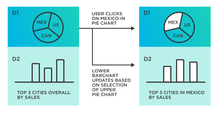
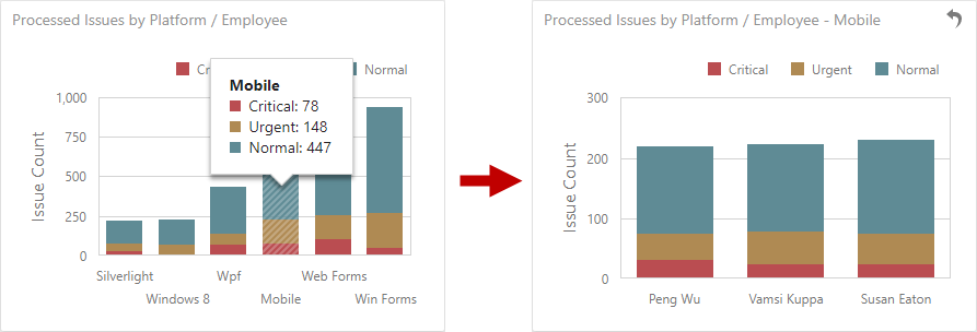
Incorporating Filters and Drill-downs for Interactivity
One of the key features that sets interactive dashboards apart is their ability to allow users to interact with the data. Filters and drill-downs are essential components that make dashboards more dynamic and useful.
- Filters: Filters allow users to refine the data displayed on the dashboard. They can select specific criteria, such as date ranges, regions, products, or customer segments, to narrow the data down. Filters make dashboards more flexible and adaptable to different users’ needs. For instance, a sales manager might use a filter to view only opportunities in a particular region, while an executive might prefer a broader, company-wide view.
- Drill-downs: Drill-down functionality allows users to click on a chart or metric to see more detailed data. For example, a user might click on a bar chart showing regional sales numbers to see the underlying data for each salesperson or opportunity. Drill-downs help users go beyond the high-level insights and understand the specifics that drive the numbers.
Adding both filters and drill-downs to your dashboards ensures that users can explore the data on their terms, making the dashboard much more interactive and valuable. Salesforce Training enhances this experience by teaching users how to effectively use these features to gain deeper insights and make informed decisions.
Using Dynamic Dashboards for Personalized Views
Salesforce’s Dynamic Dashboards feature allows you to tailor dashboards to individual users. This is especially helpful in large organizations where different users need to see different data based on their roles and permissions.
Key benefits of dynamic dashboards include:
- Personalization: Dynamic dashboards allow users to see data that’s relevant to their role without needing to create multiple separate dashboards. For example, a regional sales manager might see data specific to their region, while an executive might see a global view of performance.
- Role-Based Customization: Users with different roles in the organization can have different views of the same data. You can configure dynamic dashboards to display personalized metrics based on a user’s profile, ensuring they only see the data they are authorized to view.
Using dynamic dashboards helps increase user engagement and ensures that data is presented in a way that is relevant to each individual.
Preparing for Your Salesforce Interview? Check Out Our Blog on Salesforce Interview Questions & Answer
Optimize Dashboard Performance
As dashboards become more complex and data-heavy, performance can become an issue. Slow-loading dashboards can significantly impact user experience and reduce productivity. Here are some best practices to optimize performance:
- Limit the Number of Components: Keep your dashboard focused on the most important metrics. Too many charts, graphs, or tables can overwhelm users and slow download times.
- Use Report Filters: Use filters in your underlying reports to limit the data retrieved by the dashboard. For example, filter out irrelevant data, such as historical information that’s not required for the current Big Data Analytics.
- Optimize Report Queries: Ensure that your reports are designed efficiently. Complex queries or reports with large datasets can slow down performance. Use indexed fields and avoid unnecessary joins in the report queries.
- Consider Refresh Intervals: If real-time data is not crucial, consider scheduling periodic updates for your dashboard to avoid performance issues. For instance, refreshing the data every hour or once a day can significantly improve load time.
By optimizing your dashboard, you ensure a smooth user experience, which is critical for user adoption and engagement.
Incorporating Alerts and Notifications
Adding alerts and notifications to your Salesforce dashboard can enhance its interactivity. These features allow users to be immediately notified of important events or changes in the data, making it easier to act quickly.
- Set Up Alerts: You can configure alerts based on specific conditions, such as when a sales target is reached or when a customer service case exceeds a certain threshold. These alerts ensure that users are promptly informed about critical changes that require action.
- Chatter Integration: Salesforce allows you to integrate Chatter with your dashboards. Users can receive alerts via Chatter posts, allowing teams to collaborate in real-time when critical metrics change.
Incorporating alerts and notifications ensures that users stay up-to-date with the data that matters most, driving proactive decision-making.
Testing and Iterating the Dashboard
After building your interactive dashboard, it’s essential to test it thoroughly. User feedback and testing are key components of ensuring that your dashboard meets the needs of your users.
Key steps for testing include:
- User Feedback: Share the dashboard with end-users and gather their feedback. Ask them whether the data is relevant, whether the layout is intuitive, and whether the filters and drill-downs are easy to use.
- Functionality Testing: Ensure all interactive elements, such as filters and drill-downs, work as expected. Test different use cases to identify any issues.
- Performance Testing: Test the dashboard’s load time and responsiveness. Identify any areas where performance could be improved.
Iterating based on feedback will help refine the dashboard and ensure it delivers real value to users. Salesforce Training plays a crucial role in this process, equipping users with the knowledge to provide insightful feedback and optimize the dashboard for better performance and usability.
Conclusion
Interactive dashboards in Salesforce are an essential tool for gaining real-time insights, making data-driven decisions, and improving productivity across your organization. By understanding your audience’s needs, utilizing the right reports and visualizations, and incorporating dynamic elements like filters and drill-downs, you can create dashboards that are not only informative but also actionable. Following best practices like optimizing performance, incorporating alerts, and continuously iterating based on user feedback ensures that your dashboard remains effective and relevant. When done right, interactive dashboards in Salesforce empower users to explore and analyze data in ways that lead to smarter decisions and better business outcomes. By mastering these best practices, you can leverage the full potential of Salesforce’s dashboard capabilities to drive success across your organization.