
 LMS
LMS
Last updated on 20th Jul 2026| 4847

- Introduction to Power BI
- Getting Started with Power BI Desktop
- Connecting and Transforming Data with Power Query
- Data Modeling and Relationships
- Creating Interactive Reports
- Building Powerful Dashboards
- Data Visualization Best Practices
- DAX Functions and Calculated Measures
- Publishing, Sharing, and Power BI Service
- Conclusion and Next Steps in Power BI
Introduction to Power BI
Power BI is a leading business intelligence and data visualization platform developed by Microsoft that helps organizations convert raw data into meaningful insights. It enables users to collect data from multiple sources, transform it into a structured format, analyze trends, and create visually appealing dashboards and reports. Power BI supports real-time analytics, allowing businesses to monitor key performance indicators (KPIs), track operational performance, and make data-driven decisions with confidence. Its user-friendly interface makes it accessible for beginners, while advanced features such as DAX, Power Query, Power BI Reports, Power BI Desktop, AI-powered analytics, Microsoft Power BI and custom visualizations cater to experienced data professionals. Organizations across industries such as healthcare, finance, retail, manufacturing, education, and IT rely on Power BI to improve reporting, streamline business operations, and gain valuable insights. Whether you are an analyst, developer, manager, or business user, learning Power BI through Data Science Training opens up numerous career opportunities in data analytics and business intelligence.
Getting Started with Power BI Desktop
Power BI Desktop is the primary development environment used to build reports, dashboards, and data models. It is a free application that provides all the essential tools required to import, transform, analyze, Power BI Reports, and visualize data. Users can connect to hundreds of data sources, including Microsoft Excel, SQL Server, Oracle, MySQL, Azure services, SharePoint, Salesforce, Google Analytics, and cloud-based databases. The application consists of three main views: Report View for designing visualizations, Data View for examining imported datasets, Microsoft Power BI and Model View for creating relationships between tables. Users can customize charts, apply filters, create slicers, add conditional formatting, and build interactive reports without extensive programming knowledge. Since Power BI is one of the most in-demand analytics tools, learners preparing for internships can also explore the Data Science Internship Complete Tutorial. After creating reports, they can publish them to the Power BI Service for online access, collaboration, scheduled data refreshes, and secure sharing with teams and stakeholders.
Get Your Data Science Certification by Learning from Industry-Leading Experts and Advancing Your Career with ACTE’s Data Science Course.
Connecting and Transforming Data with Power Query
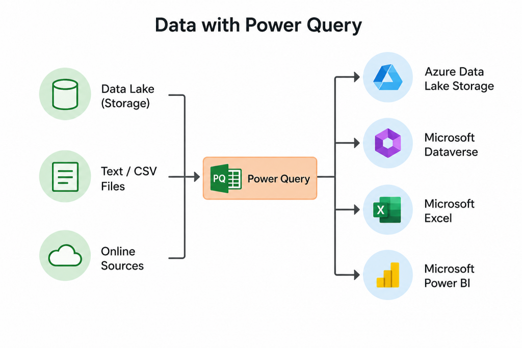
Power Query is Power BI’s powerful data preparation and transformation engine that helps users clean, reshape, and organize data before analysis. It allows users to connect to various structured and unstructured data sources, including spreadsheets, databases, Microsoft Power BI, web pages, APIs, cloud platforms, and enterprise applications. With its intuitive interface, users can remove duplicate records, handle missing values, filter unnecessary information, split and merge columns and perform advanced transformations without writing complex code.
Data Modeling and Relationships
Data modeling is one of the most important aspects of Power BI because it determines how efficiently reports perform and how accurately data is analyzed. A well-designed data model connects multiple tables using relationships based on common fields, enabling seamless analysis across different datasets. Power BI supports one-to-one, one-to-many, and many-to-many relationships, allowing users to build complex business models with ease. Users can create calculated columns, measures, and calculated tables using DAX (Data Analysis Expressions) to perform advanced calculations such as year-over-year growth, running totals, profit margins, Microsoft Power BI, and custom KPIs. Professionals looking to strengthen these business intelligence and analytical skills can benefit from Data Science Training, which covers data modeling, visualization, and advanced analytics techniques. Proper data modeling minimizes redundancy, improves report performance, enhances query efficiency, and ensures accurate filtering across visualizations. A strong data model serves as the foundation for scalable, high-performing business intelligence solutions that support detailed analysis and executive reporting.

Creating Interactive Reports
Power BI enables users to create highly interactive and visually engaging reports that make complex data easier to understand. It offers a rich collection of built-in visualizations, including bar charts, column charts, line graphs, pie charts, scatter plots, maps, gauges, KPIs, cards, tables, matrices, treemaps, and waterfall charts. Users can customize colors, themes, labels, tooltips, and formatting options to create professional-quality reports. Interactive features such as slicers, filters, drill-down, drill-through, bookmarks, cross-filtering, and cross-highlighting allow users to explore data from different perspectives with just a few clicks. Those interested in expanding their data visualization skills can also explore the Ultimate Tableau Tutorial. Reports can include multiple pages, custom navigation buttons, and dynamic visuals that respond instantly to user selections. Once published to the Power BI Service, reports can be securely shared with colleagues, embedded into websites or applications, scheduled for automatic data refreshes, and accessed from desktop, web, or mobile devices. These capabilities make Power BI an ideal solution for organizations seeking powerful, interactive, and real-time business reporting.

Get JOB Oriented Data Science Training for Beginners By MNC Experts
- Instructor-led Sessions
- Real-life Case Studies
- Assignments
Building Powerful Dashboards
- Understanding Power BI Dashboards: Power BI Dashboards provide a centralized and interactive view of important business metrics by combining multiple data visualizations into a single interface. They help users monitor performance, analyze trends, and make data-driven decisions effectively.
- Pinning Visuals to Dashboards: Pinning visuals allows users to add charts, graphs, tables, KPIs, and other report elements to dashboards. This helps create personalized business views and enables stakeholders to quickly access critical insights.
- Using Tiles and KPI Cards: Power BI dashboard tiles, KPI cards, gauges, and scorecards help display key performance indicators clearly. These elements allow businesses to track goals, measure progress, and evaluate performance efficiently.
- Configuring Real-Time Dashboards: Real-Time Dashboards in Power BI enable users to monitor live data streams from connected sources. They are widely used for operational monitoring, instant reporting, and quick decision-making in dynamic business environments.
- Customizing Dashboard Layouts: Customizing dashboard layouts helps organize visuals, resize components, and arrange dashboard elements for better readability. Effective dashboard design improves user experience and supports executive-level reporting. Learners can apply these visualization techniques while working through the Google Colab Tutorial to present project insights more effectively.
Want to Master Data Science? Explore the Data Science Master Program Offered at ACTE Today!
Data Visualization Best Practices
- Choosing the Right Chart Type: Selecting the appropriate chart type is essential for effective data representation. Power BI users can utilize bar charts, line charts, pie charts, maps, scatter plots, and tables to present insights clearly and support better decision-making.
- Applying Consistent Formatting: Consistent formatting improves the overall appearance and readability of Power BI reports. Using standardized fonts, colors, themes, labels, and legends helps create professional dashboards and visually appealing data presentations.
- Using Filters and Slicers Effectively: Filters and slicers allow users to interact with reports and analyze specific data segments dynamically. Proper implementation of filters improves data exploration while maintaining a simple and user-friendly reporting experience.
- Improving Report Performance: Optimizing Power BI reports involves reducing unnecessary calculations, limiting complex visuals, and improving data models. Performance enhancement ensures faster report loading and provides a smooth user experience.
- Designing User-Friendly Reports: Creating intuitive reports with proper navigation, drill-through options, tooltips, and bookmarks helps users understand data easily. Professionals looking to strengthen these visualization and analytics skills can benefit from Data Science Training. Effective report design improves usability and supports efficient business analysis.
Want to Learn About Data Science? Explore Our Data Science Interview Questions and Answers Featuring the Most Frequently Asked Questions in Job Interviews.
DAX Functions and Calculated Measures
- Introduction to DAX: Data Analysis Expressions (DAX) is a powerful formula language used in Power BI for performing advanced calculations, data analysis, and creating meaningful insights from business data.
- Creating Calculated Columns: Calculated Columns in Power BI help users derive new values from existing datasets by applying DAX formulas. They enhance data models by adding customized fields required for analysis and reporting.
- Building Measures: Measures are reusable calculations created using DAX to perform dynamic analysis. They are widely used for calculating totals, averages, percentages, growth rates, and key business performance indicators.
- Time Intelligence Functions: Time Intelligence functions such as TOTALYTD, SAMEPERIODLASTYEAR, DATEADD, and PARALLELPERIOD help analyze time-based data. These functions support trend analysis, year-over-year comparisons, and business performance tracking.
- Advanced DAX Functions: Advanced DAX functions including CALCULATE, FILTER, ALL, RELATED, LOOKUPVALUE, RANKX, and SWITCH enable users to handle complex calculations, create dynamic reports, and solve real-world business analytics challenges. To strengthen your analytical foundation alongside Power BI, you can also explore the Machine Learning Basics Tutorial for Data Science Interns.
Publishing, Sharing, and Power BI Service
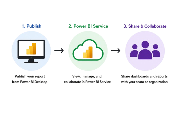
- Publishing Reports to Power BI Service : Publishing Power BI Desktop reports to the Power BI Service enables users to upload reports online for easy access, collaboration, and sharing. It helps organizations distribute interactive dashboards and business insights across teams.
- Creating and Managing Workspaces: Power BI Workspaces help organize reports, dashboards, datasets, and applications in a centralized environment. They support team collaboration, content management, and efficient control of business analytics resources.
- Sharing Reports and Dashboards: Sharing reports and dashboards in Power BI Service allows users to securely provide data insights to colleagues, teams, and external users. It improves collaboration and supports effective decision-making across organizations. These published dashboards can also strengthen a professional portfolio, making the How to Build a Data Science Internship Portfolio a valuable resource for aspiring data professionals.
- Configuring Scheduled Data Refresh: Scheduled Data Refresh in Power BI ensures reports display the latest business information by automatically updating datasets from connected data sources. This helps maintain accurate and real-time reporting.
- Managing Security and Permissions: Power BI security features such as Row-Level Security (RLS), user roles, permissions, and governance practices help protect sensitive business data and ensure authorized access to reports and dashboards.
Conclusion and Next Steps in Power BI
Power BI is a comprehensive business intelligence and data visualization platform that empowers organizations to transform raw data into meaningful insights through interactive dashboards, reports, and advanced analytics. Throughout this tutorial, you have explored the core concepts of Power BI, including connecting to multiple data sources, transforming data using Power Query, building efficient data models, creating interactive reports, designing powerful dashboards, implementing DAX calculations, and publishing reports through the Power BI Service. These foundational skills enable users to analyze business performance, identify trends, monitor key performance indicators (KPIs), and support informed decision-making across various industries. As you continue your Power BI learning journey, focus on mastering advanced DAX functions, optimizing data models for better performance, implementing Row-Level Security (RLS), creating paginated reports, and integrating Power BI with Microsoft Fabric, Azure, SQL Server, and other enterprise applications. Learners who want to build a strong career in analytics and business intelligence can further strengthen their expertise through Data Science Training, which covers practical data analysis, visualization, and machine learning concepts. Practice by building real-world dashboards using sales, finance, HR, healthcare, and marketing datasets to strengthen your analytical skills. Earning Microsoft Power BI certifications and working on hands-on projects will further enhance your expertise and improve your career prospects as a Business Intelligence Developer, Data Analyst, Power BI Developer, Business Analyst, or Data Visualization Specialist. With continuous practice and real-world experience, Power BI can become a valuable tool for delivering data-driven insights and driving business success.