 LMS
LMS
Last updated on 20th May 2025| 9799
 (5.0) | 25693 Ratings
E-mail this post
(5.0) | 25693 Ratings
E-mail this post
- Introduction to Flexbox
- Flex Container and Flex Items
- Flex Direction Property
- Justify Content Property in Flexbox
- Align Items and Align Self Properties
- Flex Grow, Shrink, and Basis
- Common Flexbox Layout Patterns
- Best Practices for Using Flexbox
- Flexbox vs. Grid Layout
Introduction to CSS Flexbox
Flexbox, or the Flexible Box Layout, is a CSS layout model that provides a more efficient and predictable way of arranging and distributing space among elements within a container, even when their size is unknown or dynamic. Unlike traditional methods like floats or inline-blocks, Flexbox is designed for one-dimensional layouts, making Web Designing and Development Courses easier to align and distribute items along either a row or column. Flexbox simplifies complex layouts, allowing developers to create responsive and flexible web designs with minimal code. Flexbox consists of a flex container and its flex items. The container is the parent element that holds all the child elements (flex items), and the layout is defined using a set of flex properties applied to both the container and its items. One of the main advantages of Common Flexbox is its ability to automatically adjust the layout of items based on available space, which makes navigation bar an essential tool for responsive web design.
Flex Container and Flex Items
In Flexbox, the flex container is the element that holds all the flex items. The flex container has a set of properties that control the layout of its children (the flex items). By applying display: flex to the parent element, it turns into a flex container. This action enables the flex items inside it to follow a set of rules designed for distributing space and aligning items. The flex items are the children of the flex container. For Loop in React Items are the elements inside the container that will be aligned and adjusted using Flexbox properties. Once an element becomes a flex item, it can be controlled with properties such as flex-grow, flex-shrink, and flex-basis, which determine how the items grow, shrink, or maintain their size in the flex container.
Learn the fundamentals of Web Development with this Web Developer Certification Courses .
Flex Direction Property
The flex-direction property in Flexbox is used to define the direction in which the flex items are placed within the flex container. It determines whether the flex items will be arranged in rows or columns. The possible values for flex-direction are:
- row: This is the default value. It arranges the items in a horizontal row, from left to right in left-to-right languages.
- row-reverse: This reverses the order of items in the row, arranging them from right to left.
- column: Mastering CSS Tooltips arranges the items vertically, from top to bottom.
- column-reverse: This reverses the order of items in the column, arranging them from bottom to top.
- flex-start: This is the default value. Install React on Windows aligns the items to the start of the flex container (left for row, top for column).
- flex-end: Aligns the items to the end of the flex container (right for row, bottom for column).
- center: Centers the flex items within the container, both horizontally and vertically.
- space-between: Distributes the items evenly, with the first item at the start and the last item at the end of the container, and equal space between the items.
- space-around: Distributes the items evenly, with equal space around each item.
- space-evenly: Distributes the items evenly with equal space between them, including the space before the first item and after the last item.
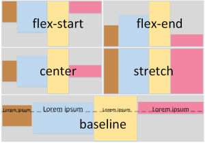
- align-items: This property aligns all the flex items within the container along the cross axis.
- stretch: The default value. Items are stretched to fill the container.
- flex-start: Aligns the items to the start of the cross axis.
- flex-end: Aligns the items to the end of the cross axis.
- center: Centers the items along the cross axis.
- baseline: Aligns the items to their baseline, ensuring that text lines up.
- align-self: This property allows individual flex items to override the align-items value and specify their own aligning items along the cross axis. It is applied to a single item, unlike align-items, which affects all items in the flex container. It accepts the same values as align-items.
- flex-grow: This property determines how much a flex item will grow relative to other items when there is extra space in the container. The default value is 0, meaning the item will not grow. If an item has flex-grow: 1, Map Function in React Js will take up the remaining space after the other items have been allocated their space.
- flex-shrink: This property controls how much a flex item will shrink when the container is too small to fit all items. The default value is 1, meaning the item will shrink proportionally if necessary. If you set flex-shrink: 0, the item will not shrink, even if the container is too small.
- flex-basis: This property defines the initial size of a flex item before any growing or shrinking takes place. navigation bar can be set to any valid length (px, %, em, etc.) or to auto, which means the item’s size will be determined by its content.
- Start with a Flex Container: Always define a parent element as a flex container by using display flex.
- Use Flexbox for Simple Layouts: Flexbox is ideal for simpler, one-dimensional layouts. For complex, two-dimensional layouts, consider using CSS Grid.
- Avoid Overusing order: Use the order property sparingly, as React Bootstrap Navbar can make the Flexible Box Layout harder to maintain. Stick to the natural order whenever possible.
- Use flex-wrap for Responsiveness: To ensure that your layout adapts to different screen sizes, use flex-wrap: wrap to allow items to move to the next line when necessary.
- Leverage align-items and justify-content: These properties are essential for aligning items and ensuring that they are evenly spaced in the container.
- Test Responsiveness: Always test your layout across different devices to ensure it behaves as expected. Flexbox is designed for flexibility, but you should still verify that the design works on all screen sizes.
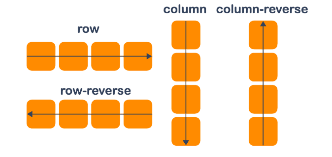
By using flex-direction, developers can control the main axis of the flex container and how the flex items are arranged along it. For example, setting flex-direction: column will stack the flex items vertically, while flex-direction: row arranges them horizontally. The order property in Flexbox allows developers to change the visual order of flex items without altering their order in the HTML document. By default, the order of items is 0, but you can assign a positive or negative integer to change the visual sequence. This can be useful when you want to reorder items for responsive designs or specific Flexible Box Layouts. In this case, the visual order will be: item2, item1, item3, even though they appear in this order in the HTML code.
Dive into Web Development by enrolling in this Web Developer Certification Courses today.
Justify Content Property in Flexbox
The justify-content property in Flexbox is used to align the flex items along the main axis of the flex container. The main axis is determined by the flex-direction property, so if the direction is row, the main axis is horizontal, and if the direction is column, the main axis is vertical. Using justify-content, you can fine-tune the alignment of items along the main axis, depending on how much space is available in the container. The justify-content property has several values that can be used to control the alignment of flex items:
Align Items and Align Self Properties
The align-items and align-self properties are used to control the alignment of flex items along the cross axis, which is perpendicular to the main axis. Web Developer Certification Courses properties are helpful when the items don’t take up the full space available in the flex container.
Flex Grow, Shrink, and Basis
Flexbox provides three properties—flex-grow, flex-shrink, and flex-basis—to control how CSS Flexbox items behave when the container is resized. These properties help manage the distribution of space among flex items and their ability to adapt to changing screen sizes. Together, these three properties enable Flexible Box Layout and responsive item sizing, ensuring that the layout adapts smoothly to changes in container size.
Get hands-on experience in web technologies by signing up for this Web Developer Certification Course now.
Best Practices for Using Flexbox
Are you getting ready for your Web Development interview? Check out our blog on Web Development Interview Questions and Answers!
Common Flexbox Layout Patterns
Flexbox can be used to create many common layout patterns, such as navigation bar, grids, and sidebars. Some of the most popular patterns include, Centered content Flexbox makes Useful Node Js Libraries easy to center elements both horizontally and vertically within a container, using justify-content: center and align-items: center. Equal-height columns Flexbox allows columns to automatically adjust their height to match the tallest column, eliminating the need for JavaScript or complicated CSS hacks. Responsive grids Flexbox provides a simple way to create grids that adjust based on the screen size, without needing to define specific breakpoints.
Flexbox vs. Grid Layout
While both Flexbox and CSS Grid are powerful layout systems, they serve different purposes. Common Flexbox is ideal for one-dimensional layouts, such as aligning items in a row or column. CSS Flexbox is best used when you have a linear arrangement of elements, such as a navigation bar or a set of buttons. Grid, on the other hand, is designed for two-dimensional layouts. Web Designing Training allows you to create both rows and columns simultaneously, making it more suitable for complex grid-based layouts, like photo galleries or card layouts.