 LMS
LMS
Last updated on 03rd Jul 2025| 10695
 (5.0) | 45654 Ratings
E-mail this post
(5.0) | 45654 Ratings
E-mail this post
- Introduction to React Slick
- Why Use React Slick?
- Installing React Slick
- Basic Slider Setup
- Customizing Sliders
- Adding Arrows and Dots
- Responsive Design in Slick
- Autoplay Settings
- Lazy Loading Images
- Conclusion
Introduction to React Slick
React Slick is a popular carousel component built for React applications, based on the widely used jQuery library “React Slick Carousel.” It offers a simple and flexible way to add image sliders, carousels, and other interactive sliding UI components to React-based websites and apps. Developers often use React Slick when they need an easy-to-integrate, customizable slider that supports advanced features like autoplay, lazy loading, responsive design, and custom navigation arrows. As React is declarative and component-driven, integrating a robust carousel with rich features enhances both UX and developer productivity.React Slick is a React library for creating responsive, custom sliders and carousels. It is a React wrapper for the popular Slick Carousel library, allowing developers to easily add slider functionality to React applications. React Slick is a widely used choice for image carousels, basic slider in React Slick, product showcases, or any content slider of any form with minimal setup due to its functionality, including autoplay, event handling, automatic slide, transitions infinite scrolling, multiple slides, and custom navigation.
Are You Interested in Learning More About Web Developer Certification? Sign Up For Our Web Developer Certification Courses Today!
Why Use React Slick?
React Slick Carousel is preferred for a variety of reasons. First and foremost, it offers extensive functionality with minimal setup. Unlike building a custom carousel from scratch, React Slick comes pre-equipped with useful features like swiping, child elements,infinite scrolling, integrating automatic slide transitions dot indicators, arrows, responsive breakpoints, and more. Its performance is reliable, even when handling dynamic data or large image sets. Another major advantage is that it is built specifically for React, so the syntax and usage align with React’s component model. It also benefits from the wide adoption of the original Slick library, which has been tested and refined over the years, making it a solid choice for production-level applications.
Installing React Slick
To start using React Slick in a project, developers first need to install the necessary packages. React Slick requires two dependencies: the core react-slick package and slick-carousel for the base styles.
Run the following command using npm:
npm install react-slick slick-carousel Or with Yarn: yarn add react-slick slick-carouselAfter installing the packages, include the CSS files from slick-carousel in your project. This can be done by importing them directly in your React component or App file:
- import “slick-carousel/slick/slick.css”;
- import “slick-carousel/slick/slick-theme.css”;
Once installation and import are complete, you’re ready to implement your first slider.

Basic Slider Setup
Creating a basic slider in React Slick,involves importing the Slider component and passing in your content as child elements. Here’s a simple example of a functional image carousel:
- import React from ‘react’;
- import Slider from “react-slick”;
- import “slick-carousel/slick/slick.css”;
- import “slick-carousel/slick/slick-theme.css”;
- const BasicSlider = () => {
- const settings = {
- dots: true,
- infinite: true,
- speed: 500,
- slidesToShow: 1,
- slidesToScroll: 1
- };
- return (
- );
- };
The settings object contains all the configuration needed to run the slider. Each child div inside the Slider component represents a slide.
Excited to Obtaining Your web developer Certificate? View The web developer course Offered By ACTE Right Now!
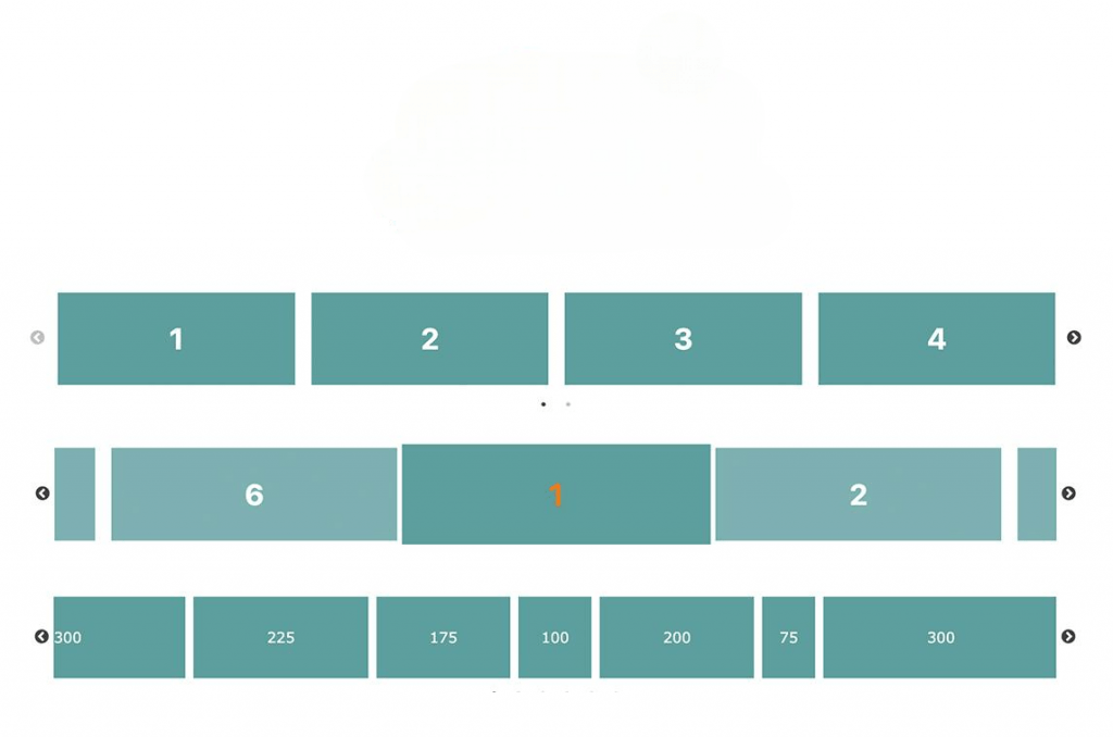
Customizing Sliders
React Slick Carousel allows extensive customization to make image sliders match your design requirements. Some of the customizable options include:
- Infinite: enables infinite scrolling
- SlidesToShow: number of slides to display at once
- SlidesToScroll: number of slides to scroll at a time
- Autoplay: enables automatic slide transitions
- AutoplaySpeed: delay between transitions
- Speed: transition speed in milliseconds
- Fade: enables fade transitions instead of sliding
You can combine multiple properties to fine-tune the slider’s behavior. For example:
- const settings = {
- infinite: false,
- speed: 700,
- slidesToShow: 3,
- slidesToScroll: 2,
- autoplay: true,
- autoplaySpeed: 3000
- };
Adding Arrows and Dots
By default, basic slider in React Slick includes navigation arrows and pagination dots. These can be customized or replaced entirely with custom React components. To use custom arrows:
- function CustomNextArrow(props) {
- const { className, onClick } = props;
- return →;
- }
- function CustomPrevArrow(props) {
- const { className, onClick } = props;
- return ←;
- }
- const settings = {
- nextArrow:
, - prevArrow:
- };
For dots, you can override styles using CSS or customize the rendering through the customPaging option.
Interested in Pursuing web developer certification Program? Enroll For Web developer course Today!
Responsive Design in Slick
React Slick provides built-in support for responsive design using the responsive configuration. This feature allows developers to define different slider settings based on screen width breakpoints. Example:
- const settings = {
- dots: true,
- infinite: true,
- slidesToShow: 4,
- slidesToScroll: 1,
- responsive: [
- {
- breakpoint: 1024,
- settings: {
- slidesToShow: 2,
- slidesToScroll: 1,
- infinite: true,
- dots: true
- }
- },
- {
- breakpoint: 600,
- settings: {
- slidesToShow: 1,
- slidesToScroll: 1
- }
- }
- ]
- };
This ensures optimal viewing and interaction experience across devices—desktops, tablets, and mobile screens.
Autoplay Settings
Enabling autoplay creates a continuously rotating slider. This is ideal for image carousels, hero banners, basic slider in React Slick, event handling and product displays. Use the following options:
- autoplay: true,
- autoplaySpeed: 2000 // milliseconds
This feature increases engagement while maintaining user control and attention.
Lazy Loading Images
Lazy loading is essential for performance, automatic slide transitions, especially when dealing with image-heavy sliders. basic slider in React Slick supports lazy loading with the lazyLoad option:
- lazyLoad: ‘ondemand’
This setting loads slides only when needed, reducing initial load time. The lazy loading modes available are on demand and progressive. It’s a useful feature for e-commerce, media galleries, and any app where performance matters.
Conclusion
React Slick is a versatile and developer-friendly tool for creating responsive, customizable carousels in React applications. From simple sliders to advanced galleries with autoplay, image sliders,lazy loading, child elements and event handling, it provides a wide range of features with minimal setup. The ability to integrate seamlessly with React’s component-based architecture, coupled with its support for custom navigation and responsive design, makes it a go-to solution for front-end developers. Whether you’re building a portfolio, integrating an e-commerce store, or a dynamic marketing site, React Slick carousel can greatly enhance user engagement and UI appeal. With proper configuration and attention to performance, it becomes an essential asset in modern web development.React Slick is an accessible and versatile solution for adding responsive carousels and sliders to React applications. From product showcases to image galleries, its vast array of features, ease of integration, automatic slide transitions, basic slider in React Slick, and flexibility make it ideal for a range of applications. By leveraging the support of Slick Carousel and a React-friendly interface, developers are able to quickly and easily develop sliders that are dynamic, slick, and visually stunning.