 LMS
LMS
Last updated on 16th May 2025| 9349
 (5.0) | 41229 Ratings
E-mail this post
(5.0) | 41229 Ratings
E-mail this post
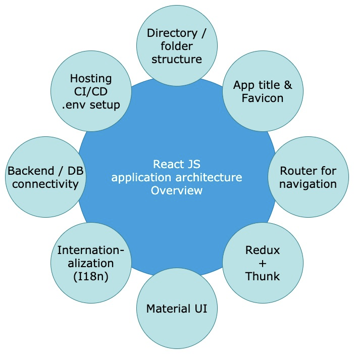
- Introduction to Material UI in React
- Installing and Setting Up Material UI
- Key Components of Material UI
- Customizing Themes in Material UI
- Material UI Grid System
- Form Components in Material UI
- Material UI Icons and Usage
- Building Responsive UIs with Material UI
- Styling with Material UI and CSS-in-JS
- Accessibility Features in Material UI
- Top Methods for Material User Interface Design
- Advanced Material UI Components
Introduction to Material UI in React
Google’s Material Design philosophy is followed by the popular React component library Material UI (MUI). It facilitates developers in making visually appealing, responsive web applications by giving them access to well-designed, pre-styled UI components ,enrolling in Web Designing & Development Courses can help deepen your understanding of these principles. Delivering a uniform user interface that prioritizes accessibility and ease of use while prioritizing the user experience is the fundamental concept underlying Material UI. Material UI components offer many user interface elements, including buttons, forms, tables, and grids. These components are highly adaptable and can be used to develop modern, user-friendly applications quickly. React developers can concentrate on creating the functionality of their applications while keeping a polished and professional appearance thanks to Material UI, which abstracts away a large portion of the UI design complexity. The solution is perfect for developers working on big, complicated projects because it is made to operate flawlessly with React and offers both flexibility and scalability. This guide will explain how to get started with Material UI, explore key components, customize themes, work with responsive layouts, and use advanced features to build high-quality user interfaces.
Installing and Setting Up Material UI
To start using Material UI in a React project, you’ll first need to install it. Here’s how you can get started:
Create a React App: If you don’t already have a React app set up, create one using the following command:
- Install Material UI: To add Material UI to your project, you need to install two main packages:
- @mui/material – This contains the core components.
- @emotion/react and @emotion/styled – These are required for styling and support the CSS-in-JS
- approach used by Material UI.
- Run the following commands in your terminal to install them:
- npm install @mui/material @emotion/react @emotion/styled
Install Material UI Icons (Optional): Material UI provides a collection of icons that can be easily used in your components. Install the icons package with: npm install @mui/icons-material
Start Your App: Once installed, you can start the app with: npm start Now, Material UI is ready to be used in your React project. You can start importing and utilizing its components.
Key Components of Material UI
Material UI offers various components, each with multiple properties and configurations. Here are some of the key elements you’ll use frequently in your projects:
Button:The Button component is a versatile, customizable button element. It supports various types, including text, outlined, and contained buttons. You can easily add colors, icons, and event handlers to buttons.
Example:- import Button
The TextField component creates text input fields. It can include helper text, validation, and various styling options. You can also create multi-line text inputs and customize their appearance with different variants.
Example:- import TextField
The Card component is a container for displaying content in a compact, visually distinct manner. It can be used for product information, user profiles, and other content blocks.
Grid:
Customizing Themes in Material UI
Material UI provides a powerful theme customization system, allowing you to create a consistent look and feel across your application. The theme configuration controls colors, typography, spacing, and component styles.
Creating a Custom Theme: You can create a custom theme using createTheme from Material UI’s theme provider.
Example:- import
- { createTheme, ThemeProvider }
- from ‘
- @mui/material/styles’;
- const theme = createTheme(
- {
- Palette:
- {
- primary:
- {
- main: ‘#1976d2’,
- // Custom color for the primary color
- },
- secondary:
- {
- main:’#d32f2f’,
- // Custom color for the secondary color
- },
- },
- });
- function App()
- {
- Return
- (
- ThemeProvider theme={theme}
- MyComponent
- ThemeProvider
- );
- }
Advance your Web Development career by joining this Web Developer Certification Courses now.
Material UI Grid System
The Material UI Grid system is a powerful and flexible layout tool based on a 12-column structure, designed to help developers build responsive user interfaces that adjust seamlessly across various screen sizes. It provides an intuitive way to arrange content by dividing the layout into columns and rows, making it easy to create consistent and adaptable designs. Understanding the Scope of Web Development can provide valuable context for why tools like Material UI are essential in modern front-end workflows. The core of this system lies in the use of the Grid component from Material UI, which comes in two key roles: containers and items. A Grid with the container prop acts as a wrapper that holds the layout structure, while individual child components with the item prop represent the content blocks placed within this grid. For example, using Grid container spacing={2} allows you to define a grid layout with spacing between items, and each item can be defined like
Form Components in Material UI
Material UI offers a comprehensive set of form components that simplify the process of building interactive, accessible, and responsive forms while enhancing the overall user experience. These components are designed to handle a wide range of use cases, from simple input fields to more complex form controls, making them an essential part of any Material UI-based application. If you’re new to the field, understanding What Is a Web Developer can help clarify how these tools fit into broader development workflows. One of the most frequently used components is the TextField, which serves as a flexible input element. It supports features like labels, different variants, validation states, and helper text. For example, a TextField used for capturing an email address might include an error prop to highlight invalid input and a helperText prop to provide feedback, such as:
Material UI offers a large set of pre-designed icons that you can easily integrate into your application. To use them, you first need to install the. Material UI offers a robust and flexible solution for building responsive user interfaces, making it a preferred choice among developers aiming for seamless cross-device compatibility. One of its most powerful features is the Grid system, which allows you to structure layouts that automatically adapt to various screen sizes. This system is based on a 12-column layout and can be easily customized using props like xs, sm, md, and lg, which represent different viewport widths extra small, small, medium, and large, respectively. For those looking to validate and expand their front-end expertise, earning a Web Developer Certification can be a strategic step forward. These props enable developers to define how much space each element should occupy depending on the screen size, allowing content to rearrange itself fluidly and logically across devices ranging from smartphones and tablets to laptops and large desktop screens. The integration of media queries and breakpoints within the Grid system makes it effortless to fine-tune layouts without writing extensive custom CSS. This significantly reduces development time while ensuring design consistency and responsiveness. In practice, you can create components that span the full width of a mobile screen but only occupy half or a third of the width on larger screens, giving you complete control over the user interface’s behavior. With Material UI, building responsive layouts becomes a more intuitive and streamlined process, empowering developers to deliver high-quality user experiences that feel native and optimized, regardless of the device being used to access the application. Preparing for Web Development interviews? Visit our blog for the best Web Development Interview Questions and Answers! Material UI adopts the CSS-in-JS approach for styling, allowing developers to define styles directly within JavaScript files. This methodology provides flexibility, scoped styles, and theme integration, making it easier to maintain and scale styling across large applications. For developers working with React Material UI these built-in styling tools offer powerful and intuitive ways to build and customize components. Material UI supports several styling solutions, including the use of the sx prop and the styled utility, both of which offer powerful ways to customize the appearance of components. The sx prop is a convenient shorthand that allows you to apply inline styles directly to any Material UI component using a JavaScript object syntax. For example, you can style a button with padding and a background color from the theme using Custom Styled Button. This approach is especially useful for quick styling adjustments or when you need to reference theme values dynamically. For more advanced or reusable styles, Material UI provides the styled function, which lets you create custom-styled components by extending existing ones. This is done by importing styled from @mui/material/styles and passing in the base component along with a style object. For instance, you can create a custom button with specific hover effects like so: const MyButton = styled(Button)({ backgroundColor: ‘#1976d2’, ‘&: hover’: { backgroundColor: ‘#115293’ } });. This technique is ideal for defining consistent and reusable design elements across your application. Together, these styling options make Material UI a robust and versatile framework for building beautifully styled React applications with ease and efficiency.
Material UI places top emphasis on accessibility so that everyone, including those with disabilities, may use its components.
When developing applications using Material UI, adhering to best practices makes your UI effective and user-friendly. Some of the best practices are:
Leverage Material UI’s grid system and breakpoints for flexible layouts.
Material UI provides a rich set of advanced components that enhance user experience by adding interactive, responsive, and highly functional UI elements to your React applications. These components go beyond basic inputs and buttons, offering features that are essential for modern web design and application development. For those looking to build a strong foundation in user interface development, Web Designing Training
can be an excellent resource to complement practical learning. One such component is the Drawer, which serves as a sliding panel that typically appears from the left or right side of the screen. It is commonly used for navigation menus or additional UI options and is especially effective in mobile-friendly layouts. The Drawer component can be configured to be temporary or persistent, and its behavior can be customized based on the application’s requirements. Another essential component is the Snackbar, which displays brief, non-intrusive notifications at the bottom of the screen. Snackbars are useful for informing users of events such as form submissions, saved changes, or errors. They automatically disappear after a short duration, ensuring minimal disruption to the user’s workflow. Dialog components are also a key part of Material UI’s advanced toolkit. Dialogs are modal windows used to display alerts, confirmations, or additional information that requires user interaction before proceeding. They are versatile and support various layouts, buttons, and forms, making them suitable for a wide range of use cases from confirming deletions to collecting input. Another valuable component is Autocomplete, which enhances input fields by providing real-time suggestions as users type. This is particularly useful in search fields, dropdowns, or any area where predictive input improves user efficiency and accuracy. Autocomplete is highly customizable and can be integrated with APIs or local datasets. By mastering these advanced components and understanding how to use them effectively, developers can unlock the full potential of Material UI. This not only accelerates development time but also ensures that applications are both visually appealing and functionally robust, delivering a superior user experience across devices and screen sizes.
Material UI Icons and Usage
Building Responsive UIs with Material UI
Styling with Material UI and CSS-in-JS
The accessibility features of Material UI
Top Methods for Material User Interface Design
Advanced Material UI Components