Last updated on 08th May 2025| 8703
- Introduction
- The Importance of Data Visualization in the Modern World
- The Science Behind Data Visualization
- The Psychology of Data Visualization
- Trending Techniques in Data Visualization
- Key Insights from Industry Leaders
- Challenges in Data Visualization
- Conclusion
Introduction
Science of Data Visualization is more than just a set of charts or graphs; it’s the art and science of translating complex Visualizing data into meaningful visuals. As the amount of data we generate grows exponentially, the ability to efficiently present and interpret that data becomes increasingly important. Whether you are a data scientist, a business executive, or a researcher, understanding how to effectively communicate data visually can significantly enhance decision-making, insight generation, and audience engagement. In Business Analyst Training blog, we will dive into the science behind data visualization, explore trending techniques that are shaping the field, and discuss key insights and challenges associated with creating impactful visual data narratives.
The Importance of Data Visualization in the Modern World
With the vast volumes of data being generated by businesses, governments, and consumers, traditional methods of analyzing data through spreadsheets or raw reports are no longer enough. Visualizing data helps individuals and organizations transform raw numbers into digestible, actionable insights. Ultimately, data visualization is an indispensable tool for any organization looking to unlock the full potential of its Visualizing data. Here’s why data visualization is crucial:
- Simplification of Complex Data: Visualizations simplify large and complex datasets, making them easier to understand at a Root Cause Analysis. Innovative techniques allow viewers to quickly grasp trends, patterns, and outliers.
- Faster Decision-Making: Visualizing data enables faster, more informed decision-making, allowing businesses to react quickly to trends and market shifts.
- Engagement and Storytelling: Well-designed visualizations can tell compelling stories, drawing attention to key insights and creating a more engaging experience for audiences.
- Better Data Communication: Whether for internal teams or external stakeholders, visualizations bridge the gap between technical and non-technical audiences by providing a common language for discussing data.
Gain in-depth knowledge of Business Analyst by joining this Business Analyst Training now.
The Science Behind Data Visualization
Data visualization is rooted in both science and design. From a scientific perspective, the goal of data visualization is to enhance our ability to process and interpret data. Human brains are wired to process visual information much faster than raw text or numbers. This is why data visualization can be such a powerful tool: it taps into cognitive processes to help us absorb information more efficiently. Understanding the science behind data visualization ensures that designs are not only aesthetically pleasing but also optimized for human comprehension. Key scientific principles behind effective data visualization include:
- Visual Perception: Research in visual perception helps us understand how the human eye processes shapes, colors, and patterns. By applying these principles, data visualization can be designed to maximize clarity and reduce cognitive overload.
- Cognitive Load: The design of a visualization must minimize the amount of mental effort required to understand the data. Introduction to SAP- HANA involves choosing the right type of chart, color scheme, and layout to guide the viewer’s understanding.
- Gestalt Principles: These principles focus on how we perceive and organize visual stimuli. By leveraging principles like proximity, similarity, and closure, visualizations can be structured in a way that directs the viewer’s attention to the most important data points.
- Color Theory: Colors can evoke emotions, influence interpretation, and aid in distinguishing between data sets. Using the right color palette ensures that the visualization is both visually appealing and informative.
- Interactive Visualizations: Interactive data visualizations allow users to engage with the data directly, making it possible to explore and manipulate visual information. Users can drill down into specific Business Analyst Training points, filter data, and even change the parameters of the visualization. Increased engagement, personalization, and deeper insights. Interactivity allows users to control the data they see and how they see it. Dashboards in tools like Tableau, Power BI, or custom interactive visualizations built using D3.js.
- Storytelling with Data : Data storytelling combines data visualization with narrative innovative techniques to present data in a compelling and insightful way. The idea is to guide the audience through the data with a clear, structured story that explains trends and patterns while keeping them engaged. Greater audience engagement, clearer insights, and improved decision-making by framing data in a narrative context. Interactive reports where each Data Quality point or Basic Quality Improvement Ishikawa Tools comes with context, such as those produced by The New York Times or The Guardian for major events.
- Heatmaps and Geospatial Data Visualizations: Heatmaps and geospatial visualizations are particularly useful for displaying complex data across geographic regions. Heatmaps visualize data density or intensity using color gradients, making Tableau easy to identify hotspots, trends, or anomalies. Effective for analyzing patterns based on location, density, or frequency. Geographic heat maps that display COVID-19 cases across different regions, or sales Visualizing data by geographical location.
- Data Animation : Animated data visualizations are a creative way to show changes over time. By animating data points, charts, or graphs, these visualizations provide a dynamic representation of trends, helping viewers see how Data Quality evolves. Helps to convey time-dependent changes and makes complex data more digestible by showing movement and transformation. Animated line charts that show stock price movements over time or animated maps showing climate changes.
- Artificial Intelligence in Data Visualization: AI integration is revolutionizing data visualization by enabling automated insights and recommendations. With AI integration , tools can automatically detect patterns, suggest the best visualizations, and even predict future trends based on historical data. Reduces human bias, speeds up the data analysis process, and provides deeper insights that may not be immediately obvious. AI integration analytics tools like Tableau’s Ask Data or Microsoft Power BI’s Quick Insights feature, which offer suggestions and visualizations based on data input.
- Data Overload: Visualizations can become overwhelming when Slowly Changing Dimension and Its Types try to communicate too much information at once. Striking a balance between detail and simplicity is key.
- Bias in Design: Designers must be mindful of how design choices (color, scale, chart type) can influence how data is interpreted, leading to potential bias.
- Data Quality: Poor data quality will always result in misleading visualizations, no matter how well-designed they are. Ensuring clean, accurate data is essential.
Start your journey in Business Analyst by enrolling in this Business Analyst Training .
The Psychology of Data Visualization
The effectiveness of a Science of Data Visualization isn’t just about the data it’s also about how the brain perceives it. Understanding the psychological principles behind how we interpret visual information can help in designing more impactful visualizations. Attention The human eye is naturally drawn to contrast, movement, and areas with higher data density. Designers can use these principles to highlight the most important data points. Memory People tend to remember visual information better than numbers or text. By creating memorable and visually compelling representations, you can help ensure that key insights are retained. Decision-Making Good data visualization aids in decision-making by presenting Upgraded Version of Tableau in ways that are easy to understand, reducing cognitive overload and supporting informed choices. By leveraging Science of Data Visualization psychological insights, designers can create visualizations that are not only accurate but also memorable and actionable.

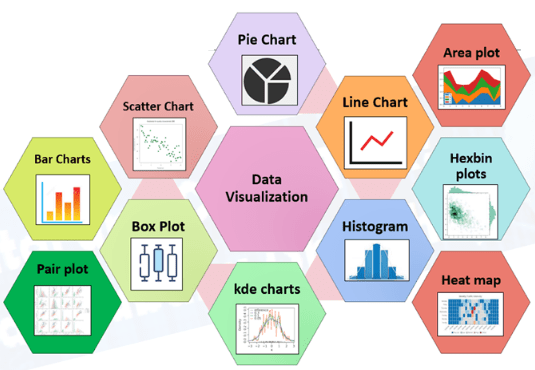
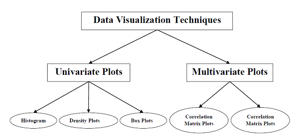
Trending Techniques in Data Visualization
As data visualization continues to evolve, several techniques have emerged that are setting the trends for the future of the field. Let’s take a closer look at some of the most exciting and innovative techniques that are currently shaping the industry.
Aspiring to lead in Business Analyst? Enroll in ACTE’s Business Intelligence Master Program Training Course and start your path to success!
Key Insights from Industry Leaders
Several thought leaders in the field of data visualization have provided valuable insights into the future of this discipline Edward Tufte, a pioneer in the field of data visualization, advocates for simplicity and clarity, recommending that designers avoid “chartjunk” (unnecessary elements) in their visualizations. Alberto Cairo, a leading expert on data journalism and Definitive Guide of Working Capital Management , emphasizes the importance of creating “trustworthy” Science of Data Visualization by using accurate representations and not distorting data. Ben Jones, author of “Communicating Data with Tableau,” highlights the role of interactivity in enhancing data exploration, allowing users to discover insights on their own terms. These experts underline the importance of clear, honest, and user-friendly design in creating visualizations that truly add value.
Preparing for Business Analyst interviews? Visit our blog for the best Business Analyst Interview Questions and Answers!
Challenges in Data Visualization
Despite the many advancements in data visualization, there are still several challenges that need to be addressed, Overcoming these challenges requires thoughtful design, ongoing refinement, and a commitment to presenting data in a way that is both truthful and clear.
Conclusion
The science of data visualization continues to evolve as new technologies and techniques emerge. With interactive visualizations, storytelling, AI integration, and sophisticated innovative techniques like geospatial mapping and animation, the possibilities for how we present and interpret Data Quality are expanding rapidly. However, as we continue to innovate, Business Analyst Training dessential to remember the core principles of effective data visualization, simplicity, and relevance. By leveraging these insights, understanding the psychology behind visual information, and staying ahead of trends, data professionals can create visualizations that not only inform but also inspire action. As we move further into 2025 and beyond, data visualization will continue to play a pivotal role in how we understand and interact with the world around us.