Last updated on 11th Jun 2025| 10556
- Introduction
- What is Power BI?
- Why Use Power BI for Reporting?
- Step-by-Step Guide to Creating a Power BI Report
- Best Practices for Creating Power BI Reports
- Common Issues and Troubleshooting
- Enhancing Power BI Reports with Visualizations and Customizations
- Conclusion
Introduction
Creating insightful reports is essential for businesses aiming to make data-driven decisions that enhance performance and competitiveness. Power BI, developed by Microsoft, is a leading business intelligence tool that empowers users to transform raw data into visually compelling and interactive reports. Its intuitive interface and robust features enable even beginners to start creating impactful visualizations quickly, while offering advanced capabilities for experienced users to perform complex analysis. Power BI simplifies the process of understanding complex data by enabling users to connect to various data sources, clean and model data, and design customized dashboards, making it a key component of Business Analyst Training. These dashboards can include a variety of visual elements such as charts, maps, and tables, all designed to communicate insights clearly and effectively. Interactivity features like filters, slicers, and drill-throughs allow users to explore data dynamically, gaining deeper insights and making informed decisions. In this blog, we will start by explaining what Power BI is, including its key features and benefits. We will then guide you through the entire process of creating a Power BI report step by step, covering everything from connecting to data sources and transforming data to designing visuals and publishing the report. Whether you are new to Power BI or looking to refine your skills, this comprehensive guide will equip you with the knowledge needed to harness the full potential of Power BI, ultimately helping you create impactful reports that support strategic business decisions.
Are You Interested in Learning More About Business Analyst? Sign Up For Our Business Analyst Training Today!
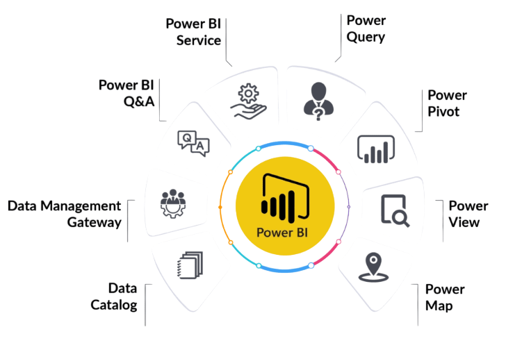
What is Power BI?
Power BI is a comprehensive suite of business analytics tools designed to help organizations visualize, analyze, and share data insights effectively. It enables users to create interactive reports and dashboards that simplify complex data, making it easier to understand and act upon. One of Power BI’s key strengths is its versatility in connecting to a wide array of data sources, including databases, Excel spreadsheets, cloud services, web APIs, and more. This flexibility allows users to consolidate data from multiple systems into a single, unified view, facilitating more comprehensive analysis, a technique often explored in Business Analytics With R Programming Languages. The Power BI ecosystem comprises several essential components. Power BI Desktop is a Windows application where users can import data, perform transformations, and design detailed reports with various visualizations. The Power BI Service is a cloud-based platform that enables sharing, collaboration, and publishing of reports and dashboards across an organization. Power BI Mobile apps extend this functionality by providing access to reports and dashboards on smartphones and tablets, supporting decision-making anytime and anywhere.
Additionally, Power BI integrates with other Microsoft tools like Excel, SharePoint, and Teams, enhancing productivity and collaboration. Overall, Power BI’s user-friendly interface combined with its powerful data connectivity and visualization capabilities makes it a valuable tool for organizations seeking to leverage their data for strategic insights. Whether used for operational monitoring, financial analysis, or sales tracking, Power BI helps users turn raw data into meaningful stories that drive smarter business decisions.
Why Use Power BI for Reporting?
- Ease of Use: Power BI has a user-friendly interface that enables both beginners and experienced users to create powerful reports without extensive coding or technical skills.
- Interactivity: Power BI reports allow users to interact with data directly, filter, drill down, and view different aspects of the data in real-time.
- Custom Visuals: Power BI offers a rich library of built-in visualizations like bar charts, pie charts, line charts, and many more. Users can also import custom visuals from the Power BI marketplace.
- Data Integration: Power BI integrates seamlessly with a variety of data sources like SQL Server, Excel, Google Analytics, and many others, making it easy to pull in which can help identify inefficiencies such as Where Are The 8 Hidden Wastes.
- Collaboration and Sharing: Power BI makes it easy to share reports and dashboards with others across the organization, fostering better collaboration and data-driven decision-making.
- Real-Time Data Updates: Power BI supports real-time data streaming, allowing reports and dashboards to display up-to-date information as it happens.
- Cost-Effective and Scalable: Power BI offers a range of pricing options, including a free version with core features suitable for individual users and paid plans for organizations requiring advanced capabilities and larger user bases.
- Connect to Data Sources: Open Power BI Desktop, select “Get Data,” choose your data source (Excel, SQL Server, etc.), and load the data into Power BI.
- Transform and Clean Data: Use Power Query Editor to clean, filter, and reshape your data, ensuring accuracy and consistency for analysis.
- Create Data Relationships: Define relationships between multiple tables in the Model view to enable accurate cross-table analysis, a fundamental technique covered in Business Analyst Training.
- Design Visualizations: Drag fields onto the report canvas to create visuals like charts and tables, customizing their appearance and layout to tell your story.
- Add Interactivity: Incorporate filters, slicers, and drill-down options to allow users to explore data dynamically and gain deeper insights.
- Publish and Share: Publish your report to the Power BI Service, share dashboards with colleagues, and set up data refresh schedules for up-to-date information.
- Maintain and Update: Regularly update data sources, refine visuals based on feedback, and monitor performance to keep reports relevant and effective.
- Data Not Loading Properly: Ensure that you are using the correct data source and that any transformations in Power Query Editor have been applied successfully.
- Relationships Not Working: Check your table relationships for accuracy. Incorrect or missing relationships can result in incorrect data in your visuals. Use the Model view to verify relationship directions and cardinality.
- Slow Performance: If your report is slow to load, consider optimizing the data model by reducing the number of columns and rows or aggregating data before importing, which can help manage the What is Cost of Quality COQ.
- Visuals Not Displaying Correctly: Ensure you have selected appropriate visual types for your data. Verify that filters or slicers are correctly configured and not unintentionally filtering out data.
- Data Refresh Issues: If your data is not updating as expected, verify your data source credentials and scheduled refresh settings in Power BI Service.
- Missing Data or Gaps: If some data appears missing, confirm that filters are not overly restrictive and that data types are consistent. Use data profiling tools to identify anomalies or gaps in your dataset.
- Design and Layout Problems: For clear and effective reports, maintain consistent color schemes, font sizes, and visual arrangements. Use alignment and spacing tools to improve readability and presentation.
To Explore Business Analyst in Depth, Check Out Our Comprehensive Business Analyst Training To Gain Insights From Our Experts!
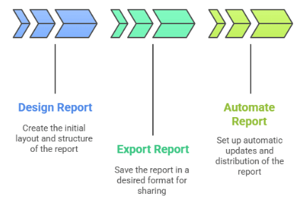
Step-by-Step Guide to Creating a Power BI Report

Best Practices for Creating Power BI Reports
Creating effective Power BI reports requires adherence to best practices that ensure clarity, usability, and impactful insights. First, define clear objectives before designing the report, understanding what questions need to be answered and who the target audience is. This focus helps in selecting the most relevant visuals and data points. Keep the layout clean and uncluttered by using whitespace strategically, avoiding overcrowded visuals that can overwhelm users. Consistency in color schemes, fonts, and formatting enhances professionalism and makes the report easier to interpret. Utilize appropriate visualization types for different data sets such as bar charts for comparisons and line graphs for trends to communicate insights effectively, which relates to understanding What Are Market Structures. Incorporating interactive elements like slicers, filters, and drill-throughs empowers users to explore data dynamically, fostering deeper engagement. Data accuracy and reliability are paramount; always validate data sources and calculations to prevent misinterpretation. Additionally, optimize report performance by limiting the amount of data loaded and avoiding overly complex DAX formulas when possible. Clear labeling, descriptive titles, and tooltips add context, making the report self-explanatory. Finally, test the report across different devices and user groups to ensure accessibility and responsiveness. Regularly updating and maintaining the report ensures it remains relevant and accurate over time. Following these best practices enhances the effectiveness of Power BI reports, enabling users to make informed decisions based on clear, concise, and well-structured data visualizations.
Looking to Master Business Intelligence? Discover the Business Intelligence Master Program Training Course Available at ACTE Now!
Common Issues and Troubleshooting
Enhancing Power BI Reports with Visualizations and Customizations
Enhancing Power BI reports with visualizations and customizations is essential to effectively communicate insights and engage your audience. Visualizations transform raw data into intuitive, interactive charts and graphs that make complex information easier to understand. Power BI offers a wide array of visual types, including bar charts, pie charts, line graphs, scatter plots, maps, and custom visuals from the marketplace, allowing you to select the most suitable format for your data. Customizations further refine these visuals by adjusting colors, labels, axes, and data labels to align with branding or specific reporting standards, which is an important concept in What is Build Verification Testing. Interactive features such as slicers, filters, drill-throughs, and tooltips enable users to explore data dynamically, fostering deeper insights and personalized analysis. Incorporating conditional formatting can highlight key trends or anomalies, making critical information stand out instantly. Additionally, leveraging themes and templates helps maintain consistency across reports, ensuring a professional and cohesive appearance. Advanced features like calculated measures, DAX expressions, and custom visuals can add significant depth to your reports, allowing for tailored data analysis. Proper use of visualizations and customizations not only enhances the readability and aesthetic appeal of your reports but also improves decision-making by presenting data in a clear, concise, and engaging manner. Ultimately, thoughtful customization transforms static reports into powerful storytelling tools that drive action and strategic planning within any organization.
Preparing for a Business Analyst Job Interview? Check Out Our Blog on Business Analyst Interview Questions and Answers
Conclusion
Creating a Power BI report is a structured process that involves multiple key steps, each essential to producing effective and insightful visualizations. The journey begins with connecting to various data sources such as Excel spreadsheets, databases, cloud services, or even web APIs. Once connected, the next step is transforming and cleaning the data to ensure accuracy and consistency. Power BI provides powerful tools within Power Query to filter, merge, and shape data, making it ready for analysis. Proper data transformation is crucial, as it lays the foundation for meaningful insights. After preparing the data, the next phase involves designing the report layout. This includes selecting appropriate visualizations such as charts, tables, and maps that best represent the data and facilitate understanding, a key focus in Business Analyst Training. Interactive elements like slicers, filters, and drill-throughs play a vital role in enabling users to explore data dynamically. Customizing visuals with colors, labels, and formatting enhances readability and aligns the report with branding standards. Additionally, adding calculated measures and DAX expressions allows for advanced calculations and insights. Throughout the process, it’s important to maintain a focus on clarity, simplicity, and usability to ensure the report effectively communicates key messages. With each step carefully executed, you can harness Power BI’s capabilities to create powerful, interactive reports that support better decision-making. By following a systematic approach and leveraging best practices, you’ll develop skills to unlock the full potential of your data and deliver compelling insights that drive organizational success.