Last updated on 10th Jun 2025| 10713
- Introduction
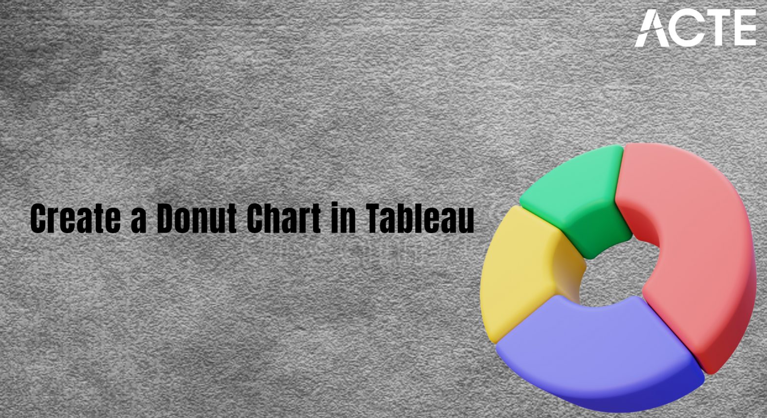
- What is a Donut Chart?
- Why Use a Donut Chart?
- Step-by-Step Guide to Creating a Donut Chart in Tableau
- Best Practices for Donut Charts in Tableau
- Common Issues and Troubleshooting
- Conclusion
Introduction
Creating engaging visualizations in Tableau is a key part of any Data quality process. Among the many types of charts that Tableau offers, the Donut Chart stands out for its ability to display proportions and parts of a whole with a visually appealing, circular design. It’s particularly useful when you want to show categorical data Spreadsheets distributions or highlight key insights in a clear and concise way. This blog will guide you through the process of creating a Donut Chart in Tableau with 10 easy steps. Whether you’re a Tableau novice or an experienced user, you’ll find that creating a Donut Chart is straightforward and offers great flexibility for your data visualization needs.
A pie chart with a hole in the center with a donut-like shape is referred to as a donut chart. Instead of slices, donut charts represent categories as arcs. The hole in the center might seem to be just for aesthetics at first glance, but it serves a more significant purpose by helping readers not misinterpret the area parameter. Donut charts have been used to show complex data by people for years. Although they resemble pie charts, donut charts are easier to comprehend because they enable the audience to focus on changes in value instead of the relative sizes of the segments. Donut charts are also easier to create and look more modern compared to other infographic choices.
Are You Interested in Learning More About Business Analyst? Sign Up For Our Business Analyst Training Today!
What is a Donut Chart?
A Donut Chart is a variation of a Pie Chart, where the center of the pie is cut out to create a “donut” shape. Like pie charts, Donut Charts represent Data quality as segments of a circle, with each segment corresponding to a proportion of the total. The major difference is the central hole, which allows for better labeling or adding additional context, such as the total value or key insights. Donut charts are often used to display parts of a whole in a more modern and clean visual format. They’re especially effective when you have multiple categories to display and want to emphasize the relative size of each segment. A donut chart is an alternative to the pie chart. Yet, unlike pie charts, it displays qualities or categories as arcs and leaves part Spreadsheets of the center aside. Pie charts attempt to show the qualities’ relative values to one another and the chart as a whole. Comparing other pie charts is difficult due to this fact.
The Tableau Business Intelligence App and how to create a Tableau doughnut graphic. Tableau’s doughnut chart is an improved pie chart that makes it easy to view and compare multiple dimensions. A twist on a pie chart, the donut chart (also referred to as a doughnut chart) derived its name from the circular hole in the center that provides the visual look and feel of a donut. You can illustrate more data in this space.
Why Use a Donut Chart?
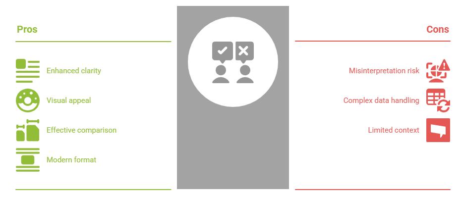
- Visual Appeal: Donut charts are visually striking and can be more aesthetically pleasing than traditional pie charts.
- Enhanced Labeling: The space in the center of a Donut Chart allows for additional information, such as totals or text labels, making it more informative.
- Improved Readability: The ring format can be easier to read and interpret when compared to the Business goals compact form of a pie chart, especially when there are fewer categories.
- Comparison of Proportions: Donut charts allow viewers to quickly compare different segments of a whole.
- Adding Context: To offer further context, the donut chart’s center can be utilized to show the total value or other pertinent data.
- Suitable for Fewer Categories: Because they can get cluttered with too many segments, donut charts work best when you have fewer categories (e.g., 2-4).
- Clearer Than Pie Charts: Donut charts are easier to understand than pie charts because of the “hole” in the middle, which helps avoid misunderstandings regarding the area parameter.
- In the Marks dropdown menu, change the mark type from Automatic to Pie.
- You will now see a pie chart that shows the distribution of sales across product categories (or whichever measure you chose).
- Create a new field: Go to the Data pane and right-click to create a new calculated field called “Dummy”
- Formula: In the calculated field dialog, type 0 (zero) to create a constant value that will be used to create the hole in the center.
- Drag this “Dummy” field to the Rows shelf.
- Drag the newly created Dummy field to the Rows shelf, next to your pie chart.
- Right-click on the Dummy field and select Dual Axis. This will combine the pie chart and the dummy field into a single chart.
- Click on the Size shelf in the Marks card and adjust the slider to make the pie chart smaller. This will make the outer ring thinner.
- As you shrink the pie chart, the inner space will widen, creating the donut effect.
- Click on the Dummy field in the Marks card and select Shape from the dropdown menu.
- Change the shape to a Circle or leave it as is (if the circle is already present).
- Adjust the size of the circle to make sure it appears as a hole in the center of the donut chart.
- In the Marks card, click on the Label shelf.
- Drag the Sales (or other measure) into the label shelf.
- You can also choose to display percentages by clicking the dropdown in the Label shelf and selecting Quick Table Calculation > Percent of Total.
- In the Marks card, click on the Label shelf.
- Drag the Sales (or other measure) into the label shelf.
- You can also choose to display percentages by clicking the dropdown in the Label shelf and selecting Quick Table Calculation > Percent of Total.
- Remove gridlines:To keep the visualization clean, remove gridlines by right-clicking on the gridlines and selecting “Remove”.
- Customize colors:Click on the Color shelf to adjust the color scheme of the segments in your donut chart
- Title and Tooltip: Add a descriptive title to your chart, and customize the tooltips for better context when hovering over the segments.
- Limit the Number of Categories: Too many segments can make the donut chart cluttered and difficult to read. Keep the number of segments to a reasonable amount (usually under 6-8).
- Use for Part-to-Whole Comparisons:Donut charts are ideal for showing proportions of a whole, like sales distribution, Metrics, market share, or departmental contributions.
- Add Context in the Center: Use the center of the donut chart for additional context, such as the total value, a key insight, or a target metric.
- Ensure Clarity with Color:Use distinct, contrasting colors for each segment to make the data easy to interpret at a glance
- Color Selection: Select a small number of colors that stand out visually. Steer clear of hues that are hard for color-blind people to distinguish.
- Focus on Proportions: When displaying the proportions of a whole, where the sum of the parts should equal 100%, donut charts work well.
- Overlapping Labels: If your labels are overlapping, reduce the size of the donut chart, Data driven and increase the distance between segments.
- No Hole in the Donut: If you don’t see a hole in the center, ensure that the Dummy field is being used correctly as a dual-axis and that the size of the pie chart has been adjusted appropriately.
- Incorrect Percentages: If the percentages aren’t calculating correctly, ensure you’ve set up the Percent of Total calculation correctly and applied it to the label.
To Explore Business Analyst in Depth, Check Out Our Comprehensive Business Analyst Training To Gain Insights From Our Experts!
Step-by-Step Guide to Creating a Donut Chart in Tableau
Step 1: Connect to Data
The first step in any Tableau visualization is to connect to your data source. Open Tableau and connect to your dataset. You can connect to a variety of sources, such as Excel, SQL, Metrics,Google Sheets, or others. You need to first choose whatever data you want to chart, and then choose the “Doughnut” option from your software’s chart options so you can produce a donut chart. You are able to change layouts, include data labels, and choose multiple chart styles so you can customize the look of your chart after it has been produced. For this tutorial, let’s assume you are working with a dataset that includes categories (like product types, regions, etc.) and a measure (like sales, revenue, or quantity).
Step 2: Drag Dimensions to Rows or Columns
After connecting to your Data quality, drag a dimension (such as “Product Category”) to the Rows shelf, and a measure (like “Sales”) to the Columns shelf. This will create a bar chart by default.
Step 3: Create a Pie Chart First
Before turning it into a Donut Chart, you need to create a Pie Chart. To do this:

Step 4: Convert the Pie Chart to a Donut Chart
Now that you have your pie chart, it’s time to make it a donut. To create the hole in the middle of the pie:
Step 5: Create a Dual-Axis Chart
Now that you have your pie chart,Business goals and dummy data, you need to combine them into a dual-axis chart to create the donut effect:
Step 6: Adjust the Size of the Donut
To adjust the size of the donut:
Step 7: Format the Inner Circle to Create the Hole
To create the hole in the center of your donut chart:
Step 8: Synchronize Axes
You can enhance your donut chart by adding labels or percentages. To add labels:
Step 9: Add Labels or Percentages
You can enhance your donut chart by adding labels or percentages. To add labels:
Step 10: Final Adjustments and Customization
Finally, make some finishing touches:

Best Practices for Donut Charts in Tableau
While Donut Charts are visually appealing, they work best in certain situations. Here are some best practices:
Gain Your Master’s Certification in Business Intelligence by Enrolling in Our Business Intelligence Master Program Training Course.
Common Issues and Troubleshooting
Conclusion
Creating a Donut Chart in Tableau is a simple and effective way to visualize part-to-whole relationships in your data. By following the 10 easy steps outlined in this blog, you can transform Spreadsheets a standard pie chart into a clean, aesthetically pleasing donut chart that offers better clarity and interactivity. Whether you’re tracking sales, market share, or any other category, the donut chart can help you present your Data driven in a way that is both visually engaging and informative. With these tips and best practices, you’ll be able to create stunning donut charts in Tableau that will enhance the storytelling power of your dashboards. Through various Metrics donut charts, pie charts, and bar charts, the data visualization made comparisons between different information easy. It is now easier for users to study and comprehend the whole-to-part relationships in the information thanks to donut charts. Donut charts are one of the most popular data visualization charts, although data visualization environments provide a broad range of charts and tools. Donut charts convey complex facts with enhanced visual ease despite their simple design structure. Donut charts are not without their limitations, including fewer categories, even though it has numerous advantages like being easy to use,Business goals, customizable, and easy to comprehend. They are thus inappropriate for Data driven that is constantly in motion. In the end, your personal preferences and the type of data you wish to represent will choose whether or not to use a donut chart.