Last updated on 09th Jun 2025| 10493
- Introduction to Advanced Charts
- Creating a Dual-Axis Chart
- Waterfall Charts in Tableau
- Radar Charts and Their Uses
- Gantt Charts for Project Timelines
- Sankey Diagrams for Flow Analysis
- Heatmaps for Data Visualization
- Tree Maps and Their Applications
Introduction to Advanced Charts
Advanced charts are powerful tools that go beyond basic data visualization methods, providing deeper insights into complex data. These charts enable users to represent relationships, trends, and patterns in large data sets in a more intuitive and interactive manner. While basic charts such as bar, line, and pie charts serve as great starting points for data analysis, advanced charts like dual-axis charts, waterfall charts, radar charts, and Sankey diagrams offer a more detailed perspective and are suitable for more complex data sets. Advanced charts allow analysts and decision-makers to explore data from various angles, uncover hidden patterns, and make informed decisions, a skill developed through Business Analyst Training. For example, dual-axis charts are perfect for comparing two distinct data sets that may have different units of measurement, while Sankey diagrams visually illustrate the flow of values from one category to another. Heatmaps and tree maps enable users to identify correlations in large datasets, while animated charts can provide dynamic views over time, adding depth to analysis. Using the right type of advanced chart can significantly enhance the storytelling aspect of data visualization, providing clarity and actionable insights for various business needs, including financial analysis, sales reporting, performance tracking, and project management.
Interested in Obtaining Your Business Analyst Certificate? View The Business Analyst Training Offered By ACTE Right Now!
Creating a Dual-Axis Chart
A dual-axis chart is a powerful tool in data visualization that allows the comparison of two different data sets with different units of measurement on the same graph. It combines two separate y-axes on a single chart one on the left side and one on the right side and is most useful when comparing metrics that operate on different scales. For instance, a company may wish to compare revenue (measured in dollars) with the number of units sold (measured in quantity) on the same graph, a practice aligned with What is the ASAP Methodology. By using a dual-axis chart, you can plot both data sets on a single chart, making it easier to see how they correlate. For example, while the number of units sold may increase steadily over time, revenue might not follow the same pattern, thus revealing more nuanced insights. To create a dual-axis chart, the user needs to drag two separate fields onto the rows or columns shelf in Tableau or similar tools. One field will be assigned to the primary y-axis, while the second will be assigned to the secondary y-axis. It’s important to carefully select the chart type for each axis, such as using a line chart for one axis and a bar chart for the other, to avoid confusion.
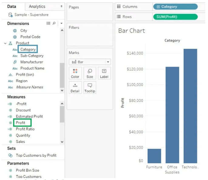
Although dual-axis charts can simplify the comparison of two data sets, it’s important to ensure that the y-axes are clearly labeled to avoid confusion. The use of color and differentiation between the axes is also critical for making the chart easy to understand. Additionally, users should avoid using more than two axes, as this could result in an overly cluttered chart that is difficult to interpret.
Waterfall Charts in Tableau
- Purpose: Waterfall charts in Tableau visually display how an initial value is affected by a series of positive and negative changes, showing the cumulative effect over time or across categories.
- Structure: The chart consists of bars that “float” either upward or downward from the previous total, making it easy to track incremental changes and their impact on the overall total.
- Use Cases: Commonly used to analyze financial data like profit and loss statements, revenue breakdowns, or budget variations, helping users understand where gains and losses occur.
- Creating in Tableau: To build a waterfall chart, place the measure on Rows and dimension on Columns, then apply a running total, a key skill for How to Build a Successful Data Analyst Career.
- Color Coding: Tableau allows you to color bars differently based on positive, negative, or total values, which improves clarity by highlighting increases, decreases, and subtotals
- Customization: Users can customize labels, tooltips, and bar sizes to enhance readability and better communicate the story behind the data.
- Benefits: Waterfall charts simplify complex data changes into a clear visual narrative, making it easier for stakeholders to identify key drivers behind overall performance shifts.
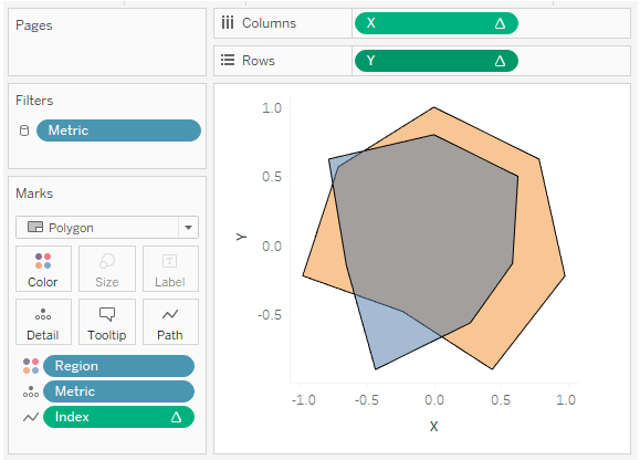
- Definition: Radar charts, also known as spider or web charts, display multivariate data in a two-dimensional chart with several axes starting from the same point. Each axis represents a different variable.
- Use Cases: Common in performance analysis, they help compare employee skills, product features, customer satisfaction metrics, or market research data, all of which are explored in Business Analyst Training.
- Structure: Data points for each variable are plotted along the axes and connected to form a polygon. The shape and size of the polygon visually represent the strengths and weaknesses across variables.
- Comparison: Radar charts are especially useful for comparing multiple items or groups across several variables simultaneously, making it easy to spot patterns, similarities, or differences.
- Limitations: While useful for overview comparisons, radar charts can become cluttered and hard to interpret if too many variables or categories are included.
- Best Practices: Use radar charts with a moderate number of variables and groups, ensure clear labeling, and combine with other charts for detailed analysis.
- Visual Insight: By displaying all variables in a single view, radar charts provide a holistic overview, allowing users to quickly identify which areas perform well or need improvement.
- Definition: Sankey diagrams are flow charts that visualize the movement or flow of resources, energy, money, or data between different stages or categories.
- Purpose: They highlight major transfers or losses within a system, making it easy to understand how inputs are distributed and where resources are concentrated or wasted.
- Structure: The diagram consists of nodes (representing entities or stages) connected by links (flows). The thickness of each link corresponds to the size of the flow, visually emphasizing larger or more important transfers.
- Use Cases: Sankey diagrams are widely used in energy management to show energy inputs and losses, in finance to illustrate cash flows, or in supply chains to track product movement and identify bottlenecks, as discussed in Books To Read For a Six Sigma Certification.
- Benefits: They provide an intuitive and immediate visual summary of complex flow data, making patterns and inefficiencies easy to spot and communicate to stakeholders.
- Creation in Tools: Many data visualization platforms, including Tableau and specialized software, support creating Sankey diagrams, though they can be complex to build due to the need for precise flow calculations.
- Interpretation Tips: To interpret effectively, focus on the relative widths of flows, follow major paths from start to end, and look for unusually thin or missing links indicating losses or gaps.
To Earn Your Business Analyst Certification, Gain Insights From Leading Data Science Experts And Advance Your Career With ACTE’s Business Analyst Training Today!
Radar Charts and Their Uses

Gantt Charts for Project Timelines
Gantt charts are a widely-used tool in project management, providing a clear visualization of the timeline of project tasks. A Gantt chart displays tasks or milestones along the y-axis and the time span along the x-axis. This makes it easy to track the progress of individual tasks, identify dependencies between tasks, and assess the overall timeline of a project. In a Gantt chart, each task is represented by a horizontal bar. The length of the bar indicates the duration of the task, and the position of the bar along the timeline shows when the task begins and ends, a concept often explained in What is SAP Certification. If tasks are dependent on each other, these relationships can be illustrated with arrows or lines, showing which tasks need to be completed before others can begin. Gantt charts are particularly useful for visualizing project schedules and for ensuring that tasks are completed on time. Project managers use Gantt charts to identify potential delays, optimize resource allocation, and monitor the overall progress of the project. The ability to modify timelines and track changes in real-time makes Gantt charts an essential tool for project tracking. In Tableau, Gantt charts can be easily created by dragging tasks onto the rows shelf and the project timeline onto the columns shelf, with the task duration represented by the size of the bars.
Gain Your Master’s Certification in Business Intelligence by Enrolling in Our Business Intelligence Master Program Training Course.
Sankey Diagrams for Flow Analysis
Heatmaps for Data Visualization
Tree maps are hierarchical data visualizations that use nested rectangles to represent data. The size of each rectangle reflects the value of the category it represents, making it easy to compare the relative size of different categories at a glance. Along with size, color is often used to represent another measure, such as performance, growth, or risk. This combination of size and color provides a rich visual summary, enabling users to understand two dimensions of data simultaneously. In tree maps, the hierarchy is displayed through rectangles nested inside parent categories. For example, a large rectangle might represent total sales in a country, while smaller rectangles inside it show sales by state or city, a concept explained in Which Certification is Right for You: Six Sigma or Lean Six. This structure allows for clear visualization of how subcategories contribute to the overall totals, making it simple to analyze data across multiple levels. These visualizations are popular in business dashboards for monitoring financial performance, product sales, and inventory management. Their compact design is especially useful for presenting large amounts of hierarchical data in limited space without overwhelming the viewer. By interpreting the size and color of rectangles, users can quickly identify which categories are performing well or poorly, aiding faster decision-making. Overall, tree maps are effective tools for visually exploring complex hierarchical data and gaining insights at a glance.
Preparing for a Business Analyst Job Interview? Check Out Our Blog on Business Analyst Interview Questions and Answers
Tree Maps and Their Applications
Tree maps are a type of hierarchical data visualization that display data using nested rectangles. Each rectangle’s size corresponds to the value of the category it represents, allowing users to quickly see the relative importance of different categories. Additionally, the color of each rectangle can indicate another measure, such as performance, growth, or risk, adding a second layer of information. This dual encoding makes tree maps especially useful for complex datasets with hierarchical relationships, such as sales figures broken down by region, product line, or sales channel. In a tree map, each level of the hierarchy is represented by rectangles nested inside their parent categories. For example, a top-level rectangle might represent total sales in a country, while smaller rectangles inside it represent sales in individual states or cities, a visualization technique covered in Business Analyst Training. This structure makes it easy to compare both the size and distribution of data across categories and subcategories at a glance. Tree maps are commonly used in business dashboards to visualize financial performance, product sales, or inventory management. Their compact layout enables the presentation of large volumes of data in a small space, making them ideal for high-level overviews. When interpreting a tree map, users can quickly identify which areas are performing well or poorly based on the size and color of the rectangles, enabling faster, data-driven decision-making. Overall, tree maps provide a powerful and efficient way to explore hierarchical data visually.