Last updated on 11th Jun 2025| 10532
- Introduction
- What is Power BI?
- What is a Power BI Dashboard?
- Key Features of Power BI Dashboards
- How to Create a Power BI Dashboard
- Types of Power BI Dashboards
- Power BI Dashboard vs. Report
- Conclusion
Introduction
In today’s fast-paced business environment, having access to real-time data and insights is essential for making informed decisions quickly. Power BI, a powerful business intelligence tool developed by Microsoft, helps organizations transform their raw data into actionable insights. One of the standout features of Power BI is its Dashboards, which provide a consolidated view of key metrics and data from multiple sources in an interactive and visually compelling format. A Power BI dashboard is a single-page, customizable canvas that allows users to monitor important business data at a glance. It pulls visuals from different reports and datasets, making it easier to track performance across various departments or functions without switching between multiple screens, a skill highlighted in Business Analyst Training. This consolidated view helps decision-makers stay informed and respond swiftly to changes or trends. Key features of Power BI dashboards include real-time data updates, interactive visuals such as charts and maps, and the ability to filter and drill down into specific data points for deeper analysis. Dashboards can be accessed on desktops, tablets, and mobile devices, ensuring that stakeholders can stay connected to vital information anytime and anywhere. Creating a Power BI dashboard involves connecting to data sources, designing meaningful visuals within reports, and then pinning those visuals to the dashboard. Customization options like arranging tiles, setting up alerts, and applying filters make dashboards highly adaptable to specific business needs. By leveraging Power BI dashboards effectively, organizations can enhance their data analysis capabilities and drive smarter, faster business decisions.
Interested in Obtaining Your Business Analyst Certificate? View The Business Analyst Training Offered By ACTE Right Now!
What is Power BI?
Power BI is a powerful business analytics service developed by Microsoft that enables users to visualize, analyze, and share data insights across their organization. It transforms raw data from various sources into interactive reports and dashboards, making complex information easy to understand and actionable. With Power BI, businesses can connect to a wide range of data sources including Excel spreadsheets, cloud services like Azure and Salesforce, databases, and even web APIs, consolidating disparate data into a single platform one of the Reasons to Get a Six Sigma Certification. At its core, Power BI offers a suite of tools designed for data modeling, visualization, and collaboration. Users can create detailed reports with interactive charts, graphs, maps, and other visuals that highlight trends, patterns, and key performance indicators (KPIs). These reports can be published and shared via the Power BI service, ensuring stakeholders have access to up-to-date information in real-time, whether on desktop or mobile devices. One of Power BI’s strengths is its user-friendly interface combined with advanced analytics capabilities. It supports data transformation, custom calculations using DAX (Data Analysis Expressions), and integration with machine learning models, allowing users to uncover deeper insights.
Power BI also supports natural language queries, enabling users to ask questions about their data and receive instant visual answers. Overall, Power BI empowers organizations to make data-driven decisions faster and more efficiently by providing a comprehensive, scalable, and accessible analytics solution. Whether for small businesses or large enterprises, Power BI’s flexibility and robust features help unlock the full potential of data in today’s competitive landscape.
What is a Power BI Dashboard?
- Definition: A Power BI Dashboard is a single-page, interactive visual interface that displays data insights through charts, graphs, and key metrics, helping users quickly understand and analyze business performance.
- Purpose: Dashboards provide a consolidated view of important information, allowing decision-makers to monitor business health, track goals, and identify trends at a glance.
- Customization: Users can customize dashboards by pinning various visual elements (called tiles) from reports or datasets, tailoring the layout and content to specific business needs.
- Interactivity: Dashboards are interactive; users can click on visuals to filter data, drill down into details, or navigate to related reports for deeper analysis.
- Real-time Data: They can display real-time or near real-time data, enabling timely decisions based on the most current information available, which is a core aspect of What is Strategic Enterprise Management & its Components.
- Accessibility: Power BI Dashboards are accessible across devices desktop, mobile, and tablet making it easy for users to stay informed anytime, anywhere.
- Collaboration: Dashboards support sharing and collaboration, allowing teams to work together by sharing insights, annotations, and updates within an organization securely.
- Real-Time Data: Power BI dashboards can be configured to display data that is continuously updated in real time, ensuring users always have the latest insights at their fingertips.
- Multiple Data Sources: Dashboards can pull data from various sources, such as Excel files, cloud services, databases, and APIs, allowing for a holistic view of the business a core concept taught in Business Analyst Training.
- Interactivity: Dashboards in Power BI are interactive. Users can click on individual visual elements to drill down further into the underlying data or filter the view to focus on specific subsets of data.
- Customizable Visuals: Power BI offers a variety of visual elements like bar charts, pie charts, line graphs, maps, and KPIs, which can be customized to suit the needs of the user or organization.
- Mobile Compatibility: Power BI dashboards are accessible via mobile apps, making it easy for users to access their insights on the go.
- Sharing and Collaboration: Dashboards can be easily shared with others in the organization. Users can also collaborate by commenting and discussing insights directly within the dashboard.
- Operational Dashboards: They display key performance indicators (KPIs) and metrics related to ongoing processes like sales, production, or customer service, helping teams react quickly.
- Strategic Dashboards: Designed for senior management, these dashboards highlight long-term trends and overall business performance. They summarize high-level KPIs such as revenue growth, profit margins, and market share to support strategic decision-making.
- Analytical Dashboards: These provide in-depth data analysis with complex visuals and filters. They enable users to drill down into datasets, identify patterns, and understand causes behind trends for detailed insights.
- Tactical Dashboards: They focus on medium-term goals and departmental performance, allowing managers to track project progress and resource utilization, demonstrating What Are The Benefits of Measurement & Constrained Optimization Methods.
- Customer Dashboards: These are tailored to track customer-centric data like satisfaction scores, churn rates, or buying behavior, helping marketing and sales teams enhance customer relationships.
- Financial Dashboards: Focused on financial metrics such as cash flow, expenses, and budgeting, these dashboards help finance teams monitor financial health and forecast future performance.
- Project Dashboards: These track project timelines, milestones, budgets, and risks. They help project managers keep projects on track and communicate status to stakeholders effectively.
To Earn Your Business Analyst Certification, Gain Insights From Leading Data Science Experts And Advance Your Career With ACTE’s Business Analyst Training Today!
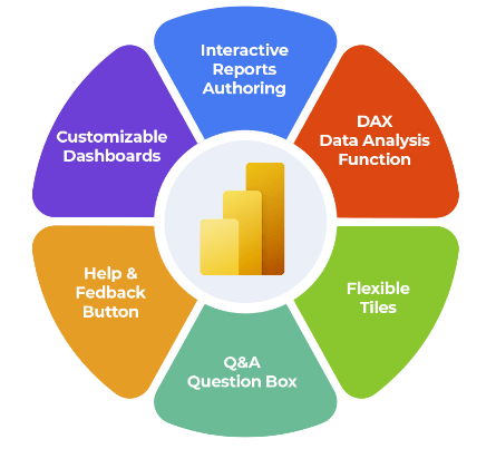
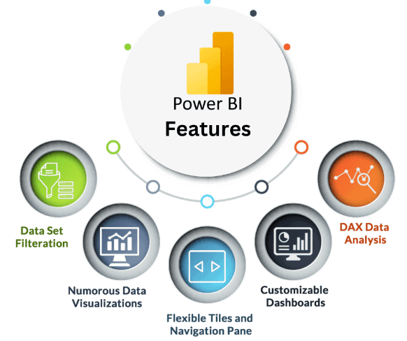
Key Features of Power BI Dashboards

How to Create a Power BI Dashboard
Creating a Power BI dashboard involves several key steps that enable you to transform raw data into insightful visualizations for effective decision-making. The process begins with connecting Power BI to your data sources, which can include Excel files, cloud services, databases, or other platforms. After importing the data, you start by creating reports where you design and arrange various visuals like charts, graphs, and tables that represent your key metrics and insights. Once your report pages are ready, the next step is to pin important visuals or entire report pages to a new or existing dashboard. Pinning allows you to consolidate essential data points and metrics from one or multiple reports into a single, customizable dashboard, a process that supports What Is Time Management In SAP HR. This high-level overview provides a real-time snapshot of business performance. Customization plays a crucial role in dashboard creation. You can resize and rearrange tiles, apply filters, and add interactive elements such as slicers to make the dashboard more user-friendly and dynamic. Additionally, you can personalize the dashboard’s appearance with themes, colors, and layout adjustments to align with your brand or preferences. After building your dashboard, sharing it with colleagues and stakeholders is simple through the Power BI service. You can grant access permissions to ensure the right people have real-time visibility into the data. Additionally, dashboards are accessible on mobile devices, enabling decision-makers to stay informed on the go. Overall, creating a Power BI dashboard is a straightforward process that combines data connection, report creation, visualization pinning, and customization empowering users to monitor business health and drive informed decisions efficiently.
Gain Your Master’s Certification in Business Intelligence by Enrolling in Our Business Intelligence Master Program Training Course.
Types of Power BI Dashboards
Power BI Dashboard vs. Report
Power BI Dashboards and Reports are both fundamental components of the Power BI ecosystem, but they serve different purposes and offer distinct functionalities. Understanding the difference between the two is key to effectively using Power BI for data analysis and decision-making. A Power BI Report is a detailed collection of multiple pages filled with various visualizations such as charts, tables, and maps. Reports allow users to explore data in-depth, with interactive features like filters, slicers, and drill-throughs that help analyze data from multiple perspectives. Each report page can present different aspects of the data, making reports ideal for comprehensive analysis and storytelling. Reports are created from datasets and provide a rich environment for data exploration, enabling users to dive deep into the details behind the numbers, which highlights What Is the Benefit of Modern Data Warehousing. On the other hand, a Power BI Dashboard is a single-page, high-level overview that consolidates key visualizations and metrics from one or more reports. Dashboards are designed for quick monitoring and real-time insights, displaying the most important KPIs and summaries at a glance. Unlike reports, dashboards are not multi-page and don’t support detailed data exploration directly within them. However, users can interact with dashboard tiles to navigate back to the underlying reports for deeper analysis. Dashboards are highly customizable and can pull visuals from multiple datasets, making them ideal for executive summaries or quick status updates. In summary, while reports focus on detailed, multi-page data exploration, dashboards provide concise, actionable snapshots. Using both together allows organizations to balance deep analysis with efficient monitoring, ultimately supporting better business decisions.
Preparing for a Business Analyst Job? Have a Look at Our Blog on Business Analyst Interview Questions and Answers To Ace Your Interview!
Conclusion
Power BI dashboards are essential tools for visualizing and monitoring business data in real-time. They consolidate various key performance indicators (KPIs) and metrics into a single, interactive interface, allowing users to quickly grasp the health and status of their business. By presenting data visually through charts, graphs, and maps, Power BI dashboards make complex data easier to understand and analyze. Creating a Power BI dashboard begins with connecting to relevant data sources such as Excel files, databases, or cloud services. Once the data is imported, users can build reports by selecting appropriate visualizations that best represent their data. These reports can then be pinned to dashboards, enabling a consolidated view of critical metrics. Customization is a key feature of Power BI dashboards. Users can tailor layouts, choose color schemes, add filters, and set up drill-throughs to explore data at deeper levels, all of which are practical skills developed in Business Analyst Training. Interactive elements such as slicers and clickable visuals make dashboards dynamic, empowering users to explore data from multiple angles without needing technical expertise. Sharing dashboards with colleagues and stakeholders is straightforward in Power BI. Dashboards can be published to the Power BI service, where authorized users can access them via web browsers or mobile apps. This accessibility ensures that decision-makers have up-to-date information wherever they are. Ultimately, Power BI dashboards help organizations make data-driven decisions faster by providing real-time insights and clear visual summaries of business performance. By focusing on relevant business metrics and designing dashboards thoughtfully, businesses can unlock valuable insights that drive growth and operational efficiency. Mastering dashboard creation, customization, and sharing in Power BI is therefore crucial for maximizing its value in any data analysis and reporting effort.