Last updated on 12th Jun 2025| 10711
- Introduction
- What is Data Visualization?
- Why is Data Visualization Important in Business Intelligence?
- Benefits of Using Data Visualization in Decision-Making
- Top 6 Business Intelligence Tools for Data Visualization
- Common Challenges in Data Visualization and How to Overcome Them
- How to Choose the Right Business Intelligence Tool for Your Needs
- Conclusion
Introduction
In today’s data-driven world, businesses increasingly depend on data visualization to make well-informed decisions. Business Intelligence (BI) tools play a vital role in this process by transforming raw data into clear, meaningful insights through easy-to-understand visual formats like charts, graphs, and interactive dashboards. These visualizations simplify complex datasets, allowing organizations to quickly identify trends, patterns, and opportunities that might otherwise remain hidden in rows of raw numbers. The power of data visualization lies in its ability to make data accessible to all users, regardless of their technical expertise, which is a key focus of Business Analyst Training. By presenting information visually, BI tools enable faster analysis and more effective communication across teams, fostering a culture of data-driven decision-making. Among the wide range of BI tools available today, certain platforms have emerged as leaders due to their advanced data visualization features, user-friendly interfaces, and strong integration capabilities. These tools not only help businesses monitor key performance indicators (KPIs) in real time but also allow users to drill down into data, customize reports, and share insights effortlessly. In this blog, we will explore the top 6 business intelligence tools that excel in data visualization. By understanding the strengths of each, organizations can choose the best fit for their unique needs, budget, and technical environment, unlocking the full potential of their data and driving better business outcomes through insightful visual analytics.
Do You Want to Learn More About Business Analyst? Get Info From Our Business Analyst Training Today!
What is Data Visualization?
Data visualization is the process of representing data visually through charts, graphs, maps, and other graphical formats. This method transforms complex and often overwhelming raw data into a clear and concise visual context, enabling users to grasp information quickly and easily. Instead of analyzing lengthy spreadsheets filled with numbers, decision-makers can interpret visual representations to identify important patterns and trends at a glance. In the realm of business intelligence (BI), data visualization plays a pivotal role in turning data into actionable insights, a consideration often discussed in Splunk vs ELK. It enhances the reporting process by helping organizations spot key trends that might otherwise go unnoticed. For example, sales growth over time can be easily tracked with line charts, while bar graphs can quickly compare performance across different regions or products. Monitoring Key Performance Indicators (KPIs) becomes more efficient through dashboards that visually display metrics in real-time, allowing businesses to react promptly to changing conditions. Visualization tools also help highlight relationships and correlations within the data, such as how marketing spend influences customer acquisition.
Furthermore, data visualization supports data-driven decision-making by presenting information in a way that is accessible to both technical and non-technical users. This democratizes data access within organizations, encouraging collaboration and informed discussions. Overall, data visualization is essential for simplifying data complexity, improving understanding, and facilitating faster, more accurate decisions. It turns raw data into compelling stories that drive business success.
Why is Data Visualization Important in Business Intelligence?
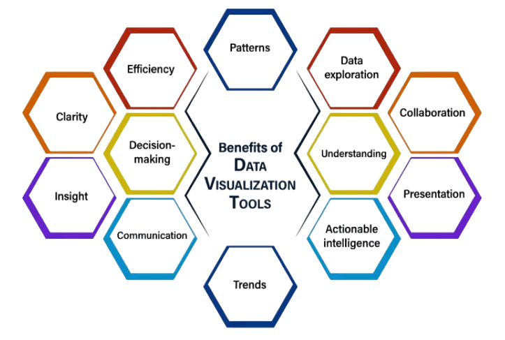
- Simplifies Complex Data: Data visualization turns large, complex datasets into clear charts and graphs, making insights easier to understand.
- Improves Decision-Making: Visual data helps businesses quickly spot trends and outliers, enabling faster and more informed decisions.
- Enhances Data Accessibility: It makes data understandable to non-technical users, promoting a data-driven culture across the organization.
- Speeds Up Analysis: Interactive visuals allow users to explore data with filters and drill-downs, reducing analysis time a key difference in QlikSense vs QlikView.
- Facilitates Communication: Clear visual representations help convey complex findings effectively to stakeholders, ensuring alignment.
- Identifies Relationships and Correlations: Visualization reveals connections between variables that are hard to see in raw data.
- Supports Monitoring and Performance Tracking: Real-time dashboards help track KPIs continuously, allowing quick response to changes or issues.
- Faster Comprehension: Visualization helps decision-makers quickly understand complex data by presenting it clearly and concisely.
- Improved Accuracy: It reduces errors by making data anomalies and inconsistencies visible, ensuring decisions are based on reliable information.
- Enhanced Insight Discovery: Visual tools reveal hidden patterns and trends that might be missed in raw data, uncovering valuable insights an important focus in Business Analyst Training.
- Better Communication: Visuals effectively convey findings to teams and stakeholders, promoting shared understanding and informed decisions.
- Supports Data-Driven Culture: Accessible visuals encourage employees at all levels to use data in everyday decision-making.
- Increased Engagement: Interactive visuals engage users more deeply, allowing exploration of data from multiple perspectives.
- Real-Time Monitoring and Responsiveness: Live dashboards enable continuous tracking of key metrics for timely and responsive decision-making.
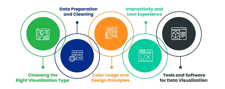
- Data Overload: Too much information can overwhelm users; focus on key metrics and simplify visuals to avoid clutter.
- Choosing the Wrong Chart Type: Using inappropriate charts confuses users; select chart types that best represent the data (e.g., bar for comparisons, line for trends).
- Poor Data Quality: Inaccurate data leads to misleading visuals; ensure thorough data cleaning and validation before visualization, especially when using Splunk Timechart.
- Lack of Context: Visuals without clear titles, labels, and legends can be misinterpreted; always provide necessary context for understanding.
- Ignoring the Audience: Designs that don’t consider the user’s knowledge and needs reduce effectiveness; tailor visuals accordingly.
- Overcomplicating Visuals: Too many colors or elements clutter the view; keep designs clean and highlight key information for clarity.
- Limited Interactivity: Static visuals restrict exploration; add filters, drill-downs, and tooltips to enable deeper insights.
Would You Like to Know More About Business Analyst? Sign Up For Our Business Analyst Training Now!
Benefits of Using Data Visualization in Decision-Making

Top 6 Business Intelligence Tools for Data Visualization
There are numerous business intelligence (BI) tools available today, but six stand out for their strong data visualization capabilities. These tools help organizations turn complex data into clear, interactive visuals that support better decision-making. Tableau is widely praised for its intuitive drag-and-drop interface and powerful analytics features. It allows users to create highly customizable and interactive dashboards, making it popular among data analysts. Microsoft Power BI integrates seamlessly with Microsoft products like Excel and Azure, providing a cost-effective solution with robust data modeling, real-time reporting, and sharing capabilities. It’s ideal for organizations already invested in the Microsoft ecosystem, aligning with What Is Measurement System Analysis Required Skills. Qlik Sense offers an associative data model that enables users to explore data dynamically without being limited to predefined queries. Its self-service analytics and smart visualizations empower users to uncover hidden insights easily. Looker, now part of Google Cloud, focuses on web-based analytics and easy collaboration, with strong integration into cloud data platforms. Its modeling language, LookML, allows for consistent and reusable data definitions. Domo provides a cloud-based BI platform with real-time data connectivity, making it a strong choice for businesses that need live updates and mobile-friendly dashboards. Sisense excels at handling large and complex datasets by embedding analytics into applications and workflows, allowing organizations to deliver insights directly where they’re needed. Choosing the right tool depends on your organization’s size, budget, data sources, and technical expertise. These top BI tools offer a range of features to help businesses visualize data effectively and make data-driven decisions confidently.
Are You Considering Pursuing a Master’s Degree in Business Intelligence? Enroll in the Business Intelligence Master Program Training Course Today!
Common Challenges in Data Visualization and How to Overcome Them
How to Choose the Right Business Intelligence Tool for Your Needs
Choosing the right business intelligence (BI) tool is essential for turning data into actionable insights that drive smarter decision-making. To make the best choice, organizations should consider several key factors. First, assess your business goals and specific requirements whether you need robust data visualization, advanced analytics, real-time reporting, or easy integration with existing systems. Understanding what problems you want the BI tool to solve will help narrow down the options. Next, evaluate the data sources your organization uses. Some BI tools work better with certain databases, cloud platforms, or file formats. Ensuring compatibility will streamline data integration and reduce complexity. Additionally, consider the tool’s ease of use and learning curve, important factors in What Is Image Processing. A user-friendly interface is important, especially if the tool will be used by non-technical staff, while more advanced users might require deeper customization and scripting capabilities. Scalability is another crucial factor. Choose a tool that can grow with your business and handle increasing data volumes and user counts without sacrificing performance. Also, take into account deployment options cloud-based tools offer flexibility and easier updates, whereas on-premises solutions provide more control and security. Cost and licensing models vary widely among BI tools, so it’s important to weigh your budget against the features offered. Finally, evaluate the vendor’s support, training resources, and community ecosystem, which can significantly impact your success with the tool. By carefully considering these factors, you can select a BI solution that aligns with your organizational needs, maximizes user adoption, and delivers valuable business insights efficiently.
Preparing for a Business Analyst Job? Have a Look at Our Blog on Business Analyst Interview Questions and Answers To Ace Your Interview!
Conclusion
Data visualization plays a crucial role in business intelligence (BI) by helping organizations transform raw data into meaningful insights. It enables decision-makers to easily interpret complex information through interactive and visually appealing charts, graphs, and dashboards. This capability supports faster and more accurate decision-making, ultimately driving business growth and efficiency. Several leading BI tools specialize in data visualization, each offering unique features to cater to different organizational needs. Tableau is renowned for its user-friendly interface and powerful visual analytics, making it a favorite among data analysts. Power BI, developed by Microsoft, integrates seamlessly with other Microsoft products and provides strong data modeling and reporting capabilities, making it a key tool in Business Analyst Training. Qlik Sense offers associative data indexing, allowing users to explore data relationships intuitively. Looker focuses on web-based analytics and easy collaboration, while Domo provides a cloud-based platform with real-time data access. Sisense is known for its ability to handle large datasets and embed analytics into applications. Choosing the right data visualization tool depends on factors such as the organization’s budget, technical expertise, data sources, and specific business requirements. For example, a company heavily invested in the Microsoft ecosystem might prefer Power BI, whereas a business needing highly customizable visuals may lean towards Tableau. By implementing an appropriate BI visualization tool, organizations can accelerate their data analysis process, enhance operational decision-making, and uncover actionable insights. This not only boosts productivity but also helps businesses stay competitive by responding swiftly to market changes and customer needs. Overall, effective data visualization is a cornerstone of modern business intelligence strategies.