Last updated on 09th Jun 2025| 10805
- What is a Bullet Chart?
- Use Cases for Bullet Charts
- Creating a Bullet Chart in Tableau
- Understanding Bullet Chart Components
- Formatting the Target and Actual Bars
- Customizing Colors and Labels
- Adding Reference Lines to Bullet Charts
- Using Bullet Charts for Performance Tracking
What is a Bullet Chart?
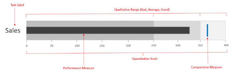
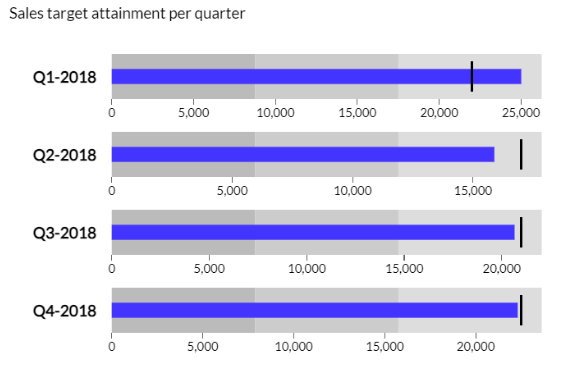
A Bullet Chart is a type of data visualization designed to display performance data in relation to a target. Created by Stephen Few, a leader in data visualization, bullet charts serve as a compact and effective alternative to more traditional visuals like gauge charts or standard dashboards. Unlike pie charts or bar charts, which can become cluttered when comparing multiple data points, bullet charts offer a streamlined way to present performance across several measures clearly and concisely. The structure of a bullet chart includes a horizontal bar representing the actual value or performance measure. A vertical line or marker indicates the target value, providing a clear reference point, a technique taught in Business Analyst Training. Additionally, bullet charts often include shaded background ranges that represent qualitative benchmarks such as poor, satisfactory, and good performance. These ranges give important context, helping viewers quickly understand how the actual value compares to expectations or goals. Bullet charts are highly efficient visual tools because they convey critical information with minimal distraction. They emphasize the key elements actual performance, target, and context allowing users to focus on what matters most. This makes bullet charts particularly valuable in dashboards and reports where space is limited, yet clarity and quick interpretation are essential. Overall, bullet charts enhance performance tracking by delivering precise, actionable insights in a visually compact format.
Do You Want to Learn More About Business Analyst? Get Info From Our Business Analyst Training Today!
Use Cases for Bullet Charts
Bullet charts are versatile and effective visual tools widely used across various industries to track performance against goals. One of the most common use cases is in business dashboards, where bullet charts provide a clear and concise way to monitor key performance indicators (KPIs) such as sales targets, revenue growth, or customer satisfaction scores. Their compact design allows multiple metrics to be displayed side by side without overwhelming the viewer, making them ideal for executive summaries and management reports. In finance, bullet charts help visualize budget versus actual spending, highlighting areas where expenses exceed or fall short of expectations, a practice used in Quality Improvement in Six Sigma. This immediate insight supports better financial planning and control. Marketing teams use bullet charts to measure campaign effectiveness by comparing actual conversions or engagement rates against predefined goals, enabling quick adjustments to strategy. Operations and manufacturing benefit from bullet charts to track production efficiency, quality control metrics, or equipment downtime against targets. The visual context provided by the background ranges helps teams identify performance gaps and prioritize improvement efforts.
Healthcare organizations use bullet charts to monitor patient outcomes, adherence to treatment protocols, or resource utilization, facilitating data-driven decisions for improving care quality. Overall, bullet charts are favored in any scenario where clear, at-a-glance performance comparisons are crucial. Their ability to combine actual results, targets, and qualitative benchmarks in a compact space makes them a powerful visualization for tracking progress, identifying issues, and driving informed decisions across diverse fields.
Creating a Bullet Chart in Tableau
- Prepare Your Data: Before building a bullet chart, ensure your dataset includes the measure you want to analyze (actual value), the target or goal for that measure, and any ranges you want to display (like poor, average, and good performance).
- Create a Basic Bar Chart: Start by dragging your measure (actual value) to the Columns shelf and your dimension (category) to the Rows shelf. This creates a simple horizontal bar chart showing actual performance.
- Add the Target Line: To add a target marker, drag the target measure to the Columns shelf next to the actual value. Change its mark type to a Gantt bar or line, depending on your design preference, a technique covered in What is Process Capability Analysis.
- Build Performance Ranges: Use calculated fields to define performance ranges (for example, thresholds for poor, average, and good). Drag these fields to the Columns shelf and use stacked bars or reference bands to represent these background ranges.
- Synchronize Axes: Make sure the axes for your actual values, target markers, and ranges are synchronized so everything aligns correctly. This may involve using dual axes and synchronizing them.
- Format the Chart: Adjust colors, sizes, and labels. Use contrasting colors for the actual bar, target marker, and background ranges. Add labels for clarity, such as actual values and targets.
- Add Tooltips and Interactivity: Enhance your bullet chart by customizing tooltips with detailed information and enabling filters or actions so users can interact with the chart for deeper analysis.
- Actual Value Bar: This is the main horizontal bar in the bullet chart that represents the current or actual performance metric. It’s usually displayed in a solid, bold color to stand out clearly against the background.
- Target Marker: A vertical line or thin bar that indicates the goal or target value for the metric. It provides a clear reference point so users can easily see how actual performance compares to the target.
- Performance Ranges: These are shaded background areas behind the actual value bar, typically segmented into qualitative ranges such as poor, satisfactory, and good performance, concepts covered in Business Analyst Training.
- Scale or Axis: A linear scale along the length of the chart shows the range of possible values. It provides a frame of reference for interpreting the position of the actual bar and target marker.
- Labels: Text elements that identify the metric being measured, actual value, target value, and sometimes the performance ranges. Clear labeling helps users quickly understand the chart without confusion.
- Comparison Metrics (Optional): Some bullet charts include additional markers or bars to compare current data against past performance or benchmarks, enabling a deeper analysis.
- Background and Layout: The overall design elements such as spacing, color contrast, and alignment that ensure the chart is clean, readable, and visually balanced.
- Purpose of Customization: Customizing colors and labels enhances the clarity and effectiveness of visualizations by making data easier to interpret and more visually appealing.
- Color Coding: Use colors strategically to differentiate categories, highlight important values, or show performance levels. Consistent color schemes improve user comprehension.
- Custom Color Palettes: Many tools allow you to create or import custom color palettes, helping align visualizations with brand guidelines or personal preferences and ensuring consistency across reports and dashboards, an important aspect of SAP Financials & SAP Accounting Modules.
- Conditional Formatting: Apply dynamic color changes based on data values. For example, a bar might change from yellow to green as sales increase, providing immediate visual feedback on performance.
- Label Placement: Position labels thoughtfully inside bars, above columns, or beside data points so they are easy to read without cluttering the visualization. Avoid overlapping or excessive labeling.
- Label Content: Customize what information labels display, such as exact values, percentages, or categories. Clear and relevant labels help users understand the data without additional explanation.
- Accessibility Considerations: Choose colors and label formats that are accessible to all users, including those with color vision deficiencies. Use high contrast and consider adding patterns or icons alongside colors.
Would You Like to Know More About Business Analyst? Sign Up For Our Business Analyst Training Now!
Understanding Bullet Chart Components

Formatting the Target and Actual Bars
Formatting the target and actual bars in a bullet chart is essential for making the visualization clear, intuitive, and visually appealing. The actual bar, which represents the measured value, is typically displayed as a solid horizontal bar. It should be bold and distinct, often using a strong color such as blue or black, to ensure it stands out clearly against the background. Adjusting the thickness of the actual bar can help emphasize its importance without overwhelming other elements of the chart. The target bar or marker, usually represented as a vertical line or a thin bar crossing the actual bar, serves as a reference point for the goal or benchmark, a concept explained in What is SAP Sales & Distribution SD Module. It is important to format this target marker in a contrasting color, such as red or dark gray, so that it is easily distinguishable from the actual bar. The thickness of the target marker should be thinner than the actual bar to maintain visual hierarchy but thick enough to be noticeable. Adding subtle effects, such as shadows or gradients, can enhance the readability and depth of the bars without cluttering the chart. Transparency can also be used strategically, especially when overlapping bars, to prevent visual confusion. Consistent spacing and alignment between the bars help maintain a clean look. Additionally, including clear labels or tooltips for both the actual and target values ensures users can quickly understand what each bar represents. Overall, thoughtful formatting improves the effectiveness of bullet charts by making the key performance comparisons immediately understandable.
Looking to Master Business Intelligence? Discover the Business Intelligence Master Program Training Course Available at ACTE Now!
Customizing Colors and Labels
Adding Reference Lines to Bullet Charts
Adding reference lines to bullet charts enhances their ability to convey important contextual information about performance metrics. Reference lines serve as visual benchmarks or thresholds that help users quickly assess how actual values relate to predefined standards or targets. These lines can represent minimum acceptable levels, warning thresholds, or stretch goals beyond the main target, providing a richer understanding of performance. In a bullet chart, reference lines are typically drawn as thin vertical or horizontal lines positioned along the scale. They are often differentiated by style such as dashed or dotted lines and color to distinguish them from the actual and target bars, a detail highlighted in Tips to Learn Tableau. For example, a green line might indicate a desired minimum performance level, while a yellow line could mark a cautionary threshold, and a red line might signal a critical limit. This use of color coding helps viewers immediately grasp the significance of each reference line. Including multiple reference lines can create a layered context, showing ranges like poor, satisfactory, and excellent performance. This visual guidance helps users make informed decisions quickly by identifying where a metric stands in relation to key benchmarks. When adding reference lines, it’s important to ensure they do not clutter the chart or distract from the primary data. Clear labeling or tooltips can further clarify what each reference line represents. Overall, reference lines improve the interpretability of bullet charts, making them more effective tools for performance analysis and communication.
Preparing for a Business Analyst Job? Have a Look at Our Blog on Business Analyst Interview Questions and Answers To Ace Your Interview!
Using Bullet Charts for Performance Tracking
Bullet charts are an excellent choice for tracking performance over time or against specific targets due to their compact and efficient design. Unlike traditional charts that may take up significant space and become cluttered when displaying multiple metrics, bullet charts allow users to monitor several key performance indicators (KPIs) simultaneously within a single dashboard. This streamlined presentation helps prevent information overload while still providing clear, actionable insights. Organizations across various industries use bullet charts to track important metrics such as sales figures, revenue growth, and customer satisfaction scores. Each bullet chart displays the actual performance as a horizontal bar, with a target marker indicating the goal or benchmark, a technique taught in Business Analyst Training. This visual comparison enables users to instantly see whether performance is meeting, exceeding, or falling short of expectations. Additionally, bullet charts often include shaded background ranges to offer contextual cues, such as poor, satisfactory, or excellent performance levels, making it easier to interpret the data at a glance. For managers and executives, bullet charts are especially valuable because they support quick, informed decision-making. Instead of sifting through detailed reports or multiple charts, leaders can assess the health of various business areas in one view and identify where attention or corrective action is needed. By presenting performance data in a concise, visually clear manner, bullet charts help organizations maintain focus on their objectives and track progress efficiently over time.