Last updated on 10th Jun 2025| 11101
- Introduction
- What Is a Heatmap in Tableau?
- What Is a Treemap in Tableau?
- Key Differences Between Heat Maps and Tree Maps
- Advantages of Heat Maps in Tableau
- Advantages of Tree Maps in Tableau
- Best Practices for Creating Heat Maps and Tree Maps in Tableau
- Conclusion
Introduction
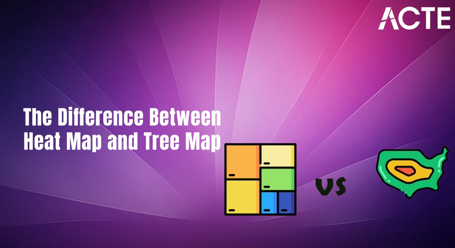
Difference between Tableaus Heat Map and Tree Map and When it comes to visualizing complex datasets, Tableau offers a variety of chart types to help users convey insights effectively. Two of the most popular types of visualizations are Heat Maps and Tree Maps. Both are highly effective for displaying data patterns and trends, but they serve different purposes and use cases. Understanding the differences between these visualizations can help you choose the right one for your analysis. In this blog, we’ll explore what difference between Tableaus Heat Map and Tree Map, discuss the key differences between them, and guide you on when to use each one.
Are You Interested in Learning More About Business Analyst? Sign Up For Our Business Analyst Training Today!
What Is a Heat Map in Tableau?
A Heat map tableau is a data visualization that uses colors to represent data values in a matrix format. Typically, heat map tableau are used to visualize the intensity of data at the intersection of two variables. They are ideal for showing patterns, trends, and relationships across a wide range of categories or dimensions.
Key Features of Heat Maps
- Color Gradients: Heat Maps use color gradients (typically from light to dark or from one color to another) to represent the intensity or magnitude of data values. For example, darker shades may indicate higher values, while lighter shades represent lower values.
- Matrix Layout: heat map tableau display data in a grid format, where each cell corresponds to the intersection of two categorical dimensions.
- Easy Comparison:heat map tableau make it easy to compare multiple variables at once, helping to identify trends, outliers, and clusters in the data.
When to Use of tableau Heat Maps
- When you need to visualize the relationship between two categorical dimensions.
- When you want to highlight the intensity or frequency of data points.
- When you need to compare values across categories and detect patterns or anomalies.
For example, you could use a Heat Map to visualize sales data across different products and regions, where the intensity of the color represents the sales volume.
What Is a Treemap in Tableau?
A Tree map tableau is another type of visualization in Tableau, but it uses nested rectangles to represent hierarchical data. Each rectangle’s size represents a specific measure, such as sales, revenue, or count, while the color indicates the value of a related metric. Tree Maps are ideal for visualizing parts of a whole and understanding the relative proportion of categories in a hierarchy.
Key Features of Tree Maps
- Rectangular Blocks: Tree map tableau Each rectangle in a Tree Map represents a category or subcategory, and the size of the rectangle indicates the value of a specific measure.
- Color Representation: The color of each rectangle indicates a measure’s value, tree map tableau providing additional context to the size-based data.
- Hierarchical Structure: Tree map tableau allow for the visualization of hierarchical data, where each parent category is broken down into smaller subcategories.
- Proportional Display: The size of each rectangle visually communicates the proportion of the total represented by each category.
When to Use of tableau Tree Maps
- When you need to visualize parts of a whole, such as how each product category contributes to overall sales.
- When you want to Use of tableau Tree Maps represent hierarchical data and compare categories at different levels.
- When you need Use of tableau Tree Maps to highlight the relative proportions of different categories based on a measure.
For example, you might use of tableau Tree Maps to show revenue by product category, where each category’s size represents its revenue, and the color indicates whether that revenue is above or below target.
To Explore Business Analyst in Depth, Check Out Our Comprehensive Business Analyst Training To Gain Insights From Our Experts!
Key Differences Between Tree map and Heat map in tableau
While both Tree map and Heat map in tableau are useful for visualizing data patterns, they serve different purposes and are designed to showcase different aspects of your data. Let’s explore the main differences:
Visual Representation
- Heat Map: A Heat Map represents data in a grid format where colors indicate the magnitude of data values at the intersection of rows and columns. It’s essentially a matrix with color-coded cells.
- Tree Map: A Tree Map represents data in a hierarchical format using rectangular blocks, where the size of the block shows the value of a measure, and the color indicates additional data.
Data Representation
- Heat Map: Heat Maps are best suited for showing relationships between two dimensions or categories. They are ideal for revealing patterns or trends between categories, such as identifying which time period (rows) and product (columns) have the highest or lowest sales.
- Tree Map: Tree Maps represent hierarchical data, making them ideal for visualizing parts of a whole. They help you see how different subcategories (such as products or departments) contribute to the overall total.
Use Cases
- Heat Map: Use appropriate Tableau chart types and apply colors/formatting to highlight trends and targets.
- Tree Map: Great for showing the breakdown of parts within a whole. Use Tree Maps when you want to see how various categories or subcategories contribute to a total (e.g., sales by product category, market share by company, or profits by department).
- Heat Map: Heat Maps typically allow users to interact with the color gradients, making it easier to compare data at a glance. However, they may not show hierarchical data as clearly as Tree Maps.
- Tree Map: Tree Maps are interactive in that users can explore the different subcategories within the hierarchical structure. They allow for zooming into different levels of data, making them great for visualizing complex datasets with multiple layers.
Interactivity and User Experience

Advantages of Heat Maps in Tableau
- Easy to Identify Patterns: Heat Maps help users easily spot patterns, trends, and anomalies across categories at a glance.
- Simple to Implement: Heat Maps are relatively straightforward to create in Tableau with simple categorical dimensions and color encoding.
- Effective for Large Datasets: Heat Maps are effective when you need to analyze large datasets with multiple categories and dimensions.
Gain Your Master’s Certification in Business Intelligence by Enrolling in Our Business Intelligence Master Program Training Course.
Advantages of Tree Maps in Tableau
- Displays Hierarchical Data: Tree Maps are excellent for visualizing hierarchical data and showing how smaller subcategories contribute to larger categories.
- Proportional Representation: The size of the blocks helps to communicate proportions, making it easy to see which categories are the most important or have the highest value.
- Compact Display: Tree Maps provide a compact and space-efficient way to represent a large amount of data in a relatively small area.
Best Practices for Creating Heat Maps and Tree Maps in Tableau
Best Practices for Heat Maps
- Use Clear Color Gradients: Make sure the color scheme in your Heat Map is intuitive. Use contrasting colors to represent high and low values clearly.
- Limit Dimensions: Don’t overload your Heat Map with too many dimensions. Keep it simple to ensure the pattern remains easy to identify.
- Add Tooltips: Use tooltips to provide additional context for the data displayed in each cell of the Heat Map.
- Choose Effective Hierarchies: Ensure that your data hierarchy makes sense. For example, categories should be logically grouped, and subcategories should be meaningful.
- Use Meaningful Color: Choose color schemes that provide clear visual differentiation, especially when showing performance (e.g., red for low and green for high).
- Limit the Number of Categories: If you have too many categories or subcategories, the Tree Map can become cluttered and hard to read. Keep it manageable.
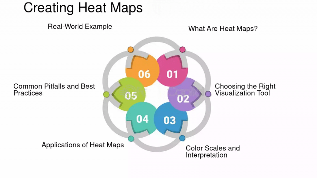
Best Practices for Tree Maps
Want to Learn About Business Analyst? Explore Our Business Analyst Interview Questions and Answers Featuring the Most Frequently Asked Questions in Job Interviews.
Conclusion
Both Difference between Tableaus Heat Map and Tree Map and its powerful tools for data visualization in Tableau, but they are suited to different tasks. Heat Maps are ideal when you want to compare the intensity of values between two categorical dimensions and identify patterns across a matrix. On the other hand, Tree Maps excel in visualizing parts of a whole, making them perfect for hierarchical data and showing how categories contribute to a total. Understanding Difference between Tableaus Heat Map and Tree Map these two types of visualizations and knowing when to use each one will allow you to choose the most effective chart for your data, ensuring that your Tableau dashboards are clear, impactful, and insightful.