
Last updated on 05th Jun 2025| 11355
- Introduction to Pivot Tables
- Preparing Data for Pivot Tables
- Creating Your First Pivot Table
- Configuring Rows and Columns
- Summarizing Data with Values
- Applying Filters and Slicers
- Grouping Data in Pivot Tables
- Pivot Table Styles and Formatting
Introduction to Pivot Tables
A Pivot Table is one of the most powerful and versatile features in Microsoft Excel, widely used for summarizing, analyzing, exploring, and presenting large and complex datasets. Its primary purpose is to help users quickly extract meaningful insights from vast amounts of raw data without altering the original dataset. By using a Pivot Table, you can automatically sort, count, and total data stored in one table and display the results in a new, interactive format. This allows for a clearer understanding of data patterns and trends. Pivot Tables enable users to group data by categories, filter information based on specific criteria, and perform a range of calculations such as sums, averages, and percentages, which are essential skills covered in Business Analyst Training. This flexibility makes it easy to view the same data from multiple perspectives. For example, a sales manager might use a Pivot Table to calculate total sales by product, region, or individual salesperson, gaining instant access to performance metrics across different business segments. Moreover, Pivot Tables are dynamic users that can drag and drop fields to rearrange data on the fly, add slicers for quick filtering, and update the table when the underlying data changes. This interactivity makes them ideal for dashboards and live reports. Whether you’re identifying trends, spotting outliers, or preparing executive summaries, Pivot Tables are an essential tool for efficient and insightful data analysis.
Do You Want to Learn More About Business Analyst? Get Info From Our Business Analyst Training Today!
Preparing Data for Pivot Tables
Preparing data for Pivot Tables is a crucial step to ensure accurate and meaningful analysis. Before creating a Pivot Table, the source data must be well-organized and structured properly. The dataset should be arranged in a tabular format, where each column represents a single variable or field, and each row contains a unique record or entry. Column headers should be clear, descriptive, and free from blank spaces or merged cells, as Pivot Tables use these headers to create fields an essential best practice emphasized in any Data Analytics Course For Beginners. Consistency in data is essential. All entries within a column should be of the same data type for instance, numbers in a “Sales” column or dates in a “Transaction Date” column. Avoid including subtotals, grand totals, or empty rows within the data range, as these can interfere with the Pivot Table’s calculations and summarizations. It’s also important to ensure that there are no completely blank columns or rows, as this may disrupt the range selection.
Before building a Pivot Table, clean your data by removing duplicates, correcting errors, and filling in any missing values. If the data is pulled from external sources, such as databases or reports, it may need to be refreshed or standardized. You may also consider converting the range into an Excel Table, which allows the Pivot Table to automatically update when new data is added. Proper data preparation ensures that your Pivot Table will be both functional and reliable, leading to more insightful and accurate reporting.
Creating Your First Pivot Table
- Prepare Your Data: Ensure your dataset is organized in a tabular format with clear column headers, no blank rows or columns, and consistent data types in each column. This clean data foundation is essential for accurate Pivot Table creation.
- Select Your Data Range: Click anywhere inside your dataset or manually select the entire data range you want to analyze. Excel will use this selection as the source for your Pivot Table.
- Insert the Pivot Table: Go to the “Insert” tab on the Excel ribbon and click “PivotTable.” In the dialog box, verify the data range and choose whether to place the Pivot Table on a new worksheet or an existing one. Click “OK” to create the Pivot Table framework.
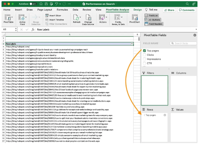
- Add Fields to the Pivot Table: In the PivotTable Fields pane, drag and drop relevant column headers into the four areas: Rows, Columns, Values, and Filters, to analyze data effectively an approach that reflects the data-driven decision-making emphasized in the History & Evolution of Six Sigma.
- Choose Summary Functions: By default, numerical data in the Values area is summed. To change this, click the drop-down arrow next to the field in Values, select “Value Field Settings,” and choose other functions like Count, Average, Max, or Min.
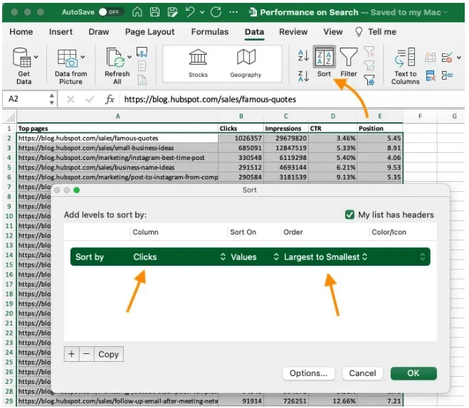
- Filter and Sort Data: Use the Filters area or filter buttons on row and column labels to narrow down your data view. Sorting options help you organize data ascending or descending for easier analysis.
- Format and Customize: Apply Pivot Table styles, adjust column widths, and format numbers to improve readability and presentation. You can also refresh the Pivot Table if the source data changes.
- Understand Rows and Columns Areas: In a Pivot Table, the Rows and Columns areas determine how your data is organized and displayed. Rows run vertically and list data items down the side, while Columns run horizontally across the top.
- Drag Fields to Rows: To organize data vertically, drag relevant fields from the PivotTable Fields pane into the Rows area. This groups your data by those categories, such as listing sales representatives or product names down the side.
- Drag Fields to Columns: To display data horizontally, drag fields into the Columns area. For example, placing “Month” here will create columns for each month, allowing you to compare values side by side an important technique taught in Business Analyst Training.
- Add Multiple Fields: You can add more than one field to Rows or Columns. Fields are arranged hierarchically, with the first field representing the primary grouping and additional fields creating subcategories for more detailed breakdowns.
- Rearrange Fields: Easily change the order of fields in Rows or Columns by dragging them up or down within their area. This changes the level of grouping and affects how data is nested and summarized.
- Expand and Collapse Groups: Use the plus (+) and minus (–) buttons next to row or column labels to expand or collapse grouped data, helping to focus on specific details or summaries.
- Filter Row and Column Labels: Apply filters to rows or columns by clicking the dropdown arrows next to their labels. This lets you display only the data you want to analyze, making your Pivot Table more focused and manageable.
- Understand Filters and Slicers: Filters and slicers allow you to narrow down the data displayed in your Pivot Table, focusing analysis on specific subsets without altering the original dataset. Filters are traditional dropdown menus, while slicers provide visual, clickable buttons.
- Add Filters to the Pivot Table: Drag a field into the Filters area of the PivotTable Fields pane. This adds a filter dropdown above the Pivot Table where you can select one or multiple items to display, such as filtering data by region or product category.
- Using Report Filters: Once a filter is added, click the dropdown arrow to choose the specific criteria. You can select single or multiple values, depending on the filter’s settings, allowing for dynamic data exploration—an essential skill for those asking, “ Why Should I Become a CBAP“
- Insert Slicers: To add slicers, select the Pivot Table, go to the “Analyze” or “PivotTable Analyze” tab on the ribbon, and click “Insert Slicer.” Choose the fields you want slicers for, and click OK. Slicers display buttons for each unique field value.
- Interact with Slicers: Click slicer buttons to instantly filter the Pivot Table data. Multiple slicers can be used together to refine the view further, making it easier to compare different segments.
- Customize Slicers: Adjust slicer size, style, and layout using slicer tools. You can also connect slicers to multiple Pivot Tables for synchronized filtering across reports. Clear Filters and Slicers: Easily reset filters by clicking the clear filter icon in the filter dropdown or the clear button on slicers, returning the Pivot Table to its full data view.
Would You Like to Know More About Business Analyst? Sign Up For Our Business Analyst Training Now!
Configuring Rows and Columns

Summarizing Data with Values
Summarizing data with Values is a key feature of Pivot Tables that allows users to perform calculations and aggregate data in meaningful ways. In a Pivot Table, the Values area is where numerical data is summarized, helping to transform raw numbers into insightful metrics. Common summary functions include Sum, Count, Average, Max, Min, and more, which can be applied to one or multiple fields depending on the analysis requirements. When you add a numeric field to the Values area, Excel automatically sums the values by default. However, this can be easily changed to other calculations such as counting the number of records, finding the average, or identifying the highest or lowest values. For example, in a sales dataset, you might summarize total revenue by product category, count the number of transactions per region, or calculate the average sales per salesperson. You might also explore How to use Control Chart Constants to monitor process stability and detect variations over time. These summaries provide quick snapshots that help identify patterns, trends, and outliers. Pivot Tables also support advanced calculations like percentage of total, running totals, and calculated fields, enabling even deeper analysis without altering the original data. Users can customize the value field settings to display data in different formats, such as showing results as percentages, differences from previous periods, or rankings. This flexibility makes Pivot Tables extremely powerful for turning detailed data into digestible insights. In addition, values can be filtered and grouped to focus on specific segments, making it easier to highlight important business metrics or performance indicators. Summarizing data with Values in Pivot Tables is essential for efficient data analysis, helping users make informed decisions based on clear, concise summaries.
Are You Considering Pursuing a Master’s Degree in Business Intelligence? Enroll in the Business Intelligence Master Program Training Course Today!
Applying Filters and Slicers
Grouping Data in Pivot Tables
Grouping data in Pivot Tables is a powerful feature that helps organize and summarize information more effectively. It allows users to combine related items into groups, making it easier to analyze large datasets by breaking them down into meaningful categories. For example, dates can be grouped by months, quarters, or years, while numerical data can be grouped into ranges or bins. This helps reveal trends and patterns that might be missed when viewing raw data. To group data, you simply select the items you want to group within the Pivot Table and apply the grouping function. Excel then treats these grouped items as a single category in the report, which is relevant when learning How To How To Measure The Effectiveness Of Corporate Training through data analysis techniques. This is especially useful for date fields, where grouping by time periods can provide insights into seasonal sales trends or monthly performance. Similarly, grouping numbers into ranges can help analyze distribution and frequency, such as grouping sales amounts into bands like 0-1000, 1001-5000, and so on. Grouping also works with text fields, allowing related items to be combined for a cleaner, more organized summary. Additionally, users can ungroup data at any time if needed. This flexibility lets analysts drill down into specific segments or view data at a higher level of aggregation. Overall, grouping enhances the readability and usability of Pivot Tables, making it easier to interpret complex datasets and draw actionable conclusions. It’s an essential technique for anyone looking to gain deeper insights and make data-driven decisions.
Go Through These Business Analyst Interview Questions and Answers to Excel in Your Upcoming Interview.
Pivot Table Styles and Formatting
Pivot Table styles and formatting play a vital role in enhancing the readability and visual appeal of reports, making it easier to interpret data quickly. Excel offers a variety of built-in Pivot Table styles that allow users to customize the look of their tables with just a few clicks. These styles include different color schemes, banded rows or columns, and various font options that can highlight key data points or separate sections clearly. Applying consistent formatting helps to distinguish between different parts of the Pivot Table, such as row labels, column labels, and values, improving overall clarity. For instance, banded rows or columns make it easier to follow data across the table, reducing eye strain when working with large datasets a useful feature often emphasized in Business Analyst Training. Users can also manually format elements like fonts, borders, and background colors to match corporate branding or presentation standards. Beyond basic styling, Excel enables users to format numbers within the Pivot Table for better data interpretation. You can apply currency symbols, percentage formats, or adjust decimal places depending on the data type. Conditional formatting can also be applied to highlight trends or outliers dynamically, such as using color scales or data bars to visualize high and low values. Moreover, Pivot Tables support customization of subtotals and grand totals, allowing users to control which totals are displayed and how they are formatted. This helps create cleaner, more focused reports tailored to specific analysis needs. Overall, effective use of Pivot Table styles and formatting enhances both the professionalism and usability of data summaries.