
Last updated on 13th Jul 2020| 1977
Importance Of Data Visualization
Data Visualization is one of the most important parts of data analysis. It has always been important to present the data in an understandable and visually appealing format. Data visualization is one of the skills that Data Scientists have to master in order to communicate better with the end users.
Data is the word here.
Let me first give you an idea of the kind and amount of data that we are dealing with. According to SiliconAngle, there were 2.5 petabytes of stored data world over in the year 2012 and it is set to hit more than 50 petabytes mark by the end of 2017. To put things in perspective, this data has largely been produced by websites and cross platform transactions. Add to it the fact that there would be a total of 20 billion “smart” devices connected to the internet by the end of 2020 and the numbers can be baffling!
Data visualization allows data scientists to converse with their end users. The outcome of data analysis is not immediately comprehensible to the people who do not directly deal with data. Data visualization bridges that gap and makes people appreciate the possibility of data analysis.
Let us consider the following example to understand this:
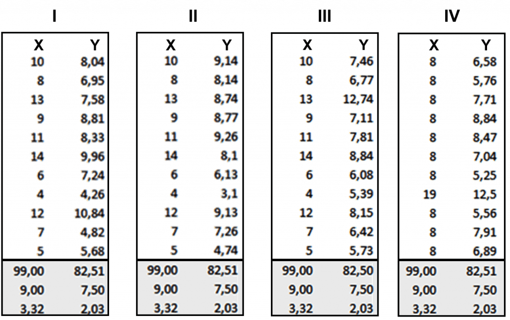
The following image shows the x and y coordinates of different points to be plotted on a graph. The numbers look almost the same, don’t they? Maybe the lines will look similar after we plot each set on the graph.
So, now take a look at the image below when we plot these points in our graph:
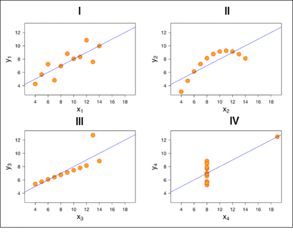
You see how different they look like when you actually visualize it. It wasn’t possible for us to figure out the nature of each line until we visualized it.
Tableau Tutorial: Introduction To Data Visualization Tools
Here are the top 5 data visualization tools that are being used extensively in BI:
- Tableau
- Qlikview
- Domo
- Microsoft power BI
- Excel
Let us know a little bit about all of them.

Tableau:
Basic version of Tableau data visualization tool is free which can perform regular tasks such as:
- Sales data analysis
- User density monitoring
- Consumer segmentation
- Tracking budgeting expense
- Categorizing and sub-categorizing data

Excel:
You can actually do some pretty complex things with Excel, from ‘heat maps’ of cells to scatter plots. As an entry-level tool, it can be a good way of quickly exploring data, or creating visualizations for internal use, but the limited default set of colors, lines and styles make it difficult to create graphics that would be usable in a professional publication or website.

Microsoft Power BI:
Microsoft Power BI is a cloud-based business intelligence and analytics service that provides a full overview of your most critical data.
Connecting to all of your data sources, Power BI simplifies data evaluation and sharing with scalable dashboards, interactive reports, embedded visuals and more.

Domo:
Domo is designed to be available for all business users, regardless of technical expertise, to help them make better business decisions.
Domo recently launched Business Cloud, the world’s first open, self-service platform to run an entire organization. Business Cloud brings together the data, the people and the insights users need to find answers to critical business questions and make faster, better-informed decisions to improve performance.

Qlikview:
The QlikView business discovery platform is one of a few visual analytics tools offered by Qlik. QlikView can’t create the same elegant visualizations that the other tools offer, but the software’s dynamic model means that you can quickly analyze your data in multiple dimensions. In addition, QlikView is able to work off of data in memory instead of off your disk, allowing for real-time operational BI environments (like monitoring financial transactions).

Best Tableau Training to Enhance Your Career By TOP-Rated Instructors
- Instructor-led Sessions
- Real-life Case Studies
- Assignments
QlikView is able to work with a wide variety of data sources, including SAP, Oracle, Salesforce.com and other legacy data files like Excel spreadsheets. What’s more, QlikView can combine these disparate data sources into a single visualization or dashboard.
But now the big question is which tool should you go for? Well, I say go with Tableau. Take a look below to know why.
Why Tableau?
Below are some of the pros or features of Tableau which will spellbind you to start using it right away!
Tableau Features:
1. Apt visualizations:
Tableau connects to many different data sources and can visualize large data sets than Power BI can. Once in Tableau, a dashboard shows the basics of the users’ data. The user can then drill down into datasets by downloading a worksheet. From there, they can apply various visualizations to the data.
In Tableau, you select the data and switch between visualizations on the fly. It’s easier to jump between visualizations in Tableau.
Tableau visualizes data from the start, allowing you to see the significance right away. Tableau differentiates correlations using color, size, labels and shapes, giving you context as you drill down and explore on a granular level.
2. Depth of discovery:
The features of Tableau gives users ways to answer questions as they investigate data visualizations. The solution can show basic trends as predictions, use “what if” queries to adjust data hypothetically, and visualize components of data dynamically for comparisons.
3. Implementation:
Tableau provides a variety of implementation and consulting services. For enterprise-level deployment, there’s a four-step process spanning weeks, and for smaller-scale deployments, there are quick-start options that can complete setup in a matter of hours.
Tableau provides a variety of implementation and consulting services. For enterprise-level deployment, there’s a four-step process:
- Phase 1 – This phase involves IT planning, architecture consulting, pre-install checkup, server installation and verification, and validation of security configuration.
- Phase 2 – Phase 2 involves working with data and data migration, including data modeling, data mining, data extraction, data sources and business workflow.
- Phase 3 – In Phase 3, there’s a two-day classroom training covering Tableau Fundamentals, hands-on advanced coaching, and building and formatting visualizations.
- Phase 4 – This final phase helps companies expand Tableau usage across their business. It includes implementation workshops where topics such as evaluating action plans and defining measurable outcomes are discussed.
4. Automation functionality:
Tableau is a little more intuitive with creating processes and calculations. For example, when creating calculations in a tabular format, the formula can be typed once, stored as a field and applied to all rows referencing that source. This makes it easier to create and apply recurring processes. Tableau’s flexibility also allows users to create custom formulas that aren’t available in most of the tools.
5. Data source connectors:
Tableau offers hundreds of native connectors to easily pull, cleanse and correlate data from practically any source without having to create custom code.
Tableau extracts large data sets from sources for quick, ad-hoc analysis using two different methods: Live Connection and In-memory. Both adapt to your local database and, based on the size and capacity, sync data quickly by extracting the relevant data to a query. It also has a general Open Database Connectivity (ODBC) connection for any connections that don’t have a native connector provided.
Tableau Product Family
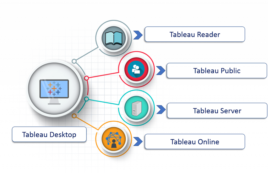
1. Tableau Desktop:
It is a self service business analytics and data visualization that anyone can use. It translates pictures of data into optimized queries. With tableau desktop, you can directly connect to data from your data warehouse for live up to date data analysis. You can also perform queries without writing a single line of code. Import all your data into Tableau’s data engine from multiple sources & integrate altogether by combining multiple views in an interactive dashboard.
2. Tableau Server:
It is more of an enterprise level Tableau software. You can publish dashboards with Tableau Desktop and share them throughout the organization with a web-based Tableau server. It leverages fast databases through live connections.
3. Tableau Online:
This is a hosted version of Tableau server which helps make business intelligence faster and easier than before. You can publish Tableau dashboards with Tableau Desktop and share them with colleagues.
4. Tableau Reader:
It’s a free desktop application that enables you to open and view visualizations that are built in Tableau Desktop. You can filter, drill down data but you cannot edit or perform any kind of interactions.
5. Tableau Public:
This is a free Tableau software which you can use to make visualizations with but you need to save your workbook or worksheets in the Tableau Server which can be viewed by anyone.
Understanding Tableau
Let us start by taking a look at the data types that Tableau supports. Refer to the diagram below which shows all the compatible data types of Tableau.

Enroll in Tableau Certification Course & Get Hired By TOP MNCs
Weekday / Weekend BatchesSee Batch Details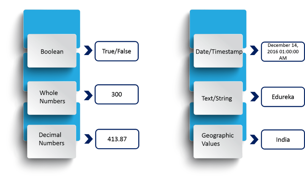
The above diagram shows you the data types that Tableau supports with respective examples.
Now, the data types that we are dealing with can also be categorized broadly into two categories and they are:
- Measures
- Dimensions
Refer to the diagram below to understand the differences between Dimensions and Measures.
10 Tips for Learning Tableau
Aside from data visualization, Tableau is useful for data mining, data cleaning, statistical computations, and graphs. But like any tool, it is crucial to learn how to use it to take advantage of its many features. Here are ten tips for learning this powerful software
1. Look at Tableau Graphs and Data Visualizations Online
See how Tableau is applied in various scenarios and industries to see how it can be used.
2. Follow the Tableau community
Subscribe to Tableau-related lists, and follow other users within your industry who are applying Tableau to get their feedback on the design and user experience.
Check out guides and resources like the Tableau Reference Guide. Follow Twitter handles like @tableaupublic and @HighVizAbility and data visualization pages like Storytelling with Data, the Tableau blog, and other similar blogs.
3. Read up on Tableau offline
Check out this list of data visualization books from Tableau or read one of these starter books to learn the software:
- Tableau Your Data! Fast and Easy Visual Analysis with Tableau Software, by Daniel G. Murray
- Communicating Data with Tableau, by Ben Jones
- Practical Tableau: 100 Tips, Tutorials, and Strategies from a Tableau Zen Master, by Ryan Sleeper
4. Identify and Align Skill Sets
Tableau helps piece together information and unify it into an informative, visually appealing data story. Creating this calls for skill sets that include:
- Working knowledge of data
- Experience with tools like Microsoft Excel and Google Sheets
- Basic data analysis experience
- Math and statistical knowledge
- Analytical and visualization skills
- The ability to filter, sort and group data
- Programming knowledge for advanced features like Tableau Developer and Tableau Dashboard Designer
5. Practice
The best way to learn new software is to use it. Download and install the desktop version, and start exploring its features. Use Tableau Public to publish interactive data visualizations online. Download existing workbooks as a learning resource.
6. Find free datasets
Use these free practice datasets, new contributed datasets, datasets shared on community forums, and this list of public datasets, and read these tips to look for free datasets to work within Tableau. Search Kaggle for open data to use as practice.
7. Create a Tableau portfolio
Practice your data visualization skills by building an online Tableau portfolio and starting a dashboard project. Use the active Tableau Public Gallery for inspiration.
8. Build a Tableau project footprint online
Share links to your dashboard or post them to GitHub repositories, and explain your method. Look at your project from a fresh viewpoint by getting suggestions and feedback from the active Tableau community.
9. Get involved
Engage with a Tableau user group, and meet local Tableau users. Refer to this map to find a group near you. Also, join Facebook groups for community insight.
10. Get trained
Because of its wide adoption across industries and applications, demand is high for Tableau certification.
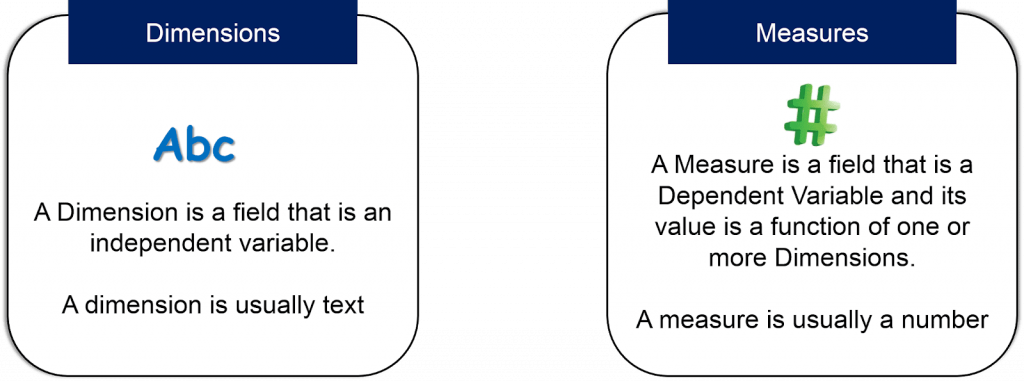
In order to make it more understandable to you, A dimension is used to add more detail to describe your data.