
Last updated on 23rd Dec 2021| 3579
A dashboard is used to represent tables or charts which are related to some business meaning. It is done through panels. The panels in a dashboard hold the chart or summarized data in a visually appealing manner.
- Introduction to Splunk Dashboard
- Creating Dashboard
- Splunk Dashboard Studio in Search & Reporting
- New Single Value, Table, and Choropleth SVG Visualizations
- Expanded Defaults Support
- Change dashboard permissions
- View and edit dashboard panels
- Add controls to a dashboard
- Add saved reports to a dashboard
- Adding a search to an existing dashboard
- Conclusion
- A dashboard is used to represent tables or charts that are related to some business sense. This is done through panels. The panels on the dashboard hold charts or summarized data in an attractive way. We can add multiple panels and therefore multiple reports and charts in a single dashboard.
- Dashboards are views that contain panels. Panels can include modules such as search boxes, fields, maps, tables, and lists. Typically, dashboard panels are attached to reports.
- After creating a search visualization or saving a post, we can add it to a new or current dashboard. Additionally, we can use Dashboard Editor to create and edit dashboards. The Dashboard Editor is useful when we have a collection of saved reports that we want to quickly add to the Dashboard.
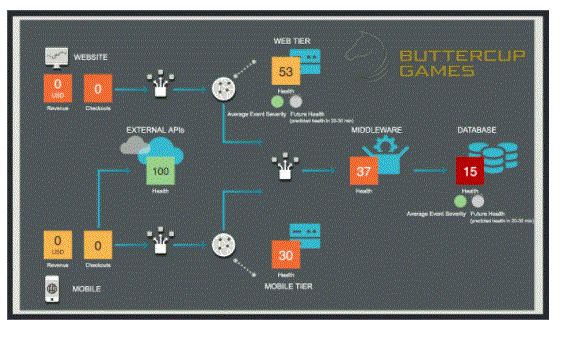
- Here is a dashboard example. In this tutorial, we have taken the example of Buttercup games. The syntax and procedure will be the same for all the cases though we can change the key keyword or name as per our requirement.
Introduction to Splunk Dashboard:
Creating Dashboard:
We will continue with the search query from the previous chapter which shows the count of files in days of the week. We choose the Visualization tab to see the result in the form of a pie chart. To place the chart on the dashboard, we can choose the Save As → Dashboard Panel option as shown below.
Dashboard1– In the next screen you will be asked to fill in the details of Dashboard and Panel in it. We fill the screen with the details shown below.
Dashboard2– On clicking the save button, the next screen gives an option to view the dashboard. On choosing to view the dashboard, we get the following output where we can see the dashboard and options to edit, export or delete.
Dashboard3– We can add another chart to the dashboard by adding a new panel containing the charts. Below is the bar chart and its query which we are going to add in the above dashboard.
Dashboard4– Next, we fill in the details for the second chart and click on Save as shown in the image below –
dashboard5– Finally, we get the dashboard which consists of both the charts in two separate panels. As you can see in the image below, we can edit the dashboard to add more panels and you can add more input elements: text, radio, and dropdown buttons to create a more sophisticated dashboard.
- You can access Splunk Dashboard Studio directly in the Search & Reporting app. From the Dashboard List page, you will see the classic dashboard (Simple XML) and a unified table for dashboards in Dashboard Studio. You’ll also see some resource cards that we’ve added at the top to provide quick links to the Dashboard Studio Example Hub, Dashboard Studio Documentation, and Classic Dashboard (Simple XML) Documentation.
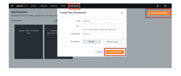
- When you click on “Create New Dashboard”, you will have the option to create your dashboard as Classic Dashboard or Dashboard Studio. If you select Dashboard Studio, you have two layout options: Absolute Layout for pixel-perfect positioning (think of it like a free-form canvas) and Grid Layout for quick and clean arrangement of charts.
- You can also save visualizations from Search to Dashboard Studio. Once you have completed your SPL query and selected the visualization you want to save, click the “Save As” menu above the search bar. If you save your visualizations in a new dashboard, you’ll have to choose between Classic Dashboard and Dashboard Studio, similar to the Dashboard page.
- Note that there are some visualizations that are available in Search/Classic Dashboard (Simple XML) but are not supported in Dashboard Studio, such as custom visualizations or visualizations with Trellis enabled. You will not be able to save these visualizations in Dashboard Studio. You can see a comparison chart between Classic Dashboard and Dashboard Studio in the docs.
Splunk Dashboard Studio in Search & Reporting:
- KPIs: KPI1=54, KPI2=79, and KPI 3=22.
- KPI1
- KPI2
- KPI3
- 54
- 79
- 22
New Single Value, Table, and Choropleth SVG Visualizations:
This GA release of Dashboard Studio comes with advanced visualizations for single value, single value icons, tables and choropleth SVGs. Compared to the Splunk Dashboard app (beta) visualizations, these visualizations have more flexibility and formatting options. For example, if you have a single value on your dashboard, you can choose to dynamically colorize different combinations of key price, trend, and background color.

Learn Advanced Splunk Certification Training Course to Build Your Skills
Weekday / Weekend BatchesSee Batch DetailsYou can select from predefined color palettes or you can customize the color palette by specifying HEX values. You can choose between a lighter color palette (recommended for Dark Mode Dashboard) or a darker color palette (recommended for Light Mode Dashboard). You can add or remove categories, and if you want to flip the order of colors, there’s a button for that!.
For table visualizations, you can now select each column you want to format, and each column can be formatted individually. In Splunk Dashboard Studio, you can wire up multiple visualizations to a single data source. Let’s say you create a single data source that returns multiple.
You would wire this data source up to three different single value visualizations and just specify which field (KPI) you want to display in each single value. The end result is that the search is executed only once, but can populate three visualizations. This is a way to reduce the number of queries executed per dashboard!
- The dashboard of Splunk Dashboard Studio has the ability to specify default settings for visualizations and data sources. Imagine you have 15 single value visualizations and you want to apply the same thresholding conditions to each single value. Instead of manually setting the threshold on each visualization, you can specify it in the default verse.
- In the source code for that visualization, you’ll see a “reference” stanza that specifies the ranges and colors, and an “options” stanza that links the ranges to the component you want to color dynamically (i.e. key values , trend, background).
- To set this as the default for all single value visualizations, you would first add a new section called “splunk.single value” under “Defaults” and under “Visualizations”. This is where you would specify the default for the single value visualization. Under “splunk.single value” you will create two stanzas for “options” and “context” and cut and paste the contents of the “options” and “context” stanzas from the visualization.
- And now, all three KPIs are complying with the thresholding conditions, but it was specified only once! This also means that when you need to make changes, you only have to make changes to the default section once, and all association visualizations will be updated. If you apply any changes directly to the visualization, those changes will override the global defaults. This allows you the flexibility of multiple visualizations with different options, and also saves time by taking advantage of the dashboard defaults.
Expanded Defaults Support:
Change dashboard permissions:
We can give Dashboard Editor access to Dashboards. However, our user function and the capabilities specified for that function may restrict the type of access we have.
If our Splunk user role is admin (with a default set of capabilities), we can create private dashboards, visible in a specific app, or visible across all apps. We may also provide access to other Splunk user positions with different skills such as user, admin and other functions.
Change dashboard panel visualization. After we’ve created a panel with the Dashboard editor, we’re using the visualization editor to adjust the look of visualizations in the panel, and decide how the viewing will display and behave.
View and edit dashboard panels:
A separate view is provided to see a list of the dashboards we have access to. We can create a dashboard from this view, and make changes in the dashboard and dashboard panel.
1. Click Dashboard in the app bar to see the Dashboard view.
We can see a pop-up dialog box asking if we want to do a Dashboard Tour. When we’re traveling, there’s an opportunity to try the dashboard yourself at the end of the ride. This option provides a view of the dashboard. In addition to the Buttercup Games-Purchase Dashboard we created, there are several built-in dashboards to list. splunk- dashboard
2. Click the arrow (>) icon in the I column to expand the dashboard information for the Buttercup Games-Purchase Dashboard.
We can view information about the software associated with this dashboard, whether or not the dashboard is scheduled, and dashboard permissions.
- In the Dashboard list, click Buttercup Games – Purchases to display that dashboard.
- Click Edit.
- splunk-dashboard
- To edit the dashboard we can either use the UI or the source. We can then add panels and inputs to the dashboard with UI options.
- Use the Add Panel option to create a new panel, add the report as a panel, or clone it from an existing dashboard.
- We can select from the list of controls to add to the dashboard including text, checkbox and time range picker using the Add Input option.
- We can use the preferred dark theme to adjust the dashboard background look. We need to save and refresh the dashboard to allow theme updates.
- We can directly edit the source XML for the panel by using the Source option. In this example, editing the source directly is not mentioned.
Add controls to a dashboard:
We can add input controls like time range picker to the dashboard panel.
- splunk- dashboard
- Click Edit in the Actions window and select the Edit Panel. Open the website Edit Dashboard.
- Click Add Panel.
- Sidebar Panel The add panel opens on the right side of the browser.
- splunk- dashboard
- To add a new panel from an existing study, select New from Reports.
- The list includes reports we created and saved and embedded.
- splunk- dashboard
- Select Trends to buy.
- The Preview Sidebar panel appears next to the Add Sidebar. The preview includes report details, the discovery the report is based on, and a summary of the report. This is the report we created on the sparkline map.
- splunk- dashboard
- Tap on Dashboard Add.
- The updated screen is at the bottom of the dashboard.
- Select Chart breakdown of activities and conversion levels by item from the Add Panel sidebar tab and add it to the dashboard.
- splunk- dashboard
- Add Panel Close the sidebar.
- Rearrange the dashboard panel.
- Drag and drop a tab to the top of a column by the drag and drop button. When we drag a line, a four-pointed arrow symbol appears on the drag-and-drop bar.
- splunk- dashboard
- To add our changes to the Dashboard, press Add in the Edit Dashboard window.
Add saved reports to a dashboard:
Bet- Make sure we have the Games Buttercup-by dashboard. This dashboard was created and modified in the previous section of this tutorial, Creating Dashboards and Panels. Before continuing with this section, we need to create a dashboard.
Tap Dashboard in the Apps bar and select Buttercup Games-Purchase Dashboard to see a list of our dashboards.
- Click Search in the Apps bar to start a new search.
- Make sure the time limit is set to all times.
- To evaluate VIP clients and items purchased by clients, run the search below.
- sourcetype=access_* status=200 action=purchase [search
- sourcetype=access_* status=200 action=purchase | top limit = 1
- customer | table client] | Stats count as “Total Purchases”,
- dc(productId) AS “Total Products”, value (ProductName) AS
- “Product Name” by Client IP | Rename the client IP as “VIP Client”
- The following image shows the results of the search
- splunk- dashboard
- Click Save As and select Dashboard Panel.
- For Dashboard, click on Existing and select Buttercup Games – Purchases.
- For the panel title, type VIP client purchases.
- Click View Dashboard.
- Click Edit.
- In the Dashboard editor, drag the VIP client purchases panel next to Top purchases by category pie chart.
- Click Save.
Adding a search to an existing dashboard:
We can save the ad-hoc search as a panel in the existing dashboard. This example includes the ProductName field in the section of this tutorial Allowing Field Lookups. Until we continue this section, we have to complete all those steps. If we do not configure the lookup area, the searches performed in this section do not return the appropriate results.
Let’s use lookup to run the search below.
- The first thing you see when you enter the Search and Reporting app is the Summary dashboard. It offers a search bar and time frame picker that you can use to input and run your initial search.
- When you add an input to Splunk, that input gets added relative to the app you’re in. Some apps, such as *nix and Windows apps, write input data to a specific index (in the case of *nix and Windows, that is the OS index). If you review the Summary dashboard and you don’t see data you’re sure Splunk contains, make sure you’re viewing the correct indexes.
- You might want to add the index that the app uses to the list of default indexes for the role you are using. For more information about roles, see this topic about roles in Securing Splunk.
Conclusion: