
Last updated on 31st Dec 2021| 4974
A Pareto chart is a bar graph. The lengths of the bars represent frequency or cost (time or money), and are arranged with longest bars on the left and the shortest to the right.
- Introduction to Pareto Chart
- Pareto Control charts
- What is the use of Pareto Charts
- Pareto analysis
- The Pareto principle
- Performance of control Charts
- Types of Charts
- Charts Details
- How to Create Pareto Chart
Introduction to Pareto Chart
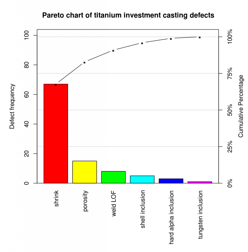
A Pareto chart is a special example of a bar chart. For a Pareto chart, the bars are ordered by frequency count from highest to lowest. These charts are often used to identify areas that focus on process improvement first.
Pareto charts show an ordered frequency count of values for different levels of a categorical or nominal variable. Charts are based on the “80/20” rule. This law states that about 80% of problems are the result of 20% of causes. This rule is also called “the significant few and the trivial many”. Then, the idea is that you can focus on a few important root causes of the problem and ignore a lot of the trivial.
A Pareto chart showing ordered frequency counts for the levels of a nominal variable. The chart shows the types of findings derived from business processes audits. The most common finding is that a standard operating procedure (SOP) was not followed.
Pareto Control charts
A control chart, also known as a Shevart chart (after Walter A. Shevart) or process-behaviour chart, is a statistical process control tool used to determine whether a manufacturing or business process is in control. It would be more appropriate to say that control charts are graphical devices for statistical process monitoring (SPM). Conventional control charts are mostly designed to monitor process parameters when the underlying form of process distribution is known. However, in the 21st century more advanced technologies are available where incoming data streaming can be monitored without any knowledge of the underlying process delivery. Delivery free control charts are becoming increasingly popular.
What is the use of Pareto Charts
The left vertical axis is the frequency of occurrence, but it can optionally represent cost or another important unit of measurement. The right vertical axis is the total number of incidents, the total cost, or the cumulative percentage of the total of the particular unit of measure. Since the values are in descending order, the cumulative function is a concave function. To take the example below, reducing the amount of late arrivals by 78% is enough to address the first three issues.
The purpose of a Pareto chart is to highlight the most important among a (usually larger) set of factors. In quality control, Pareto charts are useful for finding defects to prioritise in order to observe the greatest overall improvement. It often represents the most common sources of defects, the most frequent types of defects, or the most frequent causes of customer complaints, etc. Wilkinson (2006) devised an algorithm for producing a statistically based acceptance threshold (similar to confidence intervals) for each bar in a Pareto chart.
These charts can be generated by simple spreadsheet programs, specialised statistical software tools, and online quality chart generators. The Pareto chart is one of the seven basic tools of quality control
- Pareto analysis is a formal technique that is useful where several possible courses of action are competing for attention. In essence, the problem-solver estimates the benefit delivered by each action, then selects a number of most effective actions that distribute the total benefit as reasonably close to the maximum possible.
- A Pareto analysis in a diagram showing which cause should be addressed first. Pareto analysis is a creative way of looking at the causes of problems because it helps to stimulate thinking and organise ideas. However, this can be limited by the exclusion of potentially significant problems that may be small initially, but which tend to grow over time. It should be combined with other analytical tools such as failure mode and effects analysis and fault tree analysis for example. [citation needed]
- This technique helps to identify the top part of the causes that need to be addressed to solve most of the problems. Once the major causes have been identified, tools such as the Ishikawa diagram or the FISH-**** analysis can be used to identify the root causes of problems. While it is common to refer to Pareto’s “80/20” rule, under the assumption that, in all situations, 20% of the causes determine 80% of the problems, this ratio is and should not be merely a convenient rule of thumb. Should and should not be. It is considered an immutable law of nature. The application of Pareto analysis in risk management allows management to focus on the risks that have the greatest impact on the project.
Pareto analysis
The Pareto principle
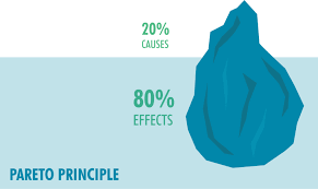
The Pareto principle states that for many outcomes, approximately 80% of the results come from 20% of the causes (“something significant”).[1] Other names for this principle are the 80/20 rule, the law of the significant few, or the factor of sparsity. Theory.
The Pareto Principle applies to raising funds: 20% of donors contribute 80% of the total. Management consultant Joseph M. Juran developed the concept in terms of quality control and improvement, naming it after Italian economist Vilfredo Pareto, who noted the 80/20 connection at the University of Lausanne in 1896. [4] In his first work, Cours d’Économie Politique, Pareto showed that about 80% of the land in Italy was owned by 20% of the population. The Pareto principle is only concerned with the Pareto efficiency.
Mathematically, the 80/20 rule is roughly described by a power law distribution (also known as a Pareto distribution) for a particular parameter, and many natural phenomena exhibit such a distribution. has been shown to do. [5] It is a business management saying that “80% of sales come from 20% of customers”.
- When a point falls outside the established range for a given control chart, those responsible for the underlying process are expected to determine whether a particular cause has occurred. If one has, it is reasonable to determine whether the results for the particular cause are better or worse than the results for the general cause alone. If worse, that cause should be eliminated if possible. If preferable, it may be appropriate to deliberately maintain the particular cause within the system that produces the result. [citation needed]
- Even when a process is under control (that is, no specific causes are present in the system), there is about a 0.27% chance of a point exceeding the 3-sigma control limit. So, even a control process plotted on a properly constructed control chart will eventually indicate the possible presence of a particular cause, even if one has not actually occurred. For the Shewhart control chart that uses the 3-sigma threshold, this false alarm occurs on average once every 1/0.0027, or 370.4 observations. Therefore, the in-control average run length (or in-control ARL) of the Shewhart chart is 370.4. [citation needed]
- Meanwhile, if a particular cause occurs, it may not be of sufficient magnitude for the chart to generate an immediate alarm condition. If a particular cause occurs, that cause can be described by measuring the change in mean and/or variance of the process in question. When those changes are quantified, it is possible for the chart to determine an out-of-control ARL. [citation needed]
- It turns out that the Shewhart chart process is quite good at detecting large changes in mean or variance, as their out-of-control ARLs are quite low in these cases. However, for small changes (such as a 1- or 2-sigma change in the mean), the Shewhart chart does not detect these changes efficiently. Other types of control charts have been developed, such as EWMA charts, Qsum charts, and real-time contrast charts, which more efficiently detect small changes by using information from observations collected prior to the most recent data point. ,
- Multiple control charts work best for numerical data with Gaussian assumptions. Real-time contrast charts were proposed for process monitoring with complex features, e.g. Higher-dimensional, numerical and categorical mixing, missing-valued, non-Gaussian, non-linear relations.
Performance of control Charts
- {\displaystyle {\bar {x}}}{\bar {x}} and R chart the quality attribute measure within a subgroup independent variable large (≥ 1.5σ)
- {\displaystyle {\bar {x}}}{\bar {x}} and s chart the quality attribute measure within a subgroup of the independent variable large (≥ 1.5σ)
- Shevart person control chart (ImR chart or XmR chart) quality attribute measure independent variable for an overview Large (≥ 1.5σ)
- Three-way chart quality attribute measure within a subgroup independent variable large (≥ 1.5σ)
- P-Chart Fraction Non-conformity Independent Traits Within a Subgroup Large (≥ 1.5σ)
- NP-chart number non-conformity independent properties within a subgroup large (≥ 1.5σ)
- C-chart Number of non-conformities within a subgroup Independent attribute Large (≥ 1.5σ)
- U-Chart Non-conforming independent properties per unit within a subgroup Large (≥ 1.5σ)
- EWMA chart Exponentially Weighted Moving Average of a Quality Attribute Measure Within a Subgroup Independent Attribute or Variable Small (<1.5σ)
- CUSUM chart Cumulative sum of quality attribute measure within a subgroup Small independent attribute or variable (<1.5σ)
- Time Series Model Quality Attribute Measurement Auto-correlated Attribute or Variable N/A Within a Subgroup
- Regression Control Chart Quality Trait Measurement Within a Subgroup Dependent Variable of Process Control Variables Large (≥ 1.5σ)
Types of Charts
Chart Process Overview Process Overview Relationship Process Overview Variation Size to Detect Type
Some practitioners also recommend the use of individual charts for attribute data, especially when the assumptions of binomially distributed data (P- and NP-charts) or Poisson-distributed data (U- and C-charts) are violated. Is. [14] Two primary justifications are given for this practice. First, normality is not necessary for statistical control, so individual charts can be used with non-normal data. [15] Second, trait charts derive the measure of dispersion directly from the mean ratio (assuming a probability distribution), while individual charts derive the measure of dispersion from the data, independent of the mean, inferring the individual’s chart from the trait chart. To make it stronger. Assumptions about the distribution of the underlying population. [16] It is sometimes noted that the substitution of individuals’ charts works best for large calculations, when the binomial and Poisson distributions approximate a normal distribution. i.e. when the number of trials n > 1000 for P- and NP-charts or > 500 for U- and C-charts.
Critics of this approach argue that control charts should not be used when their underlying assumptions are violated, such as when the process data is neither normally distributed nor binomial (or Poisson) distributed. is done. Such processes are not under control and should be rectified before implementation of control charts. Additionally, the application of charts in the presence of such deviations increases the type I and type II error rates of control charts, and may make the charts of little practical use. [citation needed]
- Points (i.e., data) representing a statistic (e.g., a mean, range, ratio) of the measure of a quality characteristic in samples taken from the procedure at different times
- The mean of this statistic is calculated using all samples (eg, mean of mean, mean of categories, mean of proportions) – or the reference period against which the change can be measured. Similarly a median can be used instead.
- A centre line is drawn on the value of the mean or median of the data.
- The standard deviation of the statistic (for example, the square of the mean (variance)) is calculated using all samples—or else—for a reference period against which the change can be assessed. In the case of the XMR chart, strictly speaking it is an estimate of the standard deviation, [clarification needed] does not make the assumption of uniformity of the process over time which makes the standard deviation.
- Upper and lower control limits (sometimes called “natural process limits”) which indicate the range at which the process output is considered statistically ‘unlikely’ and is typically drawn at 3 standard deviations from the centre line. goes.
Charts Details
A control chart consists of:
- The more restrictive upper and lower warning or control limits are drawn as separate lines, usually two standard deviations above and below the centre line. It is routinely used when a process requires tight control over variability.
- Division into zones with the addition of rules governing the frequency of observations in each zone
- Interpretation with events of interest as determined by the quality engineer in charge of process quality action on special causes
Charts may have other optional attributes, including:
This makes control range a very important decision aid. Control limits provide information about process behaviour and have no intrinsic relation to any specification targets or engineering tolerances. In practice, the mean (and hence the centerline) of the process may not coincide with the specified value (or target) of the quality attribute because process design simply cannot provide the process characteristic at the desired level.
Control charts limit specification limits or targets because of the tendency of those involved in the process (for example, machine operators) to focus on performance to specification, when in fact the least-cost action is to minimise process variation as much as possible. Have to keep it low. Attempting to create a process whose natural centre is not the same as the target performance of the target specification increases process variability and significantly increases costs and causes great inefficiency in operation. However, process capability studies examine the relationship between natural process limits (control limits) and specifications.
Control charts are intended to allow simple detection of events that are indicative of increased process variability. [8] This simple decision can be difficult where the characteristic of the process is constantly changing; The control chart provides statistically objective parameters of change. When change is detected and considered good then its cause should be identified and possibly a new way of working should be done, where change is bad then its cause should be identified and eliminated.
The purpose of adding a warning range or subdividing a control chart into zones is to provide quick notification when something goes wrong. Rather than immediately launching a process improvement effort to determine whether specific causes exist, the quality engineer may temporarily increase the rate at which samples are taken from process output until it is clear that The process is really under control.
The rough result of Chebyshev’s inequality is that, for any probability distribution, the probability of an outcome greater than k standard deviation from the mean is at most 1/k2. The better result of the Vysochanskii–Petunin inequality is that, for any unequal probability distribution, the probability of an outcome greater than k standard deviations from the mean is at most 4/(9k2). In the normal distribution, a very normal probability distribution, 99.7% of observations are within three standard deviations of the mean (see normal distribution).
How to Create Pareto Chart
A Pareto chart provides the facts needed to set priorities. It organises and displays information to show the relative importance of various problems or causes of problems. It is a variant of a vertical bar chart that places items in order (from highest to lowest) relative to some measurable effect of interest: frequency, cost or time.
The chart is based on the Pareto principle, which states that when multiple factors influence a situation, a few factors will be responsible for most of the effect. The Pareto principle describes a phenomenon in which 80 percent of the variation observed in everyday processes can be explained by only 20 percent of that variation.
Placing items in descending order of frequency makes it easier to understand the problems that matter most or the causes that account for most of the variation. Thus, a Pareto chart helps teams focus their efforts where they can have the greatest potential impact. They are a major root cause analysis tool.
Pareto charts help teams focus on the small number of really important problems or their causes. They are useful for setting priorities, showing which are the most important problems or causes to be addressed. Comparing the Pareto chart of a situation over time can also determine whether an implemented solution has reduced the relative frequency or cost of that problem or cause.
Conclusion
Even in situations that do not strictly follow the 80:20 rule, this method is an extremely useful way of identifying the most important aspects to focus on. When used correctly Pareto analysis is a powerful and effective tool in continuous improvement and problem solving that separates the ‘significant few’ from ‘many other’ causes in terms of cost and/or frequency of occurrence.
It is the discipline of organising data that is central to the success of using Pareto analysis. Once calculated and displayed graphically, it becomes a selling tool for the improvement team and management, raising the question of why the team is focusing its energy on certain aspects of the problem.
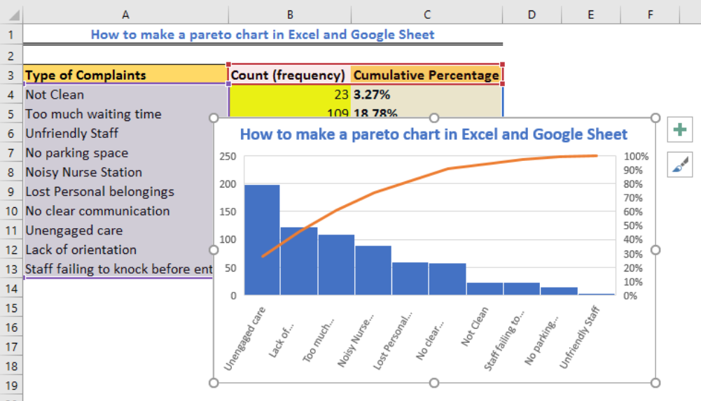
Pareto diagrams (commonly known as the 80/20 Pareto rule) are very useful for managers and for locating problems in the workflow process. As we have demonstrated using a real-life example in Excel, you can clearly find that the top 20% of your company’s processes are causing 80% of the problems. By taking care of key problems, you ensure that the overall processes of your business are running smoothly as you take care of potential or real bottlenecks.