
Last updated on 28th Oct 2025| 10972
- Power BI Heatmap
- What is a Heatmap?
- Importance in Analytics
- Heatmap in Power BI
- Steps to Create Heatmap
- Conditional Formatting
- Custom Visuals for Heatmaps
- Examples of Heatmaps
- Business Use Cases
- Advanced Heatmap Features
- Conclusion
Power BI Heatmap
In today’s data-driven world, businesses generate vast amounts of information every second. Interpreting this data effectively is crucial for informed decision-making and strategic planning. Visualizations serve as powerful tools to represent complex datasets in a simplified form. Among these, the heatmap has emerged as one of the most effective ways to highlight variations, patterns, and anomalies within datasets. To learn how to design and interpret such visuals for real-world decision-making, explore Business Analyst Training a hands-on program that equips professionals with data storytelling techniques, dashboard creation skills, and domain-specific analytics strategies using tools like Power BI and Excel. Within Microsoft’s Power BI ecosystem, heatmaps are widely used because they provide a clear and intuitive way of spotting insights that may not be evident in raw data tables or standard charts. This guide explores the concept of heatmaps in Power BI, their importance in analytics, steps to create them, customization techniques, business applications, and advanced features.
What is a Heatmap?
A heatmap is a graphical representation of data in which values are depicted by varying colors. Instead of focusing on numbers, users can quickly identify trends, correlations, or irregularities by looking at the color intensities. For example, in a sales report, higher sales values might appear in dark green, while lower sales could appear in red or yellow. Heatmaps are particularly useful when dealing with two-dimensional data, such as sales figures across different regions and time periods. To learn how to interpret such visuals and translate insights into strategic decisions, explore Become a Business Analyst a step-by-step guide that outlines the skills, tools, and career pathways needed to thrive in data-driven roles across industries. By assigning colors to numerical values, heatmaps reduce the cognitive load of interpreting raw figures, allowing decision-makers to act quickly.
Interested in Obtaining Your Business Analyst Certificate? View The Business Analyst Training Offered By ACTE Right Now!
Importance in Analytics
Heatmaps play an essential role in analytics because they: reveal patterns at a glance, simplify complex data relationships, and guide decision-makers toward actionable insights. To understand how professionals leverage such tools to drive business outcomes, explore What Does a Business Analyst Do a practical guide that outlines the responsibilities, tools, and strategic thinking required to transform raw data into meaningful business recommendations.
- Highlight Patterns and Trends: They make it easy to spot recurring behaviors, such as seasonal sales fluctuations or customer activity spikes.
- Identify Outliers: Color variations immediately bring attention to anomalies that may require further investigation.
- Simplify Decision-Making: Business executives often prefer visuals over raw reports. Heatmaps allow quick comprehension.
- Improve Comparisons: With a color-coded scale, comparing performance across categories becomes straightforward.
- Enhance User Experience: Heatmaps improve dashboards by making them more interactive and engaging.
By turning large, complex datasets into intuitive visuals, heatmaps in Power BI help organizations harness the power of analytics more effectively.
To Earn Your Business Analyst Certification, Gain Insights From Leading Data Science Experts And Advance Your Career With ACTE’s Business Analyst Training Today!
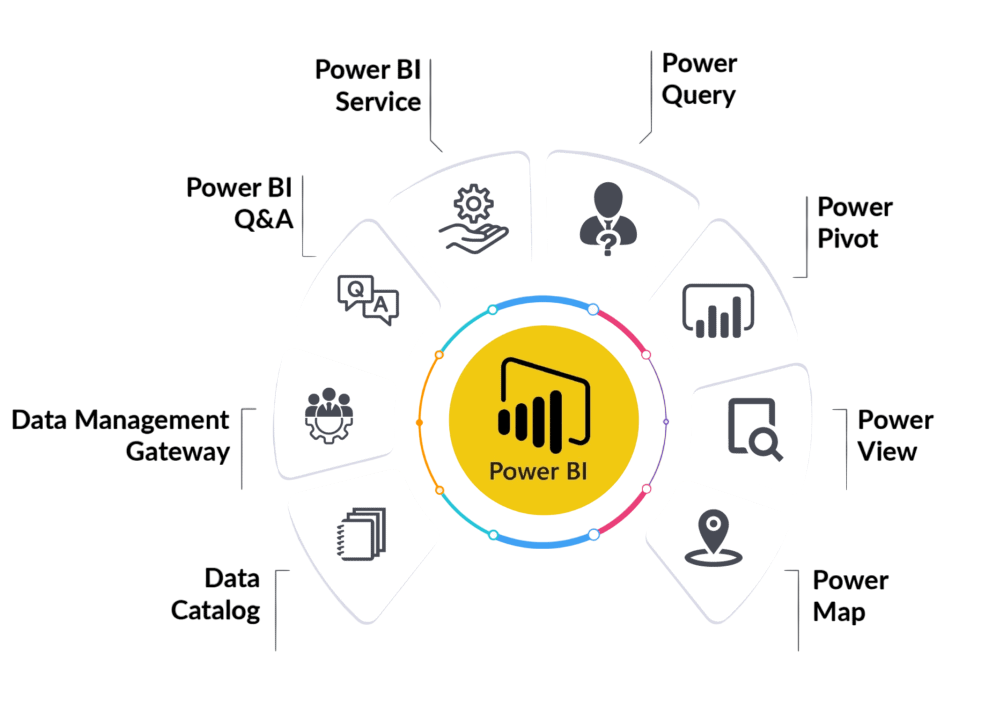
Heatmap in Power BI
In Power BI, a heatmap can be created using either conditional formatting on tables and matrices or by using custom visuals from the Power BI marketplace. These visualizations allow analysts to present insights in a visually impactful way. To build the skills needed to design such visuals and translate data into strategic decisions, explore Learn Business Analytics a practical guide that covers data modeling, visualization techniques, and real-world applications across industries.
For instance:
- A retail company might use a heatmap to see which products sell best during different months.
- A financial institution could use it to monitor risks across portfolios.
- An HR department might visualize employee performance across departments and years.
Power BI provides flexibility in designing heatmaps, ensuring they can be adapted to different business needs and contexts.

Develop Your Skills with Business Analyst Online Training
Weekday / Weekend BatchesSee Batch DetailsSteps to Create Heatmap
Making a heatmap in Power BI is simple and helps you see data trends across categories. First, load your data. You can import it from places like Excel, SQL Server, or SharePoint. Once your data is in Power BI, add a table or matrix from the visualization options to set up your heatmap. Then, put the fields you want into the rows, columns, and values sections. For example, you might use Region for rows, Month for columns, and Sales Amount for values. To turn it into a heatmap, use conditional formatting. Go to the Values field, click the menu, and pick Conditional Formatting, then Background Color. After that, set up your color scale. To master these visualization techniques and apply them in real-world analytics projects, explore Business Analyst Training a hands-on program that teaches data modeling, dashboard design, and decision-support strategies using tools like Power BI and Excel. Usually, green means high values, and red means low values, so you can quickly see what’s going on. Lastly, change the look by adjusting fonts, formatting rules, and grid size to make it easy to read.
Want to Pursue a Business Analyst Master’s Degree? Enroll For Business Analyst Master Program Training Course Today!
Conditional Formatting
Conditional formatting is a really useful part of Power BI, mainly because you can make heatmaps without any outside help. It lets you set rules for colors based on things like numbers, percentages, or your own formulas. For example, you can set sales over ₹1,000,000 to show up in dark blue, and sales between ₹500,000 and ₹1,000,000 in light blue. If sales are below ₹500,000, you could mark them in red to quickly see where performance is low. To understand how mastering such data visualization techniques can impact your earning potential, explore Business Intelligence Analyst Salary a detailed guide that breaks down salary trends, skill-based compensation, and career growth opportunities in the BI domain. Besides just changing background colors, you can also change font colors, add data bars, and use icons to point out information and patterns in your data. This helps make reports look better and makes it easier to understand the data.
Go Through These Business Analyst Interview Questions and Answers to Excel in Your Upcoming Interview.
Custom Visuals for Heatmaps
While Power BI’s built-in formatting works well, advanced scenarios often call for custom visuals available from the AppSource marketplace. Some popular heatmap visuals include dynamic scaling, cross-filtering, and KPI overlays. To understand how Power BI compares with other enterprise BI tools in handling such advanced analytics, explore MSBI vs Power BI Key Differences a comparative guide that breaks down architecture, integration capabilities, licensing models, and visualization strengths across both platforms.
- Heatmap Visual by Microsoft: Provides more flexibility in color schemes and interaction.
- Synoptic Panel: Useful for overlaying heatmaps on images like maps, floor layouts, or organizational structures.
- Matrix Heatmap: Ideal for showing relationships between two variables.
These visuals allow businesses to go beyond simple conditional formatting, enabling interactive exploration and deeper insights.
Examples of Heatmaps
Heatmaps can be applied across industries and use cases. Some examples include:
- Sales Heatmap: Showing product sales across different regions and timeframes.
- Website Traffic Heatmap: Visualizing page visits or click patterns.
- Financial Heatmap: Tracking portfolio performance across sectors.
- Customer Support Heatmap: Monitoring complaint volumes by time of day and issue type.
- HR Heatmap: Assessing employee satisfaction across departments and years of service.
Each of these examples highlights the flexibility and adaptability of heatmaps in solving real business challenges.
Business Use Cases
Across different fields, heatmaps in Power BI are becoming more common for finding useful information that shapes plans. For example, stores use heatmaps to see what sells best and when, which helps them manage stock and sales.
Hospitals use them to follow patient traffic, improving how they use resources. Banks use heatmaps to spot strange spending and stop fraud. Marketing teams use them to see how people react to ads, so they can make better ads. Factories use them to watch machines and cut downtime, keeping things running well. Because they give fast, clear views, heatmaps help managers make quick, smart choices that can really help their organizations do well.
Advanced Heatmap Features
As businesses mature in their Power BI usage, advanced heatmap capabilities come into play, dynamic color scaling, drill-through interactions, and integration with DAX measures for contextual insights. To master these advanced features and build scalable analytics solutions, explore Become a Power BI Developer a step-by-step guide that equips professionals with data modeling expertise, visualization best practices, and deployment strategies for enterprise-grade BI environments.
- Dynamic Heatmaps: Interactivity allows filtering by region, product, or time period.
- Drill-Through Heatmaps: Users can click on a heatmap cell to view detailed underlying data.
- Hierarchical Heatmaps: Supporting multiple levels of data (e.g., region → city → store).
- Integration with Maps: Heatmaps layered over geographic maps for geospatial analysis.
- R and Python Integration: Custom scripting in Power BI enables more sophisticated heatmap designs beyond default visuals.
These advanced features elevate the analytical power of heatmaps, making them valuable for enterprises with complex datasets.
Conclusion
Heatmaps in Power BI are an indispensable visualization tool for businesses seeking to transform raw data into meaningful insights. By converting numbers into color-coded patterns, heatmaps simplify analysis, highlight trends, and allow for faster decision-making. Whether through basic conditional formatting or advanced custom visuals, Power BI enables organizations to create interactive, dynamic, and visually engaging heatmaps that cater to diverse industries. To build the analytical mindset and visualization skills needed to leverage such tools effectively, explore Business Analyst Training a career-focused program that equips professionals While they come with limitations, when used appropriately, heatmaps can provide a competitive advantage by uncovering insights that might otherwise remain hidden in complex datasets. As businesses continue to embrace analytics, the role of Power BI heatmaps will only grow, helping enterprises navigate an increasingly data-driven world.