
Last updated on 07th Jun 2025| 10968
- What is a Gauge Chart?
- Use Cases for Gauge Charts
- Creating a Gauge Chart in Tableau
- Data Preparation for Gauge Charts
- Customizing the Gauge Needle
- Formatting the Gauge Scale
- Adding Dynamic Color Indicators
- Using Gauge Charts for KPI Tracking
What is a Gauge Chart?
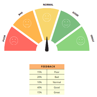
A Gauge Chart is a specialized data visualization tool designed to display a single value within a defined range, making it ideal for tracking performance against a target or goal. Visually, it resembles a semi-circular dial with a needle that points to the current value on the scale. This design offers an immediate, intuitive way to understand how a particular metric is performing relative to expectations. Gauge charts are most commonly used to represent key performance indicators (KPIs) or critical metrics that require continuous monitoring, such as sales figures, website traffic, financial ratios, or operational efficiency. One of the defining features of a gauge chart, often highlighted in Business Analyst Training, is its use of color gradients to segment the scale into meaningful zones. For example, red often indicates underperformance, signaling that immediate attention may be needed. Yellow represents moderate or cautionary levels, suggesting that performance is acceptable but could improve. Green denotes satisfactory or excellent performance, highlighting when targets are met or exceeded. These color cues help decision-makers quickly assess the status of a metric without needing to delve into detailed numbers. While gauge charts are visually appealing and provide clear insights, they are best suited for specific scenarios where a single value needs to be evaluated against a benchmark. They are less effective for showing trends over time or comparing multiple data points. Therefore, it’s important to use gauge charts thoughtfully within dashboards and reports to ensure they complement other visualizations and provide meaningful, actionable information. When applied correctly, gauge charts are powerful tools for quick, at-a-glance performance tracking.
Do You Want to Learn More About Business Analyst? Get Info From Our Business Analyst Training Today!
Use Cases for Gauge Charts
Gauge charts are often used to track performance against specific business goals. For example, they can display a sales figure against a target, showing how close or far the business is to meeting its objectives. This is especially useful for executives who want to quickly assess performance without delving deep into complex data. Many organizations track customer satisfaction using surveys or feedback forms, a method explained in How To Measure The Effectiveness Of Corporate Training. A gauge chart can display the current satisfaction score against a target, providing a simple yet effective way to visualize customer sentiment. Gauge charts are popular for visualizing metrics like website traffic, bounce rates, and conversion rates. They can show how these metrics are performing against business goals or previous benchmarks. A gauge chart can represent financial performance indicators, such as profit margin, revenue, or cost management.
It is commonly used to depict whether financial targets are on track or need immediate attention. In industries like manufacturing or healthcare, gauge charts can visualize critical performance indicators such as production quality, equipment health, or patient recovery rates, helping ensure that safety standards are met. While gauge charts can be effective in showing a single measure against a target, it is important to ensure they are used in contexts where their design truly adds value. Overuse of this chart type may result in clutter or misinterpretation of the data.
Creating a Gauge Chart in Tableau
- Prepare Your Data: Begin by ensuring your dataset contains the key measure you want to display on the gauge, such as sales, target achievement, or performance scores.
- Create a Calculated Field for the Needle Position: Create a calculated field that converts your measure into an angle or proportional value, typically scaled between 0 and 180 degrees, so the needle can point correctly on the semicircle gauge.
- Build the Base Pie Chart for the Gauge Background: Construct a pie chart divided into two slices one representing the filled portion based on your value, and the other the remaining part of the semicircle.
- Add the Needle Using a Dual-Axis Chart: Create a second chart layer for the needle, usually a line or shape mark that rotates according to the calculated angle, a technique discussed in Why Should I Become a CBAP.
- Synchronize Axes and Remove Unnecessary Elements: Synchronize the axes so the needle aligns exactly over the gauge. Hide headers, gridlines, and tooltips to keep the visualization clean and uncluttered.
- Format and Color the Gauge: Apply meaningful colors to the gauge slices. Add labels or annotations showing minimum, maximum, and current values to enhance clarity.
- Add Final Touches and Integrate into a Dashboard: Add titles and any interactivity if needed. Finally, place the gauge chart on a dashboard along with other visuals to create a comprehensive and interactive report.
- Ensure Data Accuracy: The value you’re comparing against a target must be accurate and updated in real time if possible. For instance, if you’re visualizing sales, make sure that your sales figures are up-to-date and correctly reported.
- Create Calculated Fields: Gauge charts often require calculated fields to show performance against targets, a technique taught in Business Analyst Training.
- Standardize Values: If you’re comparing performance across multiple gauges (e.g., sales performance in different regions), ensure that all values are in the same format (e.g., dollars or percentages) to ensure consistency.
- Handle Missing Data: Incomplete or missing data can skew your results. Consider setting up data validation rules to ensure that the data fed into the gauge chart is complete and accurate.
- Use Percentages or Ranges: If your gauge is showing performance against a percentage or range (e.g., 50% of target achieved), ensure that your data reflects this and doesn’t just show raw numbers.
- Define the Range: The scale should reflect the range of values your metric will fall within. For example, if you’re tracking sales performance, the range could be 0 to 100% of the target.
- Choose Clear Markers: Use clear, readable labels for your scale markers. Avoid cluttering the scale with too many labels; instead, focus on key milestones (e.g., 0%, 50%, 100%).
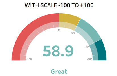
- Color Segments: Divide the scale into segments using color to indicate different performance ranges (e.g., red for poor performance, yellow for moderate, and green for good performance), a method explained in History & Evolution of Six Sigma.
- Ensure Proper Spacing: The segments of the scale should be evenly spaced to reflect a proportional view of the data. Uneven spacing could distort how users perceive performance.
- Use a Clear Needle or Indicator: The needle or pointer should be easily distinguishable from the background and color segments. Use a contrasting color or shape to ensure users can quickly identify the current value on the gauge.
- Provide Contextual Labels and Tooltips: Include labels such as minimum, maximum, and current values near the gauge for clarity. Additionally, add tooltips or hover information to provide more detailed insights without overcrowding the visual.
Would You Like to Know More About Business Analyst? Sign Up For Our Business Analyst Training Now!
Data Preparation for Gauge Charts

Customizing the Gauge Needle
Customizing the gauge needle is an important aspect of creating effective and visually appealing gauge charts, which are commonly used to track Key Performance Indicators (KPIs) and display performance metrics. The gauge needle serves as the primary indicator, pointing to the current value on the scale, so its design and customization significantly impact the readability and overall user experience of the chart. When customizing the gauge needle, several factors should be considered. First, the needle’s shape and size need to be proportionate to the gauge itself. A needle that is too thick or too long can obscure important scale markings or distort the visual balance, while one that is too thin or short might be hard to see clearly. Adjusting the needle’s thickness and length helps achieve optimal visibility and aesthetic harmony, a tip covered in How to use Control Chart Constants. Color customization is equally vital. The needle’s color should contrast well with the gauge background and the color-coded zones on the dial. Often, a bold color such as red or black is chosen for the needle to make it stand out, but this depends on the overall color scheme and the context of the dashboard. Some tools allow dynamic needle coloring based on the value it points to, which can add another layer of visual feedback. Additionally, some platforms support custom needle designs, such as arrows, triangles, or even images, offering creative ways to enhance the visual appeal or align with brand identity. The needle’s animation, such as smooth movement when values change, can also be customized to improve user experience by providing a fluid and responsive feel. Ultimately, thoughtful customization of the gauge needle enhances the clarity, usability, and professionalism of gauge charts, making them more effective tools for data-driven decision-making.
Want to Pursue a Business Intelligence Master’s Degree? Enroll For Business Intelligence Master Program Training Course Today!
Formatting the Gauge Scale
Adding Dynamic Color Indicators
Adding dynamic color indicators to data visualizations significantly enhances the clarity and effectiveness of information presentation. Dynamic color indicators automatically change colors based on the data values or performance thresholds, providing immediate visual cues about the status or health of a particular metric. This technique is especially useful in dashboards, reports, and charts where quick decision-making is crucial. For example, in sales or financial dashboards, dynamic colors can signal whether a KPI is within acceptable limits (green), approaching a warning level (yellow), or falling below expectations (red). This color-coding system helps users instantly identify areas that need attention without having to analyze numbers in detail, a technique taught in Data Analytics Course For Beginners. Dynamic indicators can be applied to various chart types, including gauge charts, bar graphs, and tables, enhancing their interpretability. Implementing dynamic color indicators involves setting rules or conditions that determine the color changes based on the data. Many visualization tools like Tableau, Power BI, and Excel support this feature, allowing users to customize thresholds and color schemes according to organizational goals or industry standards. For example, a customer satisfaction score above 85% might trigger a green indicator, while scores below 60% turn red. It’s important to use dynamic colors thoughtfully to avoid confusion or misinterpretation. Consistent color coding across reports and dashboards helps users build familiarity and trust in the data. Additionally, accessibility considerations, such as colorblind-friendly palettes, should be taken into account. Overall, dynamic color indicators transform static data into actionable insights by providing at-a-glance understanding, enabling faster responses, and improving communication across teams and stakeholders. This approach makes data-driven decision-making more efficient and effective.
Want to Learn About Business Analyst? Explore Our Business AnalystInterview Questions and Answers Featuring the Most Frequently Asked Questions in Job Interviews.
Using Gauge Charts for KPI Tracking
Gauge charts are highly effective visual tools for tracking Key Performance Indicators (KPIs) because they provide an immediate, intuitive understanding of how a specific metric is performing relative to a target or threshold. Shaped like a speedometer, gauge charts display a needle or pointer that moves across a semi-circular or circular scale, showing the current value within a defined range. This format makes it easy for users to quickly assess whether performance is on track, below expectations, or exceeding goals. One of the main advantages of gauge charts is their ability to visualize progress toward critical business objectives such as sales targets, customer satisfaction scores, or production efficiency. By segmenting the gauge into color-coded zones (e.g., red for poor performance, yellow for caution, and green for good performance), a key concept in Business Analyst Training, these charts enhance clarity and highlight areas that require immediate attention or celebrate successes. This color coding helps stakeholders make rapid decisions without needing to dive into detailed data tables. Gauge charts are especially useful in dashboards where space is limited, as they convey key information compactly and visually. They can be customized with different scales, ranges, and thresholds to suit various industries and KPI requirements. However, it’s important to use gauge charts thoughtfully, as they typically track a single data point and may not be suitable for displaying trends or multiple KPIs simultaneously. In summary, using gauge charts for KPI tracking enables businesses to monitor performance at a glance, encourages accountability, and supports timely interventions, ultimately driving better operational outcomes and strategic success.