 LMS
LMS
Last updated on 12th May 2025| 9623
 (5.0) | 45201 Ratings
E-mail this post
(5.0) | 45201 Ratings
E-mail this post
- Introduction to React Bootstrap
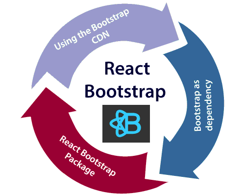
- Setting Up React Bootstrap in Your Project
- React Bootstrap Components Overview
- Creating Layouts with React Bootstrap Grid System
- Handling Forms with React Bootstrap
- React Bootstrap Components for Navigation
- Customizing React Bootstrap Components
- Best Practices and Performance Considerations
- Conclusion
Introduction to React Bootstrap
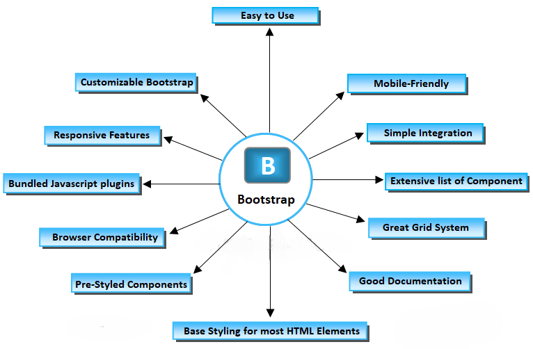
React Bootstrap is a React-based library that replaces traditional Bootstrap’sBootstrap’sBootstrap’s jQuery-based components with React components. Bootstrap, a front-end framework, is widely used for building responsive, mobile-first websites. It provides a set of pre-built UI components like buttons, navbars, modals, and form elements. React Bootstrap integrates these components into React, making them declarative and more manageable in a React application. React Bootstrap removes the reliance on jQuery, which is often incompatible with React’sReact’sReact’s declarative rendering. Instead, it offers an easy-to-use API where developers can focus on React’sReact’sReact’s state and props to manage components. By using React Bootstrap, you can leverage Bootstrap’sBootstrap’sBootstrap’s styling while keeping React’sReact’sReact’s design patterns intact. This seamless integration is beneficial for developers who are already familiar with Bootstrap.
Additionally, you can explore Web Designing & Development Courses to further enhance your skills and knowledge in building modern web applications.
Setting Up React Bootstrap in Your Project
You must install the necessary dependencies before using React Bootstrap in your React project. The steps below guide you through setting up React Bootstrap:
Step 1: Install React Bootstrap and BootstrapTo begin using React Bootstrap, you must first install react-bootstrap and Bootstrap using npm or yarn.
- Using npm:
- npm install react-bootstrap bootstrap
- Using yarn:
- Yarn add react-bootstrap Bootstrap
Once the installation is complete, you must import the Bootstrap CSS file into your project. Add the following import statement at the top of your
- src/index.js or
- src/App.js:
- import ‘bootstrap/dist/css/bootstrap.min.css’;
This will apply Bootstrap’sBootstrap’sBootstrap’s default styles to your components. Once this setup is complete, you can use React Bootstrap components in your React project.
React Bootstrap Components Overview
React Bootstrap provides a large set of components that are simple to use and integrate into React projects. Here are some of the core components available:
Buttons: React Bootstrap offers several types of buttons, such as primary, secondary, success, danger, and more. Buttons are used for user interactions.
-
import { Button } from ‘react-bootstrap’;
Alerts: Alerts display messages to users. You can display alerts (success, error, info, etc.) and control the visibility.
- import { Alert } from ‘react-bootstrap’;
This is a success alert
Modals display content in an overlay. React Bootstrap modals are great for showing forms, images, or any other content in a centered overlay.
NavbarReact Bootstrap also includes a fully responsive navbar component, which we will dive into in greater detail in the following sections.
CardsCards are used to display content in a flexible and customizable way. They can be used for articles, product listings, and more.
React Bootstrap provides many more components, including dropdowns, tooltips, popovers, and more, designed to work seamlessly in React applications.

Creating Layouts with React Bootstrap Grid System
Bootstrap’s grid system is a powerful tool for building responsive layouts, allowing developers to structure their designs using a series of rows and columns that automatically adjust to various screen sizes. React Bootstrap simplifies this process by providing components such as Container, Row, and Col to help manage layout structure effectively. The Container component acts as a wrapper that holds the grid content, offering appropriate alignment and responsive padding. It can be either a fluid container, which spans the full width of the viewport, or a fixed-width container. Within the container, rows and columns can be defined to create structured layouts. A Row serves as a horizontal container for columns, and each Col represents a section within that row. If you’re exploring a future in web development, take a moment to read How to Become a Web Developer for helpful insights and direction. For example, a common usage might involve two columns each occupying half the row’s width (md={6}), aligning side by side in a responsive manner. React Bootstrap follows a 12-column grid system, meaning each row can be divided into up to 12 units, and column spans can be adjusted accordingly to accommodate different screen sizes.
Excited to Obtaining Your web developer Certificate? View The web developer course Offered By ACTE Right Now!
Handling Forms with React Bootstrap
React Bootstrap offers a user-friendly and intuitive way to manage forms using components such as Form, FormControl, FormGroup, FormLabel, and FormCheck. These components are designed to work seamlessly with React’s state management, making form creation and handling more efficient. For example, creating a basic form with input fields, labels, and a submit button is straightforward. Using the Form and Button components, you can define input fields for email and password inside Form.Group elements, each labeled appropriately with Form.Label, and styled inputs with Form.Control. If you’re looking to advance your skills, consider earning a Web Developer Certification to gain comprehensive knowledge of web development and improve your expertise. In addition to layout and styling, React Bootstrap supports form validation. By using properties like isInvalid on a Form.Control, you can trigger validation messages based on conditions such as when a form is submitted without the required input. Feedback messages can be displayed using Form.Control.Feedback, helping guide users to correct their input. This integrated approach ensures a responsive and user-friendly form experience in React applications.
Interested in Pursuing Web Developer Master’s Program? Enroll For Web developer course Today!
React Bootstrap Components for Navigation
Navigation is a crucial part of any web application, and React Bootstrap provides several components for handling different navigation scenarios:
NavbarAs mentioned, React Bootstrap provides a responsive Navbar component that adjusts automatically to the screen size. The Navbar. The toggle button collapses the Navbar on mobile devices, showing a hamburger menu. To better understand state management in modern React apps, check out What Is React Redux Navbar. Collapse contains the navigational links.
The code imports the Navbar and Nav components from react-bootstrap to create a responsive navigation bar. The navbar has a dark background and dark variant, and it expands on large screens. Inside the navbar, there is a brand link labeled “My Website,” which redirects to the homepage. A toggle button is included for collapsing the navigation items on smaller screens. The Navbar.Collapse component contains a navigation section with two links: “Home” and “Features,” which are displayed using the Nav.Link components. The navbar adapts to different screen sizes, ensuring a responsive design.
Tabs and Pill NavigationReact Bootstrap also provides Tabs and Pills for tabbed navigation within your app.
The code imports the Tabs and Tab components from react-bootstrap to create a tabbed navigation interface. The Tabs component is initialized with a default active tab set to “home,” and an ID of “uncontrolled-tab-example.” Inside the Tabs component, there are two Tab components: one with the event key “home” and the title “Home,” which displays the content “Home content,” and another with the event key “profile” and the title “Profile,” showing the content “Profile content.” This setup allows users to switch between different sections or views within the same container.
Customizing React Bootstrap Components
React Bootstrap offers a variety of customization options, allowing you to tailor both the appearance and functionality of its components to suit your needs. One way to customize is by overriding the default styles, either using custom CSS or inline styles for specific components. For example, you can easily modify the color of a button or adjust the layout of a Card by applying inline styles. If you’re planning your career in web development, the Web Developer Roadmap is a valuable guide to help you navigate essential skills and technologies. Additionally, React Bootstrap components can be extended by integrating them with custom components or wrapping them in higher-order components (HOCs). For example, you can create a CustomButton component by combining the Button component with additional custom functionality, enabling you to create more personalized, reusable UI elements. This flexibility in styling and extending components ensures that React Bootstrap can fit various design and functionality requirements.
Best Practices and Performance Considerations
When working with React Bootstrap, it’s essential to follow best practices for efficient development and maintainability:
- Keep Components Modular: Break down your UI into smaller, reusable components. React’sReact’sReact’s component model makes it easy to keep the codebase clean and organized.
- Avoid Unnecessary Re-Renders: Use React’sReact’sReact’s memo function and shouldComponentUpdate lifecycle method to prevent unnecessary re-renders, especially when working with large or complex components.
- Lazy Loading: For performance optimization, especially with large applications, use lazy loading for Bootstrap components not immediately needed on the page.
- Custom Styles vs Bootstrap: Keep your changes minimal and consistent with the design system when customizing Bootstrap components. Over-styling can lead to inconsistencies and maintenance challenges.
Conclusion
React Bootstrap is a powerful tool for React developers who want to leverage Bootstrap’s popular design system while adhering to React’s component-based architecture. It provides an intuitive way to build responsive, visually appealing user interfaces by integrating Bootstrap components into React applications. The flexibility and variety of components available, such as grids, forms, buttons, and navigation elements, make it easier to design and develop consistent layouts. For those interested in learning more, you can explore Web Designing Training to deepen your understanding of modern web development techniques. React Bootstrap eliminates the need for jQuery, offering a React-friendly alternative that is fully optimized for React’s declarative nature. Customization is simple, allowing you to easily override default styles and extend components. Whether you’re building simple layouts or complex applications, React Bootstrap enhances productivity and improves UI design, making it an excellent choice for modern web development with React.