 LMS
LMS
Last updated on 29th Oct 2025| 12454
 (5.0) | 32961 Ratings
E-mail this post
(5.0) | 32961 Ratings
E-mail this post
- What is Checkboxes in React
- Controlled vs Uncontrolled Checkboxes
- Handling Checkbox Events in React
- Using Checkboxes with Forms
- Multiple Checkboxes Handling
- Indeterminate Checkbox States
- Styling Checkboxes in React
- Using Checkboxes with Redux
- Checkbox Validation in React
- Debugging Common Checkbox Issues
What is Checkboxes in React
The normal HTML element with the type property set to “checkbox” is used to implement React Checkbox. Although they visually depict a straightforward toggle, their successful integration into a React application requires leveraging React’s declarative approach to manage their state and react to user input. Checked (selected) and unchecked (deselected) are the two main states of a checkbox. To understand how such UI components fit into broader application logic, explore Full Stack Training a hands-on program that covers frontend frameworks, backend integration, and state-driven design patterns essential for building scalable web applications. A checkbox’s status changes when a user clicks it, and the state of your React component must reflect and control this change.One essential component of using checkboxes in React is controlling their state. Usually, hooks like useState are used to keep the checkbox’s current state true for checked, and false for unchecked within the component’s state.
Controlled vs Uncontrolled Checkboxes
Controlled checkboxes provide a predictable state and facilitate validation and interaction with other user interface elements by managing their checked status using a state variable, which is frequently found in frameworks like React. Uncontrolled checkboxes are easier to build for simple, stand-alone inputs since they rely on the browser’s Document Object Model (DOM) to handle their state. To understand how these input strategies fit into broader UI architecture, explore Web Development a foundational guide that covers form handling, state management, and best practices for building responsive, interactive web interfaces.
Controlled Checkboxes:
The state of the component (useState in React, for example) stores and modifies the checked status of the checkbox through controlled checkbox state management.
- Flow: When a user interacts with a component, an event handler is triggered, modifying the component’s state, producing a re-render and a user interface update.
- Control: Because the developer has complete authority over the checkbox’s status, complicated forms, real-time validation, and dynamic user interface modifications are all possible.
- Use cases: Best suited for intricate forms, situations requiring immediate input, or integration with other logic and state components of the game.
The visibility of other fields is impacted by the checked status of a checkbox, for instance.
Uncontrolled Checkboxes:
The checked status of the checkbox is directly managed by the browser’s DOM.
- Flow: Without developer-managed state changes, the browser manages the checked/unchecked state and updates the user interface.
- Control: The user, not the program, sets the value, and the application does not have direct, instantaneous awareness of the checkbox’s state.
- Examples of Use: Perfect for fast prototypes or straightforward forms that don’t require sophisticated state management or real-time validation.
- Integration: Using legacy or non-React code is simpler.
Are You Interested in Learning More About Full Stack Developer? Sign Up For Our Full Stack Developer Training Today!
Handling Checkbox Events in React
The onChange event handler and controlled components are the main tools used in React to manage checkbox events. These mechanisms ensure that user interactions are captured reliably and that UI state remains synchronized with application logic. To build mastery in such techniques and advance your frontend career, explore How to Become a Front End Developer a step-by-step guide that covers essential skills, tools, and workflows for creating responsive, interactive web applications.
- import React, { useState } from ‘react’;
- function MyCheckboxComponent() {
- const [isChecked, setIsChecked] = useState(false);
- const handleCheckboxChange = (event) => {
- setIsChecked(event.target.checked);
- };
- return (
- <div>
- <label>
- <input
- type=”checkbox”
- checked={isChecked}
- onChange={handleCheckboxChange}
- />
- Check me!
- </label>
- <p>Checkbox is: {isChecked ? ‘Checked’ : ‘Unchecked’}</p>
- </div>
- );
- }
- export default MyCheckboxComponent;
Checked by event.target: Inside handleCheckboxChange, event.target refers to the input element, and event.target.checked provides the current boolean checked condition of the checkbox. The function setIsChecked(event.target.checked) modifies the isChecked state, which subsequently re-renders the component and modifies the visual state of the checkbox.
Would You Like to Know More About Full Stack Developer? Sign Up For Our Full Stack Developer Training Now!
Using Checkboxes with Forms
The input HTML tag is the main tool used to construct checkboxes in forms, which let users choose from a list of options. Each checkbox in a group needs to have the same name attribute (which in server-side languages like PHP frequently ends in []) in order for this to function in a multi-select scenario. To understand how these frontend form structures integrate with backend data handling, explore Full Stack Training a comprehensive program that covers HTML fundamentals, server-side scripting, and full-stack form processing techniques. For web forms, begin with the tag in HTML, Set the type attribute to “checkbox” to create a checkbox. Make use of the name attribute: Give all checkboxes the same name to group them together. To obtain a list of chosen values as an array in server-side languages like PHP, append [] to the name (name=”interests[]”).
- <form action=”/process” method=”post”>
- <label>
- <input type=”checkbox” name=”hobbies[]” value=”reading”> Reading
- </label><br>
- <label>
- <input type=”checkbox” name=”hobbies[]” value=”gardening”> Gardening
- </label><br>
- <label>
- <input type=”checkbox” name=”hobbies[]” value=”sports” checked> Sports (pre-selected)
- </label><br>
- <input type=”submit” value=”Submit”>
- </form>

Develop Your Skills with Full Stack Developer Certification Training
Weekday / Weekend BatchesSee Batch DetailsMultiple Checkboxes Handling
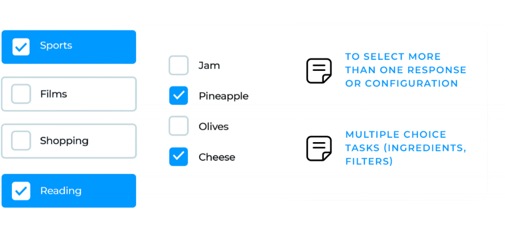
In React, developers frequently have to deal with several checkboxes while constructing various forms. They might have to dynamically add and remove the data from the state in order to accomplish this. There are several ways to accomplish this. I’ll demonstrate one of the simple approaches to solving this issue in this post. To manage multiple elements without introducing unnecessary DOM nodes, explore React Fragments Explained a focused guide that shows how fragments help streamline form rendering, improve performance, and maintain clean component structure.
- // Here I’m creating an array with a fixed size (based on the received data)
- const [checkboxState, setCheckboxState] = useState(new Array(receivedData.length).fill(false));
- // With this useState I wan’t to collect the checked checkboxes
- const [checkedCheckboxes, setCheckedCheckboxes] = useState([]);
- // This is my handler method that gets triggered when a checkbox get’s checked/unchecked
- // ..and toggles the state of the checkbox
- const handleCheckboxState = (position: number) => {
- const updatedCheckedState = checkboxState.map((item, index) => (index === position ? !item : item));
- setCheckboxState(updatedCheckedState);
- const updatedChecked = updatedCheckedState
- .map((item, index) => (item ? receivedData[index] : null))
- .filter((val) => val !== null);
- setCheckedCheckboxes(updatedChecked);
- };
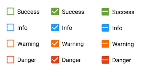
Indeterminate Checkbox States
In contrast to “checked” or “unchecked,” indeterminate checkbox states are a third visible state for a checkbox. When a set of linked items controlled by the checkbox are in a mixed state, with some selected and others unchecked, this state is usually utilized to communicate this information. The following are indeterminate checkbox states’ salient features: visual communication plays a key role in conveying uncertainty. A dash or square is frequently displayed as an indeterminate checkbox to graphically represent its in-between condition. To understand how such UI elements are structured and rendered within React, explore React Components Explained a practical guide that breaks down component composition, state handling, and how React efficiently manages dynamic form elements. It indicates that the underlying items or sub-options linked to the checkbox are not consistently selected or deselected, which makes sense. For instance, if some items in a list are selected and others are not, the “select all” checkbox would be in an indeterminate state. Setting the State: JavaScript is used in web development to programmatically set the indeterminate state. An HTML element’s indeterminate attribute can be set to true.
Preparing for Full Stack Development Job? Have a Look at Our Blog on Full Stack Development Interview Questions and Answers To Ace Your Interview!
Styling Checkboxes in React
You may use CSS classes to style a React checkbox by giving the checkbox elements unique class names and defining the appropriate styles in your CSS file. Here’s an illustration: this approach leverages JSX’s ability to bind class names directly to elements, making styling predictable and component-driven. To dive deeper into how JSX bridges HTML and JavaScript in React, explore Understanding JSX in React a foundational guide that explains syntax, dynamic rendering, and how JSX enhances readability and modularity in frontend development.
- import React from ‘react’;
- import ‘./CheckboxStyles.css’;
- const StyledCheckbox = () => {
- return (
- <div>
- <label className=”checkbox-label”>
- <input type=”checkbox” className=”custom-checkbox” />
- Checkbox Label
- </label>
- </div>
- );
- };
- export default StyledCheckbox;
To encapsulate the styles within the component itself, we construct styled-components for the label and checkbox elements in this example. Before utilizing CSS-in-JS libraries, don’t forget to install the required dependencies (like styled-components). React checkboxes can be readily customized in appearance by applying CSS classes or by using CSS-in-JS utilities. You are welcome to modify the given code samples to fit your own design tastes and expand the styles as necessary.
Using Checkboxes with Redux
The process of integrating checkboxes with Redux include sending actions to update the checked state and managing it within the Redux store.
- Describe in Redux the Checkbox State: Single Checkbox: You can use a boolean value in your Redux store to indicate if a single checkbox is checked. A number of checkboxes Multiple checkbox states can be stored in an array or object. Each element of an array of booleans represents the checked status of a checkbox. Object: An object with booleans for values that indicate if a checkbox is checked and checkbox IDs for keys.
- Create Redux Actions: Create actions that toggle checkboxes’ checked status. An action such as TOGGLE_CHECKBOX may be adequate for a single checkbox. Actions for numerous checkboxes may include SET_ALL_CHECKBOXES or TOGGLE_ITEM_CHECKED.
- Put the Redux Reducer into practice: This will change the checkbox state in the Redux store and manage the dispatched actions. A switch statement can be used to manage many action kinds. Make sure the changed checkbox state is immutable by creating a new state object with it when an action is dispatched.
Checkbox Validation in React
Verifying that a checkbox or collection of checkboxes satisfies particular requirements prior to form submission or other actions is known as checkbox validation in React. There are several ways to accomplish this. Utilizing controlled components and state is a typical method for managing form inputs in React. To explore how validation logic integrates with stateful components and improves form reliability, check out Use React Form Validation a hands-on guide that walks through validation strategies, error handling, and best practices for building robust React forms.
- import React, { useState } from ‘react’;
- function MyForm() {
- const [isChecked, setIsChecked] = useState(false);
- const [error, setError] = useState(”);
- const handleChange = (e) => {
- setIsChecked(e.target.checked);
- if (e.target.checked) {
- setError(”);
- }
- };
- const handleSubmit = (e) => {
- e.preventDefault();
- if (!isChecked) {
- setError(‘Please agree to the terms and conditions.’);
- } else {
- alert(‘Form submitted!’);
- }
- };
- return (
- <form onSubmit={handleSubmit}>
- <label>
- <input
- type=”checkbox”
- checked={isChecked}
- onChange={handleChange}
- />
- I agree to the terms and conditions.
- </label>
- {error && <p style={{ color: ‘red’ }}>{error}</p>}
- <button type=”submit”>Submit</button>
- </form>
- );
- }
- export default MyForm;
Debugging Common Checkbox Issues
Website debugging involves finding and fixing problems that impact how a site looks, works, or performs. This requires checking browser behavior, analyzing code, and using diagnostic tools. Key steps include using browser tools to check the DOM and CSS for layout or style issues. These inspection tools help developers debug rendering problems, verify element hierarchy, and fine-tune responsive behavior. To see how these frontend diagnostics integrate with backend workflows in real-world projects, explore Full Stack Training a hands-on program that covers client-side debugging, server-side integration, and end-to-end application development. Developers should watch for React Checkbox errors in console logs and check network traffic for slow resources or API problems. Testing on different devices and browsers helps find responsiveness and compatibility issues. Tools like linters and validators are used to check code quality in HTML, CSS, and JavaScript. For dynamic web apps, understanding the code’s logic is essential. Source maps and version control help trace problems.