
Last updated on 13th Aug 2025| 13195
- Introduction to Classification Metrics
- What is ROC Curve?
- True Positive Rate and False Positive Rate
- Understanding AUC
- Drawing ROC Curve in Python
- ROC vs Precision-Recall Curve
- Threshold Tuning
- Use in Model Comparison
- Multi-class ROC Curves
- Interpretation Challenges
- Summary
Introduction to Classification Metrics
Evaluating the performance of classification models is a critical step in the machine learning pipeline. Metrics help us understand how well a model is performing and where it might need improvement. While accuracy is a commonly used metric, it is not always reliable, especially with imbalanced datasets a critical insight emphasized in Machine Learning Training, where learners explore alternative evaluation metrics like precision, recall, F1-score, and ROC-AUC to ensure robust model assessment. Advanced metrics like the ROC Curve, AUC, precision-recall curves, and threshold analysis provide deeper insights. This guide focuses on understanding the ROC Curve and its relevance in model evaluation.
What is ROC Curve?
The Receiver Operating Characteristic (ROC) Curve is a graphical representation used to evaluate the diagnostic ability of a binary classifier system. It plots the True Positive Rate (TPR) against the False Positive Rate (FPR) at various threshold settings. Each point on the ROC curve represents a different trade-off between sensitivity (recall) and specificity. To complement this evaluation technique with a robust classification method, exploring Support Vector Machine (SVM) Algorithm reveals how SVMs construct optimal hyperplanes using kernel functions maximizing margin between classes and enabling high-accuracy predictions even in high-dimensional or non-linearly separable datasets. The ROC Curve is valuable because it shows how well the model separates the positive and negative classes across all classification thresholds. It is especially useful when classes are imbalanced or the cost of false positives and false negatives varies.
True Positive Rate and False Positive Rate
To understand the ROC curve, we must first define two key components of True Positive Rate and False Positive Rate. To complement this evaluation framework with interpretable model structures, exploring Decision Trees in Machine Learning reveals how tree-based algorithms segment data through hierarchical splits enabling clear visualization of decision paths and offering measurable insights into classification performance across varying thresholds.
- True Positive Rate (TPR) or Sensitivity or Recall: TPR = TP / (TP + FN) Measures how many actual positives the model correctly predicted.
- False Positive Rate (FPR): FPR = FP / (FP + TN) Measures how many actual negatives were incorrectly classified as positive.
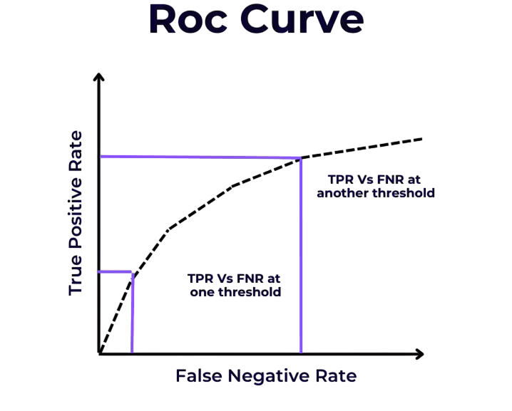
True Positive Rate and False Positive Rate rates help determine the effectiveness of a classifier across different thresholds.
Ready to Get Certified in Machine Learning? Explore the Program Now Machine Learning Online Training Offered By ACTE Right Now!
Understanding AUC
AUC (Area Under the Curve) quantifies the overall ability of the model to discriminate between classes. It represents the probability that a randomly chosen positive instance is ranked higher than a randomly chosen negative instance. To complement this evaluation metric with foundational modeling techniques, exploring Pattern Recognition and Machine Learning reveals how statistical, structural, and neural algorithms are used to identify patterns enabling systems to classify data, adapt to complex inputs, and refine decision-making across domains like healthcare, computer vision, and seismic analysis.
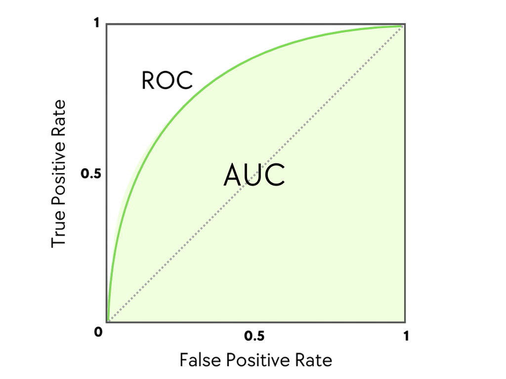
- AUC = 1: Perfect model.
- AUC = 0.5: No discriminative power (random guessing).
- AUC < 0.5: Model is worse than random.
AUC is a single scalar value that summarizes the performance of a classifier across all classification thresholds.
Drawing ROC Curve in Python
Here is a simple implementation using Python and drawing ROC Curve in scikit-learn: the curve helps visualize the trade-off between sensitivity and specificity across different thresholds. To scale such evaluation workflows in production environments, exploring Overview of ML on AWS reveals how Amazon’s machine learning services like SageMaker, Redshift, and S3 enable developers to build, train, and deploy predictive models efficiently, while integrating ROC-based diagnostics into cloud-native pipelines across industries.
- from sklearn.datasets import make_classification
- from sklearn.model_selection import train_test_split
- from sklearn.linear_model import LogisticRegression
- from sklearn.metrics import roc_curve, roc_auc_score
- import matplotlib.pyplot as plt
- # Generate dataset
- X, y = make_classification(n_samples=1000, n_classes=2, random_state=42)
- X_train, X_test, y_train, y_test = train_test_split(X, y, test_size=0.3)
- # Train model
- model = LogisticRegression()
- model.fit(X_train, y_train)
- # Predict probabilities
- y_probs = model.predict_proba(X_test)[:, 1]
- # Compute ROC curve
- fpr, tpr, thresholds = roc_curve(y_test, y_probs)
- auc = roc_auc_score(y_test, y_probs)
- # Plot ROC curve
- plt.plot(fpr, tpr, label=f”AUC = {auc:.2f}”)
- plt.plot([0, 1], [0, 1], ‘k–‘)
- plt.xlabel(‘False Positive Rate’)
- plt.ylabel(‘True Positive Rate’)
- plt.title(‘ROC Curve’)
- plt.legend()
- plt.grid()
- plt.show()
You can visualize a classifier’s performance using Python’s sklearn.metrics.roc_curve and matplotlib. After predicting probabilities, calculate the true positive rate (TPR) and false positive rate (FPR). Then, plot FPR against TPR to create the ROC curve. This method allows you to quickly evaluate model accuracy across different thresholds.
To Explore Machine Learning in Depth, Check Out Our Comprehensive Machine Learning Online Training To Gain Insights From Our Experts!
ROC vs Precision-Recall Curve
Random Forest provides a clear way to understand feature importance. It offers data scientists valuable insights into how well a model performs. By using methods like Gini Importance and Permutation Importance, analysts can measure how each feature affects the model’s predictions. Gini Importance looks at the decrease in impurity in decision trees, while Permutation Importance tests model performance by randomly shuffling feature values two powerful techniques covered in Machine Learning Training, where learners master feature evaluation strategies to enhance model interpretability and performance. These metrics help identify and remove irrelevant or redundant features, which improves the efficiency and accuracy of machine learning models. By analyzing feature contributions, data scientists can improve their feature engineering methods. This leads to stronger and more understandable predictive models that yield precise and reliable results.

Threshold Tuning
The ROC curve helps visualize the effect of different thresholds. The default threshold of 0.5 might not be optimal in every situation. Tuning the threshold helps you balance sensitivity and specificity according to the problem’s needs. To implement these adjustments effectively, exploring Keras vs TensorFlow reveals how Keras simplifies threshold tuning with its high-level API, while TensorFlow offers granular control and scalability making both frameworks valuable for optimizing classification performance in real-world scenarios for example:
- from sklearn.metrics import confusion_matrix
- optimal_idx = (tpr – fpr).argmax()
- optimal_threshold = thresholds[optimal_idx]
- pred_labels = (y_probs >= optimal_threshold).astype(int)
- cm = confusion_matrix(y_test, pred_labels)
- print(“Optimal Threshold:”, optimal_threshold)
- print(“Confusion Matrix:\n”, cm)
Threshold tuning is crucial for domain-specific applications where the cost of false positives and false negatives differs significantly.
Looking to Master Machine Learning? Discover the Machine Learning Expert Masters Program Training Course Available at ACTE Now!
Use in Model Comparison
ROC curves are widely used to compare different classifiers: they visualize the trade-off between sensitivity and specificity across various threshold settings. To connect this evaluation technique with real-world career outcomes, exploring Machine Learning Engineer Salary reveals how mastering tools like ROC analysis, model tuning, and algorithm selection can lead to compensation ranging from ₹7.5 to ₹8 lakh annually in India, with global averages exceeding 120K highlighting the value of performance-driven ML expertise in today’s job market.
- Plot multiple ROC curves on the same graph.
- The model with the highest AUC is generally preferred.
- Considers the entire range of thresholds, offering a more comprehensive
- from sklearn.ensemble import RandomForestClassifier
- model2 = RandomForestClassifier()
- model2.fit(X_train, y_train)
- y_probs2 = model2.predict_proba(X_test)[:, 1]
- fpr2, tpr2, _ = roc_curve(y_test, y_probs2)
- auc2 = roc_auc_score(y_test, y_probs2)
- plt.plot(fpr, tpr, label=f”Logistic (AUC = {auc:.2f})”)
- plt.plot(fpr2, tpr2, label=f”Random Forest (AUC = {auc2:.2f})”)
- plt.legend()
- plt.show()
Multi-class ROC Curves
ROC analysis can be extended to Multi-class ROC Curves classification using the “One-vs-Rest” approach. Each class is compared against the rest, and an ROC curve is generated for each binary classification task. To support this kind of evaluation with scalable frameworks, exploring Machine Learning Tools reveals top platforms like TensorFlow, Accord.NET, Apache Mahout, and Google Cloud ML Engine each offering specialized capabilities for model training, performance visualization, and deployment across diverse machine learning workflows.
- from sklearn.metrics import roc_auc_score
- from sklearn.preprocessing import label_binarize
- # Binarize labels
- y_bin = label_binarize(y_test, classes=[0, 1, 2])
- y_probs_bin = model.predict_proba(X_test)
- auc = roc_auc_score(y_bin, y_probs_bin, average=’macro’, multi_class=’ovr’)
- print(“Multi-class AUC:”, auc)
Keep in mind that the interpretability of Multi-class ROC Curves cases is more complex and should be handled with care.
Preparing for Machine Learning Job Interviews? Have a Look at Our Blog on Machine Learning Interview Questions and Answers To Ace Your Interview!
Interpretation Challenges
While powerful, ROC curves can be misinterpreted or misused: especially when class imbalance skews the visual interpretation or when threshold selection isn’t aligned with business objectives. To build a stronger theoretical foundation for such evaluation metrics, exploring Deep Learning Books to Read reveals expert-recommended titles that balance mathematical rigor and practical implementation covering topics like probability theory, optimization, and neural network behavior that help decode the nuances behind ROC analysis and other performance curves.
- AUC doesn’t reflect specific thresholds.
- Similar AUCs can yield different performances at a given threshold.
- Not suitable alone for imbalanced datasets.
- Requires continuous outputs (not just labels).
Hence, always supplement ROC with other evaluation tools such as confusion matrices, precision-recall curves, and domain knowledge.
Summary
The ROC Curve is a fundamental tool in model evaluation, offering a clear visualization of the trade-off between true positive and false positive rates. Its accompanying metric, AUC, serves as a strong indicator of model performance across all classification thresholds a key evaluation concept emphasized in Machine Learning Training, where learners explore ROC curves, threshold tuning, and metric selection to assess classifier effectiveness under varying conditions. However, ROC analysis should be combined with other metrics and domain understanding for optimal decision-making. Whether comparing models, tuning thresholds, or dealing with imbalanced datasets, ROC curves provide essential insights that can enhance model interpretation and deployment success. Proper use of ROC and AUC can significantly improve the robustness and reliability of machine learning solutions in real-world applications.