Last updated on 21st May 2025| 9681
- Introduction to Correlation in Statistics
- Importance of Correlation in Data Analysis
- Types of Correlation: Positive vs Negative
- Pearson’s Correlation Coefficient Explained
- Spearman and Kendall Correlation Methods
- Visualizing Correlation Using Heatmaps
- Computing Correlation in Python (Pandas, NumPy)
- Conclusion
Introduction to Correlation in Statistics
Correlation is a statistical technique used to measure the strength and direction of the relationship between two or more variables. It plays a crucial role in identifying patterns, trends, and dependencies within datasets. A positive correlation indicates that as one variable increases, the other tends to increase as well, while a negative correlation suggests that one variable decreases as the other increases. This analysis is widely used across various fields, including economics, finance, psychology, and data science, to uncover meaningful associations between variables. In business, correlation analysis aids decision-making by revealing important connections, and Data Science Training equips professionals with the skills to perform such analysis effectively. For instance, companies can analyze whether increased advertising leads to higher sales, helping allocate budgets more effectively. In healthcare, it helps researchers explore how lifestyle factors like diet, exercise, or smoking relate to the risk of developing certain diseases. The rise of big data has amplified the relevance of correlation analysis, offering more opportunities to discover intricate relationships within large and complex datasets. By leveraging correlation analysis, researchers and organizations can gain valuable insights that support evidence-based strategies and policies, ultimately leading to more informed and effective decisions.
Do You Want to Learn More About Data Science? Get Info From Our Data Science Course Training Today!
Importance of Correlation in Data Analysis
Correlation plays a vital role in data analysis by revealing the strength and direction of relationships between variables. It helps analysts and researchers understand how variables move in relation to one another, which is essential for identifying patterns, making predictions, and informing decisions. By using correlation analysis, one can determine whether changes in one variable are associated with changes in another, a key concept in Master Data Wrangling Steps, Tools & Techniques. This insight is crucial in fields like finance, where the correlation between asset returns can guide investment strategies, or in marketing, where businesses examine the link between advertising efforts and customer response. In scientific research, correlation is often the first step toward discovering potential causal relationships. While correlation itself does not imply causation, it highlights variables worth investigating further.
In sectors such as healthcare, correlation analysis can uncover associations between lifestyle habits and health conditions, guiding preventive care and public health policies. With the explosion of big data, correlation analysis has become even more important. It allows analysts to sift through large datasets to find meaningful relationships quickly. This ability to derive insights from vast amounts of information empowers organizations to make smarter, data-driven decisions, enhance performance, and create strategies backed by empirical evidence.
Types of Correlation: Positive vs Negative
- Definition of Correlation: It indicates whether and how strongly pairs of variables are related. It’s a key tool in statistical analysis and predictive modeling.
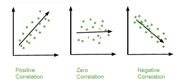
- Positive Correlation: This occurs when both variables increase or decrease together. For example, as study time increases, exam scores often increase.
- Negative Correlation: In this case, one variable increases as the other decreases. For instance, more hours of exercise may correlate with lower body fat percentage.
- Correlation Coefficient Values: The Pearson correlation coefficient (r) ranges from -1 to 1. Values closer to 1 or -1 signify stronger relationships; values near 0 suggest weak or no correlation, which is crucial for techniques like Informed Search in Artificial Intelligence.
- Real-World Examples: In economics, consumer spending and income typically show positive correlation. Conversely, temperature and heating bills often show a negative correlation.
- Use in Analysis: Understanding the type of correlation helps in identifying trends, selecting features in machine learning, and making informed decisions.
- Caution in Interpretation: It’s important to remember that correlation does not imply causation. Even a strong correlation between two variables doesn’t confirm that one causes the other.
- Definition: Pearson’s Correlation Coefficient (r) quantifies the strength and direction of the linear relationship between two continuous variables.
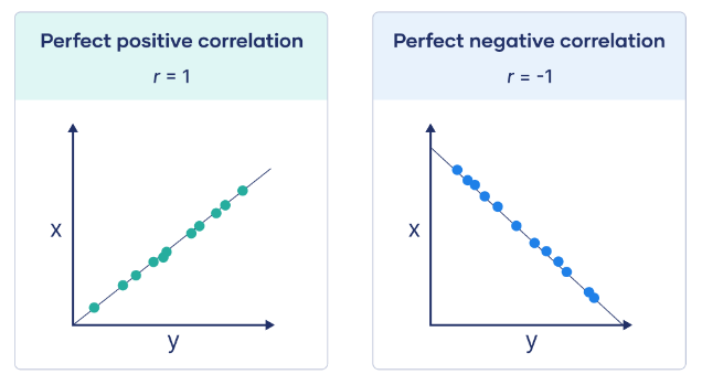
- Value Range: The coefficient ranges from -1 to +1. A value of +1 indicates a perfect positive relationship, 0 means no linear correlation, and -1 indicates a perfect negative relationship.
- Interpretation of Positive and Negative Correlation: A positive correlation (r > 0) means that as one variable increases, the other also increases, while a negative correlation (r < 0) means that as one variable increases, the other decreases.
- Strength of Correlation: The strength of the correlation is determined by the absolute value of r, where a strong correlation is |r| ≥ 0.7, a moderate correlation is 0.3 ≤ |r| < 0.7, and a weak correlation is |r| < 0.3; understanding these thresholds is a key component of Data Science Training.
- Linearity: Pearson’s r measures only linear relationships. Nonlinear associations cannot be detected by this coefficient.
- Assumptions: The variables must be continuous, linearly related, and normally distributed for Pearson’s r to be valid.
- Applications: Pearson’s correlation is used in various fields like psychology, economics, and biology to understand the relationships between variables (e.g., studying the link between height and weight).
- Definition: A heatmap is a data visualization tool that displays the correlation between variables using color gradients, making it easier to interpret complex relationships.
- Color Encoding: The color intensity represents the strength of the correlation, with darker colors indicating stronger correlations and lighter colors representing weaker ones.
- Correlation Matrix: A correlation matrix is often used in heatmaps, showing how each pair of variables correlates in a grid format, which can complement techniques like DFS in Artificial Intelligence when analyzing structured data.
- Positive vs. Negative Correlation: Positive correlations appear as warm colors (e.g., red), indicating that as one variable increases, the other tends to increase, while negative correlations appear as cool colors (e.g., blue), signifying an inverse relationship.
- Diagonal Line: The diagonal line (top-left to bottom-right) always shows a correlation of 1, as each variable is perfectly correlated with itself.
- Ease of Interpretation: Heatmaps offer a visual summary, making it easier to quickly identify strong, weak, or no correlations between variables.
- Applications: Heatmaps are commonly used in finance, biology, and marketing to visually explore and communicate relationships within large datasets.
Would You Like to Know More About Data Science? Sign Up For Our Data Science Course Training Now!
Pearson’s Correlation Coefficient Explained

Spearman and Kendall Correlation Methods
Spearman and Kendall correlation methods are non-parametric techniques used to measure the strength and direction of association between two variables. Unlike the Pearson correlation, which assumes a linear relationship and normally distributed data, Spearman and Kendall correlations are based on the ranks of the data, making them more robust to outliers and suitable for non-linear or ordinal data. The Spearman correlation assesses how well the relationship between two variables can be described by a monotonic function, a concept valuable for Mastering ChatGPT Prompts for Better Results by improving data analysis techniques. It converts the raw data into ranks and then calculates the Pearson correlation coefficient on those ranks. This method is useful when the variables have a consistent directional relationship, even if it’s not linear. Spearman correlation values range from -1 to 1, indicating perfect negative to perfect positive monotonic relationships. The Kendall correlation, or Kendall’s Tau, measures the ordinal association between two variables by comparing the number of concordant and discordant pairs. It is particularly effective for smaller datasets or those with many tied ranks. Kendall’s Tau generally provides a more conservative estimate of correlation than Spearman’s method. Both methods are valuable alternatives when data do not meet the assumptions required for Pearson correlation, ensuring more reliable and meaningful analysis.
Are You Considering Pursuing a Master’s Degree in Data Science? Enroll in the Data Science Masters Course Today!
Visualizing Correlation Using Heatmaps
Computing Correlation in Python (Pandas, NumPy)
Python offers powerful libraries such as Pandas and NumPy for computing correlation efficiently and accurately. These libraries are widely used in data analysis due to their simplicity and flexibility. In Pandas, the .corr() method allows users to quickly compute the Pearson correlation coefficient between numerical columns in a DataFrame. This method can also calculate other types of correlation, such as Kendall and Spearman, by specifying the method parameter. For example, df.corr(method=’spearman’) computes the Spearman rank correlation, which is useful for non-linear relationships. NumPy, another core library for numerical computing, provides the np.corrcoef() function, which computes the Pearson correlation coefficient matrix an essential concept when exploring questions like Is Data Science a Good Career. This method is particularly helpful when working with arrays and matrices. It returns a matrix showing the correlation between each pair of variables, which can be useful for deeper statistical analysis and feature selection in machine learning. Both libraries are essential for exploratory data analysis, enabling analysts to identify relationships, reduce dimensionality, and detect multicollinearity. Understanding and using these tools correctly allows data professionals to gain valuable insights, ensure data quality, and make informed decisions based on robust statistical evidence.
Preparing for a Data Science Job Interview? Check Out Our Blog on Data Science Interview Questions & Answer
Conclusion
Correlation analysis is an essential statistical tool used to examine the strength and direction of relationships between two or more variables. It is widely applied in data analysis, predictive modeling, and strategic decision-making across various domains such as business, healthcare, finance, and social sciences. By identifying how variables are related, correlation analysis helps analysts uncover meaningful patterns in data, making it easier to predict future trends and outcomes. In predictive modeling, correlation can guide the selection of relevant features, helping to improve model accuracy and efficiency. In business, Data Science Training supports decision-making by revealing connections between factors like customer behavior and sales performance. For example, identifying a strong correlation between marketing spend and revenue growth can help businesses allocate resources more effectively. However, while correlation provides valuable insights, it must be interpreted carefully. A key limitation is that correlation does not imply causation two variables may be correlated without one directly causing the other. Misinterpreting this relationship can lead to flawed conclusions and poor decisions. Therefore, analysts and data scientists must combine correlation analysis with other statistical techniques and domain knowledge to ensure accurate, data-driven insights that support sound decision-making.