Last updated on 22nd May 2025| 9577
- Introduction to Statistical Analysis
- Types of Statistical Analysis
- Measures of Central Tendency
- Measures of Dispersion
- Hypothesis Testing and Significance Levels
- Correlation and Causation in Statistical Analysis
- Data Visualization in Statistical Analysis
- Implementing Statistical Analysis in Python
Introduction to Statistical Analysis
Statistical analysis is a key component of data-driven decision-making. It involves the systematic process of collecting, analyzing, interpreting, and presenting data to uncover patterns and trends. By applying statistical methods, data is transformed into valuable insights, enabling informed decisions across various sectors such as business, healthcare, economics, and artificial intelligence. As the volume of data grows, particularly with the rise of big data and machine learning, Data Science Training and statistical techniques have become more essential. They help in identifying correlations, testing hypotheses, making predictions, and validating models. Whether it’s analyzing an experiment’s results, forecasting future trends, or understanding relationships between variables, statistical analysis provides the framework for making accurate and reliable conclusions. In practical terms, statistical analysis empowers organizations to optimize operations, enhance product development, improve patient care, and guide policy decisions. It offers the tools to make sense of vast amounts of data, ensuring that decisions are based on evidence rather than assumptions. As data continues to play a critical role in decision-making, the importance of statistical analysis only increases.
Are You Interested in Learning More About Data Science? Sign Up For Our Data Science Course Training Today!
Types of Statistical Analysis
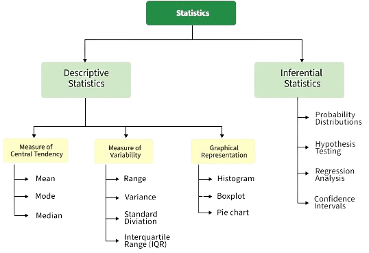
There are several types of statistical analysis, each serving a unique purpose depending on the nature of the data and the research question. Descriptive analysis is one of the most basic types, focusing on summarizing and presenting data in an understandable form. It includes measures such as mean, median, mode, variance, and standard deviation, which provide insights into the central tendency and spread of the data, and is increasingly applied in How AI Is Redefining Design Workflows. Inferential analysis goes a step further by using sample data to make generalizations about a larger population. Techniques like hypothesis testing, confidence intervals, and p-values are used to assess the validity of assumptions or predictions about the population. Regression analysis examines the relationships between variables.
It helps in predicting the value of a dependent variable based on one or more independent variables, with models such as linear and logistic regression being widely used in various fields. Multivariate analysis involves the analysis of more than two variables simultaneously. Techniques like factor analysis, principal component analysis (PCA), and cluster analysis are used to identify patterns, reduce dimensions, or classify data. Time series analysis is used to analyze data points collected over time, helping to identify trends, seasonal patterns, or cyclic behaviors, making it crucial for forecasting future events.
Measures of Central Tendency
- Definition: Measures of central tendency are statistical values that represent the center or typical value of a dataset. They help summarize a large set of data with a single representative value.
- Mean (Average): The mean is calculated by summing all the values in a dataset and dividing by the number of values. It is widely used but can be sensitive to outliers.
- Median: The median is the middle value in an ordered dataset and is more robust than the mean, especially in Probability Distributions in finance when dealing with skewed data or outliers.
- Mode: The mode is the value that appears most frequently in a dataset. It’s particularly useful for categorical data or when identifying the most common value is important.
- Weighted Mean: This variation of the mean accounts for varying levels of importance or frequency among data points by assigning weights to each value.
- Applications: Measures of central tendency are used in virtually every field, including business, education, and healthcare, to analyze trends and compare groups.
- Choosing the Right Measure: The best measure depends on the data distribution and context mean for symmetric data, median for skewed distributions, and mode for categorical data.
- Definition: Measures of dispersion describe the spread or variability of data points in a dataset. They help understand how much the values differ from the central tendency, providing insights into data consistency.
- Range: The range is the simplest measure, calculated as the difference between the maximum and minimum values. While easy to compute, it is highly sensitive to outliers.
- Variance: In Data Science Training, variance measures the average squared deviation of each data point from the mean. It provides a detailed view of data spread, especially in statistical and probabilistic modeling.
- Standard Deviation: The standard deviation is the square root of the variance. It is widely used because it is in the same unit as the original data, making it easier to interpret.
- Mean Absolute Deviation (MAD): MAD represents the average of the absolute differences between each data point and the mean. It’s a robust alternative to standard deviation.
- Use in Analysis: Measures of dispersion are essential in comparing datasets, assessing reliability, and identifying variability, helping guide more accurate and informed decisions.
- Interquartile Range (IQR): IQR measures the spread of the middle 50% of data, calculated as the difference between the third and first quartiles (Q3 – Q1). It is effective for dealing with skewed data and outliers.
- Definition of Correlation: Correlation measures the strength and direction of the relationship between two variables. It indicates whether an increase or decrease in one variable is associated with a similar change in another.
- Types of Correlation: Correlation can be positive (both variables move in the same direction), negative (variables move in opposite directions), or zero (no relationship). It is typically measured using Pearson’s correlation coefficient (r), which ranges from -1 to +1.
- Causation Explained: Causation means that one variable directly affects another. Unlike correlation, it implies a cause-and-effect relationship, which cannot be established through correlation alone, even when using advanced tools like a Vector Database.
- Correlation Does Not Imply Causation: A key principle in statistics is that just because two variables are correlated does not mean one causes the other. There may be a third variable or coincidence involved.
- Spurious Correlations: These occur when two variables appear to be related but are actually influenced by a hidden or confounding factor.
- Establishing Causation: To confirm causality, controlled experiments, longitudinal studies, or advanced statistical techniques like regression and path analysis are often required.
- Importance in Analysis: Understanding the difference between correlation and causation is crucial for accurate data interpretation and avoiding misleading conclusions in decision-making.
To Explore Data Science in Depth, Check Out Our Comprehensive Data Science Course Training To Gain Insights From Our Experts!
Measures of Dispersion


Hypothesis Testing and Significance Levels
Hypothesis testing is a core component of statistical analysis, used to determine whether there is enough evidence in a sample of data to infer a certain condition holds true for the entire population. It begins with formulating two hypotheses: the null hypothesis (H₀), which represents no effect or no difference, and the alternative hypothesis (H₁), which suggests a meaningful effect or difference exists. The outcome of hypothesis testing relies on calculating a test statistic and a p-value, which indicates the probability of obtaining the observed results if the null hypothesis were true, and can be effectively communicated through Data Visualization. A key concept in this process is the significance level, denoted by α (alpha), which is the threshold for rejecting the null hypothesis. Common values for α are 0.05, 0.01, or 0.10, depending on the field and context of the study. If the p-value is less than or equal to the chosen α level, the null hypothesis is rejected, suggesting the results are statistically significant. However, rejecting H₀ does not prove H₁ is true it only implies that the observed data is unlikely under H₀. Understanding significance levels helps control the risk of Type I errors (false positives), making hypothesis testing a powerful tool for drawing reliable conclusions from data.
Looking to Master Data Science? Discover the Data Science Masters Course Available at ACTE Now!
Correlation and Causation in Statistical Analysis
Data Visualization in Statistical Analysis
Data visualization plays a vital role in statistical analysis by transforming complex data sets and numerical results into visual formats that are easier to interpret and communicate. Effective visualizations help uncover patterns, trends, outliers, and relationships between variables that may not be immediately obvious from raw data or statistical outputs alone. Using graphs, charts, and plots enhances understanding and supports more informed decision-making. Common visualization types in Quantitative Research Methods include bar charts for categorical comparisons, histograms for distribution analysis, scatter plots for identifying correlations, and box plots for summarizing data spread and detecting outliers. Heatmaps, line graphs, and pie charts are also frequently used depending on the data and the analysis objective. In Python, libraries such as Matplotlib, Seaborn, and Plotly are widely used for creating high-quality, customizable visualizations. Seaborn, in particular, integrates seamlessly with Pandas and provides attractive, statistical-friendly plots with minimal code. These tools help in visualizing regression models, confidence intervals, and the results of hypothesis tests. Ultimately, data visualization bridges the gap between analysis and decision-making. It turns statistical results into compelling visuals that not only support interpretation but also make findings more accessible to stakeholders with varying levels of technical expertise.
Preparing for a Data Science Job Interview? Check Out Our Blog on Data Science Interview Questions & Answer
Implementing Statistical Analysis in Python
Implementing statistical analysis in Python is efficient and accessible, thanks to its powerful libraries and user-friendly syntax. Python has become a leading language for data analysis, offering tools that cover every stage of the statistical workflow from data cleaning and exploration to hypothesis testing and predictive modeling. Pandas is one of the most commonly used libraries for handling and manipulating structured data. It allows easy data cleaning, filtering, and aggregation, making it ideal for preparing data for analysis. In Data Science Training, NumPy complements Pandas by providing support for numerical operations and array-based computations. For performing core statistical analysis, SciPy and StatsModels offer a wide range of functions for descriptive statistics, probability distributions, hypothesis testing, and regression models. StatsModels, in particular, is favored for conducting in-depth statistical tests and generating detailed outputs and visualizations. Scikit-learn is another essential library, especially when statistical analysis overlaps with machine learning. It provides tools for regression, classification, clustering, and model validation. With these tools, Python allows users to implement robust statistical analysis efficiently, whether for academic research, business intelligence, or scientific computing. Its open-source nature and active community support make it a go-to choice for modern data analysis tasks.