Last updated on 26th Apr 2025| 9585
- Introduction to Data Visualization
- Bar Charts and Column Charts
- Line Graphs and Trend Analysis
- Pie Charts and Donut Charts
- Scatter Plots and Correlation Analysis
- Heatmaps and Geographic Maps
- Data Visualization Tools
- Conclusion
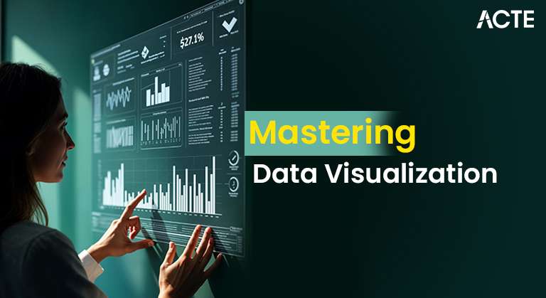
Introduction to Data Visualization
Data visualization is the graphical representation of data through charts, graphs, and other visual elements. It transforms complex information into a format that is easier to understand, analyze, and interpret. By converting raw data into visual insights, it allows decision-makers to quickly identify key patterns, trends, and outliers that might be difficult to discern in raw numerical form. This process not only simplifies data but also enhances the overall understanding of underlying dynamics, enabling more informed decision making a key objective emphasized in Data Science Training. In business intelligence, data visualization is widely used to track key performance indicators (KPIs), monitor trends over time, and assess operational efficiency. Tools like dashboards, line graphs, bar charts, and heatmaps make it easier to analyze vast amounts of data at a glance, making it accessible to both technical and non-technical users. It also aids in presenting complex findings to stakeholders, ensuring that the information is clear and actionable. In analytics and reporting, data visualization fosters a deeper understanding of data-driven insights, allowing organizations to spot opportunities, detect anomalies, and make strategic, data-driven decisions. As such, it plays a critical role in driving business success.
Would You Like to Know More About Data Science? Sign Up For Our Data Science Course Training Now!
Bar Charts and Column Charts
Bar charts and column charts are effective tools for comparing categories or groups of data. The primary difference between them is the orientation: bar charts display data horizontally, while column charts present it vertically. Both are ideal for visualizing discrete data categories and comparing their respective values useful when presenting outputs or insights derived from Large Language Models. Bar charts are often used in business settings to compare the performance of different categories, such as sales across various regions or product categories. The horizontal format makes them particularly useful when dealing with long category labels or when you want to emphasize comparisons between categories rather than their individual values.
Column charts, on the other hand, are typically used to show changes over time or compare values across different time periods, like monthly revenue growth or yearly sales. Their vertical format is particularly effective for tracking trends and changes in magnitude. Both bar and column charts are essential for analyzing categorical and quantitative data, helping organizations make informed decisions based on clear visual comparisons.
Line Graphs and Trend Analysis
- Trend Visualization: Line graphs are ideal for displaying trends over time, helping users identify patterns, fluctuations, and overall directions in the data.
- Time-Series Data: These graphs are particularly useful for time-series data, showing how values change at regular intervals, such as monthly sales, stock prices, or website traffic.
- Clear Comparisons: Multiple lines on a single graph allow for easy comparison of different datasets, such as the performance of different products or regions over time.
- Identification of Patterns: Line graphs show trends clearly perfect with Top Excel AI Tools for Smarter Data Analysis to boost insights.
- Predictive Analysis: By analyzing the slope and direction of lines, line graphs can help predict future trends, assisting in forecasting and planning.
- Simplicity: Line graphs provide a straightforward and intuitive way to represent data, making them accessible to both technical and non-technical users.
- Data Points and Clarity: The connected points on a line graph provide a clear visual of data progression without overwhelming viewers with unnecessary details.
- Performance Monitoring: Organizations use line graphs for monitoring performance metrics, ensuring they stay on track with goals and quickly respond to changes.
- Clear Labels: To enhance clarity, it’s crucial to label each segment with percentages or values, ensuring the chart conveys accurate data.
- Easy Comparison: These charts are effective for comparing parts of a whole, such as market share distribution, budget allocations, or survey responses.
- Limited Categories: Pie and donut charts work best with few categories just like AI Art Generator Tools aim for clear, aesthetic visuals.
- Visual Appeal: Donut charts, with their hollow center, provide a cleaner look and can accommodate additional information in the center, like total percentages or KPIs.
- Intuitive Understanding: Both charts are intuitive and easily understood by non-technical audiences, making them popular for presentations and reports.
- Data Proportions: Both pie and donut charts are used to show proportions of a whole, where each segment represents a part of the total value, making it easy to visualize relative percentages.
- Simple Representation: Pie charts use a circular shape divided into slices, while donut charts have a hole in the middle, offering a more modern and visually appealing alternative.
- Looker: Offers advanced visualization capabilities for enterprise-level analytics.
- D3.js: A JavaScript library for custom, dynamic visualizations.
- Power BI: Microsoft’s tool, great for business intelligence, pairs well with AI Tools for Coding to boost efficiency.
- Tableau: Known for its drag-and-drop interface, making it easy to create interactive dashboards.
- Google Data Studio: A free tool for basic data visualizations with Google ecosystem integration.
To Earn Your Data Science Certification, Gain Insights From Leading Data Science Experts And Advance Your Career With ACTE’s Data Science Course Training Today!
Pie Charts and Donut Charts

Scatter Plots and Correlation Analysis
Scatter plots are powerful tools for displaying the relationship between two variables. In a scatter plot, each point represents an individual observation, with its position determined by two variables one on the x-axis and the other on the y-axis. This format allows for easy visualization of how changes in one variable might be associated with changes in another. Scatter plots are often used to identify correlations. For example, businesses can use them to analyze the relationship between advertising spend and sales revenue, helping to understand if increased spending leads to higher sales an application often explored in Data Science Training to drive data-informed strategies. They can also reveal clusters or trends in the data, showing where values tend to group together or move in a specific direction. Additionally, scatter plots help in spotting outliers data points that fall outside the general pattern of the other points. These outliers can indicate errors, anomalies, or special cases that require further investigation. Scatter plots are valuable tools in regression analysis and data exploration, providing insights into potential relationships between variables and guiding data-driven decisions.
Want to Pursue a Data Science Master’s Degree? Enroll For Data Science Masters Course Today!
Heatmaps and Geographic Maps
Heatmaps and geographic maps are powerful data visualization tools that provide spatial insights and reveal location-based patterns. Heatmaps use color intensity to represent data density, with darker or more vibrant colors indicating higher values and lighter colors representing lower values. This makes them highly effective for spotting patterns, trends, and areas of interest. For example, heatmaps are commonly used in website click tracking to understand user behavior, showing which areas of a page receive the most clicks and engagement—similar to how ChatGPT Plugins can enhance user interaction by providing tailored responses based on user activity. Geographic maps, on the other hand, display data across a regional or global scale, visually representing information by location. These maps are especially useful for illustrating trends related to geography, such as population density, sales distribution, or regional performance. By mapping data points onto a map, it becomes easier to understand how different areas compare and identify potential areas for growth or improvement. Both heatmaps and geographic maps offer valuable insights into spatial data, making them essential tools for businesses and researchers looking to uncover location-based trends and optimize decision-making.
Data Visualization Tools
There are several powerful tools for data visualization, including:
Are You Preparing for Data Science Jobs? Check Out ACTE’s Data Science Interview Questions & Answer to Boost Your Preparation!
Conclusion
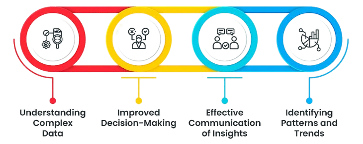
Data visualization is an essential tool for simplifying and interpreting complex data. By presenting data in the form of charts, graphs, and interactive dashboards, organizations can transform raw numbers into meaningful insights that are easy to understand and analyze. Whether used for business intelligence, research, or reporting, effective visualizations enable stakeholders to quickly grasp trends, patterns, and outliers, making it easier to interpret large volumes of information. Visualizations make data more accessible and actionable by allowing decision-makers to focus on key points without getting lost in the details an essential skill emphasized in Data Science Training. Dashboards, for instance, offer real-time, at-a-glance insights into performance metrics, making it easier to track progress and identify areas that need attention. Meanwhile, charts and graphs break down complex data sets, turning them into visual narratives that guide informed decisions. For businesses, this translates into better strategic planning, more accurate forecasting, and improved overall performance. In research, data visualizations help in conveying findings clearly and concisely. Ultimately, leveraging visualization tools empowers organizations to make data-driven decisions with greater confidence and precision.