Last updated on 21st May 2025| 9603
- Introduction to Data Visualization in Python
- Popular Python Libraries for Data Visualization
- Matplotlib: Basic Plotting in Python
- Seaborn: Statistical Data Visualization
- Plotly and Interactive Data Visualizations
- Pandas Visualization Functions
- Creating Dashboards Using Dash and Streamlit
- Customizing Charts and Graphs in Python
Introduction to Data Visualization in Python
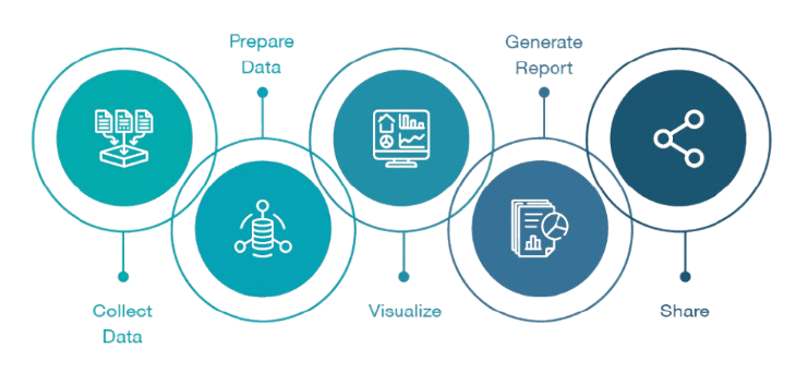
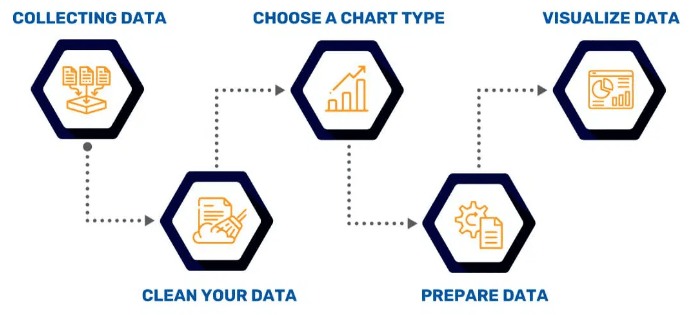
Data visualization is a fundamental aspect of data science, allowing analysts, researchers, and decision-makers to interpret complex datasets more effectively. By converting raw data into visual formats such as charts, graphs, and heatmaps, it becomes easier to identify trends, patterns, and outliers that might otherwise go unnoticed. This transformation enables clearer communication of insights and supports better-informed decisions. Python is one of the leading programming languages in the field of data science, offering a rich ecosystem of libraries tailored for data visualization, making it essential in Data Science Training. Tools like Matplotlib provide basic but highly customizable plotting capabilities, while libraries such as Seaborn build on it to offer more aesthetically pleasing statistical graphics. For more dynamic and interactive visualizations, Plotly and Bokeh allow users to create web-based visuals with ease. These libraries serve different purposes, from exploratory data analysis to reporting and dashboard creation. Effective data visualization not only enhances analytical understanding but also improves storytelling with data. This document explores various Python visualization libraries, their specific use cases, and best practices to follow helping users choose the right tools and techniques to communicate data insights clearly and powerfully.
Interested in Obtaining Your Data Science Certificate? View The Data Science Course Training Offered By ACTE Right Now!
Popular Python Libraries for Data Visualization
Python offers a wide range of powerful libraries for data visualization, making it a top choice for analysts and data scientists. Matplotlib is one of the oldest and most widely used libraries, known for its flexibility in creating static, animated, and interactive plots. It provides fine-grained control over every element of a figure, making it suitable for custom visualizations, much like a Chatbot Alternative offers tailored interactions. Seaborn, built on top of Matplotlib, simplifies complex visualizations by offering high-level functions for drawing attractive and informative statistical graphics, such as heatmaps, violin plots, and pair plots. For those looking to create interactive visualizations, Plotly is a popular choice. It allows users to build responsive, web-based charts with zoom, pan, and hover capabilities.
Bokeh is another interactive visualization library designed for modern web browsers, capable of handling large datasets and streaming data in real time. Altair, based on the Vega-Lite grammar, focuses on simplicity and clarity, making it ideal for declarative plotting. Each of these libraries has its strengths and ideal use cases. Selecting the right one depends on the specific requirements of the project, such as the need for interactivity, customization, or statistical plotting, ensuring effective communication of data-driven insights.
Matplotlib: Basic Plotting in Python
- Introduction: Matplotlib is a core Python library for creating static, animated, and interactive visualizations, widely used due to its simplicity and flexibility.
- Basic Plotting: With just a few lines of code, Matplotlib allows the creation of basic plots like line charts, bar charts, histograms, and scatter plots.
- Figure and Axes: The library uses Figure and Axes objects for layout, much like Hugging Face Transformers structure models for NLP tasks.
- Integration: Matplotlib integrates seamlessly with other libraries like NumPy and pandas, enabling users to visualize data from arrays or DataFrames easily.
- Output Formats: Users can save plots in different formats (e.g., PNG, PDF, SVG) or display them interactively in environments like Jupyter notebooks or Python scripts.
- Customization Options: Matplotlib offers extensive customization, including the ability to modify titles, axis labels, tick marks, colors, line styles, and markers for precise control.
- Common Use Cases: Matplotlib is widely used for exploratory data analysis, academic research, and creating visualizations for reports and presentations due to its versatility and control.
- Introduction: Seaborn is a powerful Python data visualization library built on top of Matplotlib, designed for creating aesthetically pleasing and statistically informed plots.
- Statistical Plots: It specializes in statistical visualizations, offering advanced plot types like heatmaps, violin plots, box plots, pair plots, and regression plots.
- Simplified Syntax: Seaborn simplifies the creation of complex visualizations with high-level functions, making it a valuable tool in Data Science Training.
- Built-in Themes: The library includes built-in themes and color palettes, enhancing the appearance of plots and ensuring clear, attractive visualizations with minimal customization.
- Integration with Pandas: Seaborn integrates seamlessly with pandas DataFrames, allowing easy plotting of data directly from DataFrames, which is ideal for data exploration.
- Statistical Functions: It supports statistical functions such as regression lines, confidence intervals, and distribution fitting, making it suitable for in-depth analysis.
- Use Cases: Seaborn is widely used in data science, economics, biology, and other fields for exploring relationships, visualizing distributions, and performing statistical analyses.
- Introduction: Pandas, primarily known for data manipulation, also provides built-in visualization capabilities for quick and simple plotting, making it convenient for exploratory data analysis.
- Integration with Matplotlib: Pandas’ plotting functions are built on top of Matplotlib, so they inherit its flexibility and customization features, allowing users to create various chart types like line, scatter, and histograms with minimal code.
- Simple Syntax: Pandas offers easy syntax for visualizations, similar to how AI Video Generator Tools simplify content creation.
- Plotting Multiple Data Types: Users can easily create line plots, bar plots, area plots, histograms, and box plots, all directly from pandas DataFrames or Series, helping in quick visual insights.
- Handling Missing Data: Pandas also handles missing data gracefully in visualizations, allowing users to plot data while automatically excluding or filling missing values.
- Customization Options: Although simple, pandas visualizations can be customized with Matplotlib parameters, such as adding titles, labels, legends, and adjusting colors or axes.
- Use Cases: Pandas visualizations are ideal for initial data exploration, comparing trends, and identifying patterns in small to medium-sized datasets, making them a great tool for rapid analysis.
To Earn Your Data Science Certification, Gain Insights From Leading Data Science Experts And Advance Your Career With ACTE’s Data Science Course Training Today!
Seaborn: Statistical Data Visualization

Plotly and Interactive Data Visualizations
Plotly is a powerful Python library designed for creating interactive and visually engaging data visualizations. Unlike traditional static plotting tools, Plotly enables users to build dynamic charts that respond to user actions such as hovering, zooming, and clicking. This interactivity enhances data exploration, making it easier to uncover patterns, trends, and outliers within complex datasets. Plotly supports a wide variety of chart types, including line plots, bar charts, scatter plots, heatmaps, 3D plots, and even geographic maps, offering flexibility for a wide range of analytical needs, much like Apache Airflow provides flexibility for managing complex workflows. One of Plotly’s key advantages is its seamless integration with web technologies, allowing charts to be easily embedded in web applications and dashboards using frameworks like Dash. Plotly also works well in Jupyter notebooks, making it a convenient choice for data scientists working in Python environments. Its user-friendly syntax and well-documented API allow for both simple and advanced visualizations with minimal code. Additionally, Plotly handles large datasets efficiently and supports real-time data updates. Overall, Plotly is an ideal choice for users who need interactive, high-quality visualizations to communicate data insights effectively, whether in business intelligence reports, scientific research, or web-based data applications.
Looking to Master Data Science? Discover the Data Science Masters Course Available at ACTE Now!
Pandas Visualization Functions
Creating Dashboards Using Dash and Streamlit
Creating interactive dashboards is an essential part of modern data communication, and two of the most popular Python frameworks for building them are Dash and Streamlit. Both tools allow data scientists and developers to turn data scripts into shareable web applications without needing advanced front-end development skills. Dash, developed by the creators of Plotly, is highly customizable and ideal for building complex, multi-page dashboards with interactive visualizations. It uses a combination of Python, React, and Flask, enabling precise control over layout and behavior, similar to the way ChatGPT vs Google Bard offer distinct approaches to AI-driven interactions. Dash is especially powerful for integrating Plotly charts and creating real-time data updates. On the other hand, Streamlit is known for its simplicity and speed. With just a few lines of code, users can create sleek, interactive apps that update automatically when inputs change. Streamlit is well-suited for quick prototypes, machine learning model demos, and data exploration. It supports widgets like sliders, dropdowns, and file uploads with minimal setup. While Dash is more feature-rich and scalable, Streamlit excels in ease of use and rapid development. Choosing between them depends on project complexity and user needs, but both significantly enhance the accessibility and impact of data insights through interactive dashboards.
Are You Preparing for Data Science Jobs? Check Out ACTE’s Data Science Interview Questions & Answer to Boost Your Preparation!
Customizing Charts and Graphs in Python
Customizing charts and graphs in Python is a crucial step in creating clear, informative, and visually appealing data visualizations. Python offers several libraries, such as Matplotlib, Seaborn, Plotly, and Bokeh, that provide extensive customization options to suit a variety of presentation needs. With Matplotlib, users can control every aspect of a plot titles, labels, colors, line styles, markers, grid lines, and axes making it highly versatile for detailed and tailored visual outputs. Seaborn builds on Matplotlib, offering aesthetically pleasing default styles while still allowing customization of elements like color palettes, annotations, and plot size, making it useful in Data Science Training. For interactive and web-based charts, Plotly and Bokeh provide advanced customization features such as hover information, animations, clickable elements, and real-time updates. Users can adjust layout settings, add legends, tooltips, and integrate visual themes to match branding or publication standards. Customizing graphs not only enhances their appearance but also improves clarity and communication, ensuring that key insights are highlighted effectively. Whether creating a simple line chart or a complex multi-panel dashboard, Python’s flexibility in chart customization allows data professionals to craft visualizations that are both functional and engaging for their specific audiences and objectives.