Last updated on 19th Apr 2025| 8742
- Data Visualization Overview
- Data Visualization Types
- Data Types in Visual Basic
- Data Science Data Visualization
- Chart Types for Data Visualization
- Best Practices for Data Visualization
- Data Visualization in the IT Sector
- In conclusion
Data visualization is a key tool for turning complex data into actionable insights. With the increasing amount of data generated by businesses and organizations, visualizing data has become one of the most effective ways to communicate information. visualization techniques allow patterns, trends, and outliers to become more apparent and aid decision-making. In Data Science Course Training , we will explore the various types of data visualizations, the types of data used in Visual Basic for applications, how data visualization tools apply to data science, the different chart types, and best practices for data visualization.
Data Visualization Overview
Data visualization is the graphical representation of information and data. By using visual elements like charts, graphs, and maps, data visualization tools provide an accessible way to see and understand trends, outliers, and patterns in data. It is a powerful tool that helps individuals and businesses make better decisions by presenting complex datasets in an easy-to-digest visual format. Data visualization helps transform complex data into a more comprehensible format, making it easier for the audience to understand the key points and trends. Data Science Career Path enables the rapid identification of patterns, correlations, and anomalies that might be hidden in raw data. By presenting data visually, decision-makers can make more informed, timely, and accurate decisions. Visualizations are more engaging than raw numbers and can tell a story, making it easier for audiences to connect with the data.
Master Data Science skills by enrolling in this Data Science Online Course today.
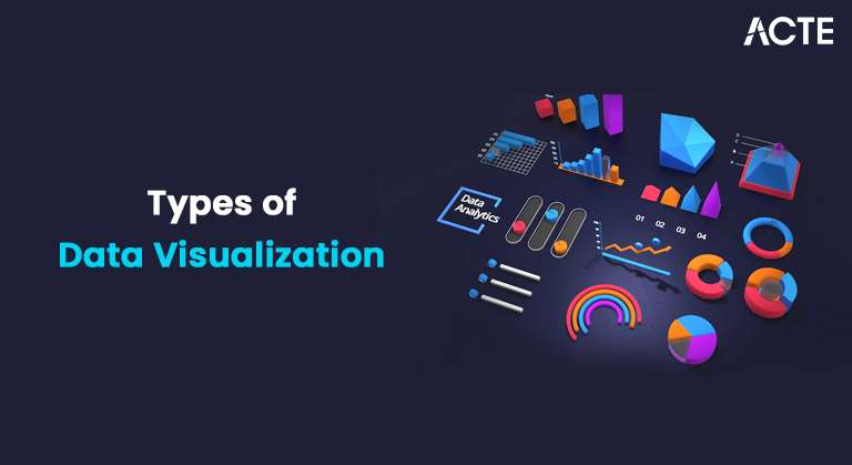
Data Visualization Types
Data visualization takes different forms, each serving a specific purpose. Below are some of the most common types of data visualizations used across industries and sectors.
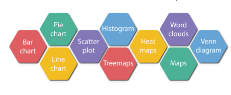
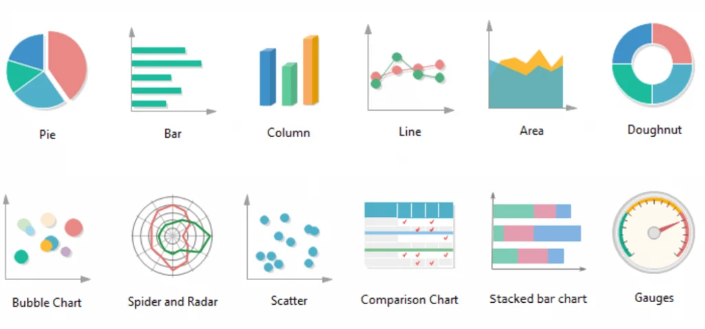
Bar Charts: Bar charts are one of the simplest and most commonly used types of data visualizations. They compare the frequency, count, or other measures (like revenue) across different categories. The bars can be oriented either horizontally or vertically.
- Use Case: Sales comparison among different products, revenue by region, and customer satisfaction comparison by department.
- Advantages: Easy to understand and can accommodate a large number of categories.
Line Charts Line charts display information using points connected by straight lines. They are often used to track changes over periods of time. The x-axis generally represents time, while the y-axis represents the variable of interest.
- Use Case: Stock price trends, sales trends, monthly traffic growth.
- Advantages: Ideal for showing trends over time, allowing for comparisons between different periods.
Pie Charts: A pie chart shows the proportions of a whole by dividing a circle into slices, where each slice represents a category’s contribution to the total.
- Use Case: Market share of different brands, the percentage of budget spent in various departments, and customer demographics.
- Advantages: Good for showing part-to-whole relationships when the number of categories is small.
Histograms: Histograms are similar to bar charts, but the Basics of Data Science is grouped into intervals, or bins, to show the distribution of a continuous variable.
- Use Case: Age distribution, exam scores distribution, income distribution.
- Advantages Useful for showing the distribution of continuous data and understanding the spread of data points.
Scatter Plots: Scatter plots represent data points on a horizontal and vertical axis to observe how one variable correlates with another. Each point represents a pair of values.
- Use Case Relationship between advertising budget and sales, correlation between age and income.
- Advantages Excellent for identifying correlations and trends between variables.
- Use Case: Website heat maps showing where users click and correlation matrices in data analysis.
- Advantages: Great for visualizing patterns and detecting clusters in large datasets.
- Use Case: Cumulative sales over time, monthly revenue with areas showing individual product performance.
- Advantages: Emphasizes the change volume and works well when showing the total value over time.
- Use Case: Product comparison based on various features, analyzing performance in different business areas.
- Advantages: Allows for comparing several variables across different categories in a single view.
- Use Case: Visualizing financial portfolio product sales breakdown by category.
- Advantages: Compact visualization of hierarchical data, showing part-to-whole relationships.
- Use Case:Salary distributions of student test scores across different schools.
- Advantages:Great for detecting outliers and understanding data distribution.
- String Data: Strings represent text, which could be anything from a single word to long passages of text. In Visual Basic, strings are stored in a variable using quotation marks.
- Integer Data: Integer data types represent whole numbers without decimals. Data Science Course Training is often used for counting and calculations that do not require precision beyond entire numbers.
- Decimal Data: The Decimal type is used for high-precision calculations, such as financial calculations. It’s beneficial when dealing with numbers that need to have decimal points but require accuracy, such as currency amounts.
- Boolean Data: A Boolean data type stores a value of either True or False. It is often used for logical operations and conditions in Visual Basic programming.
- Date/Time Data: This data type represents date and time values. It helps calculate time intervals and work with time-sensitive information, such as deadlines or scheduling events.
- Object Data: The Object data type is a generic type used to store any data, including user-defined types, controls, or arrays. It is a versatile option when the data type is not known in advance.
- Column Chart: Column charts are vertical bar charts used to compare categorical data. They work well for time-series data, with the time period on the x-axis and values on the y-axis.
- Donut Chart: Similar to pie charts, donut charts show the proportions of a whole but have a blank center, allowing for additional information to be placed inside.
- Waterfall Chart: Waterfall charts help visualize cumulative changes to a value over time or across categories. A Day in the Life of a Data Scientist often illustrate how positive or negative changes affect an initial value.
- Funnel Chart: Funnel charts are ideal for representing stages in a process, such as the steps in a sales process or customer journey. The chart shows how values reduce from one stage to the next.
- Gantt Chart: Gantt charts are used in project management to track tasks over time. They display tasks along a timeline, showing their start and finish dates and how they overlap.
- In the Information Technology (IT) sector, data visualization plays a pivotal role in transforming complex data into insightful, actionable visual formats. IT professionals, including data scientists, analysts, and engineers, rely on data visualization to understand trends, monitor system performance, and make data-driven decisions. With the increasing volume, variety, and velocity of data generated by modern IT systems, effective visualization tools are critical for making sense of this information quickly and accurately.
- IT teams use data visualizations like dashboards to monitor system health, network performance, and server uptime. Real-time charts and graphs track metrics such as CPU usage, memory utilization, response times, and traffic flow. Visualization tools help teams identify bottlenecks, anomalies, and system failures quickly.
- Visualizing log files through heat maps, time-series charts, and scatter plots can help IT teams detect unusual patterns or security breaches. For example, spikes in access requests or Data Mining vs Machine Learning login times can indicate potential security threats, enabling faster response and mitigation. Data visualization can simplify the analysis of query performance, database health, and optimization needs.
- IT professionals use visual tools to track query execution times, database size, and indexing efficiency, making it easier to spot inefficiencies and optimize performance. Project management in IT often involves complex tasks and timelines. Gantt charts, flow diagrams, and Kanban boards provide clear visual representations of progress, resources, and timelines. These tools help IT teams streamline processes, allocate resources efficiently, and meet deadlines.
- Data visualizations allow IT teams to work with business analysts and decision-makers to derive insights from large datasets. Key performance indicators (KPIs), trends, and forecasts are made more accessible through interactive dashboards, which support strategic decision-making.
- As organizations shift towards cloud services, visualizing cloud resources (like compute power, storage usage, and network traffic) is critical. Visualization tools help manage and scale cloud environments by clearly representing resource allocation, usage, and performance metrics.
Advance your Data Science career by joining this Data Science Online Course now.
Heatmaps: Heatmaps represent data through color gradients. This visualization technique helps display the intensity or frequency of values across a two-dimensional space.
Area Charts: Area charts are similar to line charts, but the area beneath the line is filled with color. They are handy for showing trends over time while emphasizing the change volume.
Radar Charts (Spider Charts): Radar charts plot multivariate data with three or more quantitative variables. Each variable is represented by a separate axis originating from a central point.
Treemaps: Treemaps display hierarchical data using nested rectangles. Each rectangle represents a category, and its size corresponds to a Data Scientist Salary in India with that category.
Box Plots (Box-and-Whisker Plots): Box plots visualize a dataset’s distribution. They show the minimum, first quartile, median, third quartile, and maximum values, making them helpful in identifying outliers.
Data Types in Visual Basic
Visual Basic (VB) is an event-driven programming language for creating Windows applications, including data visualization tools. When working with data in VB, it is essential to understand Types of Data Visualization that can be used.

Data Science Data Visualization
Data visualization plays a crucial role in data science, as it allows data scientists to explore and interpret data visually, making it easier to detect patterns and insights. Data science visualization techniques are used at different stages of data analysis, from exploration to communicating results to stakeholders. During EDA, data scientists use Compact visualization like histograms, box plots, and scatter plots to explore the dataset’s distribution, detect outliers, and understand relationships between variables. These initial visualizations guide data cleaning and transformation. data visualization tools also aid in feature engineering, where visualization techniques like correlation heatmaps and pair plots are used to identify relationships and redundancy between features, guiding the selection of relevant variables. Once models are built, visualizations such as ROC, confusion matrices, and precision-recall curves are used to evaluate the model’s performance. Data Collection visualizations help data scientists assess whether the model performs optimally or needs improvements. In data science, communicating the results of an analysis to stakeholders is vital. Data scientists often use visualizations such as dashboards, bar charts, and line graphs to effectively communicate insights in a way that is easy for non-technical stakeholders to understand.
Want to lead in Data Science? Enroll in ACTE’s Data Science Master Program Training Course and start your journey today!
Chart Types for Data Visualization
Selecting the correct type of chart is crucial for effective data visualization. Different types of charts are suitable for various kinds of data and use cases.
Best Practices for Data Visualization
Make sure the chart you select matches your data type. For example, use line charts for time-series data, bar charts for categorical comparisons, and scatter plots for correlation analysis. Avoid cluttering your visualization with too much information. Focus on the key points you want to communicate. Minimize unnecessary elements such as excessive grid lines or 3D effects, which can distract from the data. Ensure your charts are easy to understand by providing clear and concise labels for axes and the legend. Include units of measurement where appropriate. Use a Python Generators color scheme across all visualization techniques to avoid confusion. Ensure that colors are distinguishable, especially for colorblind users. Compact visualization allows users to explore the data further. Use interactive features such as tooltips, drill-downs, or filtering options to help users better understand the data.
Preparing for a job interview? Explore our blog on Data Science Interview Questions and Answers!
Data Visualization in the IT Sector
Conclusion
Data visualization is a powerful tool for presenting data and insights in a digestible format. Understanding Types of Data Visualization , such as bar charts, line charts, pie charts, and scatter plots, allows you to choose the best one based on your data. Furthermore, understanding how data types work in tools like Visual Basic and the role of data visualization in data science can significantly enhance how you present and interpret data. By adhering to Data Science Course Training , such as keeping visualizations simple and choosing the right chart types, you ensure that your visualizations communicate insights effectively. In an era of data overload, data visualization tools is more important than ever in making complex information accessible and understandable.